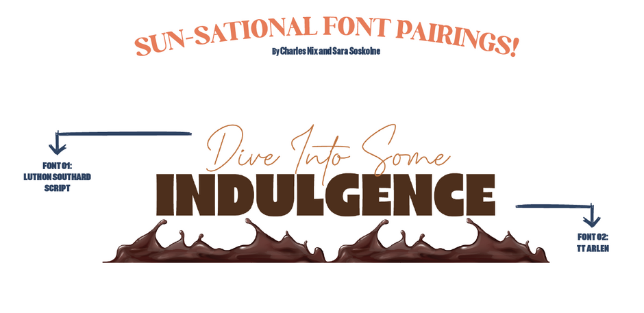
Charles Nix, Monotype Type Director, chose Luthon Southard Script by Lemonthe & TT Arlen by TypeType as a pair because they are vastly different. Pairing is about contrast. A fat sans like TT Arlen and a monoline script like Luthon Southard combine to provide maximum formal contrast.
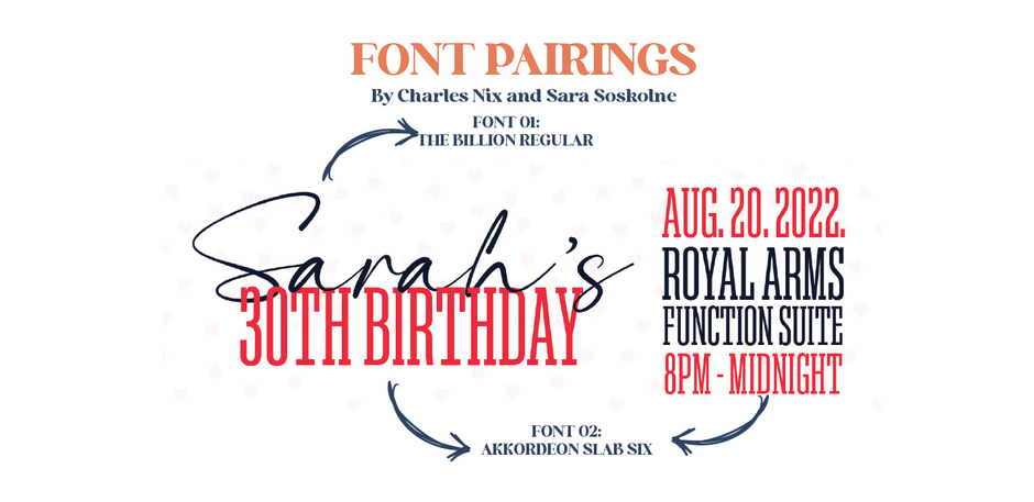
Unlike the pairing above, this pair Akkordeon Slab Six by Emtype Foundry & The Billion Regular by Lemonthe “doesn’t have to be a fat face sans and a monoline script; contrast is the key. ” - Charles Nix
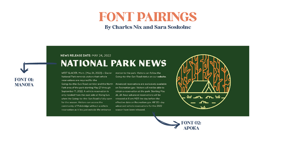
I chose to pair Manofa & Apoka both by well-known foundry The Northern Block. These fonts have the same bones. A pairing like this works because while the typefaces’ styling are completely different (which provides the all-important contrast Charles mentioned), their underlying skeletons are similar in shape — their x-heights, open apertures, simplicity of form — and proportion. The angularity of Manofa paired with the softness of Apoka yields inline contrast at its best. - Sara Soskolne
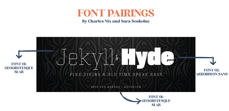
I chose to pair these two best-sellers from Emtype- Geogrotesque Slab & Akkordeon Sans - because of the seismic weight shifts. With this pairing, most everything is different in the two choices (extreme variation in weight, serif versus sans) except that both are monolinear, and have somewhat super-elliptical curves, which gives them just enough of a familial resemblance to connect them — like cousins rather than siblings. - Sara Soskolne
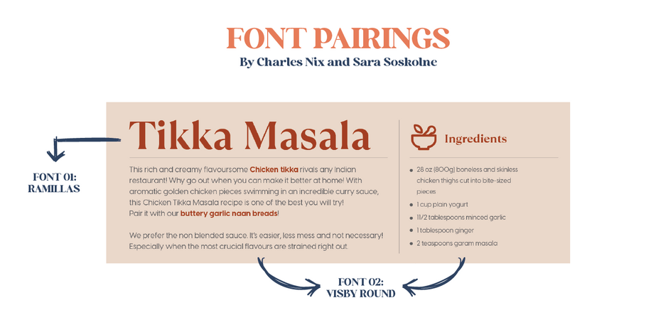
Next up: Ramillas by TypeType & Visby Round by Connary Fagen - “Same weight, different clothes: Here, I focused on a simpler idea: pairing fonts of two completely different styles in the same weight. The subtle stroke contrast in Ramillas adds an important dimension of difference from the monoline strokes of Visby; but alternatively, Visby could also be paired with another monoline face in the same weight with a totally different structure — like a script or a blackletter. - Sara Soskolne
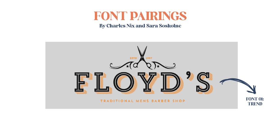
Another pairing strategy is to find a family that provides you with a wide-ranging “meal kit” of parts that you can combine in innumerable different ways like we did Latinotype’s Trend. There are so many possible versions of this lockup just from this one family: every possible combination of inline, sans, slab, and shaded versions of the same essential set of forms. This is a reliable approach, especially for the pairing beginner. - Sara Soskolne

Continuing with the “meal-in-a-box” family approach, there are more traditional systems in which the usage is implied. We’re talking optical sizes – specific typefaces for specific sizes: close-up ready Display fonts; workhorse Text fonts; and rugged Micro fonts like Blacker Pro from Zeta Fonts. - Charles Nix
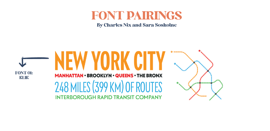
We’ve not paid much attention to the width axis, so let’s make up for that in this digestif menu. It uses just a small portion of the vast Klik family from Fenotype, taking advantage of both weight and width contrast, resulting in a nice push-pull combination. - Sara & Charles
Font Pairings from our Foundries!

Interested in learning even more about how to pair fonts? Check out these resources:

