Best Fonts For Logos
Why fonts are important to a brand
A logo is the heart of a brand. It is the strongest single image that represents a business. Many times, it’s the first impression someone has about a business. Logos should be memorable and separate a company from the competition.
MyFonts’ type experts have distilled the 270,000 fonts available from us, to the best fonts to consider for your next logo project.
Learn about how to choose the best fonts.
How to choose the best font
If you can afford it, have a custom design created explicitly for your logo. If you can’t afford a custom design, choose a typeface that is both distinctive and memorable.
Although the most obvious aspect of a brand’s projection is its name, other things also merit attention: shape, symbol, color and letters contribute to what has been called visual equity, or the value derived from visual form.
Your logo should be distinctive but many of the most distinctive fonts have a short life, and then become about as fashionable as tie-dyed T-shirts. Brands are supposed to last a long time. Pick a font that will not look out of date in two or three years.
Don’t Assume Customers See Your Logo the Same Way You Do
Don’t assume that typefaces have personalities. If you are creating a logo for a tire store, you may gravitate to a bold sans serif typeface. They’re masculine right? Maybe, but they are also overused for automotive products.
What if the client is your local church? A nice calligraphic typeface like Apple Chancery might be good for their logo – and it would be about as distinctive as a glass of milk. A typeface like Diotima would be just as appropriate – and would give the church a distinct brand.
Proof several ideas to find the right font
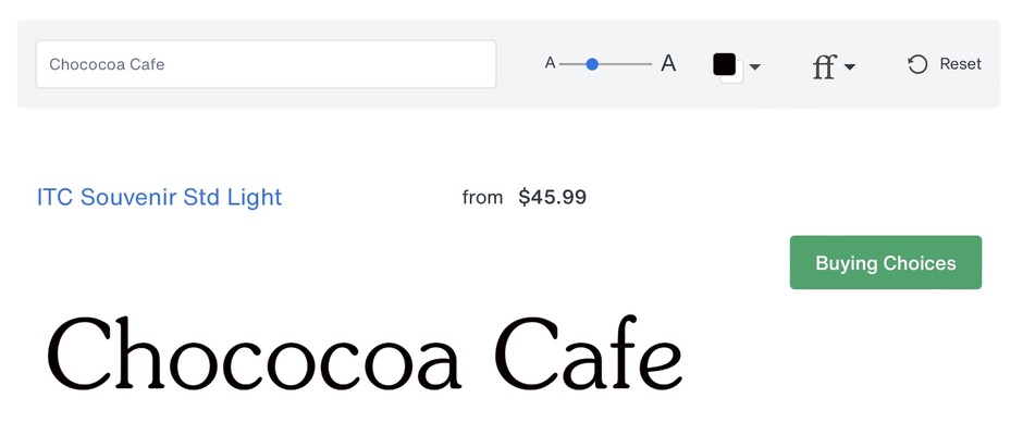
Take advantage of the MyFonts proofing app. Any font from the MyFonts offering can be proofed with one or two words. Pick the fonts you’re interested in and see what they’ll look like as your logo.
How many fonts should be used in a logo?
Sometimes two fonts are better than one. Two different fonts, especially if they contrast with each other, can create a powerful and memorable image. Experiment with different fonts. A little investment in time can pay off with something very special.
More than two fonts in a logo rarely works. The logo becomes fussy and difficult to remember. Minimalism is almost always the best guideline for logos.
What is the Difference Between a Logo and a Wordmark?
A logo is a visual representation of a company’s name, often featuring an icon or symbol associated with the brand. Nike’s swoosh is one of the most iconic logos in the world.
On the other hand, a wordmark is the font-based rendition of a logo. The BBC wordmark is an excellent example of a font-based logo.
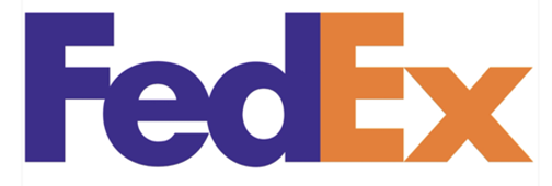
Sometimes icon logos are combined with wordmarks. Look no further than the FedEx logo with its negative space to form an arrow between the “E” and “x,” to convey speed and a strong sense of direction.
Are Logos Expensive to Create?
Logos are generally expensive to have designed. Although, Nike only paid, designer Carolyn Davidson, $35 for its swoosh logo. (Years later, She was also given shares in the company.) Font-based logos can be as inexpensive as the price of the font.
MyFonts’ type experts have distilled the 270,000 fonts available from us, to the best fonts to consider for your next logo project.
What Font Size is Best for Logos?
Logos can be on billboards, brochures, and business cards. Choose a font that will be at home in a wide range of sizes. Fonts with very fine strokes, small counters (the insides of letters like a and e) and diminutive x-heights (the proportional size of lowercase letters compared to capitals), tend to not translate well to small sizes and mobile device screens.
In some cases you may want to create two font-based logos. One for large sizes and one with a little extra letterspacing for small sizes. This, however, would not work for script font logos. Never letterspace scripts.
What Fonts are Trending for Logos in 2024 and Beyond?
Lately it seems that every new typeface is either a sans serif or a script. Where did all the stalwart, straightforward – or even quirky and charmingly fancy – serif typefaces go? Are graphic communicators doomed to a world without serifs?
Of course not. Serifs are here to stay. But design creatives are currently more interested in the serifless variety of typefaces. They are easier to work with than their serifed brethren. Sans serif typefaces also keep their good looks in a wide range of sizes (important for logos). In addition, sans serif font families are generally larger that serif families, providing more weights and proportions to choose from.
Serif typefaces can be more finicky and are usually confined to a relatively narrow band of point sizes. If set too small, serifs can become meaningless little bumps on the letters. If set too large, the thick and thin parts can become chunky and inelegant.
Serifs come in a wide variety of shapes and sizes. Those that are sturdy, are best suited to small size copy and on-screen imaging. Look to typeface families like Neue Swift ® and Archer®.
The trouble with sans serif typefaces is that it’s difficult to find one that is particularly distinctive. Humanistic typefaces like Neue Frutiger® and geometric sans, like Futura Now® are trending classics. Square sans, like Cachet™ and Felbridge™ provide a wide latitude in character spacing.
What Fonts are Becoming Outdated?
There is nothing like ubiquity to date a typeface – and make it unsuitable for logos. Logos need to stand out from the crowd – not get lost in it. If you’ve seen a typeface used for branding everything from work boots to consulting firms, stay away from it.
System fonts, like Times New Roman® and Verdana® are great communication tools because you can be assured that, if you send a document set in them to just about anybody, it will appear exactly the way you constructed it. Good for communication. Bad for logos.
The following fonts were chosen by MyFonts experts, and are ideal for logos.
Serif Fonts
Serif fonts are some of the most traditional designs and evoke feelings of steadiness, longevity, trustworthiness, and a sense of authority.

Logos set in Belluga Slanted Solid, Egyptian Slate Bold, Bell Semibold, and Sign Painter House Script Regular
A dynamic and versatile slab serif typeface that combines elegance and readability. Archer’s distinctive and refined shapes make it ideal for logo design.
The openness of Egyptian Slate’s letterforms allow for strong slab serifs with no loss of legibility. This is a straight forward, no nonsense design.
ITC Legacy Serif’s roots are in classic 15th century letterforms. It’s a design that speaks of heritage with a contemporary vibe.
First drawn as a legibility typeface for publication design, Neue Swift is an upgraded and improved version of the original. It’s distinctive, yet easy on the eyes characters make it a natural for logo design.
ITC Souvenir is a charming blend of elegance and affability. Its soft serifs and friendly demeanor easily create enduring typographic logos.
Walbaum offers the kind of warmth that’s missing from typical Didone typefaces, with a vibe that is effortlessly approachable and legible. It’s sophisticated without being stuffy.
Sans Serif Fonts
Sans Serif fonts are approachable straightforward. They can be friendly and are often associated with technology.
ITC Avant Garde Gothic is a minimalist geometric design that is highly legible and ideal for logos that instill a sense of modernism and forward thinking.
Between has balanced proportions and subtle geometric influences. It was designed for clarity and readability.
DIN Next’s timeless structure emphasizes legibility and neutrality, making it perfect for a contemporary logo design.
Gotham’s clean modern lines and extensive family of weights make it ideal for logos and extensive branding applications.
Knockout’s layered design system allows for dynamic and customizable typographic applications, giving it versatility and a wide range of choices for logo creation.
The newest version of the Frutiger typeface family which has been revised and improved. The design combines the clear structure of a sans serif, enhanced by calligraphic overtones.
Script Fonts
Script typefaces are emotional, lyrical, even passionate. Scripts have a soul, and a heart. Words set in script are perfect examples of something that is greater than the sum of its parts.
The warmth and verve of a script font with the clear character shapes of a sans serif design are subtlety combined in Nadianne. The former gives personality to a message while the latter ensures that it is easily read – even at small sizes.
One Stroke Script is a highly legible, casual typeface that looks as though it were drawn with a brush. One Stroke Script is friendly, approachable and can bring a human quality to logo designs.
The capitals of Party can be used alone or as initial letters in a logo. In addition, many alternate characters and ligatures are included. This is a design that easily sets the tone for fun and gaiety.
Snell Roundhand is a classic script with graceful flowing characters. It easily evokes a sense of elegance and sophistication. Its capitals can be used as initial letters and mixed with other alphabets.
A light, informal typeface based on handwriting, the strokes have a feeling of spontaneity with an energetic flair. Clearly this is a design with a memorable personality.
Zapfino Extra enjoys a vast array of alternate characters, hyper-flourishes, and ornaments. Zapfino Extra easily makes for distinctive and memorable logos.
Decorative Fonts
These typefaces defy simple “pigeonholing.” They can look like letters cut in stencil, decorated with flowers, or appear three-dimensional. Some use unorthodox letter shapes and proportions to achieve distinctive and dramatic results.
Arriba is a bold and eye-catching design with a playful, contemporary mien. Its thick, rounded characters convey a sense of energy and fun.
An inline adaptation of a distinctive slab serif design, Cesium maintains a high level of energy across a range of different ambiences. It’s powerful and inviting, at the same time.
Dreamland is a top-heavy, 30s retro with a sense of humor. It’s fun, funky, and more than a little irreverent. Based on showcard lettering styles of the mid-twentieth century, Dreamland can, well, create a dream of a logo design.
Bubble Gum is a juicy multi-dimensional gob of goodness that’s bursting at the seams with loads of alphabetic appeal. Its well-padded figure transforms the ample letterforms into a warm and casual logo with a little extra kick.
Raphael’s charm dates back to the latter part of the 19th century. Raphael is ornate without being fussy and romantic without being saccharine. It brings to mind the magic of bygone days, while still remaining fresh and striking.
Whimsy is a delightful and playful design, characterized by it whimsical and curvy letterforms. Whimsy will add a touch of joy and creativity to logos and is particularly suited to products for children.
More Related Content
Tips for Using Fonts in Logos
Font based logos can create a memorable visual identity and establish brand consistency. The problem is: sometimes fonts, right out of the box, can be forgetable, easily replicated, and suffer from limited versatility.
Best Fonts For Resumes
Your resume has about six-seconds to make a good impression on a hiring manager. The right font is key to success. MyFonts offers the largest number of resume friendly fonts, of any provider. Read on, to find out which are the best for your individual needs. You’ll not only learn the best fonts for resumes, but also some valuable tips on how to use them. Learn more