Best Fonts For Resumes
Your resume has about six-seconds to make a good impression on a hiring manager. The right font is key to success. MyFonts offers the largest number of resume friendly fonts, of any provider. Read on, to find out which are the best for your individual needs. You’ll not only learn the best fonts for resumes, but also some valuable tips on how to use them.
Four Things You Should Know About Fonts For Resumes
Serif v. Sans
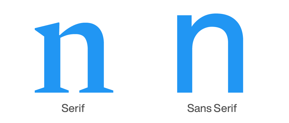
A serif is a line crossing the main strokes of a character, and an outgrowth of early calligraphic lettering. There are many varieties. Sans serif typefaces have no serifs. Both serif and sans serif fonts can create powerful resumes. Some believe that sans serif typefaces are more straight forward designs, while others contend that serif typefaces are somewhat more legible. The fonts the MyFonts type experts have chosen, as the best for resumes, are highly legible and easy to read. You can’t go wrong with any of them.
Free System & Application Fonts
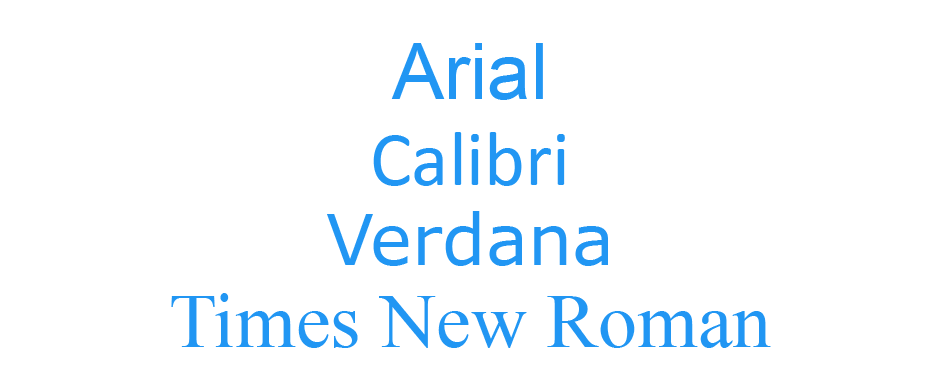
Free fonts may not be the best for resumes. Operating systems and many applications provide “free” fonts. These include Arial, Calibri, Times New Roman, Verdana, etc. They are good communication tools but, because of their ubiquity, will not make your resume stand out from the crowd.
Best Weights and Sizes
Font families offer many weights and variations. Some over 50. The MyFonts type experts have taken the guesswork out of determining which are best for resumes. The Roman (sometimes called “Book,” or “Regular”), Italic and Bold (sometimes called “Semibold”) fonts create hierarchy in resumes. Very bold fonts are best for the most important information – like your name. Bold Italic fonts, almost always, introduce too many layers of hierarchy.
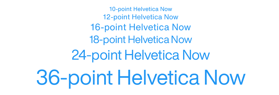
24-point is a good size for your name-heading on a resume, but it can be as large as 36-point. Headings are usually 16-point to 18-point, and 12-point is almost always the best size for resume content. Larger, and your resume will appear ponderous and uninviting to read. Smaller sizes may allow you to pack in more information, but will be somewhat more difficult to read.
B&W v. Color
Color can lead the reader’s eye to the key point, the benefit, or the bottom line. Color can also indicate ranking of information. A page that is awash in color, however, is just graphic noise. It is its rarity that makes color noticeable and powerful.
Color must be more than a typographic embellishment. It should work for its living by giving added value. Whether it’s for running heads (like Education, Work Related Experience, Skills, etc.) or simple list-bullets, the color plan and palette should be part of the initial design process. Color should not be an afterthought, or a decoration.
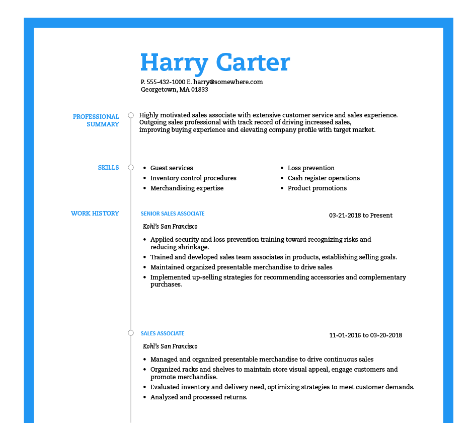
What Type of Fonts are Trending for Resumes in 2024 and Beyond?
Current trends in resume fonts consist of a mix of classics like Helvetica and Garamond, and fonts taken from the world of online user interface design. This latter group includes fonts like Roboto, which is used in many Google products, and Open Sans, which is the default font for Mozilla, including in their Firefox web browser.
So, should you go with a classic or something more modern? Later in this article we’ll discuss more about how to make specific font choices based on your goals.
Other Tips to Formatting Resume
Spacing
If your resume is crammed with text, that makes it harder to read. Try squinting at a printed copy of your resume, and if you can’t see where the important information is, edit your resume until you can.
Margins
Margins, like spacing, are key components of a resume’s readability. While 1-inch margins are ideal, sometimes narrower margins are necessary, especially if you’re trying to fit everything on one page. At a minimum, you should have half-inch margins around the page.
Legibility
What makes a font easy to read? According to a recent study by the Readability Group, key factors that affect a font’s readability include letter spacing and variable character widths. Helvetica and Book Antiqua are two fonts that many readers rate highly for readability.
How to Match Your Resume Font to the Job You’re Applying To
Just as you wouldn’t expect a graphic designer to dress the same way as an attorney for a job interview, these professionals should also present themselves differently in their resumes. In more creative fields, people are expected to show their creativity. which includes their font choices. Proxima Nova and Gill Sans can be great for these kinds of resumes.
However, if you work in a more traditional field, it’s important to convey professionalism and reliability. Standing out too much in these situations can actually put you at a disadvantage. In these cases, it’s often best to stick with classic fonts like Helvetica or Georgia.
Fonts to Avoid on Resumes
There are three general reasons you might not want to use a particular font in your resume. One reason is that the font has become so popular that it is now overused. It is harder for a resume with these fonts to stand out. Examples of such fonts include Calibri, Arial, and Times New Roman.
Another reason to avoid Times New Roman is that it’s a bit hard to read, which is the second reason to avoid using a font in your resume. It might seem like a good idea to use a bold font like Impact for headlines, but many people also find this font difficult to read.
The third reason not to choose a font is that it doesn’t convey a professional image. Fonts like Comic Sans and Papyrus might be playful, but they don’t belong anywhere near your resume. These types of fonts also often suffer from poor readability—all the better to leave them out of any professional communications.
Where to Bold Your Resume
Bold fonts are a great way to emphasize certain information, but use them sparingly. If everything is emphasized, nothing is.
Job titles are often among the most important details on your resume, so it makes sense to bold them. Another instance where you might want to bold text is when you want to highlight something in a bullet point. Examples of this include skills that are directly relevant to the job you’re applying for, as well as particularly notable accomplishments.
Fonts For Resumes
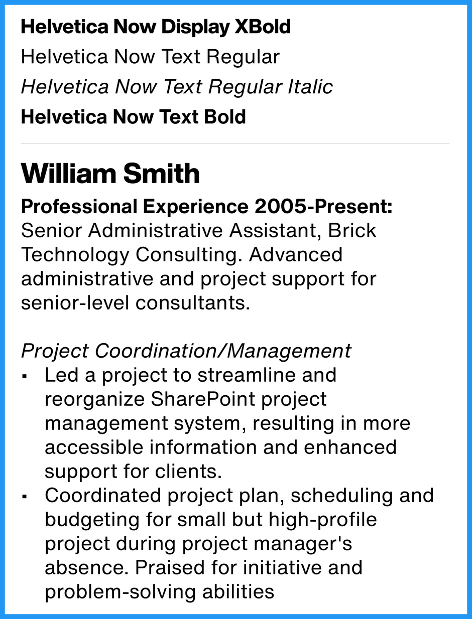
Helvetica® Now
Helvetica Now is the newest Helvetica design. A vast improvement over previous designs, it is a classic, recreated for the 21st Century – and only available from MyFonts, and its family of font providers. A solid communicator, easy on the eyes and remarkably legible, Helvetica Now says, “I’m here, I’m proven and I’m ready.”
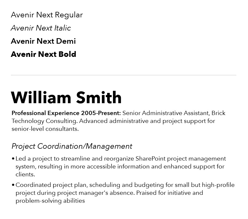
Avenir® Next
Avenir means “future,” in French. It’s a modern, forward-looking design that is destine to secure your future. The letters in Avenir are based on simple geometric shapes, softened with subtle calligraphic overtones. It’s contemporary without being harsh, and inviting to read.
Neue Frutiger®
Neue means “new” in German. Neue Frutiger is an updated and improved version of the original sans serif classic – and is only available from MyFonts, and its family of font providers. Neue Frutiger melds classic sans serif design traits with echoes of classic inscriptional letters. Many claim that it is one of the most legible and most easily read of the sans serif typefaces.

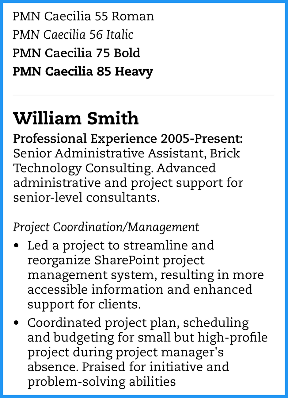
PMN Caecilia®
PMN Caecilia has sturdy slab serifs that give the design an honest straight-forward vibe. Their softened corners also create a sense of affability. In addition, PMN Caecilia’s proportionally large lowercase letters, also make it easy to read. The result is a solid and stylish typeface design that checks all the boxes.
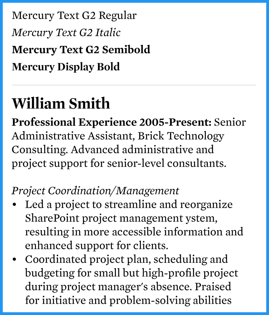
Mercury® Text
Mercury is high performance meets high style. The product of nine years’ research and development, it’s a family of powerful typefaces designed to thrive under the most adverse conditions – and remain a handsome communicator, at the same time. Mercury’s compact proportions and clear character shapes, naturally reproduce well in small sizes, while losing none of the font’s personality and charm.
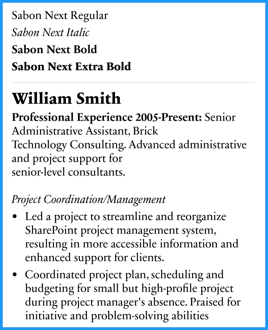
Sabon Next®
Sabon Next is patterned after classic Renaissance typefaces. The design is reader friendly, while maintaining all the grace and elegance of some of the earliest printing types. It makes a statement, without calling attention to itself. Sabon benefits from the relatively large and soft serifs which aid the reading process and give the design a friendly demeanor.
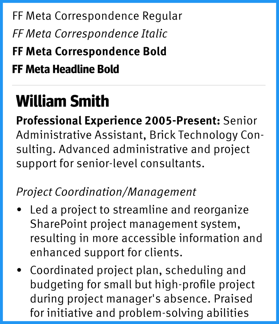
FF Meta®
Meta was designed to be economical of space and easy reading at small sizes. It’s clean and cheery, with a distinctive mien. and its ability to serve well in multiple design capacities including office documentation and correspondence. Meta is an excellent typeface to use when you have a lot to say, and not much space to say it.
More Related Content
Best Fonts For Logos
A logo is the heart of a brand. It is the strongest single image that represents a business. Many times, it’s the first impression someone has about a business. As a result, good fonts for logos should be memorable and separate a company from the competition.