Creative Characters: Up and coming — Studio Sun
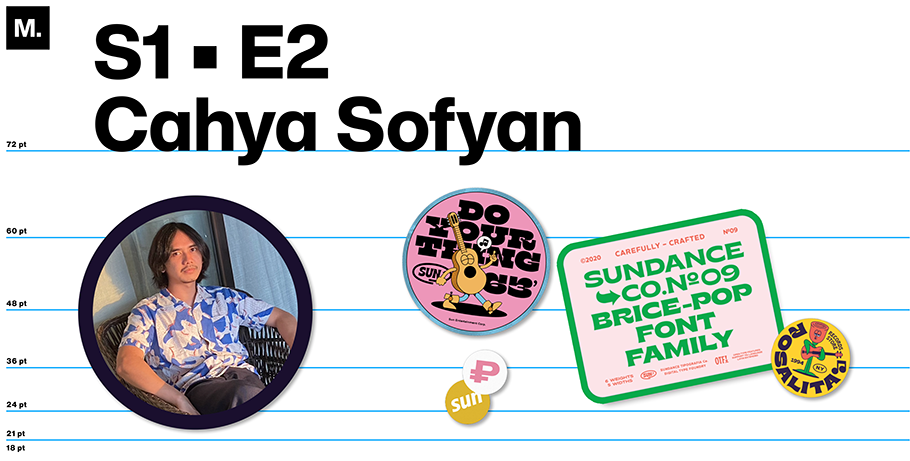
Cahya Sofyan’s inspiration knows no bounds. With a lineup of typefaces straight out of the Summer of Love by way of the Pony Express, Sofyan’s display fonts practically vibrate off the screen, while his quieter sans serifs hum with understated grace. Sofyan began experimenting with letterforms at age 19, taking inspiration from history books, found objects, and the world around him. Today, he’s the creative force behind Studio Sun/Sundance Tipografia in Bali, Indonesia.
What inspired you to start drawing type?
I was inspired by Vincent Connare and his Comic Sans® font — a quirky font, but still widely used. Comic Sans is generally pre-installed on almost all PCs, and very easy to recognize. I sincerely hope that one day my work will be owned and recognized by everyone.
When and how did you decide to pursue a career in type?
I started my typography career in 2011, but wasn’t yet selling fonts commercially. I was only designing for myself. For me, fonts are fundamental graphic elements of any visual work. I was — and am — very compelled to help designers find the right solutions for their work.
Once I decided to focus on typography as a career, my wife and I founded Studio Sun/Sundance Tipografia in 2015. My wife is our project manager, managing the work from concept to publication, while I focus on exploring font design. Besides us, we also have a team of graphic designers and copywriters.
Tell us a bit about your education. Are you self-taught, did you attend college, or learn by doing?
I studied visual communication design, where I learned a lot about advertising. Through my studies I gained a different perspective on how fonts can affect society, as well as how best to promote a font. When I began designing my own fonts, I took classes (in person and online), and participated in online discussion forums [with other type designers].
What resources do you use to research and learn about type? Is there a specific aesthetic that inspires you?
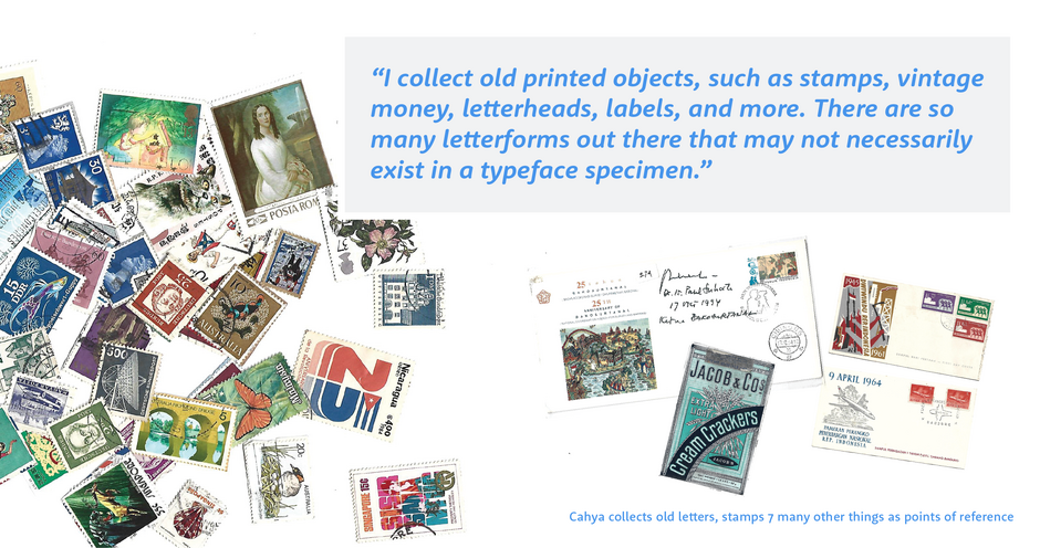
I collect old printed objects, such as stamps, vintage money, letterheads, labels, and more. There are so many letterforms out there that may not necessarily exist in a typeface specimen. I really like the early 1900s style where each letter is filled with personality; I also love art deco-style typefaces that contain multiple versions of each letter. This motivates me to infuse my work with character.
What does your design process look like?
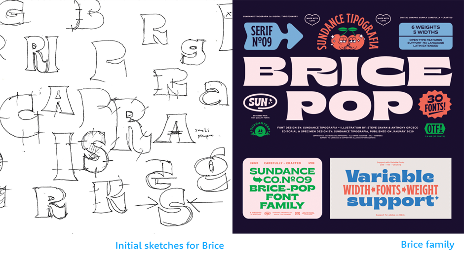
We start with some exploratory shapes, sketching digitally or on paper. We like to explore letter anatomy. Then we do some digitizing/vectorizing in the computer software; the whole process takes about four to seven months. We’ll send the demo fonts to our team of designers, who’ll send us feedback. Then we finalize the work.
Have you collaborated with designers or studios in other parts of the world?
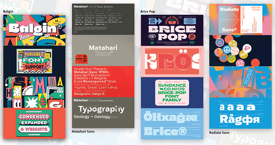
We collaborate with artists, illustrators, and graphic designers from all over the world for our promotional kits, which include posters, web banners, and social media campaigns. In early 2020 we created a series of posters for our Brice Font family with illustrators Steve Gavan and Anthony Orozco. This campaign included badges, mascots, graphical elements — even motion graphics by designer Ahmad Syarif Hafidh. Our next project was a collaboration with Sebastian Pren for our Balgin Font family; then we worked with Bernardo Henning (Hola Maybe) and Alfath Yulhanri on a campaign for Radiate Sans. Steve Gavan and Anthony Orozco have also both created promotional posters for Klose Slab and Gulfs Display. Going forward we plan to collaborate with creatives in other mediums.
Have you seen your type used in unexpected ways? How do you feel about people using your designs in unexpected or unintended ways?
Untitled Macau [Design Studio] made a three-dimensional version of our Brice Font family, which I found very interesting. The exposure is an achievement for our studio, too!
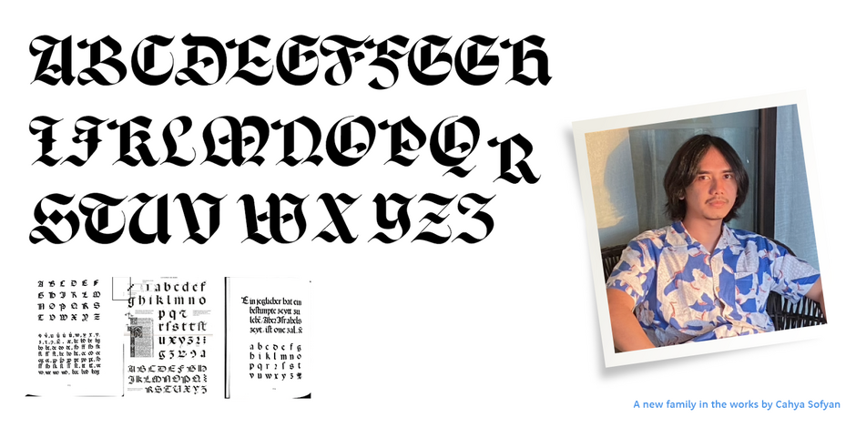
Do you have any projects you’d love to tackle in the next 3 years or so?
We focus on designing fonts with lots of scripts; in Asia there are lots of script fonts, both modern and traditional. Our studio wants to archive the history of typography, especially in Asia.
What advice/guidance would you give type designers who are just starting their careers?
Just be original. And trust yourself.
Margaret Leahy is a marketing writer and practical design fanatic based in New England.


