Inside the Studio: Creative Characters — Julien Fincker
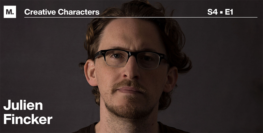
– Julien Fincker
As he exits his 30’s, graphic and type designer Julien Fincker, of Stuttgart, Germany, is celebrating the self-expression he’s found through his eponymous foundry for woodworking, printmaking, and most important, font creation. Already art director at campra communications, as well as a married dad of young twins when he launched his solo studio five years ago, Fincker nevertheless craved satisfying his independent spirit. Today, in his home studio, he creates work free of client parameters, and responds only to the call of his curiosity.
In a recent, wide-ranging interview with Monotype, he discussed his dual background (French and German), what sent him down his artistic path, and what his fonts — and font names — say about who he is. We spoke by Zoom. Our conversation has been condensed for space.
MyFonts (MF): Where were you born and raised?
Julien Fincker (JF): I’m French, but was born and raised in Germany. My parents moved here in 1978. So I grew up bilingual, in French and German. And, yes: I’ll be 40 in a couple of months. I’m good with it.
MF: What led your parents to move to Germany?
JF: My dad was a brakes engineer in the car industry. He got a good job offer from the Stuttgart area, close to the French border and to my parents’ hometown. My whole extended family lives in France. But my parents, my sister and me, we always lived here.
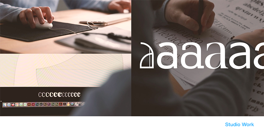
MF: Tell me about your French-sounding font Bourget. What inspired the name? Visually, the typeface reminds me of the restaurant industry.
JF: Yes, the visual influence was a restaurant-style Art Deco, which I like for the playful little details you don’t see often anymore. As for the name: I wanted to evoke the 1920’s. Then I discovered: there’s an airport in Paris — Le Bourget — where in 1927, Charles Lindbergh landed after his first flight over the Atlantic. It sounded good, it looked good, and so I thought: yes.
MF: What do you find playful about Art Deco?
JF: As you see in Bourget, there’s a fine line in every letter — something very common to Art Deco fonts. Or humorous letters that are much smaller or wider than normal.

MF: What does being playful — or humorous as a designer — mean to you?
JF: It’s very important. Because what would life be without humor?
MF: Do you view yourself as having a Gallic or German sense of humor? Or both?
JF: Actually, I think I often have British humor: dark. But I also have French humor, which is — again —made up of fine little details. But I mix a lot. Because I never really felt completely French — or completely German.
MF: Does that influence your identity as a designer and artist?
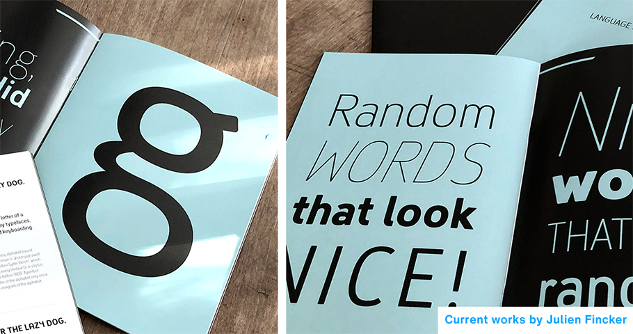
JF: Interesting question. I enjoy many influences. I don’t believe in flags or borders. I like to have good influences from Germany and France. And I try — because every country also gives you bad influences — to push those away. I love to look around. That’s why I like woodworking. You get another feeling for letters, materials, proportions. This influences my type design.
MF: Tell me about type design, as well as your full-time job.
JF: I’m art director in a communications agency. Type design and woodworking, I do freelance. I need it, because my agency works for big corporations that have their rules. You have to fight for your designs and compromise on everything. So I need some kind of artistic output. I like working on agency projects; I like my colleagues. But I like my freedom on the side.
MF: Any other freedom-loving artists in your family?
JF: My sister’s a graphic designer who also does some photography. And my dad has his side project of woodworking. He’s built tables, bookshelves, small planes and boats. Right now, he’s building a tiny boat. He takes real plans, crops them down, and then builds them completely. This is very detailed, artistic work, even if his job wasn’t.
MF: How does your dad feel about your being a working artist?
JF: Both my parents, they didn’t really know about graphic design. Because when they were growing up, you had to get a solid job as an engineer or doctor. Or a butcher.
MF: A butcher?
JF: My grandfather was a butcher, that’s why! But they were always very supportive, and I’m thankful. Because in high school, I did poorly; the one I attended focused on mathematics, science. I wasn’t very good at this. Like many creative people, I struggled. So my parents helped me find design schools. Because they noticed I was drawing a lot at 14, 15, 16. I didn’t know what to become. But going into graphic design was the right direction for me.
MF: How did you go from graphic design to font design?
JF: I have to go back a little further in time for that. I was skateboarding a lot, which opened my mind to skateboarding’s creative world with all the art and magazines! So, I began designing boards and wheels.
MF: What do you mean?
JF: I did a lot of board graphics, for example. Many artists from skateboarding subculture went into the art world. You know Shepard Fairey? He started with skateboard graphics, and now his artwork’s in museums around the world. Anyway, I began designing for the board — then skateboard wheels: this small area you can print on. It was like designing on a small donut. I was also creating letters, using Illustrator. I didn’t publish them. I didn’t even know that people designed fonts. I thought it was computers. Later, a colleague at work showed me font design, and I was hooked. And I never looked back.
MF: What are you working on now, creatively?
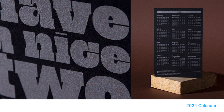
JF: When I work on fonts is mostly at night, when my kids are in bed. So time is limited. But I’ve just started a new typeface, a sans-serif with rounded corners. Before that, the last typeface I finished and released, a few months ago, is Grantig. It’s German for “grumpy.”
MF: Describe it.
JF: It has a lot of contrast. It’s a display typeface, for just headlines. It’s loud and offensive. So you can’t use it for everything. It’s a bit like a slab serif, like from the titles to old American Western movies. I took some of these elements and I changed them in a more modern way.
MF: Were you grumpy when you released it, or did the font look cranky to you?
JF: I was grumpy because I couldn’t find the right name for it. It took a long time. Then one day, I just typed “I’m grumpy” — “grantig” — and it looked good. So, okay, that’s it! I’m grumpy, Western heroes are always grumpy. It fits.
MF: Sounds like another profitable case of amalgam to me.
JF: Yes! At any rate, I like to try things. For me, it’s like a game.
Give a shout-out on social media using #CreativeCharacters
We hope you enjoyed this interview. Check out previous interviews of Up and Coming Creative Characters & Inside the Studio: Creative Characters.


