Diego Aravena — W Type Foundry
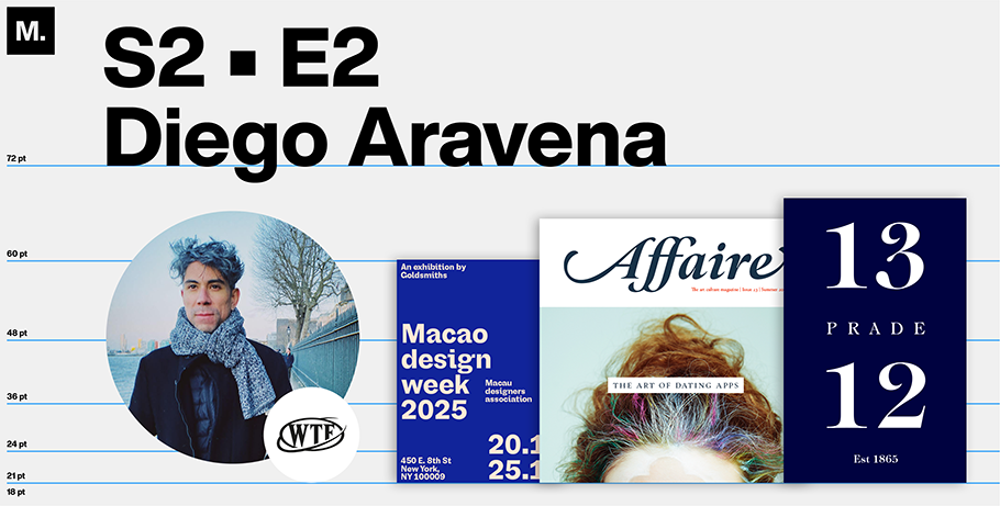
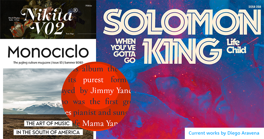
Call him a dreamer. Diego Aravena, 36, currently lives in Britain and studies at the University of Reading, where he’s earning a master’s degree in font design. Recently, Monotype caught up with him for an interview via Teams. Our conversation has been condensed for space.
MyFonts: How did you find yourself in Britain?
Diego Aravena: Because of the twists of life, in 2018, I got a chance to study an MA programme in the UK financed by Chilean national scholarship, and it turns out I fell in love with the place due to its rich typeface culture. So then decided to start my second degree in typeface design, specifically focusing on non-Latin scripts.
MF: Why non-Latin?
DA: I believe the Western typeface industry is overcrowded with talented typeface designers, so I’m exploring Asian scripts. It’s pretty challenging, to be honest. As a foreigner, looking at all these strange shapes can be a little frightening, but I think it will be rewarding in the end. Again, I am looking to differentiate myself from others.
MF: Talk a little about your foundry, W Type. In 2012, you and your cofounders — Patricio Truenos, Bana Arasanz, and David Súid — launched it as Without Foundry. I’m curious: what’s the story behind the original name, and its change?
DA: When we opened the business, we were young and disliked hierarchy. We’d just finished our undergraduate programs but knew nothing about law, finances, or accounting. So that’s why we called it Without. Afterwards, we grew up and realized we needed some order and specific roles, so we changed the name to W Foundry. We didn’t want to lose the vibe, the brand.
MF: What do you feel is your vibe or brand?
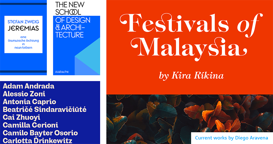
DA: Right now, I think we’re at a pivotal point in looking for our future. We’re already connected to academia because Patricio and I taught at graphic design schools, including the Universidad de Chile, where we were educators. But now, I don’t feel entirely comfortable with those who just teach and don’t do. So you got to walk onto the path. In other words, we are looking to be closer to business and acquire financial support to create more fonts. Maybe we’ll become a boutique foundry specializing in non-Latin scripts; that’s our aim now.
MF: As you shift to keep pace with the times, what’s your biggest income-driver?
DA: Retail — and Monotype is our biggest retailer. We sell some typefaces through MyFonts.
MF: What’s your foundry’s perspective on developing direct clients?
DA: I believe there are not that many clients in Latin America. Chile is still economically underdeveloped compared to Korea or other Asian countries. As a result, we don’t have direct clients who come and ask for a custom typeface. So, we’re still relying on retail fonts and exploring new ways to approach potential clients.
MF: Speaking of creating more typefaces: what led you to rework Medieval calligraphy?
DA: I’m interested in designing some old-style fonts. Think: “Lord of the Rings.” Those typefaces deserve a second chance because they have an aesthetic value — even though they emerged at the end of the Roman Empire and during the Dark Ages: the era of crusades, castles, conquers and violence.
MF: You’re saying people associate Medieval typefaces with violence?
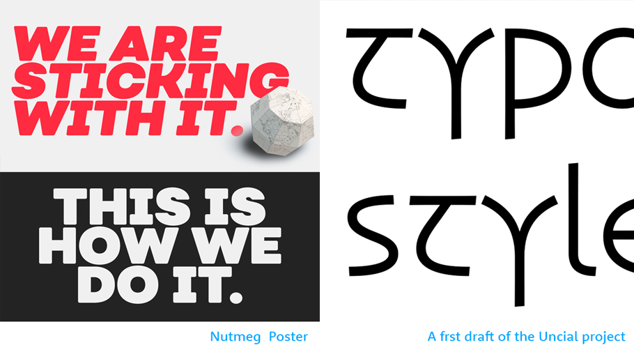
DA: I mean, I do! I’m also trying to say that typefaces developed during times of great historical stability. For instance, during the empire of Charlemagne, the Carolingian minuscules were created because he had an interest in learning. Still, looking from a broader perspective, they needed armies and warriors to maintain the kingdom’s status quo. So, these fonts have associations I don’t like. At the same time, they led to Renaissance style. People forget that. So I’m working on a project to give the old style a fresh vibe; it’s a sans serif. I want to try to make those fonts popular again.
MF: Are you talking about a revival?
DA: No, it’s not a revival because I’m doing a reinterpretation. It’s experimental, but I think it’ll work. Maybe these fonts need to be given another meaning because they are beautiful and unique! As far as history goes, they’re one of the most significant developments when it comes to typefaces, in my opinion.
Give Diego Aravena a shout-out on social media using #CreativeCharacters @wtypefoundry @MyFonts.
We hope you enjoyed this interview. Check out previous interviews of up and coming creative characters.


