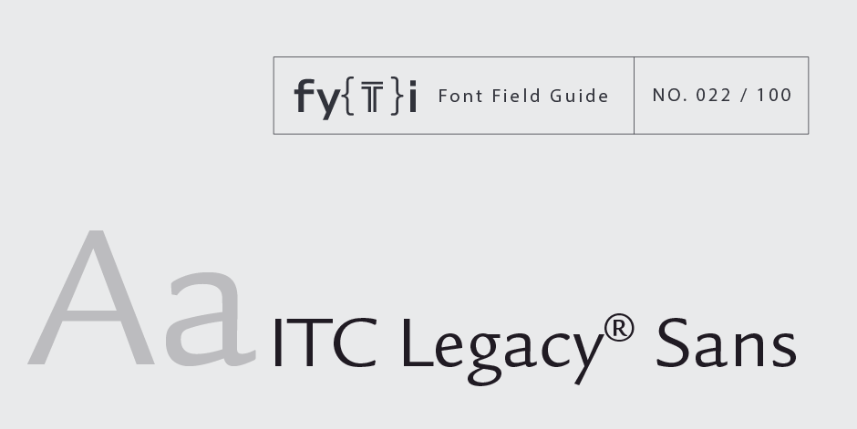
ITC Legacy® Sans Font Field Guide

Foundry: ITC Designers: Ronald Arnholm Classification: Humanistic Sans
Best Practices
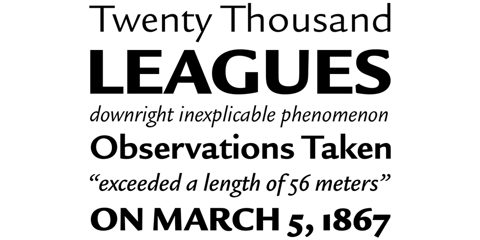
An excellent design for both hardcopy and interactive applications. The standard weights are full-bodied, while the condensed designs provide economy of space with little loss of legibility.

Family
Four weights ranging from book to ultra in regular and condensed designs – each with a companion italic.
Font Facts
- The roman characters are based on the 1470 “Eusebius” of Nicolas Jenson, while the italics find their roots in work of Claude Garamond.
- Was not dawn on a computer because Arnholm believed that “The subtle contrast between similar parts on one letter relative to another was one of the contributing factors to the mellow appearance of Jenson.”
Roots
While working on his ITC Legacy (serif) typeface, Ron Arnholm became intrigued with the concept of a sans serif typeface with the same skeletal structure of his Jenson revival. A large pad of tracing paper and a day’s worth of trial renderings later, Arnholm was satisfied that his idea was sound. Both typefaces were released in 1992.

Legibility
Humanistic overtones, a robust x-height, large counters and open apertures make the ITC Legacy Sans family an exceptionally legible and readable design.
How to spot News Gothic

Alternate Choices
Perfect Pairing
Download a pdf version of the ITC Legacy® Sans font field guide and view the ITC Legacy® Sans font family.
More Font Field Guides

Optima nova should be set more open than tight. The unhurried elegance and light gray color created by the face is disrupted when letters are set too tight. Learn more

The original Baskerville typeface was created for setting books, and its modern revivals are ideally suited to the setting of continuous text. Learn More


