ITC New Baskerville Font Field Guide

Foundry: ITC Designers: John Baskerville, John Quaranda Classification: Transitional Serif
Best Practices
The original Baskerville typeface was created for setting books, and its modern revivals are ideally suited to the setting of continuous text. Magazines, booklets, brochures, pamphlets and long form digitally imaged copy are natural uses.

Family
Four weights of regular designs – each with a complementary italic.
Font Facts
- Baskerville’s contemporaries rebuked his type as being too light. Some even believed that reading it would cause blindness. Benjamin Franklin, however, liked the Baskerville types and purchased several fonts from the Birmingham printer.
- John Baskerville was an atheist and was buried in a mausoleum he had erected on his own grounds.
Roots
Modern Baskerville fonts are based on the type of John Baskerville, the 18th century English printer and type founder. His original type has its foundation in the Caslon design, but is more precise, and has more contrast in character stroke thickness. Baskerville is the first “Transitional” design between Old Styles, typified by Caslon and Garamond, and Neo Classical designs such as Bodoni and Didot.
The first modern revival of Baskerville’s fonts was in 1923, under the design direction of Stanley Morison for Monotype.
Through a licensing arrangement, ITC gained the rights to Linotype’s New Baskerville family and released its version, called ITC New Baskerville, in 1982.

Legibility
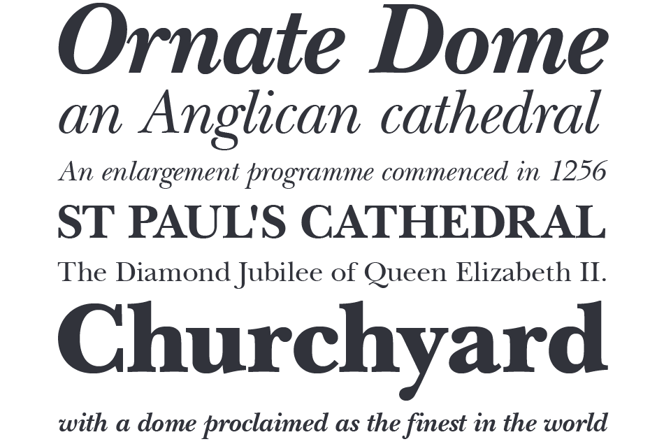
The ITC New Baskerville design is exceptionally legible, with a genial, attractive feel. More than easy to read, it is inviting to the reader. Because the design has a marked contrast between thick and thin strokes, on-screen textual content should be reviewed for character fidelity and readability.
How to spot ITC New Baskerville

Alternate Choices
Perfect Pairing
More Font Field Guides

Because of its fine hairlines and delicate serifs, Perpetua should be set a little larger in on-screen applications that in print. Learn More

Antique Olive design is not intended for continuous text copy. It can, however, be used for short blocks of textual content if given ample line space. Learn More


