Macklin Font Field Guide

Best Practices
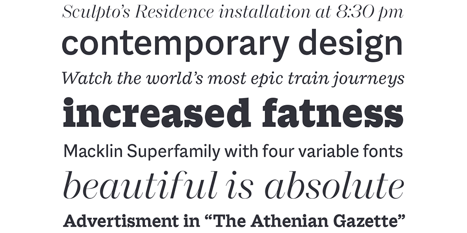
The Macklin family is a strong, adaptable family that is excellent for branding, headlines and other display uses. The simple shapes, open counters and apertures are wide and clear make it a good choice for short blocks of text copy in both print and on-screen environments. The lightest and boldest weights create inviting banners and headings, while the midrange designs are perfect for navigational links, sub heads and blocks of copy

SUPERFAMILY
The superfamily designed by Malou Verlomme for Monotype Studio is available in Sans, Slab, Text and Display.
Font Facts
- Figgins is credited with developing the first commercial slab serif font, as well as being among the first type founders to sell a sans serif font.
- In addition to the four styles—Sans, Slab, Text, and Display—Macklin includes a variable font that allows designers to define the weight and contrast.
- The different families of Macklin are meant to be combined.
Roots
Macklin was inspired by the work of British typographer Vincent Figgins. Figgins may not be familiar to those outside the world of type, but he played a key role in the evolution of typography in the late 19th century. He’s responsible for developing several type styles that emerged during that pivotal period, when typography moved off the page and into the street, in the form of adverts and posters.
Previously, typefaces had been largely constrained to books, but the arrival of advertising meant businesses were clamoring for typefaces that could grab the attention of passersby and help sell their wares. Verlomme dived deep into Figgins’ work while researching Macklin, but this typeface is explicitly not a historic revival. Macklin pays respect to Figgins, but puts a distinct twist on its typographic predecessor, pushing the family to a place that’s more suited to contemporary use.

Legibility
From text to display sizes, from casual to luxurious, the four different families of Macklin (Sans, Slab, Text, Display) offer a broad palette for visual expression.
How To Spot Macklin

Alternate Choices
Perfect Pairing
More Font Field Guides

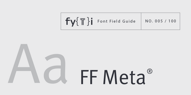
FF Meta Font Field Guide
The Meta design is somewhat condensed (saving space) and benefits from stroke weights and character spacing that withstand poor printing and modest resolution digital imaging. Learn more

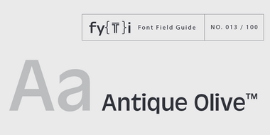
Antique Olive Font Field Guide
Antique Olive design is not intended for continuous text copy. It can, however, be used for short blocks of textual content if given ample line space. Somewhat squared curved shapes and vertically clipped strokes allow for tight, even display setting. Learn more


