Neue Haas Unica™ Font Field Guide

Best Practices
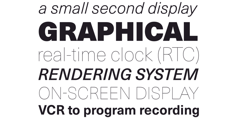
There are few applications outside the range of Neue Haas Unica. It is an excellent choice for text and display content – in hard copy or on screen.

Family
Nine weights, from Ultra Light to Extra Black, each with an Italic complement
Font Facts
- Neue Haas Unica is a reimaging of the original Haas Unica, designed by Team ’77 in 1981. Intended as an alternative to Helvetica, the team conducted extensive research into existing grotesque designs prior to developing Unica.
Roots
The 18-font Neue Haas Unica family is an extended, reimagined version of the original Haas Unica design, first released in 1980. Neue Haas Unica brings the original design into the 21st century to meet a wide range of digital and print requirements .
It is sophisticated and calm, meticulously refined, and beautifully crafted with subtle nuances.

Legibility
Neue Haas Unica was designed to be more open, with letters that are narrower than Helvetica, which has often been compared to the original Haas Unica design. This helps ensure text readability at small sizes, and on displays with modest resolution.
How to spot Neue Haas Unica

Alternate Choices
Perfect Pairing
Download a pdf version of the Neue Haas Unica font field guide and view the Neue Haas Unica font family.
More Font Field Guides

Mont™ Font Field Guide
Mont is a versatile family that can be used at both large and small sizes. When used in headlines the typeface can be set in thin or heavy weights that displays the refined geometric forms at their extremes. Learn more

Univers® Next Font Field Guide
There are few applications outside of Univers Next range. It is an excellent choice for text and display content – in hard copy or on screen. Learn more


