Serifa Font Field Guide

Best Practices
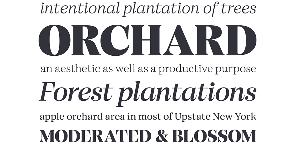
The Serifa family is a slab serif design that benefits from a humanistic design foundation. The simple shapes and robust serifs also make it a good choice for large headlines, medium blocks of text copy in addition to being highly legible small text in both print and on-screen environments.

Family
Five weights of roman design – three with complementary italics – plus a bold condensed.
Font Facts
While most slab serif typefaces are based on geometric shapes, Serifa has a humanistic design foundation.
Roots
The Serifa family and its condensed counterpart, Glypha®, have roots in Frutiger’s earlier Univers® family. A natural progression from the earlier sans serif typeface, Frutiger began sketching the design in 1964; Serifa fonts were released by the Bauer Type Foundry 1967, and subsequently adopted by Linotype in 1968.

Legibility
A large x-height and open counters aid legibility.
The tight apertures on the a, e and g can be a problematic at small sizes.
Slab serif typefaces stand up well to low resolution and small screen applications.
Spotting Serifa


