Tellumo™ Font Field Guide

Best Practices
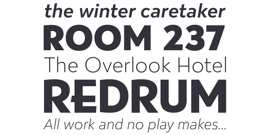
Tellumo melds a clear personality with legibility characteristics, making it ideal for display copy as well as modest blocks of running text.

Family
A modest range of six weights, from Thin to ExtraBold, make Tellumo versatile without being overwhelming. The lightest and heaviest weights are ideal for headlines and subheads.
Font Facts
- Large caps in the “swash” OpenType feature drop below the baseline, and often have extended crossbars.
- Unlike most swash letters, whole words can be set in Tellumo’s.
- The variable fonts have a weight axis.
- There are no true small caps, but the regular caps can look like small caps when set with swash letters.
Roots
While Tellumo fits comfortably into the category of geometric sans serif, with a hint of humanism – it also has a subtle infusion of designs by Lucian Bernhard, notably: Bernhard Gothic and Bernhard Fashion.

Legibility
An ample lowercase x-height, large counters, generous apertures and moderate contrast in character stroke thickness, combine to give Tellumo high levels of legibility.
How to spot Tellumo

Alternate Choices
Perfect Pairing
Download a pdf version of the Tellumo font field guide and view the Tellumo font family.
More Font Field Guides

Novaletra Serif CF Font Field Guide
Novaletra Serif CF is built to excel at small to medium sizes, in print and digital environments. Perfect for text, captions, books, and documents, Novaletra’s elegant construction helps text flow and is easy to read, even at very small sizes. Learn more

FF Mark® Font Field Guide
Ten weights with more than a thousand characters each, provide for a wide range of applications. Everything from advertising and packaging and long form text to branding, on screen and in print is within FF Mark’s range of capabilities. Learn more


