Fontsmith and M&C Saatchi Recover Soho Fonts in ‘Lost and Foundry’ Campaign
Fontsmith and M&C Saatchi Recover Soho Fonts in ‘Lost and Foundry’ Campaign
Tamasin Handley News
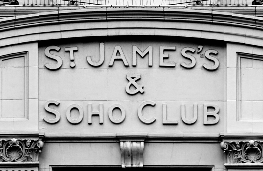
Today we are launching ‘Lost and Foundry’ on behalf of private members club and charity House of St Barnabas. Developed by Fontsmith, M&C Saatchi London and Line Form Color, the campaign sees the crumbling typefaces of Soho recovered to be sold online as a collection of display fonts, to fund the House’s vital work with London’s homeless.
The House of St Barnabas is a social enterprise that aims to break the cycle of homelessness through its Employment Academy, a programme that works with people who have been affected by homelessness and supports them into lasting work. It does this by operating as a member’s club, with all profits from the club going to the Employment Academy.
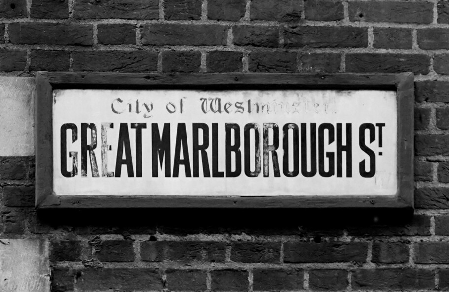
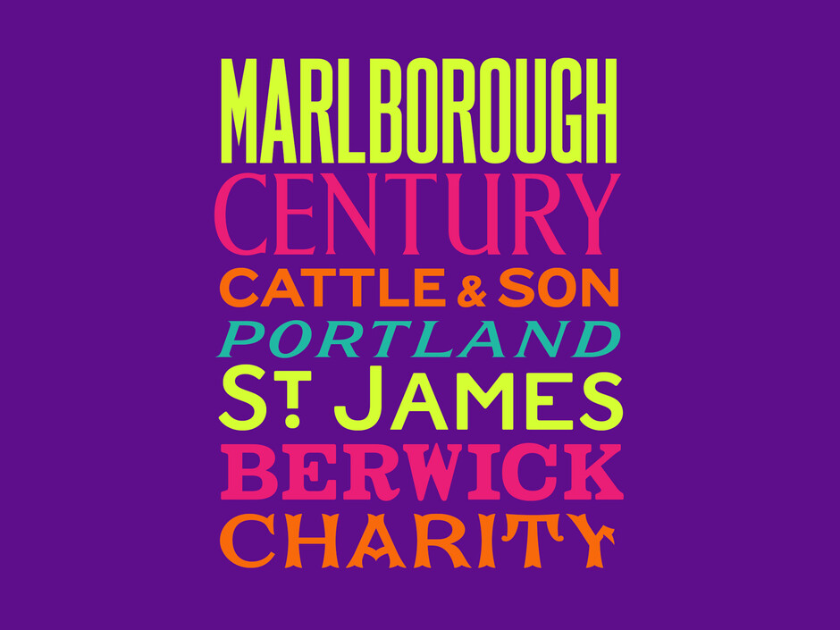
For this campaign we worked with M&C Saatchi London to develop seven fonts from crumbling signs around Soho, with each named according to the specific content or location relevant to them, such as Berwick, Cattle & Son and Marlborough.
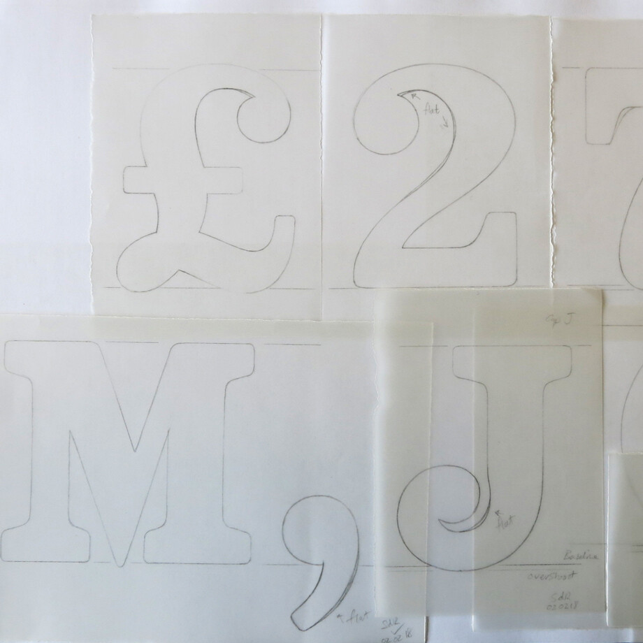
The fonts were hand drawn and turned into fully functioning fonts by Fontsmith designers Stuart de Rozario and Pedro Arilla. This involved adapting and extending the missing characters to make useful and crafted designs out of them, with it taking 3 months to digitise and design a workable series of fonts. The fonts are available to purchase from our site, with all proceeds to be donated to The House of St Barnabas. Each purchase comes with a one month free membership to the House.
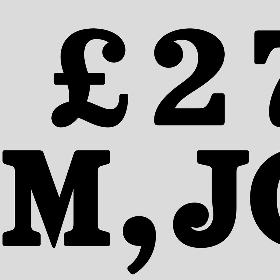
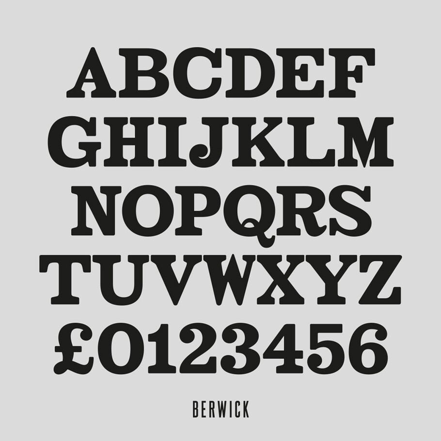
FS Berwick
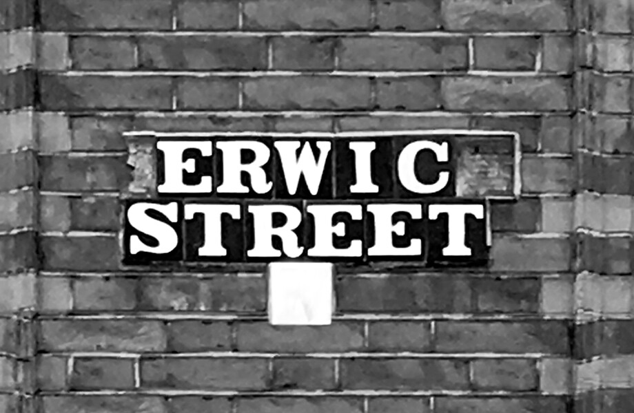
Thanks to its humble tiled origins, this Egyptian serif type maintains a uniform character width, creating the irregular letter proportions found in the final alphabet. Broad‐shouldered, the bracketed serifs firmly ground the face, whilst its extreme hairlines become a necessity due to the uniform width. Of note is the upside down ‘S’, to be found on the original sign on Berwick Street, a lovely retention. Perhaps due to its ceramic origins, there is a surprising ‘slippiness’ to its final appearance.
FS Cattle
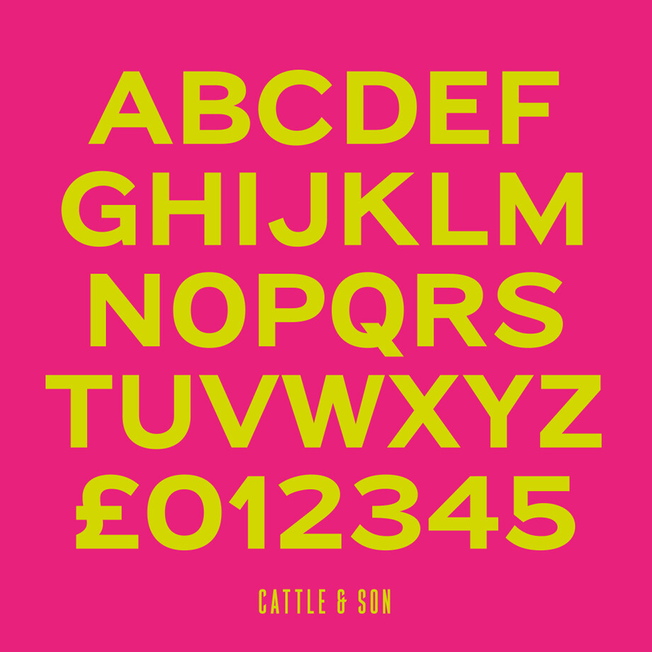
Cattle & Son is best described as a wide, but not overly extended, Grotesque‐style Sans Serif, showing a uniform width and carrying a robust strength to its form. Whilst lightly functional overall, the purposeful diagonal legs of the ‘K’, ‘R’, and the tail of the ‘Q’ add an urgency to its appearance. The reduced size of the ampersand gives away Cattle & Son’s hand‐painted origins, AND the oblique compacted ‘LTD’ found on the original sign is also included in the final set. This beautiful sign is tucked away under an arch in Portland Mews, sheltering from the weather. Perhaps this is why it has lasted so long.
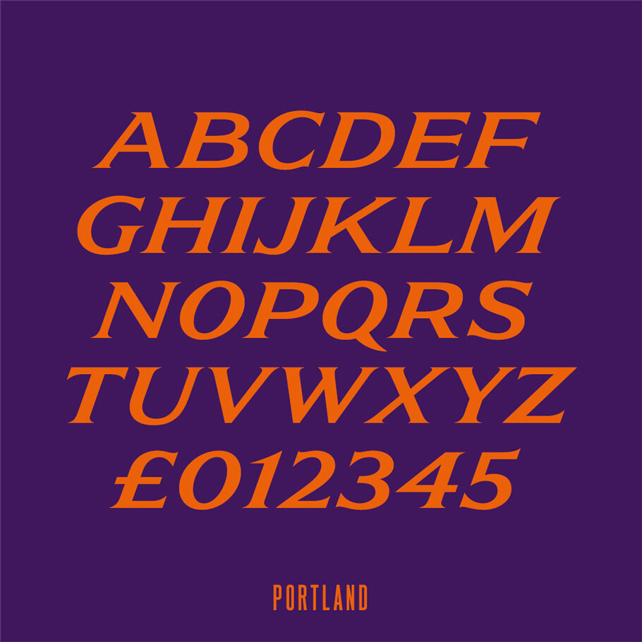
FS Portland
The sister type to Cattle & Son, Portland is oblique rather than italic. The serifs are not overly long, yet still enhance its rather rigid cap height and baseline appearance. Its ‘A’ has a top serif, the ‘M’ square and the ‘G’ foregoes any spur. Particularly delightful is the open ampersand. Numerals align to encourage the horizontal flavour of the oblique style. Overall, Portland is both confident and graceful.
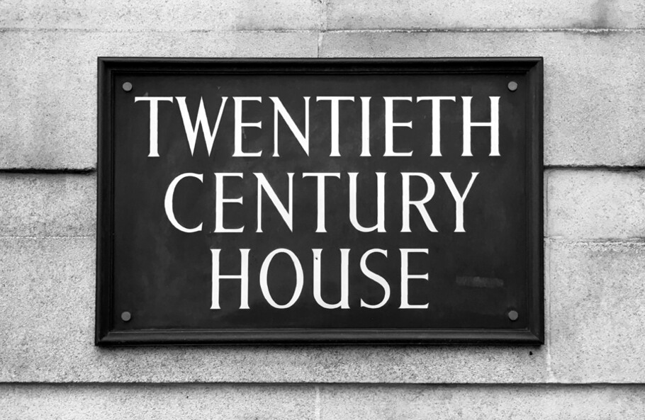
FS Century
This somewhat elongated set of Roman capitals was originally rendered in paint circa 1940, but its roots trace back to the Trajan Column in Rome. Witness the slightly unbalanced ‘W’ and the painter’s hand is revealed. Century’s flared serif style is extremely short, sharp and bracketed. The ‘M’ is splayed and has no top serifs. Century has a uniform appearance of width, probably due to its sign‐written origins. Yet is elegant, classic and accentuates sophistication.
FS Charity
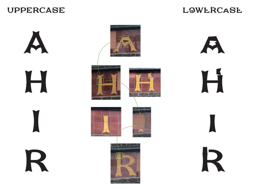
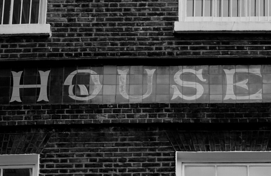
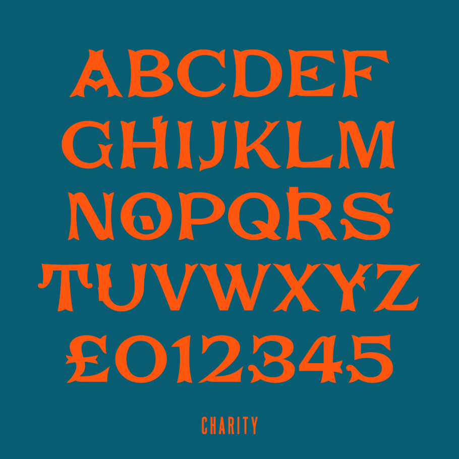
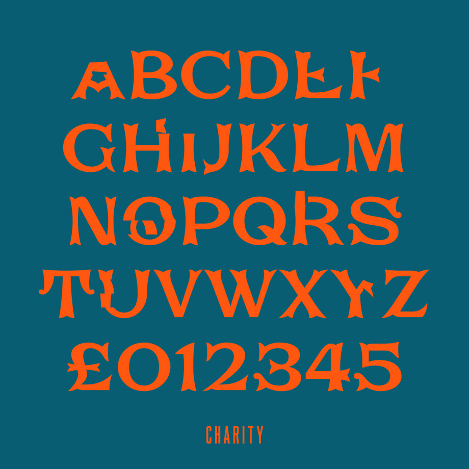
A true Tuscan letterform, the original is located on The House of St. Barnabas in ceramic tile and was revealed in all its broken glory in 2014. FS Charity retains these incorrect characters in its lowercase form allowing a lively, decorative texture to any typesetting. In the uppercase the errors from the original tiles have been fixed. FS Charity features fishtailed terminals on its strokes, a curious branched ‘T’, while the ‘S’ displays tear‐drop ends to its serifs. Almost uniform in width, the ‘A’, ‘M’ and ‘W’ are the widest characters in this set.
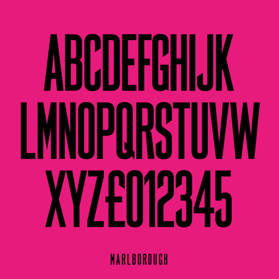
FS Marlborough
The elongated Marlborough features diagonal terminals to some characters and numerals. Also retained is the space‐saving contracted ‘T’ glyph from the original sign, while the ‘R’ features a distinctive wedge‐shaped leg. Highly individual in this form, similar signage appears around Soho, but featuring a variety of widths in their design.
