2021 Best New Font Interviews
In 2021, MyFonts introduced a plethora of fascinating font families that caught the attention of designers worldwide. The team has worked tirelessly to collect and curate all relevant data regarding the Top 25 Best-Selling NEW Fonts of 2021. This list is an excellent representation of some outstanding foundries and their contributions to this year’s typography scene. From sleek sans-serifs to vintage scripts, these fonts are sure to make a statement on any project they’re used in. Moreover, the interviews with designers and teams who created these remarkable fonts give us insight into their thought processes behind each typeface—each one unique in its own way yet equally captivating and innovative.
Check out the below interviews of designers and teams who created the best fonts of 2021.
#1 Helvetica Now Variable by Monotype

Helvetica Now Variable Helvetica Now 2.0 builds on the groundbreaking work of 2019’s Helvetica Now release—all of the clarity, simplicity, and neutrality of classic Helvetica with everything 21st-century designers need. In this 2021 release, we introduce Helvetica Now Variable and add condensed weights to the Helvetica Now static fonts. Helvetica Now 2.0 includes 96 fonts in three distinct optical sizes (Micro, Text, and Display), now with 48 new condensed weights. The Helvetica Now Variable fonts include even more: 144 instances—48 normal, 48 condensed, and 48 compressed.
#2 Gazpacho by Santi Rey
Gazpacho is inspired by the serif typefaces used in editorial media in the 70s and 80s. The morphology of the letterforms makes this typeface ideal for display purposes like logos and big, bold headlines. Also, thanks to its large x-height it works perfectly on headlines with tight leading. On the other hand, its high contrast and very simple and recognisable shapes makes it highly readable, so it works on small, long texts as well.
#3 Coco Sharp by Zetafonts
Coco Sharp is the newest evolution of the Coco typographic project, developed since 2013 by Cosimo Lorenzo Pancini for the foundry Zetafonts, with the help of Francesco Canovaro and Andrea Tartarelli. Influenced by vernacular grotesques sign-painting and modernist ideals, and inspired by the classy aesthetic of fashion icon Coco Chanel, Coco is drawn on a classic geometric sans skeleton but applies humanist proportions and visual corrections to key letters with the aim to create a warmer, subtly vintage texture on the page and on the screen.
#4 Avenir® Next World by Linotype
The original Avenir typeface was designed by Adrian Frutiger in 1988, after years of having an interest in sans serif typefaces. The word Avenir means “future” in French and hints that the typeface owes some of its interpretation to Futura. But unlike Futura, Avenir is not purely geometric; it has vertical strokes that are thicker than the horizontals, an “o” that is not a perfect circle, and shortened ascenders. These nuances aid in legibility and give Avenir a harmonious and sensible appearance for both texts and headlines.
#5 Heading Now by Zetafonts
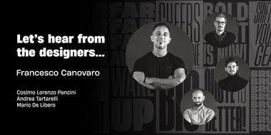
Heading Now is the new incarnation of Heading Pro, developing the original typeface family designed by Francesco Canovaro for Zetafonts into a superfamily with 160 variant combinations. Built around 10 different widths, ranging from ultra-compressed to ultra-wide, and eight weights from thin to heavy, Heading Now provides a full spectrum of sans serif type solutions to your design problems.
#6 TT Fors by TypeType
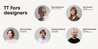
TT Fors is a modern geometric sans serif with characters and shapes contrasting in width, as close as possible to the basic geometric shapes (circle, square, triangle). TT Fors is a great addition to TypeType’s line of functional sans serifs, which already includes such fonts as TT Norms Pro, TT Commons, TT Hoves and TT Interphases.
#7 Rebrand by Latinotype
Rebrand is all about geometry, a typography that boosts confidence. However, contrary to pure, cold mathematics, this font seeks a more jovial and friendly face.
The goal with Rebrand is to offer a Geometric Sans Serif font that can work in various instances, from symbols and titles, to text, and everything in between. It also creates a whole lot of personality, ideal for branding.
#8 Cotford™ by Monotype
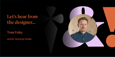
Cotford is a contemporary serif from Creative Type Director, Tom Foley. Dynamic, adaptable, and surprising—Cotford is a languid serif that ranges from delicate thins, bending and reaching like flower stems, to bold heavy weights that command the page and screen with confidence and vintage charm. And as a variable font, Cotford allows designers to explore and refine the design almost endlessly, unearthing its many visual tones and hidden secrets.
#9 Causten Round by Trustha
Causten Round is a geometric sans serif font family with round corners and maintains rationality in designing each form. With use the sharpness of the eyes, and remain logical, so that balance is maintained in each form. So, it will get a clean, neat, and perfect shape.
Causten Round comes with 9 weights and a matching oblique, making it 18 styles. It makes it perfect for all creative projects. Also, some alternative glyphs will be an attractive choice.
#10 TT Travels Next by TypeType
The idea to create an alternative version of the TT Travels font family emerged at the “Mail.ru Design Conf x Dribbble Meetup” that took place in August 2020 in Moscow. All conference branding was designed using the TT Travels font family, and, even though the set was very beautiful, we found that if the typeface were more radical and display, it would have complemented the event’s graphics even better.
#11 Vary™ by Monotype
Vary by Olli Meier is a geometric sans serif typeface inspired by Bulgarian Cyrillic. Vary is fun and adaptable and was built with three feelings (variations): classic, modern, and loopy, offering an opportunity for designers to be playful in their creations.
Vary is available as a variable font and also comes with 10 preset instances from Hairline to ExtraBlack.
#12 Coco Gothic Pro by Zetafonts
Inspired by a biography of Coco Chanel and trying to capture the quintessential mood of classical fashion elegance, Cosimo Lorenzo Pancini designed Coco Gothic looking for the effect that the first geometric sans typefaces (like Futura, Kabel or the italian eponyms like Semplicità) had when printed on paper. The crisp modernist shapes acquired in printing charme and warmth through a slight rounding of the corners that is translated digitally in the design of Coco Gothic. This signature touch is enhanced by the inclusion of light humanist touches to the proportions of the letters, resulting in the unique mix that makes Coco Gothic one of our best sellers, with a look that is both contemporary and vintage.
#13 Mont Blanc by Fontfabric
A new type giant emerges taking after the legendary geometric sans serif Mont!
Mont Blanc elevates all prized unique details of Mont and translates them into an independent flawless text font family. This type prodigy comes with heaping legibility improvements dedicated to the smaller sizes and challenging paragraphs.
#14 Ionic No 5™ by Monotype
Ionic No5 is a refresh of a classic Linotype Clarendon-style serif, another restored classic from the Monotype library, much like the recent updates to Walbaum and Helvetica Now. The original typeface was designed to be printed and read at small sizes, popular with newspapers in the 20th Century at its birth. The restoration and refinement of this typeface has bestowed a greater sense of clarity and directness, smartly stylish, and an utterly captivating appeal. Because these styles were so popular for books and newspapers for so long we associate them with being editorial or bookish, not dull, but thoughtful.
#15 Halenoir by Ckhans Fonts
Halenoir is a modern sans serif with a geometric touch that support for 28 languages. It comes in 10 weights, 102 uprights and its matching outlines, Obliques, pattern, so you can use them to your heart’s content, in each of which there are more than 801+ glyphs.
Perfectly suited for graphic design and any display use. It could easily work for branding, web, signage, corporate as well as for editorial design. documents and folders, mobile interface.
#16 Code Next by Fontfabric

We’re revealing the stand-alone type family Code Next—a staggering evolution from Code Pro in functionality, versatility, and application. The transformation includes 6 new weights, 10 new Italics, full support of Extended Cyrillic and Greek, full redesign and glyphs refinement, 2 variable fonts, to name but a few.
#17 National Forest by Rachel Kick

National Forest is a font duo inspired by the National Park Service signs that are all made using a router bit. It was designed to put the timeless nostalgia of national park signs into a digital typeface.
National Forest has a quirky, retro style and its’ natural imperfections add to its’ charm. The script and print compliment each other well for branding, display or marketing.
#18 Albula Pro by Serpentype

Albula Pro is a contemporary geometric sans with a charismatic and elegant touch. Inspired by geometry and enhanced with unique form-details, the shapes are optically corrected in order to ensure an excellent reading experience and a broad professional use. Albula Pro is an ideal choice to make your design and layout stand out. It performs perfectly in the headlines as well as for the branding purposes.
#19 Wonder by Fenotype
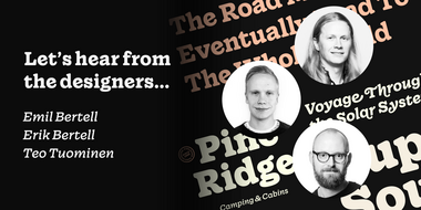
Do you sometimes have an appetite for a bit more wholesome typography? Do you find the ubiquitous sans serifs too industrial and bland in taste?
Opt for something more organic: Wonder – a rootsy yet contemporary type family. With a deliciously juicy approach to serifs and a chunky texture, Wonder is a real treat among typefaces.
#20 Reina Neue by Lián Types
Reina Neue, is not just an update of the original Reina, the typeface is entirely re-designed: its structure is cleaner and purer. The range of uses for Reina Neue is wider because of the family’s many weights, italic designs, small caps and layered styles. There are even variable fonts.
#21 TheSans by LucasFonts
TheSans has a subtle humanist overtone that help convey messages in a friendly way. The beautiful italics have a strong presence of their own – and have also been used successfully as main branding elements. Obviously, TheSans combines well with TheMix and TheSerif.
#22 Eloquia by Typekiln
Eloquia is a neo-grotesque sans serif type family with geometric roots. Though it’s a neutral typeface the unmistakable influence of geometric shapes gives it warmth and a unique flavor. With 34 fonts in total, Eloquia comes in two distinct optical sizes Text and Display. The Display styles are spaced tightly keeping headlines in mind while the Text styles feature a larger x-height and wider apertures with loose spacing making them highly legibility at small sizes.
#23 Bigola Display by Great Studio

Bigola Display is a modern vintage serif font packaged in a modern and classy style, complete with access to your OpenType features to access a large selection of alternates letters and ligatures, the choice of letters you like from variations of uppercase and lowercase letters to get a display luxurious and elegant.
#24 Flexible by Art Grootfontein

The idea for Flexible came from the late 19th century’s broadsides. The designers at the time were so creative and used stretching letters to fill their design pages. I thought it could be awesome to create a variable font that allows designers to play with the height and width of each letter as they saw fit.
#25 Rustica by TipoType

Rustica merges classic humanist sans tradition with the stroke accuracy typical of modernity and the precision of technology. This typeface was born out of the need for characters that connect the traditional values of humanism with the renewed trust in science: it is a typeface for the 21st century in which we live.