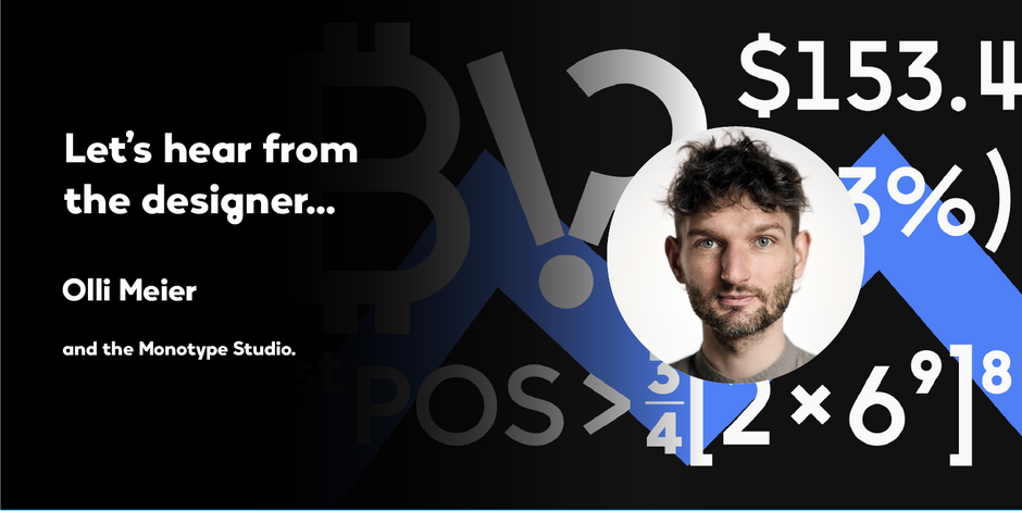
#11 Vary™ by Monotype

Q1: Where did the idea for the typeface come from? Did you set out to address a specific use or suite of the application? Was this a design you’d had in mind for a while?
Ans: I traveled to Bulgaria, In February of 2017, where I was surrounded by Bulgarian Cyrillic script. My niece, then six-years old, had just started learning to read and write the Latin and Cyrillic alphabets. We were both equally interested and fascinated by the letters – yet looked at the glyphs quite differently.
One night, while walking past a shop window, I noticed a strange glyph that looked like an asymmetrical B. When flipped 180 degrees, it looked like a funny lowercase g. This was the starting point behind the Bulgarian inspiration of the Vary typeface.
Q2: What is the one or two most important things graphic communicators should know about the typeface, or how will the family of fonts help them create better design?
Ans: Before working at Monotype, I was a freelancer for branding and corporate design projects. Vary is a well-stocked, flexible toolbox for designers. It offers many alternative characters that help develop individual logos, brand marks or a series of product names. Editorial design often features strong contrasts: large/small, thick/thin. The variable version of Vary offers 10 preset instances from Hairline to ExtraBlack, and hundreds of variations in between.
Vary also works in the office for business reports, charts, and in presentations. Nut fractions, or stacked fractions, that position the figures correctly – even in Microsoft Word, via Stylistic Set 01 – are included in the Vary character set.