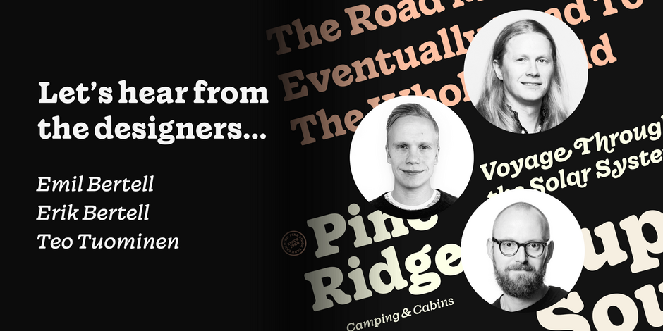
#19 Wonder by Fenotype

Q1: Where did the idea for the typeface come from? Did you set out to address a specific use or suite of the application? Was this a design you’d had in mind for a while?
Ans: We designed Walden in 2020, it’s a heavy serif family with a rustic appearance. While working on it, we had plenty of ideas that we couldn’t fit into the design. So, we designed another family – which eventually became Wonder. Like Walden, Wonder also borrows from the atmosphere of typefaces popular in the 70s and 80s, such as ITC Souvenir, ITC Benguiat, Cooper Black, and many others. Despite the retro background of the design, we drew Wonder as a rootsy yet contemporary type family with a deliciously juicy approach to serifs, and a chunky texture.
Q2: What is the one or two most important things graphic communicators should know about the typeface, or how will the family of fonts help them create better design?
Ans: Despite its rustic flair, Wonder is perfectly adaptable to contemporary contexts from branding to packaging, mobile apps and beyond. Wonder adds luscious flavor to your designs. On top of that, Wonder is technically fully-qualified and includes savvy features such as multiple numeral styles (Old Style, tabular, subscript and superscript), small caps and swash alternatives.