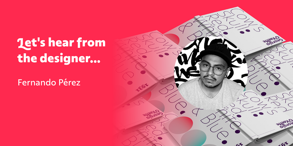
#16 Rosales by Latinotype Mexico

Q1: What should graphic communicators look for when choosing a typeface family for a specific project? What kind of typeface designs are best for pairing with your typeface?
Ans: To make a typographic selection, I think the most important thing is to be clear about the spirit that you want to convey with what you design. The shapes of the letters speak for themselves. The designer (graphic communicator) must have a sensitivity and visual education that allows him to be able to interpret this in the fonts and thus be able to make his choice more accurately. For sans serif typefaces like Rosales I think a good match will always be something close to calligraphic or lettering in order to contrast the mold forms with the freer and more expressive forms.
Q2: What were your goals when designing the typeface? What is the one or two most important things graphic communicators should know about the typeface, or how will the family of fonts help them create better design?
Ans: When designing Rosales, I had two clear objectives: First, to achieve a typeface family that could be used without problems to design long texts such as headlines, visible in its sets of drop caps; and second, to create a product that could offer more than one aesthetic proposal to the user. Why settle for just one sans serif style when we can have a little more? With Rosales we have at hand a humanist sans serif, an italic with its drop caps highly influenced by calligraphy and a geometric sans serif, all included in a single family.