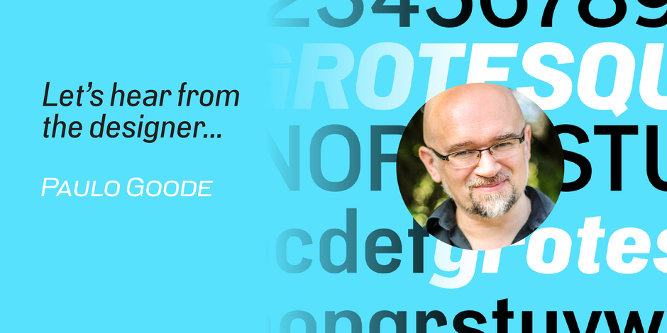
#11 PG Grotesque by Paulo Goode

Q1: Where did the idea for the typeface come from? Did you set out to address a specific use or suite of the application? Was this a design you’d had in mind for a while?
Ans: One of my pastimes is ‘type hunting’. This can entail discovering type on historic buildings, books, or, in this case, movie opening credits. I will then use these influences to create a full typeface. I discovered two instances of an unusual, high-waisted sans serif in opening titles for Italian films from the 1970s. After some research, I found that they had used a ‘lost typeface’ called Edel Grotesk from c.1914. To my knowledge, there had not been a digital revival of that family, so I set about creating my own interpretation of it with the very limited resources I could gather together.
Q2: What should graphic communicators know about the typeface, or how will the family of fonts help them create better designs?
Ans: After creating the initial character set that emulated Edel Grotesk, I began to create some promotional images for it and realised that this design would be robust enough to accommodate multiple widths and weights. I set about expanding the family so that it could handle numerous applications. This resulted in a typeface with 99 fonts… or, a single variable font with 99 default instances and every weight, width, and italic angle in between. This makes PG Grotesque one of the most comprehensive type families around.