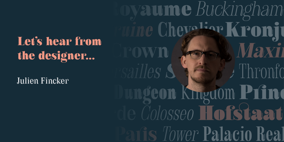
#14 Royalis by Julien Fincker

Q1: Where did the idea for the typeface come from? Did you set out to address a specific use or suite of the application? Was this a design you’d had in mind for a while?
Ans: The idea of creating Royalis was very experimental at the beginning. I wanted to draw a serif typeface with a strong personality – elegant and powerful. During the first sketches, I added playful elements like long terminals, cut ball serifs and deep inktraps, which gave the look a unique character. These dynamic elements made Royalis more and more extravagant and the association with the Musketeers grew. The different weights and styles complement each other like the three musketeers once did. Be it the charmingly elegant Aramis, the sober strategist Athos, the powerful ruffian Porthos or the charismatic d‘Artagnan, who led the group.
Q2: What should graphic communicators know about the typeface, or how will the family of fonts help them create better designs?
Ans: Right from the start, I wanted Royalis to be a very helpful and versatile typeface for every user. That’s why I decided to draw three versions – a display version, a shortened version and a text version. This means it can be used for large headlines as well as smaller text. So you can use just one typeface for a whole project and its various challenges instead of having to search for different suitable fonts. I also wanted Royalis to be very playful and fun for designers. That’s why I’ve added lots of ligatures, alternates and other interesting features to discover.