Proxima Sera: a serif story by Mark Simonson
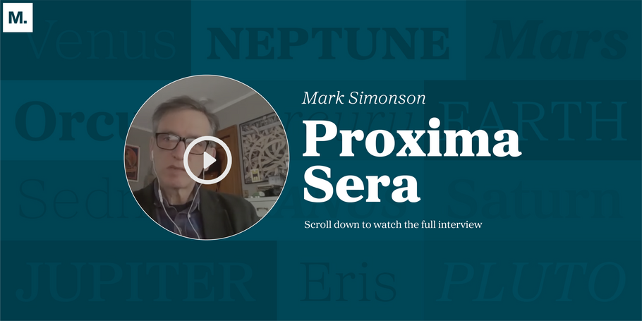
Mark Simonson is an independent type designer working out of his home in St. Paul Minnesota. Mark was variously a graphic designer, art director, illustrator, and lettering artist before becoming a full-time type designer in 2005. He’s probably best known for designing the typeface Proxima Nova. Recently, we spoke with Mark via Zoom about his latest release Proxima Sera, the serif counterpart to Nova, which pays homage to some of Simonson’s personal favorite household serif names.
Interview with Mark Simonson
MyFonts: What made you decide to make a serif counterpart of Proxima?
Mark Simonson: As soon as I released Proxima Nova in 2005, I began receiving emails from people who had licensed it asking, “What serif typeface should I pair with this? What other typeface would go well with this?” To be honest, when I was designing it, I wasn’t thinking about that; I had always made pairing decisions on my own. I would suggest a modern typeface, like Century Schoolbook or Rockwell, (a slab serif that shares some underlying design similarities) but none of my answers felt very satisfactory.
I thought about the idea of simply adding serifs to Proxima, but I experimented with that, and it never quite felt right, so I set it on the back burner and stopped working on it. Later, when thinking about existing serif & sans serif pairs, I realized that they weren’t often used together. For example, I had never seen Adrian Frutiger’s Univers, Serifa and Glypha (which are basically Univers with serifs) used together, so I thought, “that’s not probably the right approach.” I saw other things such as FF Meta and FF Meta Serif, which seemed to work better but in the back of my mind I was thinking about how much I enjoyed using Morris Fuller Benton’s typefaces together: Century Schoolbook, Century Expanded, Century Old Style, and News Gothic, Franklin Gothic, and Alternate Gothic. Even though they weren’t designed as a large family, they worked well together. I pivoted to not just adding serifs, but creating a separate design that would work harmoniously with Proxima Nova and had some affinities.
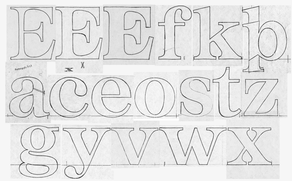
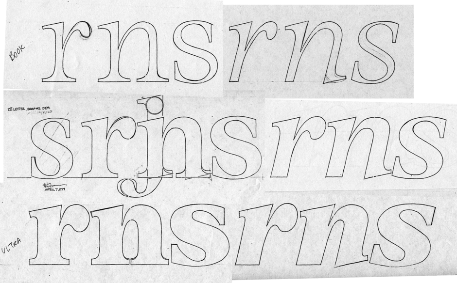
Way back in 1979, I was trying to think of a hybrid of some of my favorite serif typefaces: Times Roman, Plantin, Century Expanded, Baskerville, with proportions similar to Helvetica. At that point, as a young type designer (not even a published type designer yet), I wanted to design the Helvetica of serif typefaces, which is something all type designers try to do. I realized that my old hybrid idea might work, so that inspired my approach.
MF: How did you go about designing that serif and what was the process like?
MS: I had digitized some of my sketches from my initial idea in 1979, but I quickly realized that design was not a good companion for Proxima Nova. The design process then became modifying my original idea into something that would harmonize better with Proxima Nova. I altered the proportions. I changed some of the details: the way the lowercase ‘a’s top fits into the shoulder, so it was more agreeable with Proxima Nova. I also had to get the weights to align – Proxima Nova goes from thin to black, so I needed a similar gradation of weights with this Serif concept. The serif italic would be more typical, rather than Proxima Nova’s italic which is basically a slanted design with a couple of curves, a one story ‘a’ and things like that. With serif italics, more goes into it than angling it and adding a one story ‘a’.
MF: I’m guessing the process was a fun one for you.
MS: It was very interesting. I didn’t think I was making dramatic changes to the original concept from 1979, but it turned out to be quite a bit different than I expected. I was happy with the way that it worked with Proxima Nova. The most interesting part was designing the italic because I didn’t really have an original plan of how the italic would work. Seeing what it looked like on a page next to Proxima Nova was really illuminating.
MF: What elements make Proxima Sera both old style and modern?
MS:
I think it’s probably closer to a modern style, but there are some elements that you see more often in an old style.
Old style elements:
- Roundness: the ‘O’ and ‘C’ and ‘G’ are round whereas modern typefaces, like Bodoni and Century, tend to be narrower and oval shaped
- Terminals: see the top and bottom of the ‘S’ and the top of the ‘C’. There’s usually a little spur serif on those in moderns. I picked this up from the influence of Plantin
- Contrast: I tried to make the modulation between the thick and the thin parts like Century, Century Schoolbook or Plantin, rather than Bodoni
Modern elements:
- Terminals: the lowercase ‘f’, ‘f’ and ‘c’ have ball terminals, which look more like a modern face
- Top serifs: on lowercase letters, like the ‘n’, ‘m’, ‘h’ and the ‘d’ and is flat instead of angled. With an old style, the top serifs would be at an angle and even triangular
MF: What elements of Proxima Sera make it legible?
MS: In some ways the same things that make Proxima Nova legible: its fairly open counters, the open apertures on the letters, also make Proxima Sera legible. It doesn’t appear busy when set in body text, it feels comfortable to read. The overall texture and color is consistent and it doesn’t have a lot of noise, partly because of the flat serif - there aren’t a lot of little spiky points sticking out. It has uniformity, but there’s enough differentiation between the characters that it’s readable, and it’s also fairly wide, so it looks like a newspaper typeface and its proportions are designed to be very readable.
MF: What should designers know about using this powerful pair of typefaces together?
MS:
The way I imagine using it myself, would be to use Proxima Sera for text rather than headlines. It can work for headlines, but it’s not as flexible as Proxima Nova, at least not yet, as there are no condensed styles. I’ve always liked using bold san serifs with serif typefaces, for instance, Franklin Gothic with Century. I think it could work very well that way.
The proportions are well-matched so you can use them next to each other and the x-height is the same, the cap height is the same. Proxima Sera’s ascenders are slightly taller than Nova’s and that was necessary because of design constraints with a serif with a ball terminal. The lowercase ‘F’ forced me to do that. At some point I’m planning to design a display cut of Proxima Sera, which will be a little narrower and more refined in terms of contrast. Proxima Sera could also work for headline, especially in lighter weights.
The thin weight is not really intended for text at small sizes. Normally I wouldn’t do a thin weight for a serif typeface like this, but I was trying to match the weights of Proxima Nova so I had to push it as thin as possible. It ended up as a surprising design because there was only so small that I could make the ball terminals and it ends up like ITC American Typewriter Light, with very thin strokes with little dots all over it. It makes for an interesting display typeface in italic as well. The black weight would also be well-suited to a display. Someday, I hope to design condensed styles, which would help on the display side.
MF: It’s been really great hearing about your whole process, your journey and how Proxima Sera has come along. Any final thoughts to share with our designers?
MS: Proxima Nova was also a hybrid sans serif: a combination of some other sans, Futura, Helvetica and News Gothic – I selected specific elements of these typefaces and combined them. Proxima Sera followed a similar design process where I was working from existing, well-known, typefaces and coming up with a new hybrid based on those. Even thought they may not combine things in the same way, they’re both hybrid designs so they pair well for that reason.
Interview edited for length and clarity.


