Notes on design – TypeNotes Magazine
Notes on design – TypeNotes Magazine
The Counter Press Knowledge share
Editorial design has been having somewhat of a renaissance in recent years: there’s been a boom in interesting, innovative, independent new titles, increasingly championed by new(ish) retailers like MagCulture and Stack Magazines – It’s an exciting time for us lovers of print. So we were pretty excited to be asked by Fontsmith to help them design and launch their own independent magazine, TypeNotes.
Fast forward a year and with the release of issue two now firmly under our belts, the team at Fontsmith asked us to write a blog post on our ‘top tips for editorial design’…
Now, before we get too far, we‘ve got a confession to make: strictly speaking this is the first ‘proper’ magazine we‘ve actually designed.
‘What do these jokers know?’ we hear you ask. And not without good reason, but bear with us, everyone’s got to start somewhere, right? Two issues in we’re all starting to find our feet, it’s getting a little easier but we’re still far from experts. Which makes us offering advice on editorial design a bit of a stretch, to be honest. However, we can, at least, tell you about how we approached TypeNotes, what was behind the design and why it looks the way it does. Rightly or wrongly.
So here goes…
We started the TypeNotes journey back in late 2016, and after several lengthy discussions about where we all saw the magazine going, we landed on three key principles we knew it needed to follow.
Firstly, and call us boring, but we wanted it to be readable. Good looking, yes, but also readable. Sounds silly, right? And perhaps it’s not the most ambitious of aspirations in the world, but without getting all Beatrice Warde on you, we often see publications where in attempt to be new or different the reader seems to have been a little forgotten – they look great on blogs, photograph brilliantly, but quite quickly become tricky to read when it’s in your hands. We all agreed we wanted TypeNotes to be something that was, first and foremost, a joy to hold and read: clean, simple and elegant.
With Fontsmith’s entire type library at our eager fingertips, it was tempting to use everything and showcase as many fonts as possible. Instead, we began by picking just three: body, headline and caption. Limiting our typographic palette early on gave us some clarity, cohesion and some visual calm with which to start tackling the more expressive design tasks…
Secondly, inspired by something our editor, Emily Gosling, said in the very first meeting, we knew we needed to let the magazine ‘find its own voice’. As an entirely new entity, we were keen not to impose too much of our own style on it. Instead we tried to gently shape the design and let a visual vernacular that felt appropriate to the magazine develop. Maybe this is something to do with our background in branding, where the work is an expression of the brand personality and not the designer behind it, or perhaps this is just how all editorial designers work? We don’t know, but we started to look for the TypeNotes ‘voice’.
The main thing that became clear as we started developing ideas was that Fontsmith is brand that has always had playful side. Their font library is also packed full of character and personality. Serious work that doesn’t always take itself too seriously. We knew TypeNotes, a Fontsmith publication after all, needed to be exactly like that too.
The paired back typographic approach we’d already started to develop became the perfect structure on which to build a more playful personality: visual and verbal puns; large typographic spreads; textures, materials and imagery were all used to add playful twists throughout.
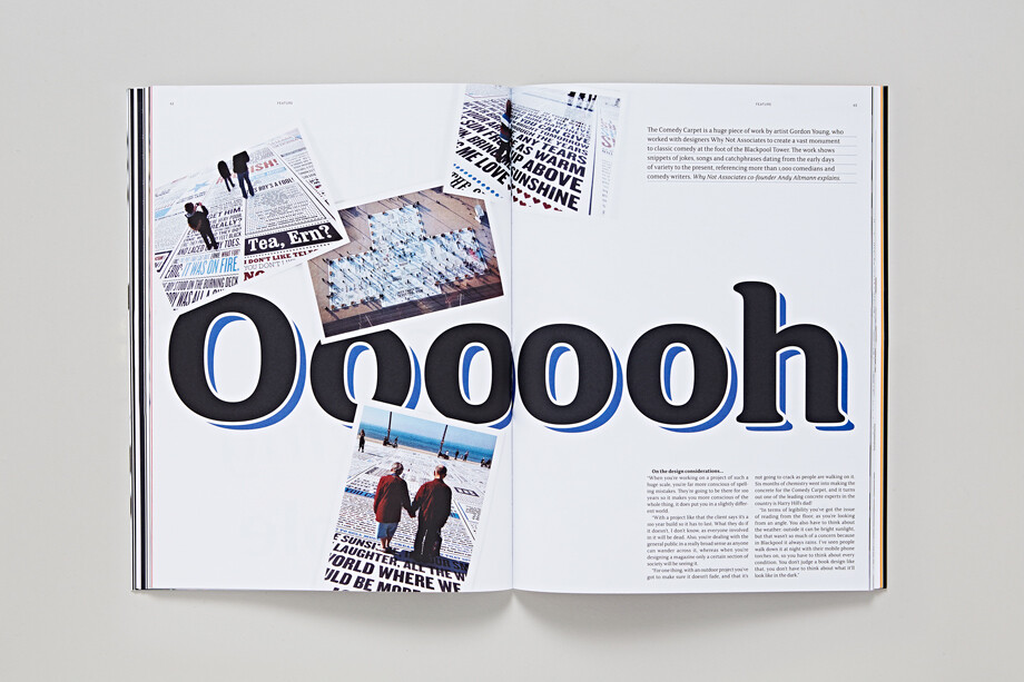
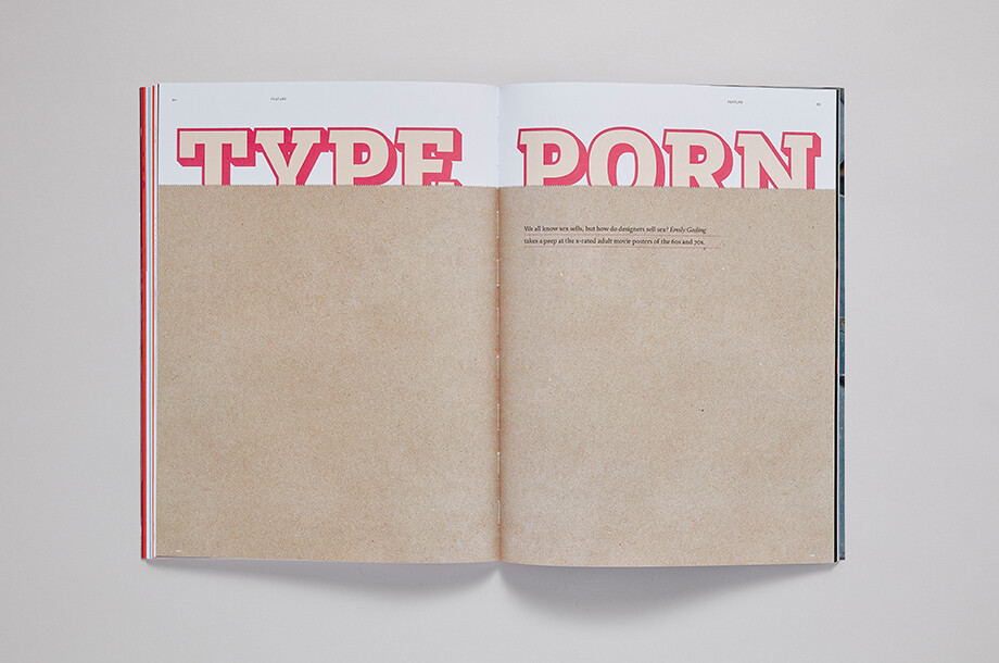
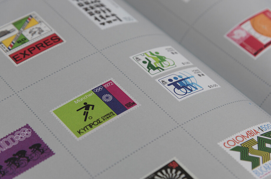
Thirdly, and finally, was the way we treated the content. Strangely, even very early on, it began to feel far too rigid to apply a uniform style (no matter how playful) to all the pages. The articles felt as though they occasionally needed their own feel. And so we started to push the design in different ways, bending some of the rules and adding elements that were specific to the individual stories: photography treated like holiday snaps for a piece on the comedy carpet in Blackpool; a ‘censored’ double page spread of mostly plain brown paper, partially obscuring the title, for an article on x-rated film posters; a perforated grid throughout the whole story on stamp design: or the ‘red-topped’ title page for a piece on mastheads (sorry, title pieces). Each one given a personality to suit its content – stretching but never breaking the overall TypeNotes ‘voice’.
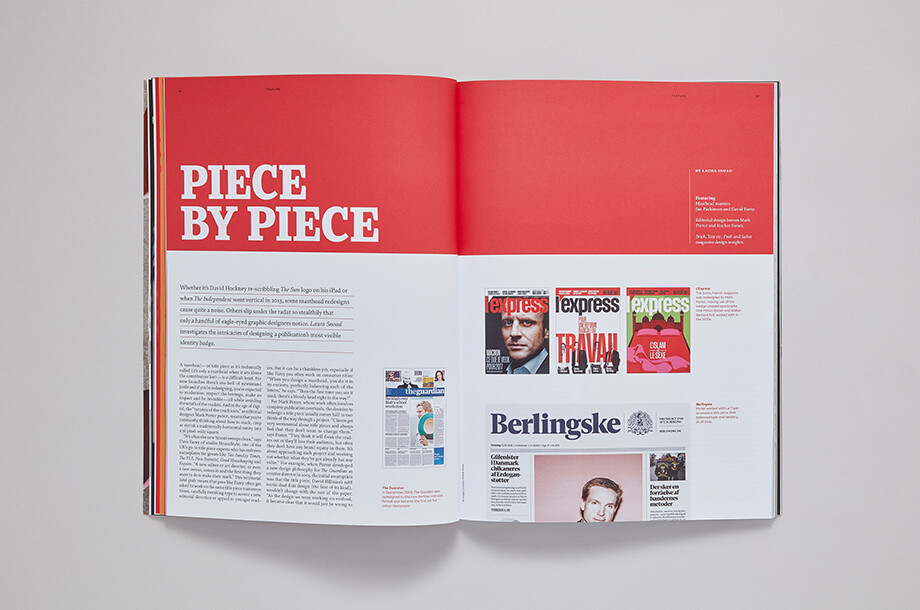
As it turns out, this individual approach to some of the articles has the nasty side-effect of pretty much doubling your workload! It seems there’s a good reason for keeping everything a bit more pinned down and style-sheeted.
But hopefully, this all adds to the pace of the magazine: bringing content to life without being too disjoined; creating variation but within a familiar framework; being playful without being flippant; simple and easy-to-read without being too plain.
That was the plan anyway, you can tell us novices how close we’ve been to achieving it so far.
Here’s to slightly less stumbling through another issue.
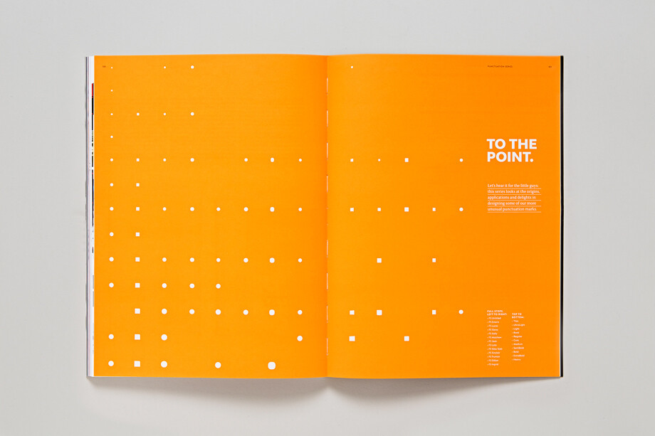
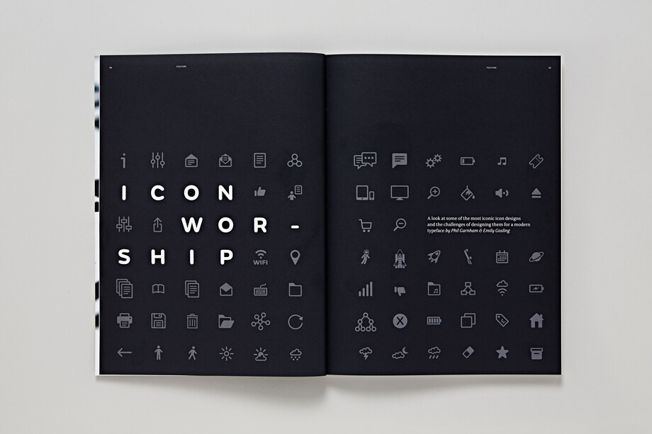
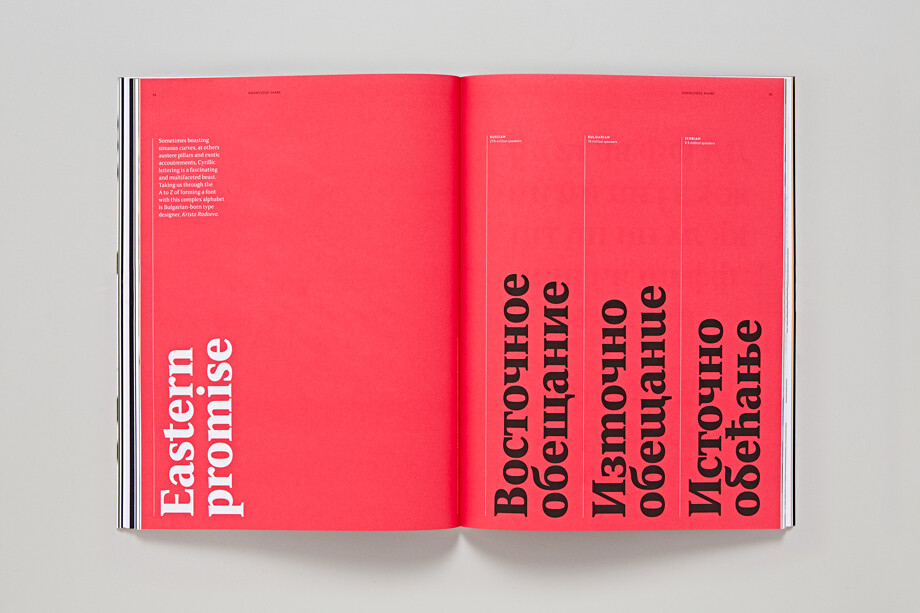
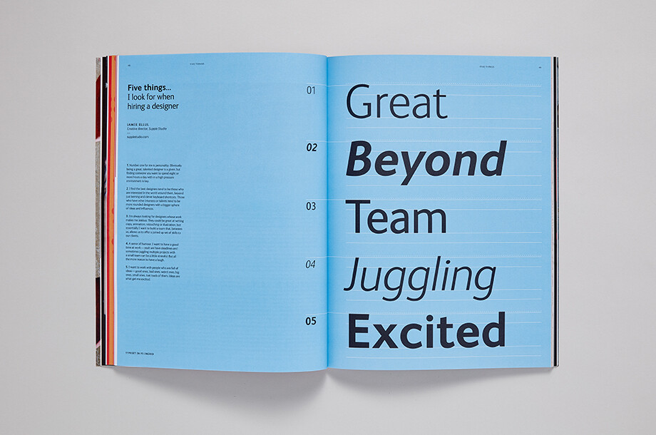
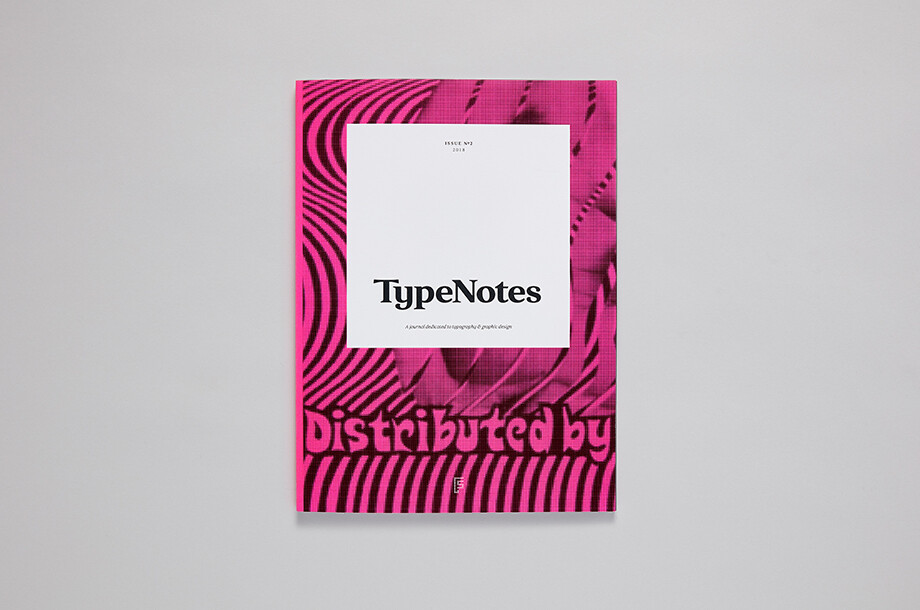
TypeNotes issue 2 is now available to buy in the Fontsmith Shop.
By Elizabeth Ellis and David Marshall at The Counter Press.