Avenir® Next Perfect Font Pairings
FOUNDRY: Linotype
DESIGNERS: Adrian Frutiger & Akira Kobayashi
CLASSIFICATION: Geometric Sans
ABOUT THE FAMILY:
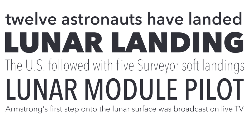
“When creating the Avenir® typeface, Adrian Frutiger drew inspiration from the past and the future. His goal was to modernize the geometric sans serif styles of the early 20th century, while embodying the aesthetics of the 21st century. In the process, Frutiger also infused a touch of organic humanism into the design.
WHAT TO LOOK FOR:
- Typefaces that contrasts with, or serve as a counterpoint to, Avenir Next
- Slab or Clarendon typefaces with subtle to overt humanistic overtones
- Transitional typeface designs like Monotype Baskerville™ or slab serif fonts, like Rockwell® Nova
- Avoid sans serif fonts but, some square sans, like Cachet™ and DIN® Next will pair reasonably well with Avenir Next
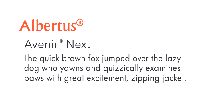
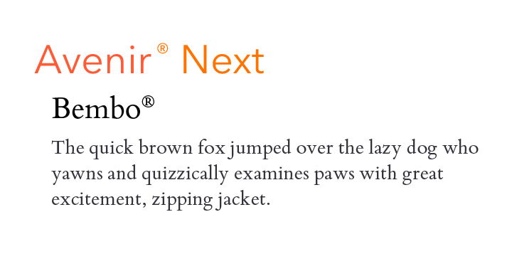
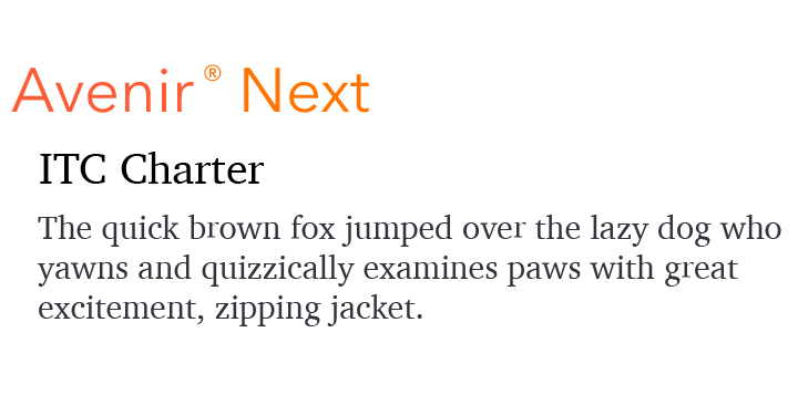
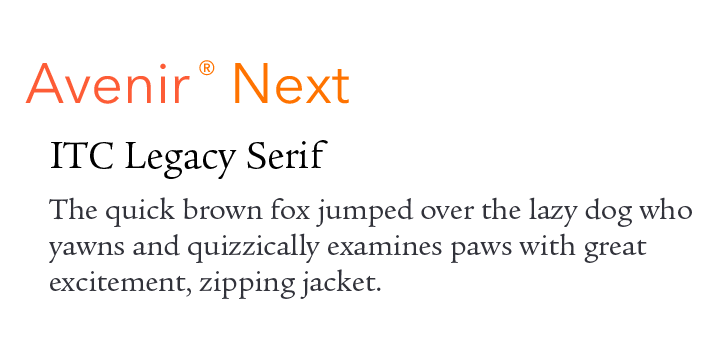
AVENIR NEXT PAIRING WITH TEXT FONTS:
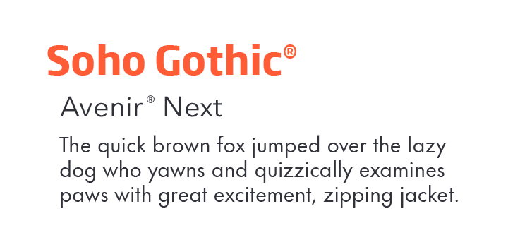
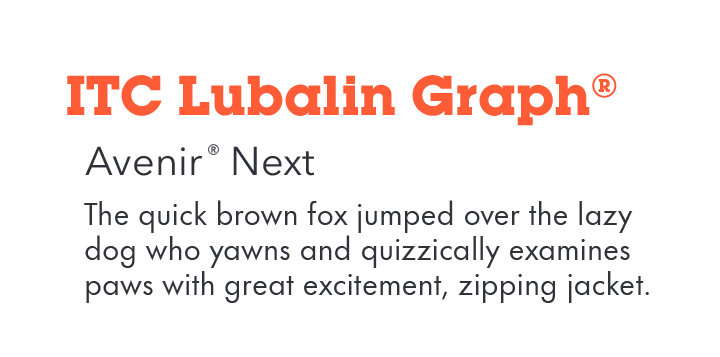
AVENIR NEXT PAIRING WITH DISPLAY FONTS:
Download a PDF version of the Avenir® Next Perfect Pairings and view the Avenir® Next font family.
Explore Other Font Pairing Guides
Futura Now is the definitive re-digitized version of the iconic geometric sans serif typeface. With 102 styles, including Condensed, Headline, and Text weights, in addition to extensive language support, Futura Now is poised to take on virtually any typographic task.

ITC Avant Garde Gothic’s characters are based heavily on geometric shapes. There is no softening with humanistic undertones. Its lowercase x-height is tall and the characters are wide. Weights range from a delicate extra light to a commanding bold. Both regular and condensed proportions are available.
