Branding Symbols Manual
Copyright, register and trademark symbols are important typographic glyphs that should not be used indiscriminately. They can vary widely from font to font, and this provides a lot of choices – and a several questions.
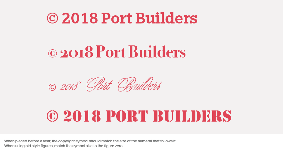
Many times, the symbols are typeface design sensitive, but this also make them inappropriate for various applications. The symbols in ITC True Grit, for example, are clearly design sensitive, but should not be used universally – maybe not even with ITC True Grit.
In addition, although some people prefer to use the serif symbols that sometime come with serif fonts, it is perfectly acceptable – and sometimes preferable – to substitute a clean sans serif symbol for text usage. They generally more readable small sizes in print and on screen.
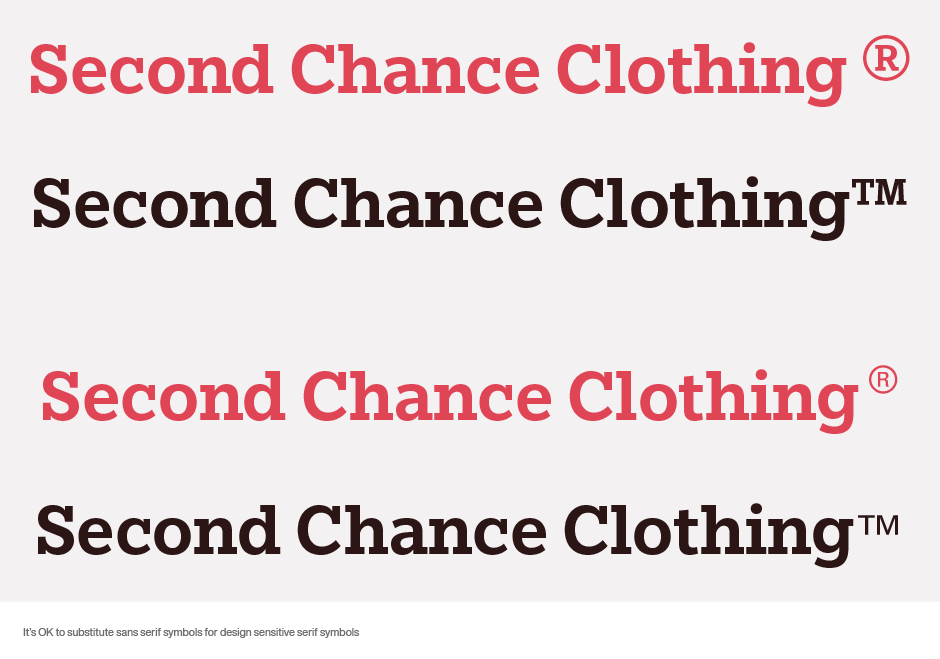
And then, there’s the question of size. Copyright, register and trademark symbols help establish brand identities and protect creative work from theft or plagiarism. They also, however, need to speak softly. They should protect the brand – not overpower it.
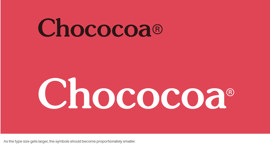
When using a ® or a ™ after a word, the point size may have to be adjusted so that it is legible – but not obtrusive. At text sizes, the symbols should be a little smaller than half the x-height of the text. As the type size gets larger, the symbols should become proportionately smaller. This is especially true in headlines.
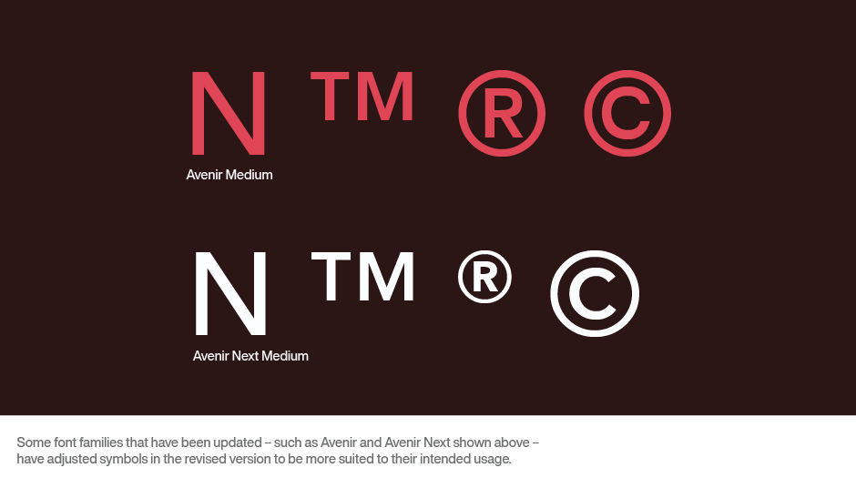
Some typeface families that have been updated – such as Avenir and Avenir Next – have adjusted the scale of these symbols in the revised version to more closely fit their intended usage.
The copyright symbol is treated differently. When it appears before text (such as a company name), the size of the symbol should be somewhere between the x-height and cap height of the text. When it appears before a year (as in ©1998), match the symbol size to the size of the first numeral. When using old style figures (as in ©1998), match the size of the zero, rather than the other, taller numerals.
While it is important to use copyright, register and trademark symbols to help protect brands, it is equally important to use them correctly.
Download a pdf version of the Branding Symbols manual.


