Type Trends: 2022 Q2 Trends by Gail and Joe

Gail Anderson
A Dynamic Duo Talks About Type
Marvel Comics has Black Widow and Daredevil. Ice Cream lovers have Ben and Jerry. Movie buffs have Thelma and Louise. What about typophiles? Well, they’ve got Gail Anderson and Joe Newton.
Meet Gail and Joe
We recently sat down with Gail Anderson and Joe Newton, of AND (Anderson Newton Design), and talked about one of their favorite subjects: typographic design. Gail and Joe launched the studio, early in 2012, as an agency dedicated to sophisticated yet spirited design – with a focus on typography. A focus, by the way, that is laser sharp and delightfully playful.
From 2002 through 2010, Gail served as Creative Director of Design at SpotCo, a New York City advertising agency that creates artwork for Broadway and institutional theater. Prior to that, she worked at Rolling Stone magazine, eventually serving as the magazine’s senior art director. She has written for books, magazines, and blogs, and lectures around the world on all things design.
Gail is currently Chair of the School of Visual Arts (SVA) BFA Design and BFA Advertising departments, and serves as creative director at the school’s Visual Arts Press, the in-house design studio for the school. Her work has been recognized by design organizations including The Society of Publication Designers, TDC, AIGA, The Art Directors Club, Graphis, HOW, Print and Communication Arts.
Oh, and Gail also creates, drop-to-your-knees-good, typographic design.
Joe has worked both sides of the table. As an art director he has created countless covers and features, and assigned hundreds of illustrations and photos for Rolling Stone and Seattle’s The Stranger. At Veer Joe was responsible for the visual identity and content curation of the Fonts division. His typographic design, looks like bacon smells.
As an illustrator, Joe has worked with publications such as the New York Times, Vibe and Nickelodeon magazine, and for clients like Sony Music and Publicis. His artwork has been honored by American Illustration, Communications Arts, and Print. While his design has been recognized by the Print Magazine, the Society of Publication Designers and the Society of Illustrator
It’s About Novelty, Voice and Energy
Gail and Joe are a team. They work together – closely – and complement each other’s work. This doesn’t mean, however, that they are of a single mind, when it comes to making great typographic design.
Want to learn more about how this dynamic duo works together, and what drives their design? “Listen-in” to our conversation below.
AND’s typographic solutions are very illustrative and evocative. What’s the thinking behind this?
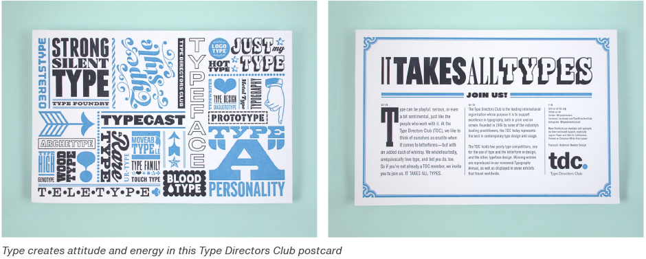
Joe Newton (JN): I started my career as an illustrator. I see type as a physical part of the composition; a word image. It should never simply be layered on top of a design. Type can have an expressive, physical presence. I think Gail treats type in a similar way. We both have an editorial design background. My first gig was at a newsweekly with a minimal art budget. Type offered a way to create attitude and energy.

What drives your personal choices of typeface and typographic design?
Gail Anderson (GA): I’m easily seduced by playful solutions and vernacular type. But the classics are still breathtaking, timeless, and ultimately irresistible. I don’t feel like I have a light enough touch or know when to stop, so it’s easier to work with the sillier stuff.
JN: Oooh, what she said! Too much is never enough. I spent half a dozen years as Head of Type for Veer.com (which distributed fonts and stock images.) I had to figure out how to convince customers why each typeface was unique and worthy of their money. So I created specimens for each release. Even now, each time I see a new typeface that I love, I want to put it to work. I want a new typeface for each project.
What guidance would you give in making typeface choices?
GA: There’s an amazing world of type out there – so much more than the stuff that comes with your computer. Do a deep dive on MyFonts.com, buy old type books, and build up your personal collection of favorites.
When you’re looking for the appropriate typeface, try not to go the “on-the-nose” route, of typing in “chocolate” in the search bar, when you’re branding a chocolate bar. Too easy. Too obvious. And almost never right.

JN: As Gail said, get outside the system fonts on your computer. If your project suggest options, give them a try. And think about what’s right for the client or product, and not just your own tastes. Many designers say “I like simple.” But is that what the project needs? Great websites like Fonts In Use and Letterform Archive are full of inspiration.
Tell our readers about one, or two, of your recent projects that you’re particularly pleased with.
JN: Type Speaks (published by Abrams) is basically a compendium of type specimens with most of the work being from the last couple of years. It features type-focused work from a lot of designers plus about 60 custom specimens created just for the book. Specimen design is a special love of mine. You’re limited to a single typeface and have to make a complete design using nothing but that. Limitations are good!

All Over the Map is a collection of maps, expertly curated by Greg Miller and Betsy Mason. The result is incredible variety. Perhaps it might be better called a book of infographics.
We often draw from the visual language of a certain subject. In this case, we drew from map legends, topography diagrams, and the like. And we found Hoefler&Co’s Surveyor type family. We’d actually purchased the family out of sheer infatuation a few years before – and then this project popped up. The typeface was derived from lettering on old maps. This is a case where the obvious choice was actually perfect.

My favorite element is the section openers where we used the Illustrator blend tool to mimic topographic lines, blending letters into a grid of vertical and horizontal lines (latitude/longitude.) While we started from a literal point, we abstracted it a bit. Melissa Farris (then Creative Director at National Geo- graphic Books) said we blew the minds of their maps department; people who work with maps every day. Some of the finest praise we’ve ever received, IMO.
Could you also comment on the Green Book Smithsonian Show project? It proves that you and Gail are seemingly unafraid to make uncommon typeface pairings.
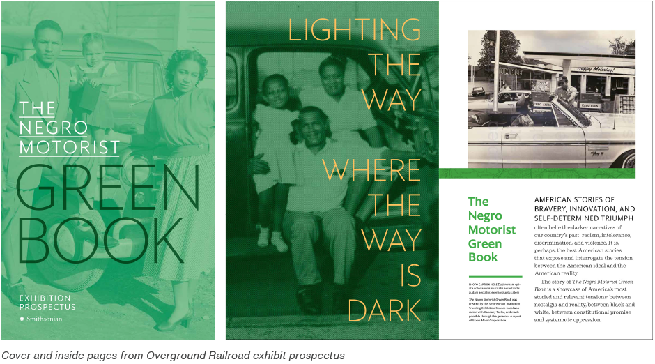
JN: We designed a book called Overground Railroad (worth a read!) for Abrams that documents the history of the Green Book travel guide. The Smithsonian asked us to help with a prospectus for a traveling exhibition of artifacts related to that history.
Our thought was to echo the style of the original Green Book guides in the prospectus, which were likely designed wherever they were being printed. (Kind of blue collar design.) But the museum wanted that balanced with something clean and elegant in the tradition of modern museum visuals. So there was a lot of back and forth about typeface selection. We ran through a series of combinations from rough and vernacular to corporate. We ended up with something that has a historical vibe that isn’t too era-specific, but lends a little earthiness to an otherwise clean typeface.

Last Words From Joe
I think currently there is a reaction to the branding trend of the last decade, which stripped everything down to a universally inoffensive sans. Now people are trying to give more particular voices to type, to make the brands feel more human and communication more lively.
Download a pdf version of the Type Trends: 2022 Q2 article and add it to your bookmarks.
Portrait above of Gail was created by Paul Davis and Portrait above of Joe was created by Zina Sanders.