2022 MyFonts Font Trends for Designers to Use this Year
Last year’s “Type Trends” guidance was about creating typographic surprises, bespoke fonts, using evocative typefaces to tell a story, and the merging of art and technology. As far as typefaces go, lighthearted scripts, industrial-strength sans serif designs, and heavyweight display typefaces were high on the popularity charts.
So, what kind of typefaces are going to be hot in 2022? We looked into the fonts that have been trending over the last several weeks, checked out the winners in several typographic design competitions, and talked with the type experts at MyFonts, to help us answer this question.
Here’s what we came up with. The typeface trends in 2022 will be:
- A resurgence of classic sans serif designs
- New interest in baroque fonts
- Display typefaces, with a cartoon vibe
- New serif typefaces that are friendly and outspoken
- Three flavors of scripts finding new popularity
- Variable fonts continuing to trend
Font Trend #1: Classic Sans
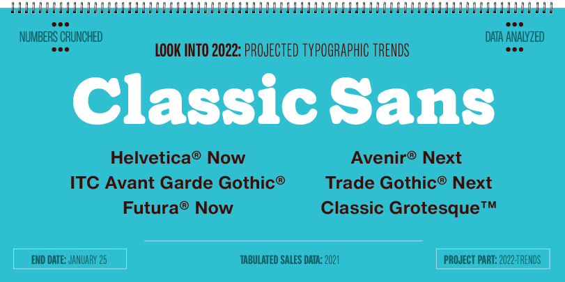
While new sans serif typefaces seem to be released daily, the traditional classics are not only still the best sellers, they’re also beginning to see an up-tick in their use. Why? Because these designs are able to address virtually any typographic need, are easy to recommend to branding clients and several have been updated with many improvements.
Designs like Classic Grotesque™ and Futura® Now infuse the demeanor of the original designs with 21st century aesthetics. Helvetica® Now and Trade Gothic® Next are classic designs updated for modern imaging needs. ITC Avant Garde Gothic® and Avenir® Next are geometric sans serif families that approach the design ethic in very different ways. While Proxima Nova™ bridges the gap between typefaces like Futura Now and Classic Grotesque, combining modern proportions with a geometric vibe.
All the families are large and diverse, with character sets that address scores of languages. Chose just the designs you need, or invest in the complete family. In either case, you’ll have powerful design tools – and be ahead of the typographic curve.
Font Trend #2: Ornate
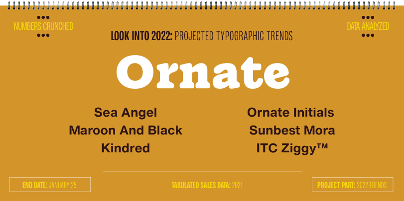
These are designs adorned with flamboyant swashes, sensuous character strokes, demonstrative interlocks and ornate character shapes. They may not rate high on the legibility scale, but are sure to attract attention, create memorable wordmarks and build headlines that are a visual delight. They’re the flowers in font gardens, and easily brighten-up an otherwise dull page.
Sea Angel, Maroon And Black and Sunbest Mora are delightfully complex confections. They have enough alternate characters, swash designs and ligatures to create lively headlines, wordmarks and packaging. There are also more subdued designs, like Kindred, a playful capitals only sans serif design, that sports a bevy of alternate characters. Think: fedora with a jaunty feather. ITC Ziggy is part Art Nouveau, part 70s psychedelic and 100% fun. The Ornate Initials family is three sets of decorative capital letter fonts that enliven a page, introduce paragraphs – and even serve as graphic illustrations.
Font Trend #3: Display Typefaces With a Cartoon Vibe
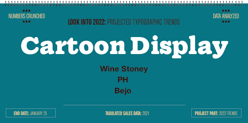
Cartoon fonts look like they came right out of a comic strip or graphic novel. They have a hand-drawn appearance, informal structure, and, more often than not, a whimsical disposition. They’re trending because they bring a human, lighthearted vibe to headlines and short blocks of text copy. The design’s popularity stems from their warm, friendly, and lighthearted qualities that we all crave these days. These fonts can also add impact to a headline and a bit of humanity to short blocks of text copy.
Wine Stony Cartoon isn’t exactly cute and cuddly. But that just goes to show that typefaces can be graphic chameleons, easily adapting to a variety of environments. Set Wine Stony Cartoon at small sizes and its rough edges go away. Set it large in a pleasing color and you’ve got a bit of earthy charm. Ghost Childs and Bejo are plus-size designs that are commanding and approachable, while the PH family has enough weights, proportions, handy icons, and word banners to fill a shipping container.
Font Trend #4: Distinctive Serif Typefaces

There are no crystal goblets here. These typefaces are not transparent containers for textual content. (So much for Beatrice Warde’s advice.) They’re fonts that make a statement. They tend to have a friendly demeanor and, because they have serifs, carry a certain amount of gravitas. Look around, and you’ll find these designs – and others like them – in a growing number of applications.
The Blacker Pro family has text and display variants galore, in normal and condensed proportions, plus a score of titling fonts. It’s enough fonts that Blacker Pro is equally at home in long form text copy and on-demand content, as it is in billboard headlines. Cotford™ is a new family of elegant display and robust text fonts. The display designs are ideal for branding, editorial displays, and logotypes, while Cotford’s text designs are ideal for lengthy copy in print and on screen. Gazpacho and Imagist are the two “happy feet” in the list. Gazpacho’s serifs are friendly and inviting, while those in Imagist are expansive and flowing. Sweep Poster melds the weight stress of old style designs, the dramatic elegance of 18th century Didones, and a charming panache in characters like the a, e and g, to create a design that is both distinctive and handsome.
Font Trend #5: Three Flavors of Scripts
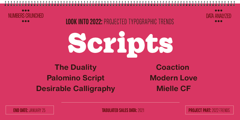
Scripts enhance the written word. They’re emotional, lyrical and, at times, even passionate communicators. Scripts have a soul, and a heart. While script fonts have been around as long as baseball, designs that are particularly elegant, script families of sympathetic fonts, and heavyweight designs that aren’t afraid to push their weight around, are stepping away from the crowd.
The Duality and Desirable Calligraphy bring new meaning to the word “elegant.” They’re sophisticated without being stuffy and lively without being flamboyant. They’re also at their best in larger point sizes, where flourishes and swashes can dance with impunity. Palomino Script is the cornerstone of the Palomino family, and is supported by two casual handwriting fonts and a suite of decorative design elements. Modern Love and Coaction take a backseat to no one. Playful and commanding at the same time, these designs – and typefaces like them – are cropping up on a variety of playlists. Lust Script is an exercises in indulgence. It’s big, brassy and more than a little sassy. It has attitude and swashes galore. Beautiful? You bet! Bashful? No way!
Font Trend #6: Variable Fonts
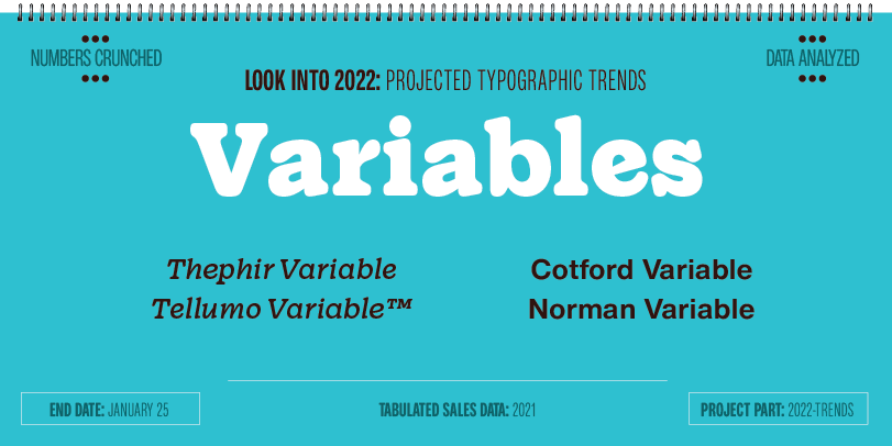
Variable fonts are an elegant melding of art and technology. They were trending last year, and continue to grow in influence. Developed primarily for web design, where they allow for faster site performance and a smaller digital footprint, Savvy designers are now using variable fonts to create brand consistency across a vast spectrum of uses, build animated graphics, fine tune text for maximum impact and legibility, and use type as an artist would a lively color palette.
Thephir Variable is part of the Thephir family featuring 10 fixed styles and a variable font with weigh and slant axes. It easily slides between svelte and robust with a slant that toggles from upright and stalwart to a stylish 15° forward angle. Tellumo Variable is a geometric sans with moderate proportions, a low stroke contrast, open apertures, and an x-height that makes it an easy reader in digital and hardcopy environments. A modest range of variable weights make it versatile without being overwhelming. Norman Variable is a condensed, high-contrast design with a large suite of ligatures and alternate characters. Its variable weight adjustments range from willowy to industrial strength. Cotford shows up twice on the 2022 list. Its static weights are distinctive designs that provide for a wide range of uses, while the variable font unlocks a much larger spectrum of typographic expression.
Add these trendy 2022 fonts to your library!
ON SALE through January 25th at 11:59 pm. Download today.
