Alphabet Tree - The Letter M
Historians tell us that our current M started out as the Egyptian hieroglyph for “owl.”

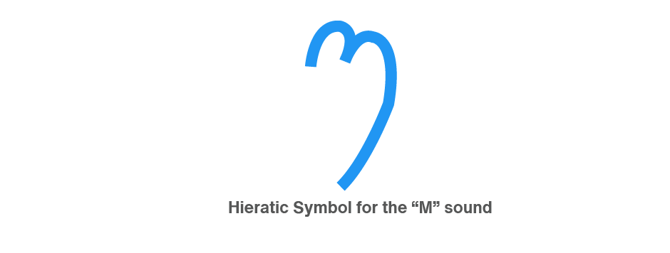
Over thousands of years, this simple line drawing was further distilled into the hieratic symbol for the ‘em’ sound. Eventually, the great-grandparent of our M looked a bit like a handwritten m balanced on the tip of one stroke.
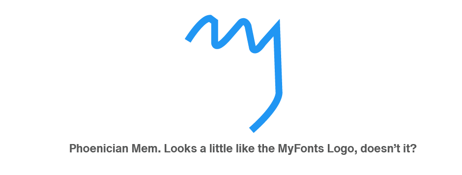
The Phoenicians called the letter mem. It’s easy to see that the Phoenician mem is based on the Egyptian hieratic symbol, and that it’s the forerunner of the thirteenth letter of our alphabet. The mem looked much like our two-bumped lowercase m with an added tail at the end.
The Greek mu evolved from the Phoenician mem. The Greeks further simplified the letter and, in the process, converted the soft, round shapes into angular strokes.
The Etruscans and then the Romans adopted the Greek form, but neither made substantial changes to the shape or proportions of the character.

Sometime in the third or fourth century A.D. the rounded lowercase m began to appear, but it was almost lost in later centuries.
In medieval writing, it became common practice to place a stroke over the preceding letter instead of writing the m (probably because m is one of the more time-consuming letters to write).

The Romans also pressed the M and six other letters – I, X, V, L, C, and D – into double-duty as their numerals, and gave M the honor of standing in for the highest value, 1,000.

The best text typefaces tend to fade into the background, letting the words be the most important visual aspect of content. But, every once in a while, you might walk on the typographic wild side. When those times occur, consider the Menhart font family.
Drawn by Oldřich Menhart in 1934, this typeface, well into octogenarian territory, design makes a statement while still being easy on the eyes. It doesn’t get in the way of graphic communication – but enhances it.
Monotype’s digital release of Menhart is the first revival since the hot metal fonts were cut. Menhart Display is based on the original Monotype drawings, while a slightly heavier, re-spaced version, has been created for text sizes. Both versions offer the full typographic capabilities, such as the automatic insertion of old style figures, ligatures and small caps. In addition to English, the extended character set supports most Central European and many Eastern European languages.

