Creative Characters: Up and coming — Olivetype
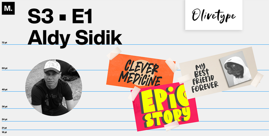
If every foundry has a vibe, then Olivetype’s is young, urban, and funky, with a liking for graffiti-like fonts. Founded in 2019 by Aldy Sidik and Nurul Hidayani, a husband-and-wife team driven by what Sidik calls “a shared passion for typography,” Olivetype is based in West Java, Indonesia, on an island surrounded by volcanos, some of them active.
In a recent email interview with Monotype, Sidik, 41, discussed his partnership with Hidayani (Olivetype’s administrator), the industries that sustain West Java, and how the local geography has helped shape their foundry’s design aesthetic.
MyFonts (MF): Tell me a bit about where you live and work. I understand that West Java has a big agricultural investment in crops like rice, sugarcane, and peanuts. In addition to farming, what other industries drive your province, and what kind of fonts speak to those industries’ needs?
Aldy Sidik (AS): In addition to farming, yes, there are other industries, too. For example, West Java has factories that make cars, toys, electronics — even aircraft. There’s also a tourism industry that brings people from all over the world to visit places like Bandung [the capital of West Java Province]. Another important industry is the creative industry, where people come up with fun and imaginative ideas for things like music, movies, art, fashion, video games, and more.
Those industries need special fonts that help them stand out and look exciting! Fonts that show their style and personality. Some of these fonts may be bold and modern, while others can be classic and elegant.
But in my experience, everybody loves brush fonts with cool textures. It’s very versatile.
MF: According to geographic descriptions, West Java is surrounded by volcanoes, some of them eruptive. Does the smoky atmosphere influence your design aesthetic?
AS: Yes, I think so. Smoky atmospheres can change the way things look. It’s like when you put on sunglasses — everything looks darker and shadier. This can affect the way designers choose shapes and colors. That’s why sometimes we tend to use bolder shapes when designing new fonts and use brighter colors for the previews.— to make sure their designs still pop!
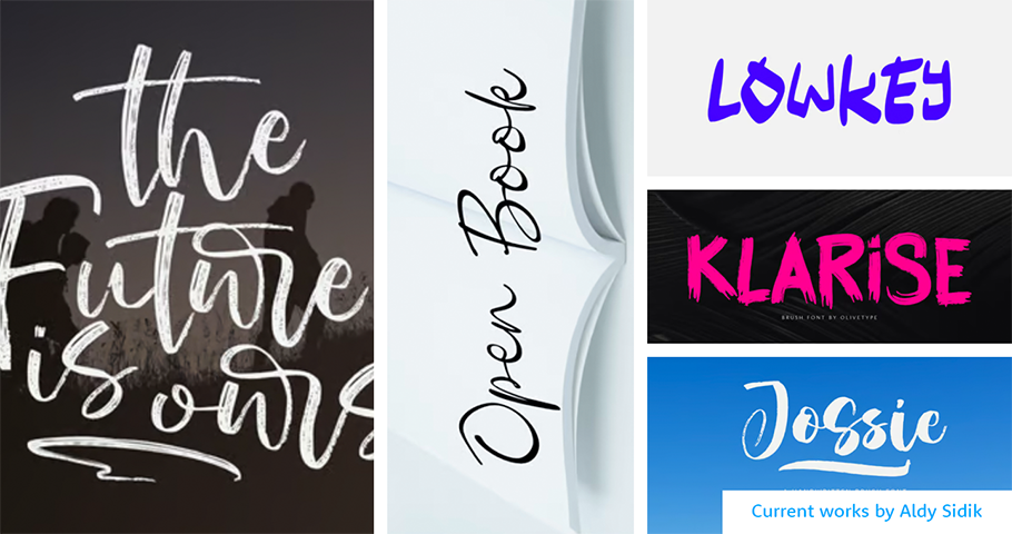
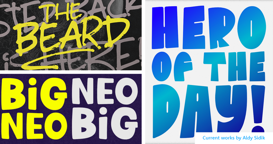
MF: I’m really interested in your graffiti-style fonts, like Big Black Scar and The Gang of Boston. Their names call to mind the makeup brand Urban Decay, with its eyeliner colors Smog and Demolition, among others. Who’s the biggest buyer of your graffiti fonts, and what led to their design?
AS: Yes, our graffiti textures are a little bit similar to that makeup brand.
To date, our biggest customers are movies and sports companies, including both Seven Sunday Films and Sidi Sport. It’s exciting to think about why they like our graffiti font! Using it is a great way for them to stand out from the crowd. If a brand wants to write its logo or message in big, bold letters on a wall or billboard, they’d want it to look awesome, and our graffiti font can do that!
Note: Big Black Scar is the name of one of my fonts. The Gang of Boston is just a preview.
MF: Monotype recently interviewed another typeface foundry based in Indonesia. Do you feel there’s particular growth in the font industry in your country — and if so, why?
AS: Yes, I can feel it. Everyone can make fonts nowadays. You can learn on YouTube or enroll in a course. The opportunity is there.
And to me the font market is very dynamic; it’s constantly changing. There is always a demand for a fresh and new high-quality font. Fonts help people express themselves better and that’s why there is so much growth.
Plus, Indonesia is full of creative people.
MF: As a typeface designer, what do you feel distinguishes you from your competitors?
AS: Everyone is unique. Each designer has their own unique style and touches that no one else can copy. Like magicians do tricks, designers use their skills to make things fun and creative. We can help you create something that’s totally one-of-a-kind — nobody else will have the same thing! Our competitors may be able to do some of the same things, but they won’t have our special flair.
MF: Which of your fonts has made you the most proud?
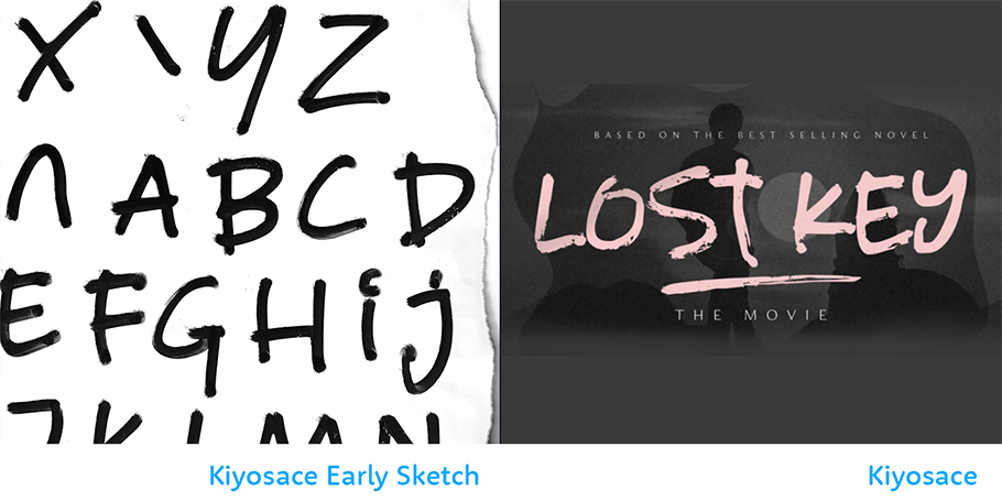
AS: Maybe it’s the Kiyosace brush font. I made it two years ago, when I was very sick. I had high blood sugar and maybe Covid. I was very weak — couldn’t get out of bed. After a long hard month, things got better. I sat at a table and started writing letters on a piece of paper using a brush pen. Then I scanned them. That was the birth of Kiyosace. Three weeks ago, I published it for the very first time on My Fonts.
MF: What are your goals for the future?
AS: To create lots of fun and creative fonts that people will love. Just like how some people like to wear cool clothes or ride a bike, I want to make cool fonts that people can use to express themselves. I also want to make sure my fonts are easy for people to use on all kinds of devices.
MF: If you were to spend a day with any font in history — meaning: one designed by someone else — which would it be and why?
AS: I think it would be Lemon Yellow Sun font by Hanoded. I just love that font. It feels so light, so cute, and bubbly. It’s an amazing font. It really is.
Give shout-out on social media using #CreativeCharacters
We hope you enjoyed this interview. Check out previous interviews of up and coming creative characters.


