Inside the Studio: Creative Characters — Santi Rey
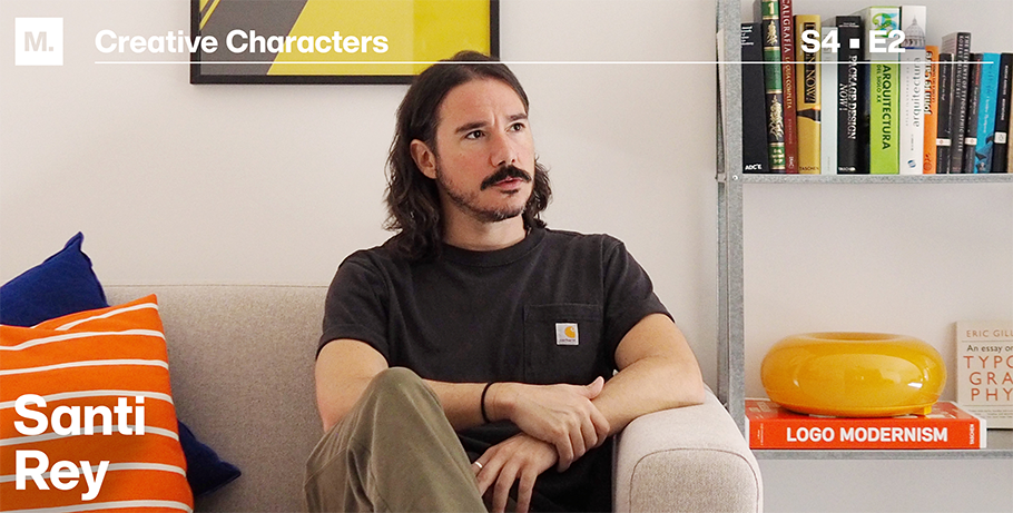
– Santi Rey
In 2014, the Spanish typeface designer Santi Rey, now 35, left his hometown of Madrid for London. Despite speaking little English at the time, he was determined to explore new job opportunities and expand his horizons. It was during this time that Santi discovered his passion for type and branding design, as well as his love for crafting compelling origin stories for his fonts.
Following his recent return to Madrid, in an interview with Monotype, he shared his inspiring design journey, creative ambitions, and even discussed his successful sale of a typeface to a national gazpacho campaign!
MyFonts (MF): Some typeface designers go to trade school to learn how to create fonts, but you taught yourself that skill. How you did that?
Santi Rey (SR): I come from the design world and have always been passionate about type and the idea of creating my own font had always been on my mind. One day I just decided to go for it - I bought some books, watched a couple of tutorials online and spent months trying. Luckily, nowadays knowledge is very accessible, and you just need the will to learn.
MF: After living for a decade in London, you moved back to Spain to set up shop. Can you talk about your career trajectory in design — both working within agencies and as an independent foundry owner?
SR: I moved to London to find opportunities in the design/advertising world, and I’ve been lucky enough to work in great places, full of talented people, where I learnt a lot. I think my background as a designer has helped me to create fonts that designers want to use. I always design thinking about me as a designer: what font would I choose?
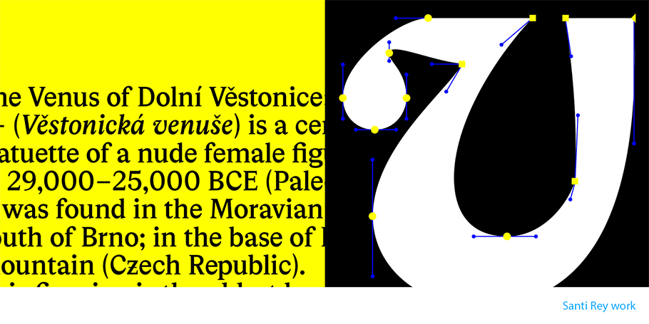
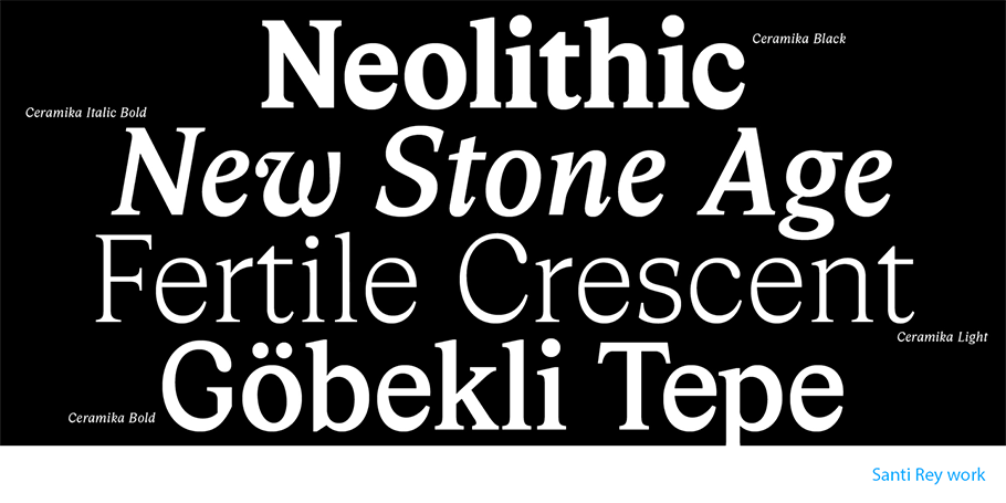
MF: Over the past few years, you’ve created and published nine fonts. Just a few of them are Ceramika, Gazpacho and Autovia. As their names signal, these fonts reference a wide range of industries (home decor, food, and travel) and have broad applications across advertising campaigns, supermarket packaging and road signage, among others. Can you talk about each one of these fonts and their uses?
SR: I always have a specific use case for each font at the beginning of every project, but that can change along the way. I designed Autovia because I was looking for a new nice bold condensed font to use for headlines but couldn’t find it anywhere. Gazpacho was meant to be used as a cooking book font, but now I see it in a lot of different places with completely different uses. That’s part of the beauty, you can’t control it.
MF: People may be especially curious about your font Gazpacho. I understand that it was discovered on MyFonts by Spain’s largest manufacturer of gazpacho, and it has since been used for the brand’s packaging across the nation’s stores — and you now see your handiwork in the grocery store every time you visit it! How does it feel to have a success like that?
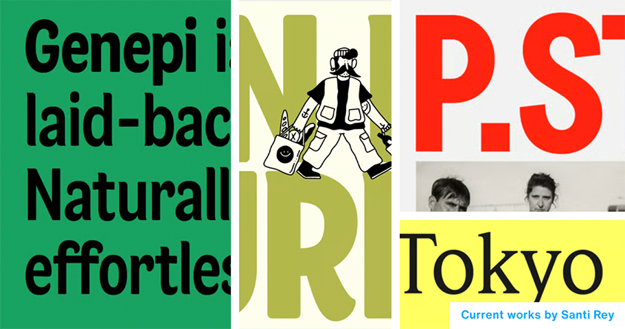
SR: Yes. That still blows my mind. My favorite brand of pre-made gazpacho uses my font Gazpacho on their campaigns and packaging. But it doesn’t end there. Gazpacho has been a bestseller for over 3 years. I see it everywhere now. In supermarkets, billboards, book covers, movie posters…it feels amazing to be honest.
MF: Not only was Gazpacho used by x, but MyFonts also named it its number one font in 2021. How did you feel when you spotted that ranking?
SR: It was actually number 2, just behind Helvetica. I suppose you can’t compete against Helvetica. I’ll happily take second place in this case.
MF: You got your start, if I understand correctly, by working for creative agencies and advertising campaigns in England, including doing design work for the national ad campaign for Marmite, a famous British food spread. What was that like and how have your extensive roots in the creative industry fueled your development as a designer?
SR: It obviously has influenced me tremendously. I’ve been more than a decade on the other side of the screen; as a graphic designer looking for the perfect font for my projects. Now I feel that I understand my potential customers better.
MF: What distinguishes you as a designer, in terms of your talent, as well as your greatest goals and achievements?
SR: I don’t really know. I feel I’m especially passionate about my work, which makes me very productive. I’ve created around 15 fonts since 2020, and considering that I’m a one-man foundry, and I’ve been working as a designer in agencies and studios during this time, I think that’s somehow impressive.
MF: What are you working on now?
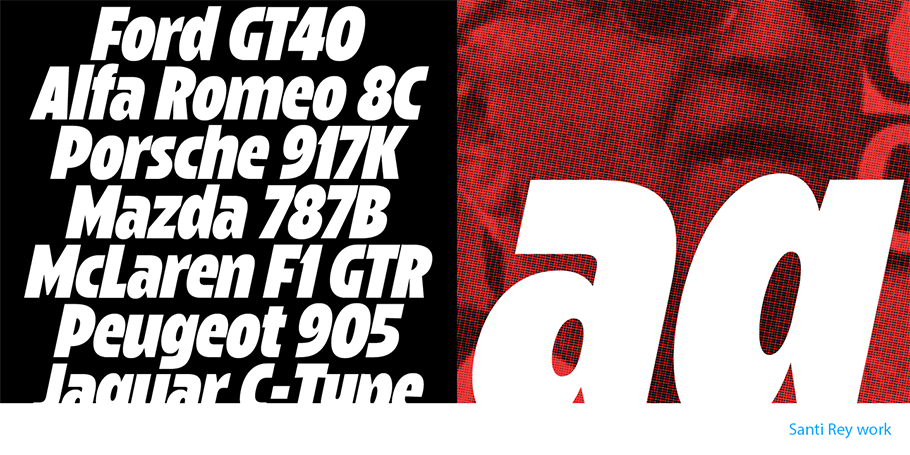
SR: I just released a variable font called Hanz. A very powerful chunky typeface inspired by motor-racing but I have already started working on my next project. I decided to give myself a challenge and I’m getting out of my comfort zone and designing a retro script. Having a lot of fun.
MF: What heights do you hope to scale in the future?
SR: None really, but maybe it would be to beat Helvetica one day.
I love what I do. I just hope to be able to keep doing this, seeing my work out there and knowing that there is, somewhere, a fellow designer that enjoys my work.
MF: I understand that you also do photography and favor pictorial dreamscapes that use a bright pop of color in saturated light. You’ve described this technique as oneiric. Can you discuss this facet of your creative work as just one part of your wide-ranging portfolio of skills and talents?
SR: I need to keep my mind sane, and in order to do that, I believe that I need to embark on different creative endeavors not related to type. Photography is one of them. Sometimes I can’t help myself and mix both passions, like in the project for my font Planta.
Give a shout-out on social media using #CreativeCharacters
We hope you enjoyed this interview. Check out previous interviews of Up and Coming Creative Characters & Inside the Studio: Creative Characters.


