Designing a mighty fine specimen
Designing a mighty fine specimen
Joseph Richardson New typefaces
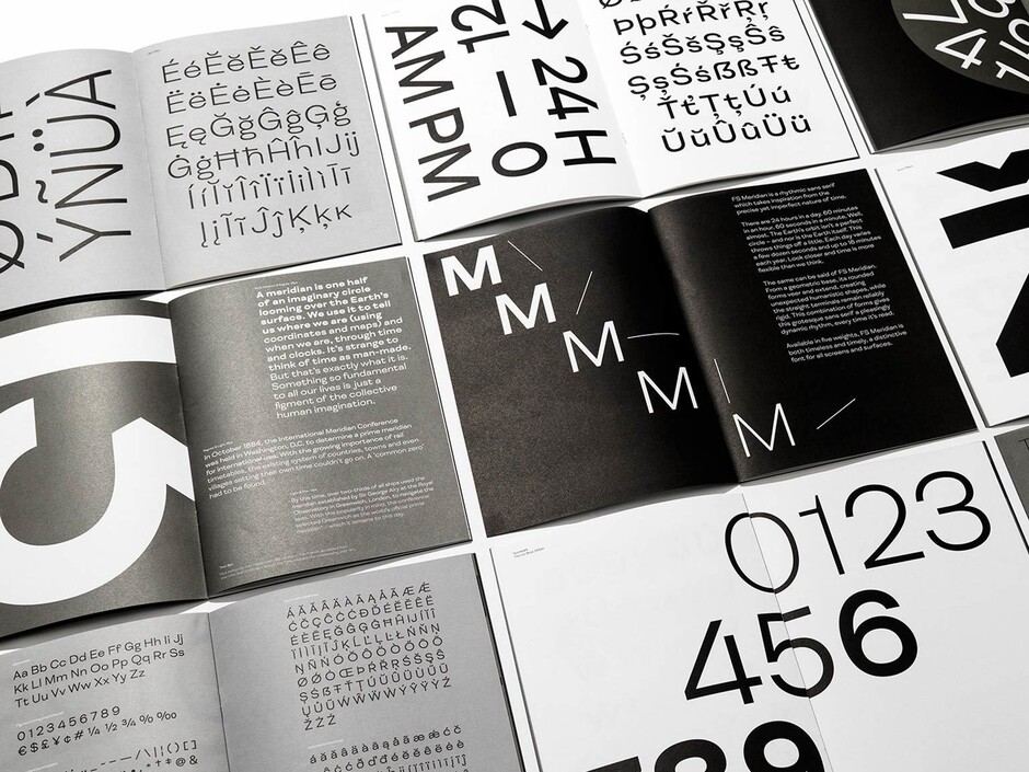
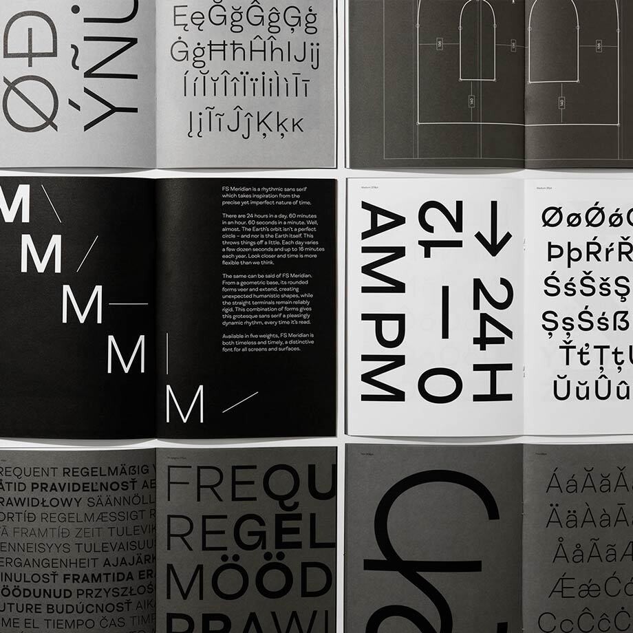
The limited edition FS Meridian specimen was created by design and branding agency OPX. Their Senior Writer Joseph Richardson had this to say about the project:
FS Meridian is a new rhythmic sans serif font inspired by the precise yet imperfect nature of time.
Designed in London, the typeface takes its name from the Greenwich Meridian that dissects the capital and marks the starting point of every time zone in the world.
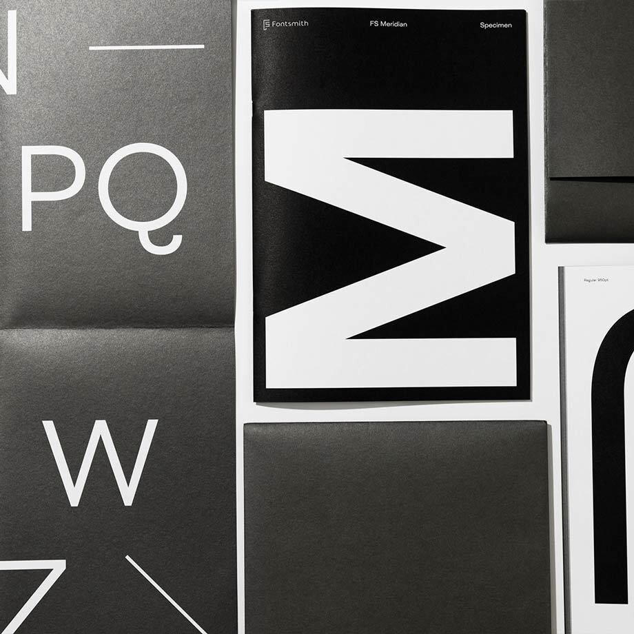
When designing the specimen book, we used time as our starting point, as OPX Creative Director David Bennett explains. “Over its 32 pages, the booklet reflects the idea of time passing – moving from black and Pantone black to white and back again through varying shades of grey. This took a fair amount of collaboration with the printers.”
The booklet is punctuated by time-inspired imagery throughout. Dislocated clock hands float across pages and numbers tumble from clock faces. These designs demonstrate the versatility of FS Meridian while evoking the way time can sometimes behave in slightly strange ways.
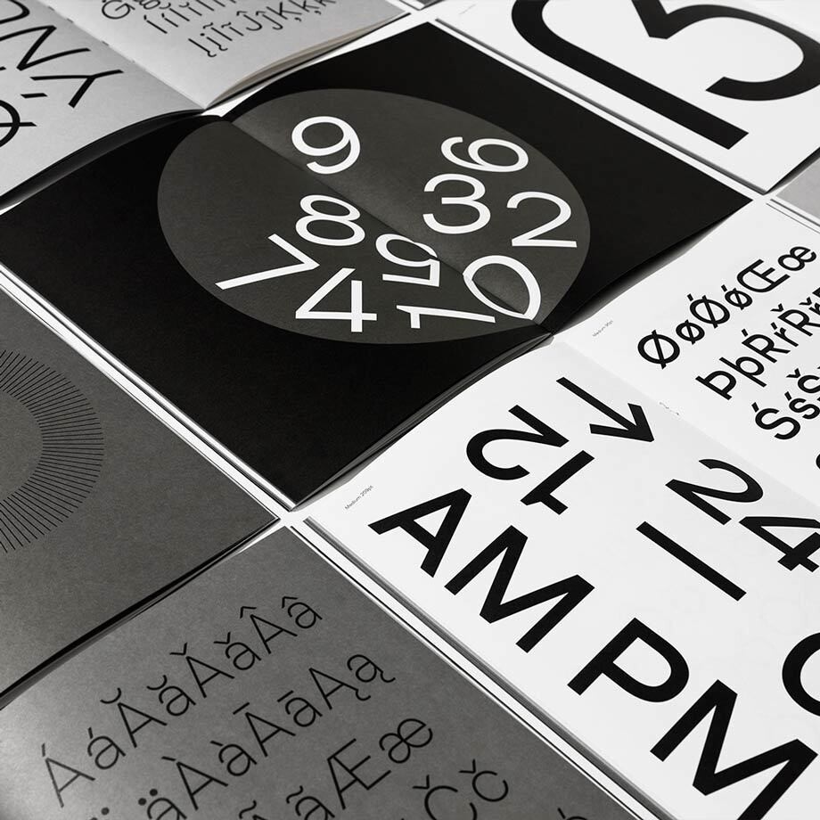
FS Meridian’s adeptness across headlines and body copy is highlighted with musings on the concept of time and a quick history lesson on how the Prime Meridian came to be. Researching this was fascinating. Did you know that until the 1880s every city decided its own time? Who said you can’t learn while seeing your dynamic new font in action?
With its contemporary tone and confident shapes, FS Meridian will bring clarity and personality to any brand. Officially launched in February 2019, MADE.COM have wasted no time in snapping it up as their subheading and body copy font.
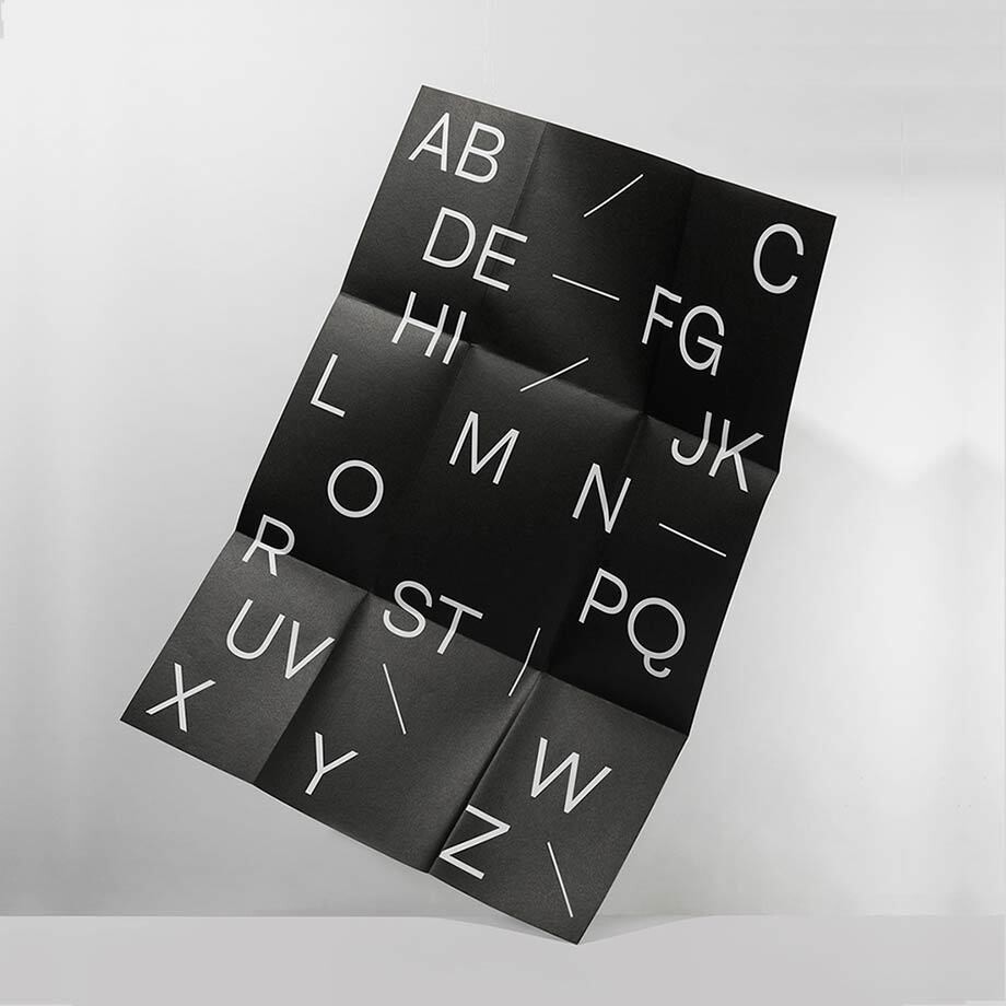
This specimen booklet is limited to 100 copies and each one comes with an A1 poster. You can take a closer look at FS Meridian, trial and buy it here. Don’t delay, time is of the essence.
OPX is a design and branding studio based in London. They use words, design and experience to invent, reinvigorate and transform brands.