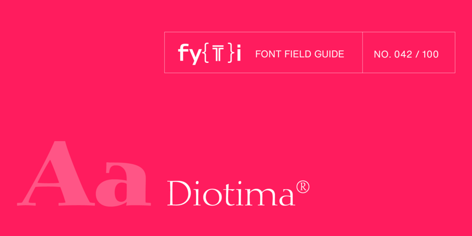
Diotima Classic® Font Field Guide

FOUNDRY: Linotype
DESIGNER: Gudrun Zapf von Hesse, Akira Kobayashi
CLASSIFICATION: Didone
Best Practices
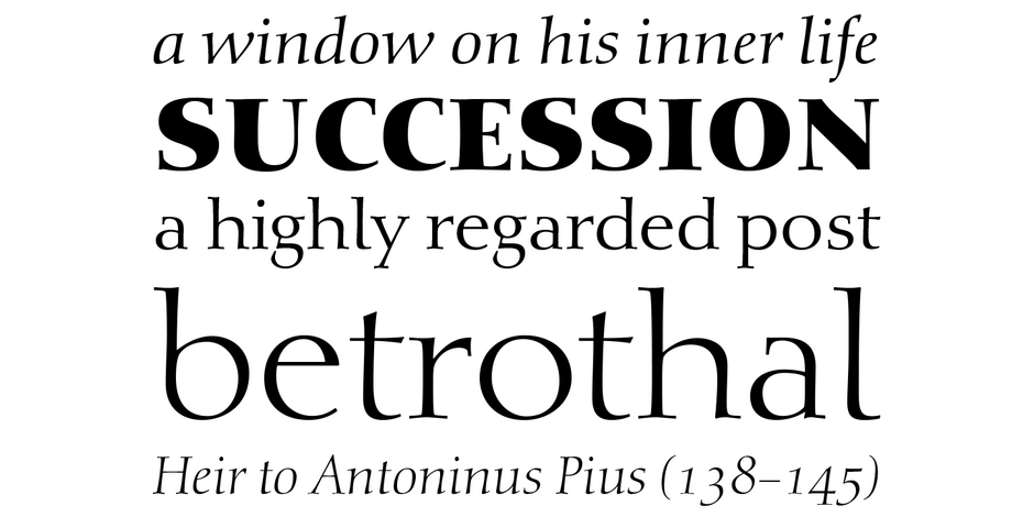
Diotima Classic Regular and Bold are distinctive – and still highly legible at text sizes. Diotima Classic Light can also be an excellent choice for short blocks of text copy. It, and the Bold and Heavy weights, create striking headlines.

Family
Diotima Classic is a four-weight family – each with a complementary Italic design.
Font Facts
- Von Hesse’s handwriting served as the basis for the italic designs.
- Diotima is a term from ancient Greece, and translates to “honored by God.“
- Diotima Classic’s letterforms are more harmonious and well-balanced than the original design.
Roots
Gudrun Zapf von Hesse began the design of the original Diotima, in 1939 when she was a bookbinder. The design was released as a family of metal typeface for hand setting by D. Stempel AG between 1951 and 1953. In 2008, Akira Kobayashi, Linotype’s type director, and von Hesse collaborated to revive and reinterpret Diotima for both text and display typography. The result is Diotima Classic.

Legibility
While decorative, the characters in Diotima Classic are highly legible in both text and display sizes, on screen and in hardcopy.
How to spot Diotima

Alternate Choices
Perfect Pairing
Download a PDF version of the Diotima Classic Font Field Guide and view the Diotima Classic font family.
More Font Field Guides

The design of Avenir Next is clean, straightforward and performs with confidence in long blocks of text copy and headlines. It also pairs well with well with so many contemporary serif text typefaces.

Neue Swift was designed for use in text sizes in publications. It can be used just about anywhere maximum legibility is a requirement. It’s also a striking design, making it both distinctive and easy on the eyes.


