ITC Cheltenham Font Field Guide

FOUNDRY: International Typeface Corporation (ITC), DESIGNER: Tony Stan & CLASSIFICATION: Clarendon Serif
Best Practices
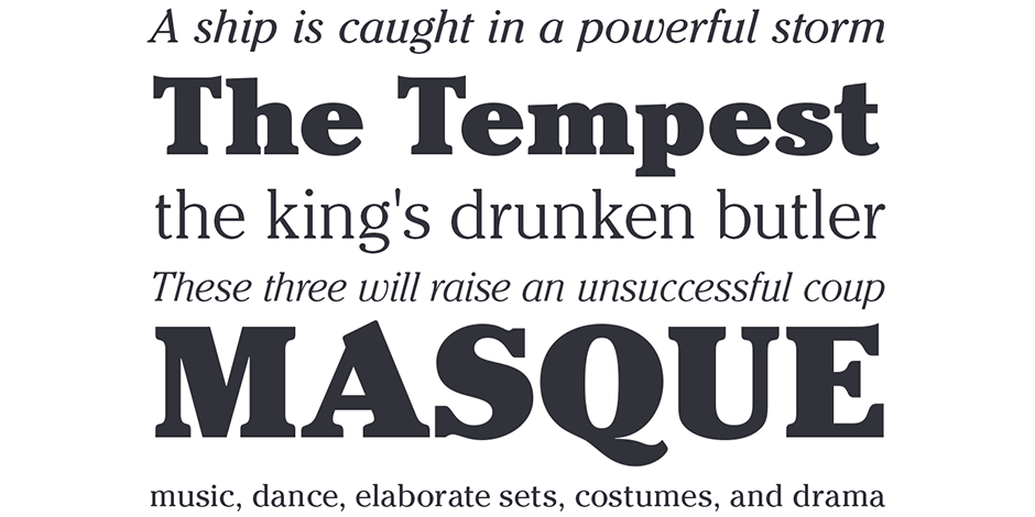
Originally drawn to be a display typeface, The ITC Cheltenham family works best at large sizes. It is also somewhat condensed, providing economy of space. Being a distinctive design, however, it should be used sparingly.

Family
Four roman and condensed weights, each with corresponding italics, plus a special “Handtooled” design.
Font Facts
- The first ITC version was drawn in just two weights, of book and ultra, as display complements to the existing text design from ATF.
- Matthew Carter drew a custom version of Cheltenham for The New York Times newspaper, in the early 2000s.
Roots
The original Cheltenham was designed in 1896 by architect Bertram Goodhue for the Cheltenham Press in New York. Cheltenham Old Style was produced by Mergenthaler Linotype Company for its metal typesetting machines, and then the designs were sold to American Type Founders in 1902. Tony Stan was commissioned, in 1975, to develop a version of Cheltenham for ITC.

Legibility
Sturdy proportions, a large x-height, open counters and distinctive character designs, make ITC Cheltenham legible. Because the design is so distinctive, however, it can hinder message delivery in text sizes.
Spotting ITC Cheltenham

Alternate Choices
Perfect Pairings
Download a pdf version of the fy{T}i ITC Cheltenham Font Field Guide and view the ITC Cheltenham font family.
More Font Field Guides

TT Commons Pro Font Field Guide
TT Commons Pro is a versatile tool. It has a wide area of application: app interfaces, websites, printed materials, branding. Learn more

ITC Stone® Sans II Font Field Guide
There is virtually no limit to ITC Stone Sans II range of applications. Fine books, annual reports, restaurant menus, business correspondence, corporate identity programs, movie credits and advertising campaigns have all been set using this design. Learn more


