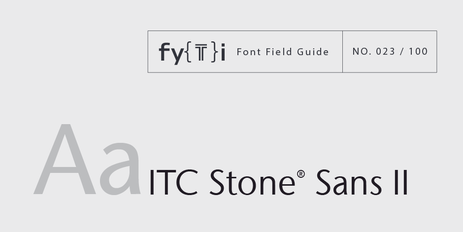
ITC Stone® Sans II Font Field Guide

Foundry: ITC Designers:Sumner Stone, Jim Wasco, Delve Withrington Classification: Humanistic Sans
Best Practices
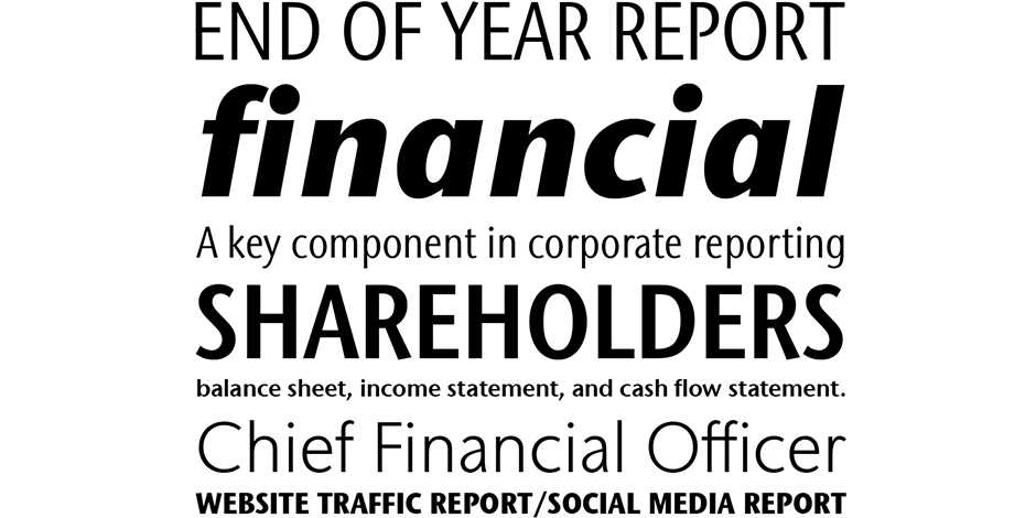
There is virtually no limit to ITC Stone Sans II range of applications. Fine books, annual reports, restaurant menus, business correspondence, corporate identity programs, movie credits and advertising campaigns have all been set using this design.

Family
Six weights of roman and condensed designs, each with a complementary italic, for 24 typefaces.
Font Facts
- ITC Stone Sans II is its own and design and should not be combined with the original ITC Stone Sans.
- The initial ITC Stone family of three designs was designed while Sumner Stone was at Adobe.
Roots
ITC Stone Sans II family is new from the ground up. The collaborative design effort between Sumner Stone, as lead designer and project director, Delve Withrington and Jim Wasco, initially begun as a general tidying up of ITC Stone Sans, but it grew into a complete reimaging of the design.

Legibility
Humanistic overtones, a robust x-height, large counters and open apertures make ITC Stone Sans II especially legible and remarkably readable.
How to spot ITC Stone® Sans II

Alternate Choices
Perfect Pairing
Download a pdf version of the ITC Legacy® Sans II font field guide and view the ITC Legacy® Sans II font family.
More Font Field Guides

ITC Legacy® Sans Font Field Guide
An excellent design for both hardcopy and interactive applications. The standard weights are full-bodied, while the condensed designs provide economy of space with little loss of legibility. Learn more

ITC Novarese™ Font Field Guide
The contrast between thick and thin strokes is noticeable but not extreme, giving text set in ITC Novarese sparkle and color without sacrificing readability. Learn more


