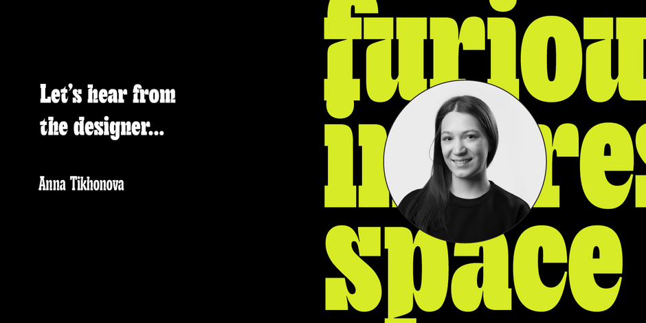
#18 TT Cometus by TypeType

Q1: Where did the idea for the typeface come from? Did you set out to address a specific use or suite of the application? Was this a design you’d had in mind for a while?
Ans: The idea behind TT Cometus was to design a narrow display slab serif. We aimed to keep the heavy serifs typical for slabs while also giving the font a modern and dynamic look. To achieve this, we combined sturdy details with completely opposite shapes, added a handmade feel, and drew inspiration from brush movements in calligraphy.
The typeface’s name evokes the image of a comet—a powerful and weighty celestial body with a beautiful tail slicing through space at an incredible speed. This is a key to understanding the font’s nature and personality.
Q2: What should graphic communicators know about the typeface, or how will the family of fonts help them create better designs?
Ans: TT Cometus is a modern slab—impressive and sturdy but energetic and dynamic at the same time. The font is a slab serif with expressive elements, friendly nature, unusual serifs, and letter terminals tapered like a comet’s tail.
TT Cometus includes numerous ligatures and the ss01 set for alternative forms of ampersand and the letter g. It’s a perfect choice for designs that require the audience’s maximum attention: in headlines, logos, or branding.
TT Cometus shines best in large point sizes. This font is anything but neutral!