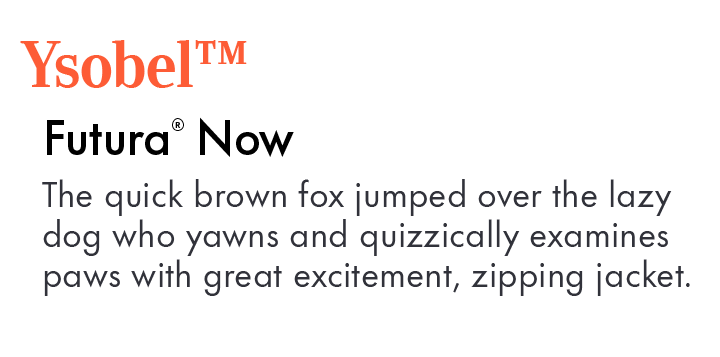
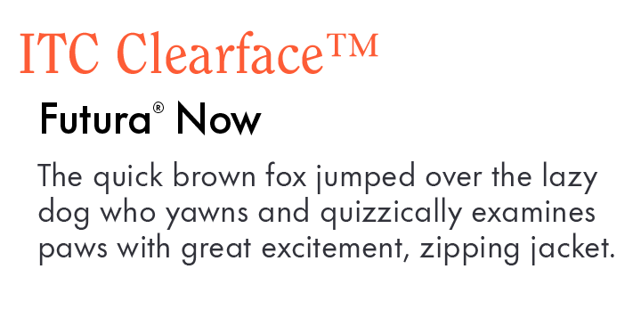
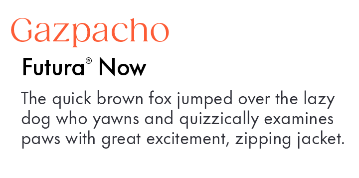
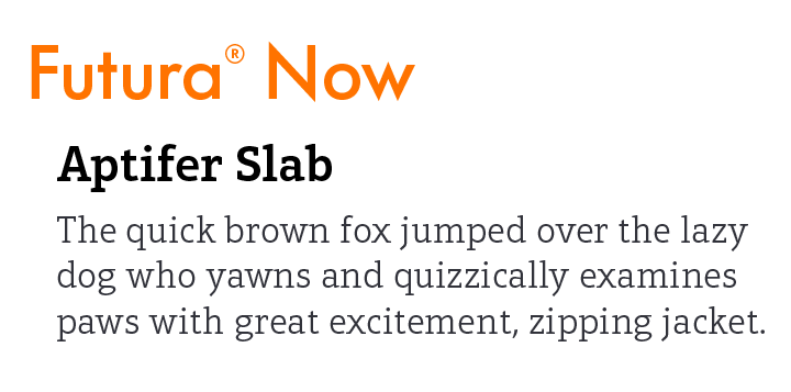
Futura® Now Perfect Font Pairings
FOUNDRY: Monotype
DESIGNERS: Paul Renner & Monotype Studio
CLASSIFICATION: Geometric Sans
ABOUT THE FAMILY:
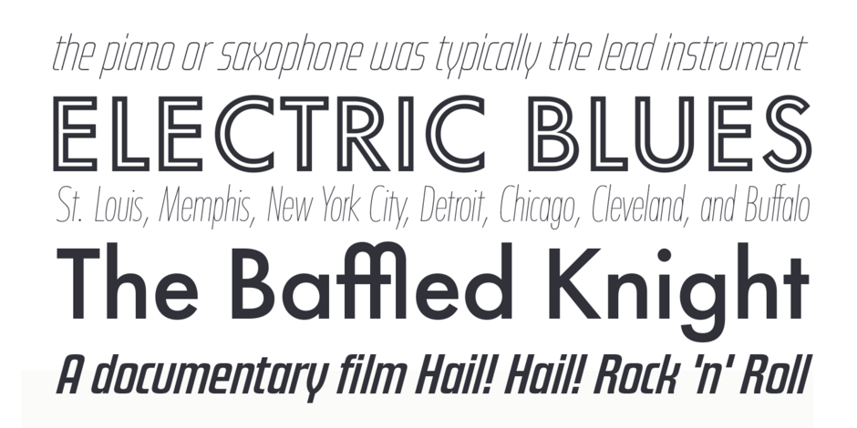
Futura Now is the definitive re-digitized version of the iconic geometric sans serif typeface. With 102 styles, including Condensed, Headline, and Text weights, in addition to extensive language support, Futura Now is poised to take on virtually any typographic task.
WHAT TO LOOK FOR:
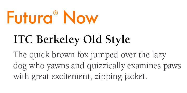
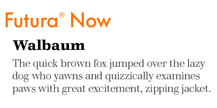
- Futura Now is a geometric sans with an elegant cap to lowercase relationship, and will pair well with just about any serif typeface.
- Humanistic typefaces, like Joanna® Nova and Malabar®, will provide an excellent counterpoint to Futura Now’s symmetrical forms.
- Futura Now Script creates a soft contrast with its monolinear interpretation of handwriting.
- Most sans serif fonts should be avoided, although soft typefaces like Stone® Humanist and Palatino® Sans can work well with Futura Now – especially if there is a strong contrast in the weights used.
TEXT:
DISPLAY:
Download a PDF version of the Futura® Now Perfect Pairings and view the Futura® Now font family.
Explore Other Font Pairing Guides
“When creating the Avenir® typeface, Adrian Frutiger drew inspiration from the past and the future. His goal was to modernize the geometric sans serif styles of the early 20th century, while embodying the aesthetics of the 21st century. In the process, Frutiger also infused a touch of organic humanism into the design.

ITC Avant Garde Gothic’s characters are based heavily on geometric shapes. There is no softening with humanistic undertones. Its lowercase x-height is tall and the characters are wide. Weights range from a delicate extra light to a commanding bold. Both regular and condensed proportions are available.
