Manual: Pesky Punctuation
We’ve come a long way since dumb quotes and typewriter spaced periods. Curly quotes and single spaces after a period are also, pretty much, commonplace.
There are some instances, however, where creating the best typographic punctuation can be a bit troublesome. These include foot and inch marks, em dashes and parentheses, braces & brackets.
Foot & Inch Marks
Foot and inch marks – also known as minute and second marks or prime and double prime marks, depending on what they’re labeling – are not curly. Use straight quotes for these marks. They are relatively easy to incorporate, but you’ll need to do a little “undoing.”
In Word® or Pages®, type a single or double quote, which will come out curly. Then press + Z for “Undo.” The single or double quote will revert or an inch or foot mark.
Typography purists will point out that proper foot and inch marks have a slight northeast-to-southwest slope to them. You can determine if the font you’re using has inch or foot marks by pressing and holding the Control, Command, and Spacebar keys simultaneously. The Character Viewer will appear as a pop-up window and you can browse through different categories of characters and symbols, including emojis, mathematical symbols, and more.
Em Dashes
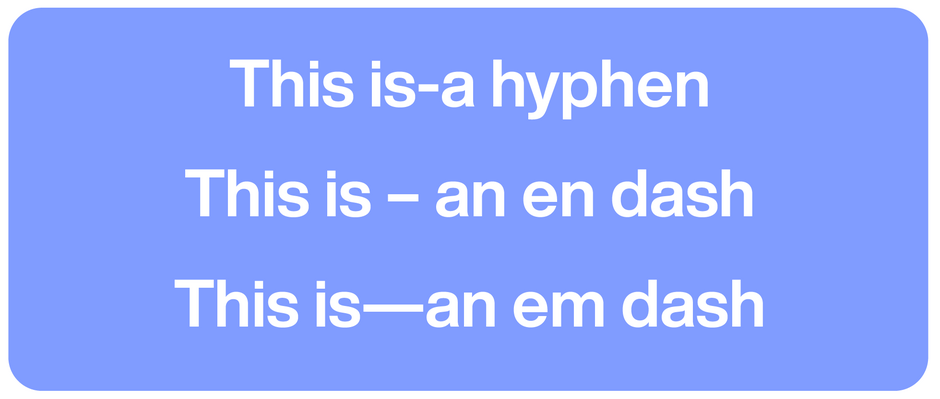
Em Dashes are used for emphasis. Since they break up the flow of the sentence—only use the em dash to stress a point. An em dash can also indicate missing words or a sudden break in thought—confusing?
The problem with em dashes is that they make such a strong statement. They can, in fact, be troublesome in text copy – stopping the reading flow altogether.
The good news is that many word processing applications: Microsoft Word, Google Docs, etc. have built-in auto-formatting features that can automatically apply styles, and formats.
First, be aware that the auto format option for dashes does not fire until you complete the word following the hyphen(s). At that time, the following will occur:
- A single hyphen preceded and followed by spaces will become an en dash.
- A single hyphen preceded by a space will become an en dash.
- A single hyphen followed by a space will remain a hyphen.
- A single hyphen with no spaces on either side will remain a hyphen.
- Two hyphens preceded and followed by spaces will become an en dash.
- Two hyphens preceded by a space will become an en dash.
- Two hyphens followed by a space will become an em dash.
- Two hyphens with no spaces on either side will become an em dash.
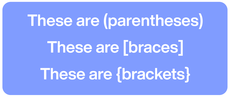
Parentheses, Braces & Brackets
Parentheses, brackets and braces serve very different job functions. Parentheses enclose extra information or asides. Brackets are used for additions or clarifications within quotations. Braces are used for grouping items, sets, or in specialized texts like math and science. While they all look, pretty much, the same, using the correct mark is important. Here’s a more detailed breakdown:
Parentheses enclose additional information or asides that are not essential to the main sentence. They also
- contain partial or complete sentences.
- signify a set of coordinates on a graph.
- In math, to group expressions and indicate the order of operations.
- In programming, they define method signatures or pass arguments into a method.
Brackets are used to insert explanations, corrections, or clarifications into quoted material. They can also be used when there is a parenthetical word or phrase within an already parenthetical phrase – or to enclose words that are added to a direct quotation.
Braces are rarely used in normal writing but are common in technical and mathematical writing. They are used to:
- Denote a list within a list.
- Enclose the third level of nested equations when parentheses and brackets have already been used for the first two levels.
- In programming, to define the start and end of a class, method, loop, or code block.
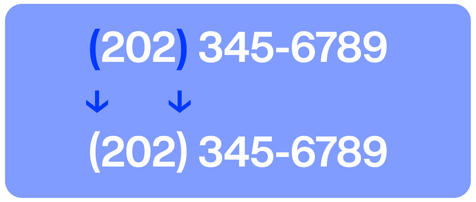
Parentheses, brackets and braces are normally designed to center vertically on the lowercase x-height. If you are enclosing all caps or lining figures the marks may need to be raised slightly.
Correct punctuation clarifies meaning, facilitates comprehension, prevents misinterpretation, enhances readability – and makes for good typography.


