Manual: Tips for Using Fonts in Logos
Font based logos can create a memorable visual identity and establish brand consistency. The problem is: sometimes fonts, right out of the box, can be forgetable, easily replicated and suffer from limited versatility.
Fonts of Distinction
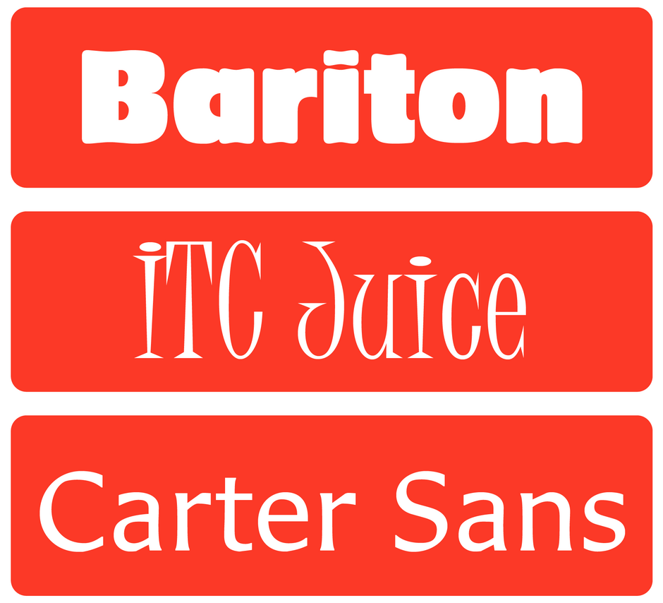
Some fonts, like Bariton™, ITC Juice™ and Carter Sans™, are distinctive, legible and can go a long way toward creating a unique brand. The thing is, you have to go looking for them. And, with over a quarter-million fonts in the MyFonts offering, that’s no small task. The good news is MyFonts provides great tools for narrowing your search.
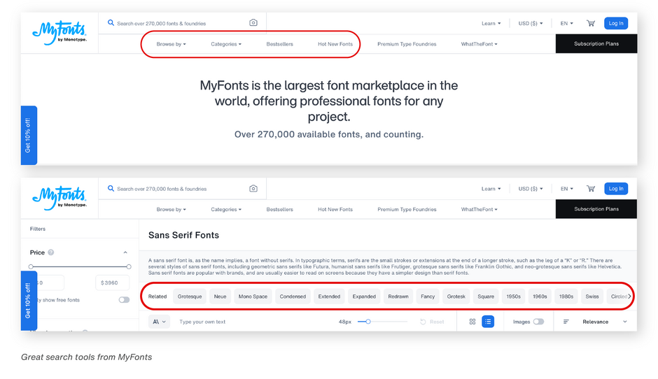
Start by clicking on one of the search filters at the top of the MyFonts home page. This will take you to a list of fonts with more filters to narrow your search even further. It takes a little time to find the perfect font for your logo but remember, your logo is one of the most important aspects of your brand and needs to have a long lifespan. It’s worth an investment of your time.
Glyph Gathering
With advent of OpenType, in addition to the standard glyph set many fonts now have swash and alternate characters. Check out the glyph palette on the MyFonts font landing page. You might discover that there is a perfect swash letter in ITC Bookman® or Benguiat Caslon, an alternate character in This Appeal or fancy ligatures in Palatino Sans® that would make your logo stand out from the crowd.

Valuable Variables
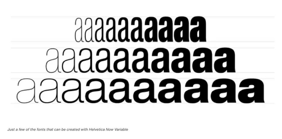
And don’t forget about variable fonts. Fonts like Helvetica® Now Variable will enable you to create just the right weight and proportion for your logo. It will give you over a million new Helvetica styles in one state-of-the-art font file. You can use it to make a custom design not available from static fonts. Chick here for more information on Variable fonts.
The Power of Two
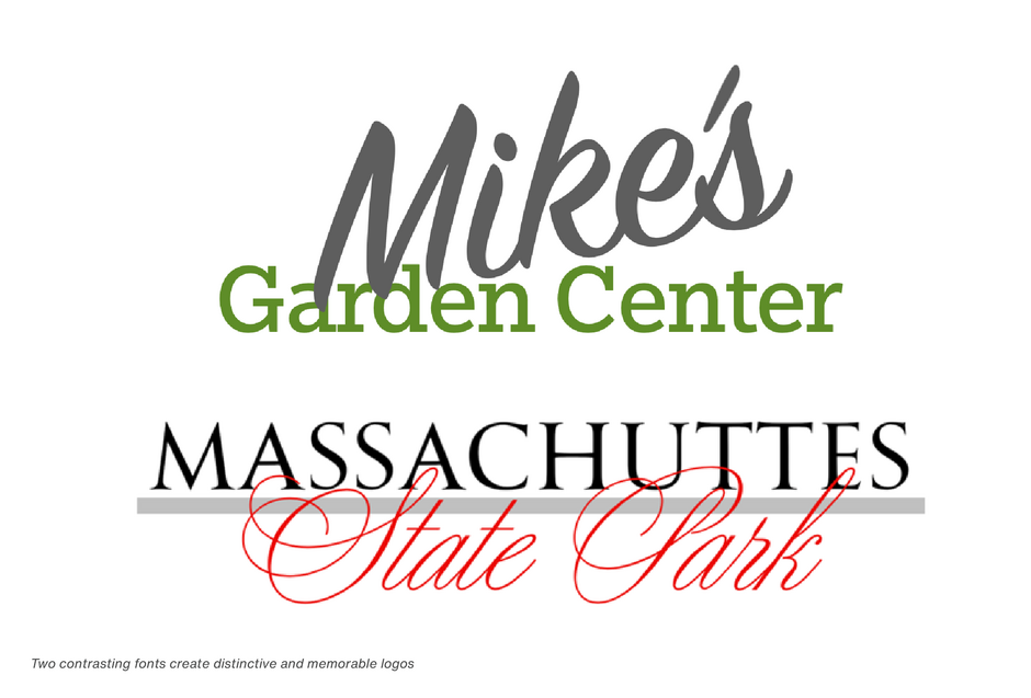
While three different fonts in a logo can easily look cluttered and are generally not recommended, two fonts that contrast strongly can create a distinctive and memorable logo.
Scaling for Size
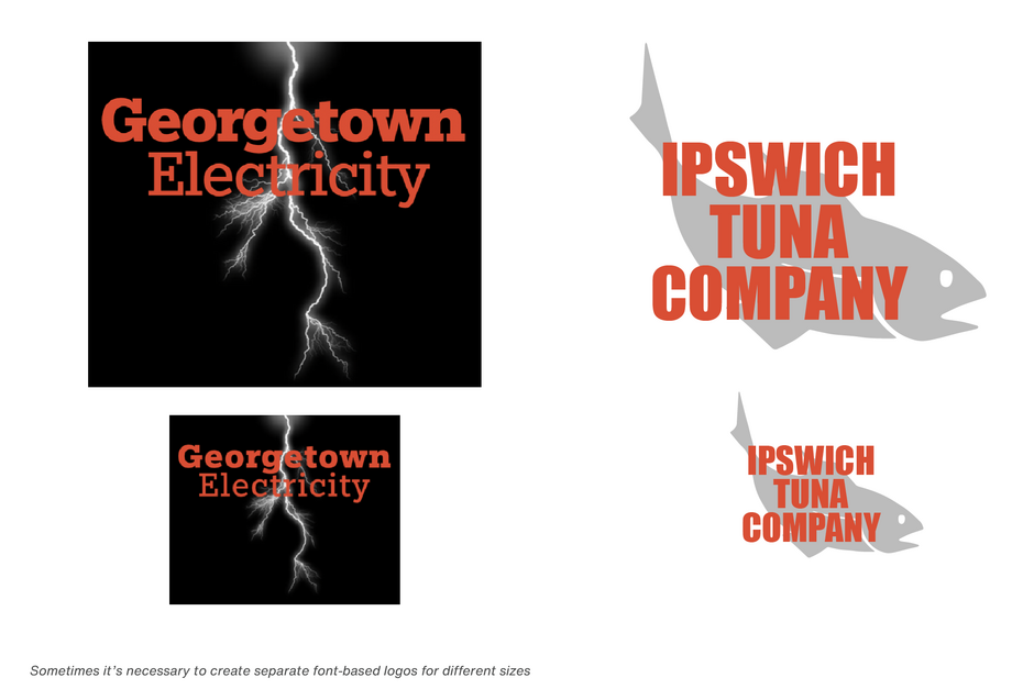
When it comes to logos, versatility is key. Logos appear in environments as varied as billboards, brochures, and business cards. Look to fonts that adapt well to different sizes. Avoid fonts with intricate details that may not translate clearly on small screens. Consider creating separate font-based logos for different sizes - one with added letterspacing for smaller displays. This, however, does not work for script fonts. Never letterspace scripts.
Take the time to choose the fonts for your logo, and build it with care. You won’t be disappointed.


