Type Trends: 2021 Q1 Trends by Katy & Milton
Katy Fischer, Executive Creative Director at TOKY
As a graphic communicator, your work needs to stand out in a heavily manufactured visual culture. You need to intrigue people, create art as well as utility and build consistent brand without it becoming static. Type can do this.
Milton Un, Design Director at Carmichael Lynch
Meet Katy and Milton
To find out how, we reached out to Katy Fischer and Milton Un – both judges in last year’s Communication Arts magazine’s Typography Competition.
Katy Fischer is a graduate of Drake University and moved to St Louis, Missouri shortly after valediction. Her first design gig there, was at a small “mom & pop” design studio. In 2004 she went to work at TOKY as a senior designer, and has been there ever since. The reason she’s been there so long? “TOKY has always given me the opportunity to do amazing work,” she explains. Clearly true. Katy is one of the country’s most awarded creatives.
Milton Un graduated from the Minneapolis College of Art and Design, and has worked in the Minneapolis area at several agencies. He was design director at Target Corporation before joining Carmichael Lynch, four years ago. “To me purpose and intention,” Milton says, “are the most important things to achieve in design.” He brings this vision to clients as diverse as Nike, Apple, ESPN, Adidas, Pentagram and Red Bull.
Like Minds
Not surprisingly, Katy and Milton are in-sync with what’s happening with type and typography today. They both say that sites like Instagram and Underconsideration are great places to view cutting-edge typographic design. They also see 70s nostalgia and Victorian typefaces as a significant direction. On the flip-side, they say that typographic wit, design authenticity and simplicity is becoming more important.
If you’re looking for 70s nostalgia and Victorian typefaces, a simple search on MyFonts will quickly reveal scores of designs like Data 70TM, RobertaTM and Rumble Brave Vintage Fonts.
Chobani® Effect
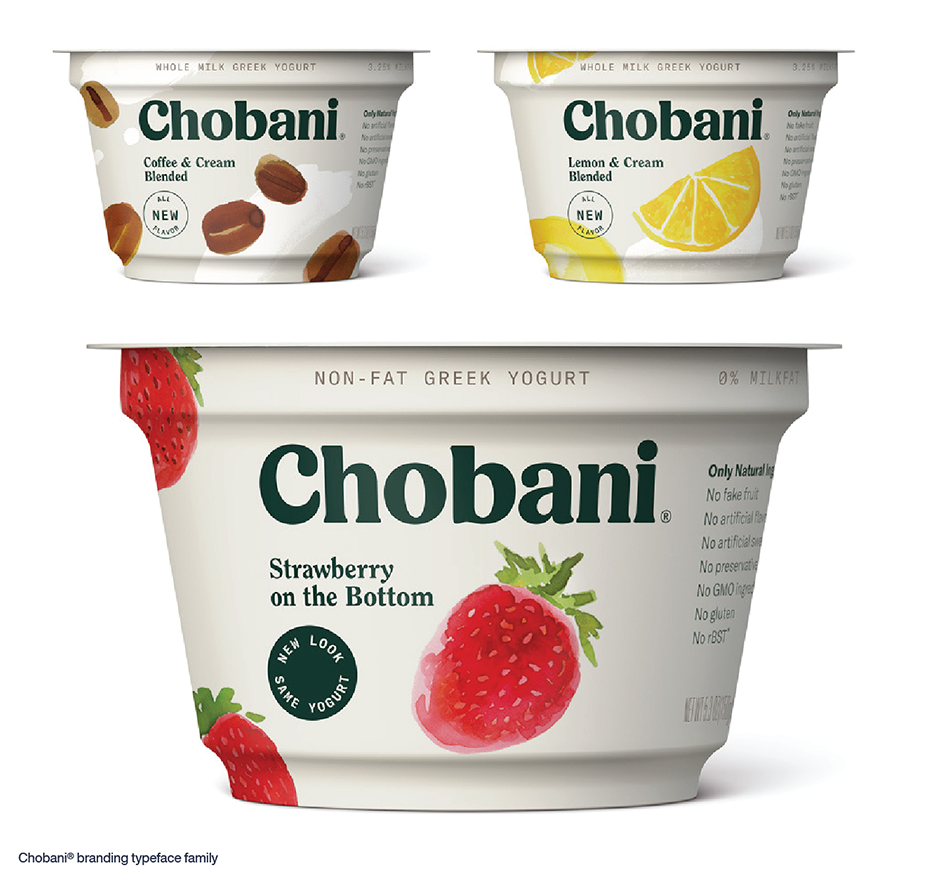
In addition, Katy and Milton both contend that something called the “Chobani® Effect” (a term Katy coined) is clearly driving a lot of typeface choices.
A little over three years ago, the folks at Chobani yogurt released a complete redesign of its branding – including new bespoke typefaces, to replace the existing designs. The typefaces could be described as the love child of Windsor™ and ITC Souvenir®. According to Katy, “The Chobani typeface family is approachable and friendly – but not sappy. It’s a little quirky. If it were a person, it would be someone you’d want to hang-out with.” While Windsor and Souvenir date back to the early 20th century, there are plenty of new takes on this genuinely friendly vibe. Boston Angel, Gazpacho, Quincy CF and Recoleta are just four of a bevy of Chobani Effect typefaces available from MyFonts.
Milton echoes Katy’s thoughts and suggests a couple of other designs. “For a while now there’s been a trend of warm and friendly fonts and graphic design in fashion and branding that I’ve enjoyed. Designers and typographers looking to the fun of Cooper Black™ and Hobo™ variants, and expressive typography.”
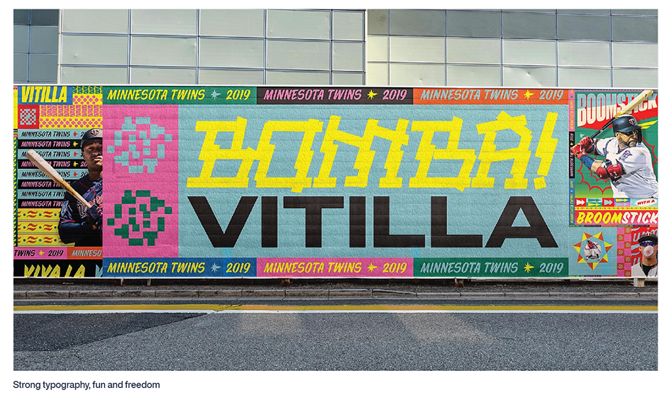
“The Twins mural is really a mixture of all this,” Milton continues. “We took strong typography that is synonymous with sports and hard work, and mixed it with a spirit of fun and freedom. We made it textural, abstract, bouncy and playful at the same time. Letterforms became illustrative elements to merge and stretch to push messaging that might be boring, and gave them a new life. I think there’s a spirit in there that is birthed from a few pasts, and ultimately created something new.”
Wit and Simplicity
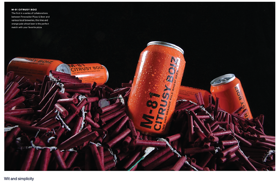
“We like to create typography with wit and simplicity,” says Katy. “The M80 Project for a Firecracker Pizza & Beer is a perfect example. Too often, beverage branding tries to tell a story through overdesign and illustration. The branding of M80 beer says, ‘I’m a can of beer that looks like a stick of dynamite. It’s not trying too hard – and it has wit.”
Lubalin and Carnase Influences
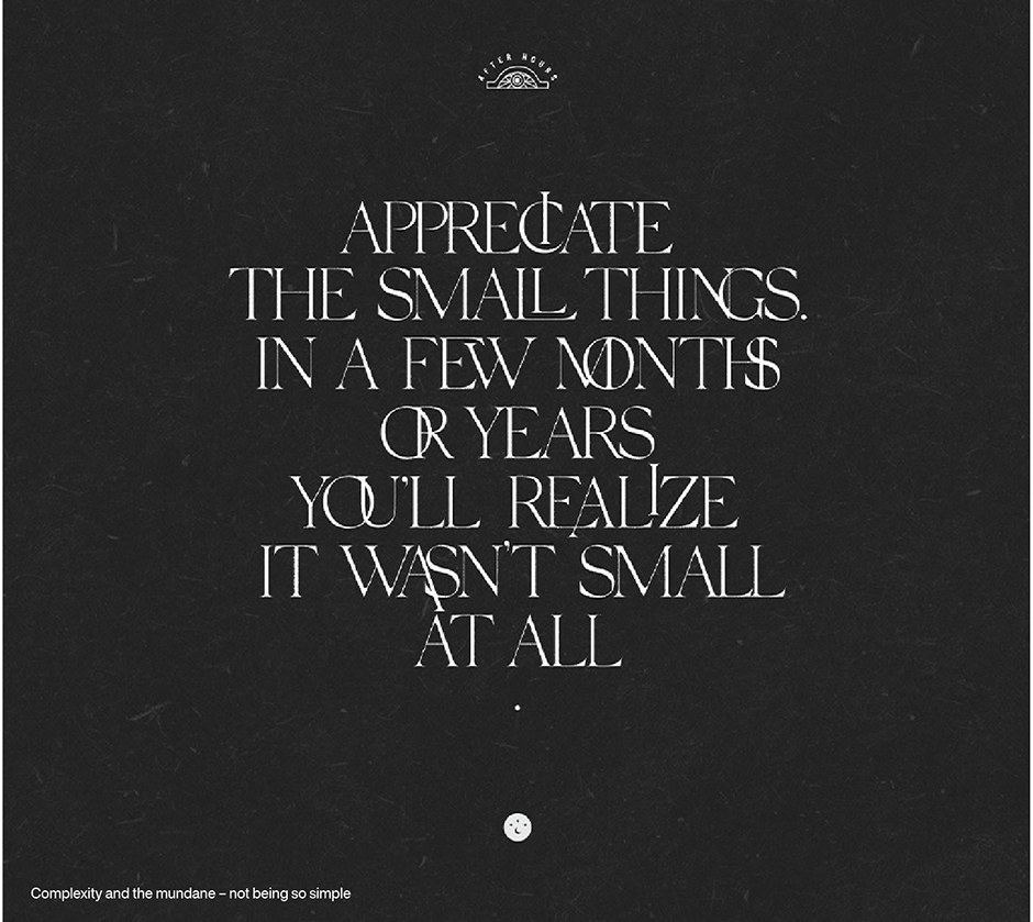
Type as image, type as texture, type that frames, typographic compositions reminiscent of old badge work, typographic compositions reminiscent of psychedelia… there’s really so many ways we’re seeing designers use type,” explains Milton. “At the same time, there’s some really beautiful simple use of type as well…minimal and airy. The typographic play in the Small Things poster is really an illustration of complexity and the innerworkings of the mundane not being so simple. The phrase itself is a calming life lesson; but the way the letterforms intersect, affect, and rely on each other is symbolic of how the universe works to make those moments come to life.”
Branding and Super Families
“We always look for super families when it comes to branding projects,” says Katy. “Even if we only use just a few cuts from the family. Large typeface families give our clients more flexibility and latitude when it comes to new applications for the brand – which always happens.”
“We also lean toward workhorse families that are accessible and have a lot of variety,” she continues. “If the design has too much personality people get fatigued. Not a good thing with a brand.”
Look to families like Classic Grotesque™, Futura® Now, Helvetica® Now and Macklin™ as excellent choices for large branding projects.
The Bottom Line
“My choices in typefaces,” says Milton, “depends on what the work is needing. This need could vary between utility and emotive – or somewhere in between. Often times the choice is guided somewhere in the mix of what the typeface does and represents. Sometimes its clarity and clean boldness. Sometimes it’s mystery.”
“At TOKY,” says Katy, “we always strive for design and typography that has personality, is authentic, and speaks to a brand’s core idea.”
Shoot for one of the above – or a combination of the two – and you can’t go wrong.
Download a pdf version of the Type Trends article and add it to your bookmarks.


