Fonts from Hoefler&Co.

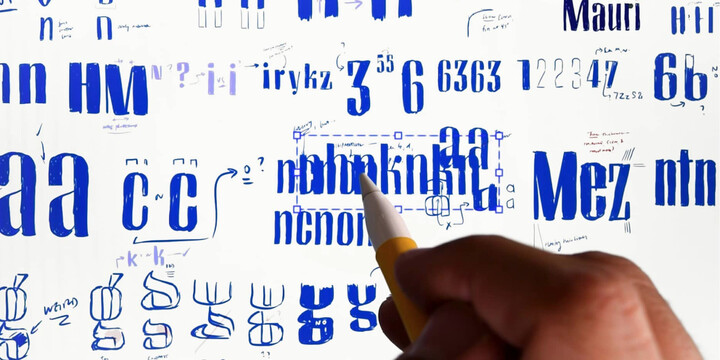
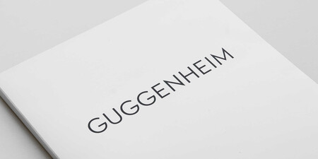
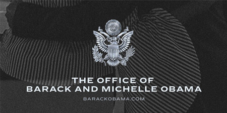
Famous for designing long-lived typefaces marked by high performance and high style, Hoefler&Co creates the fonts that give voice to the world’s foremost institutions, publications, causes, and brands. With a library of 1,500 fonts designed for print, web, office, and mobile fonts, Hoefler&Co is everywhere. Their typefaces shaped the presidential campaigns of Barack Obama and Joe Biden; they’re on the cornerstone of One World Trade Center and on every iPhone ever made. They serve brands from Delta Air Lines to Tiffany & Co., publications from Harper’s Bazaar to The New York Times, institutions such as the Guggenheim Museum, The Public Theater, and New York University, and non-profit organizations including the Natural Resources Defense Council, the Southern Poverty Law Center, and The Peconic Land Trust.
Popular Hoefler&Co. fonts.
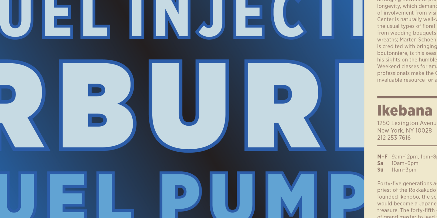
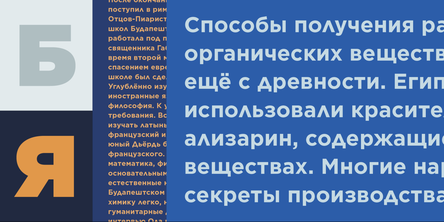
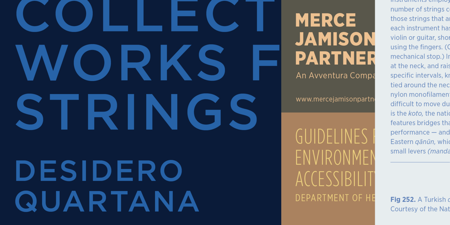
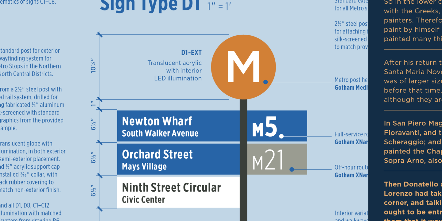
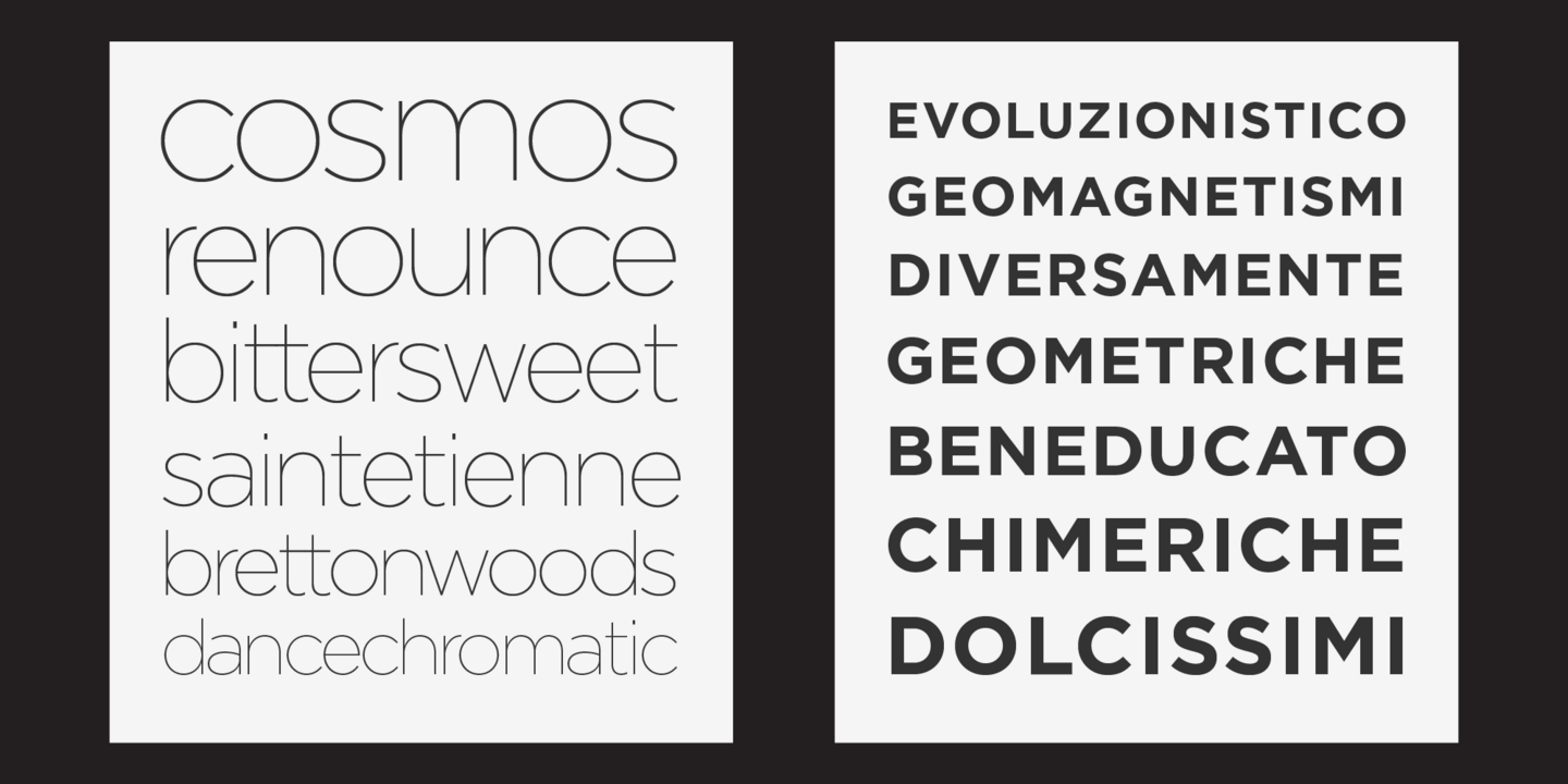
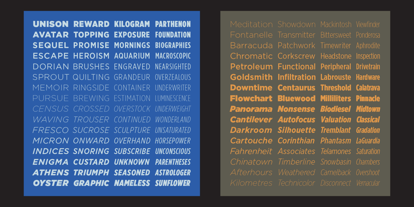
Gotham is a celebratory nod to the attractive and unassuming lettering of the city. New York is teeming with such letters, handmade sans serifs that share a common underlying structure, an engineer’s idea of “basic lettering” that transcends both the characteristics of their materials and the mannerisms of their makers. These are the cast bronze numbers that give office doorways their authority and the markings on cornerstones whose neutral and equable style defies the passage of time. They’re the matter-of-fact neon signs that emblazon liquor stores and pharmacies, and the names of proprietors plainly painted on delivery trucks. These letters are straightforward and non-negotiable yet possess great personality (and often are expertly made). And although designers have lived with them for more than half a century, they remarkably went unrevived until 2000, when we introduced Gotham.
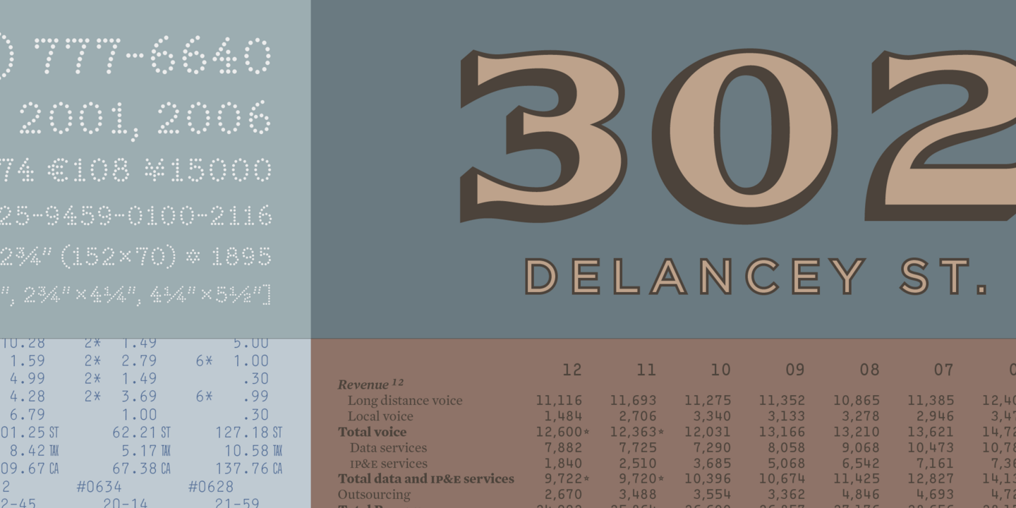
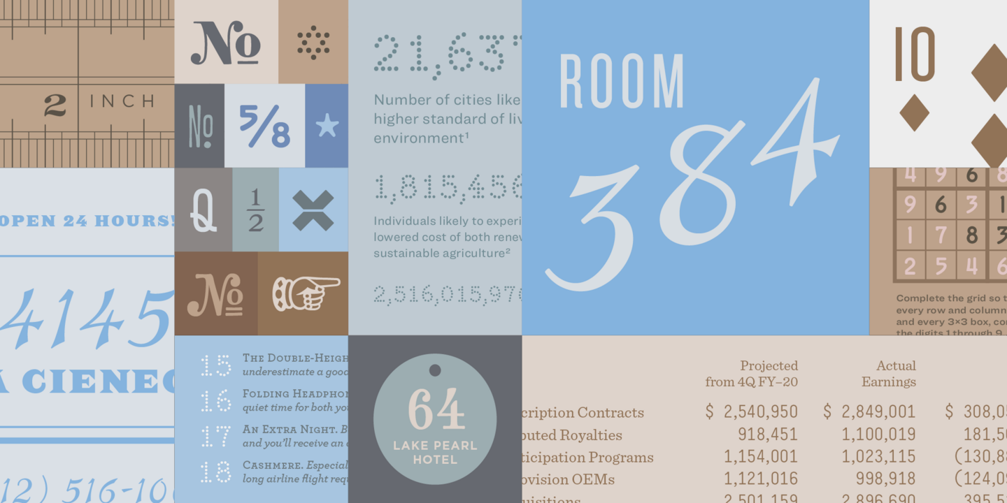
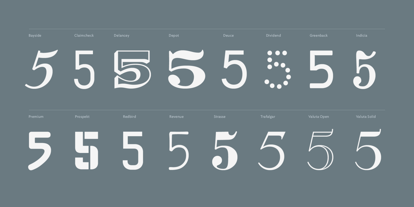
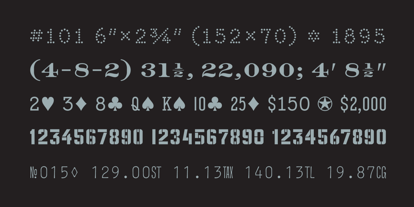
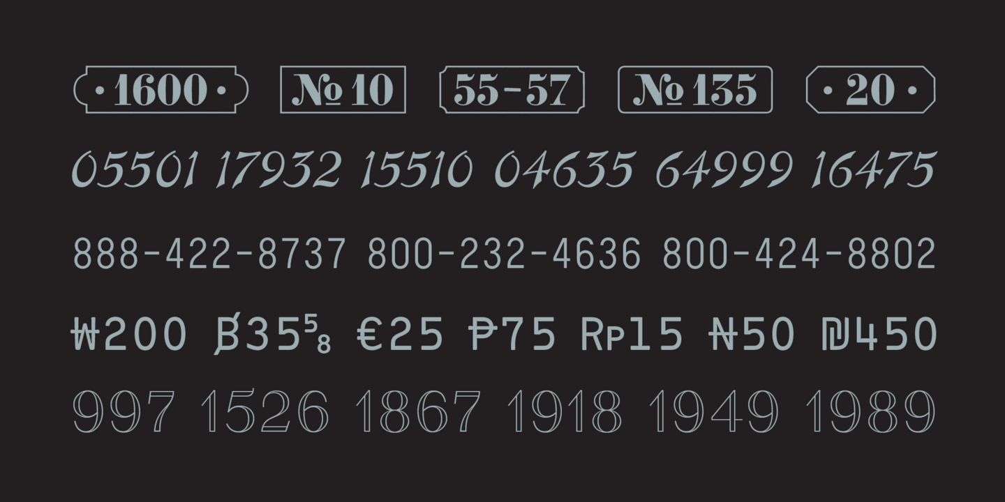
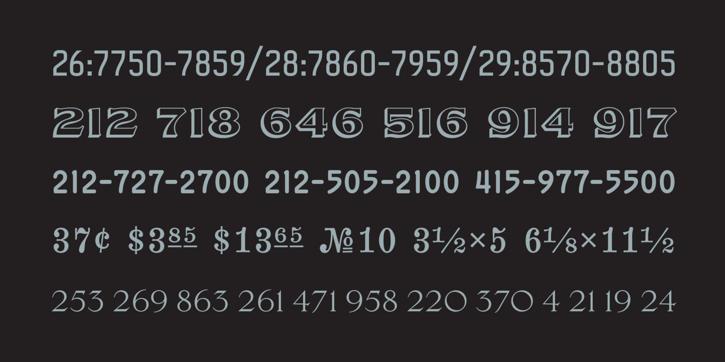
Every year, Pentagram chooses twelve beloved typefaces for its iconic Pentagram Calendar. Traditionally, the calendar features work by typographers past and present, from timeless standards like Garamond and Bodoni to modern classics such as Knockout and Gotham. In 2006, Pentagram broke with tradition and selected twelve typefaces from the same designer: H&Co, who created fifteen original fonts for the calendar and named the beloved collection, “Numbers.”
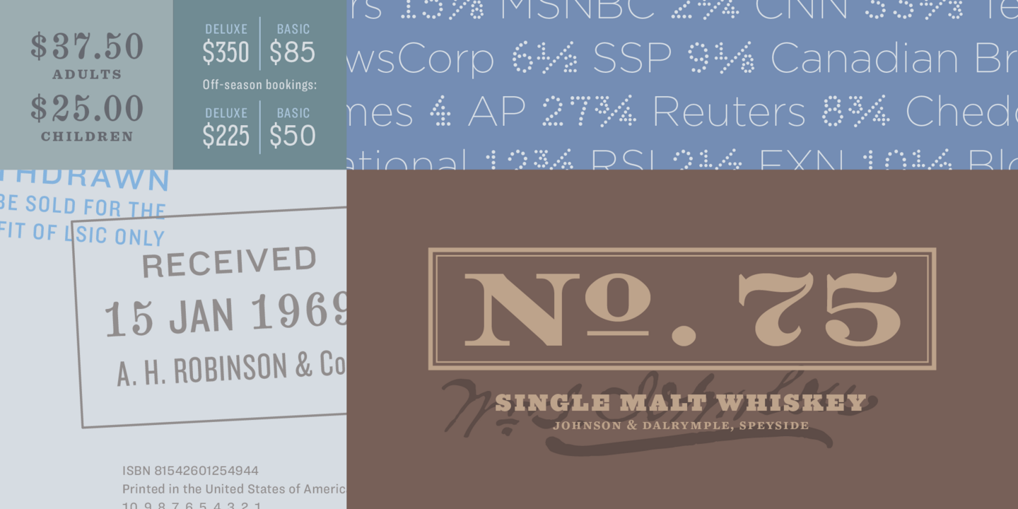
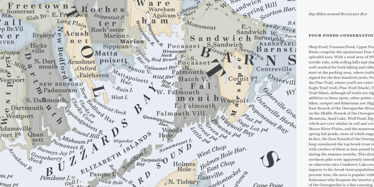
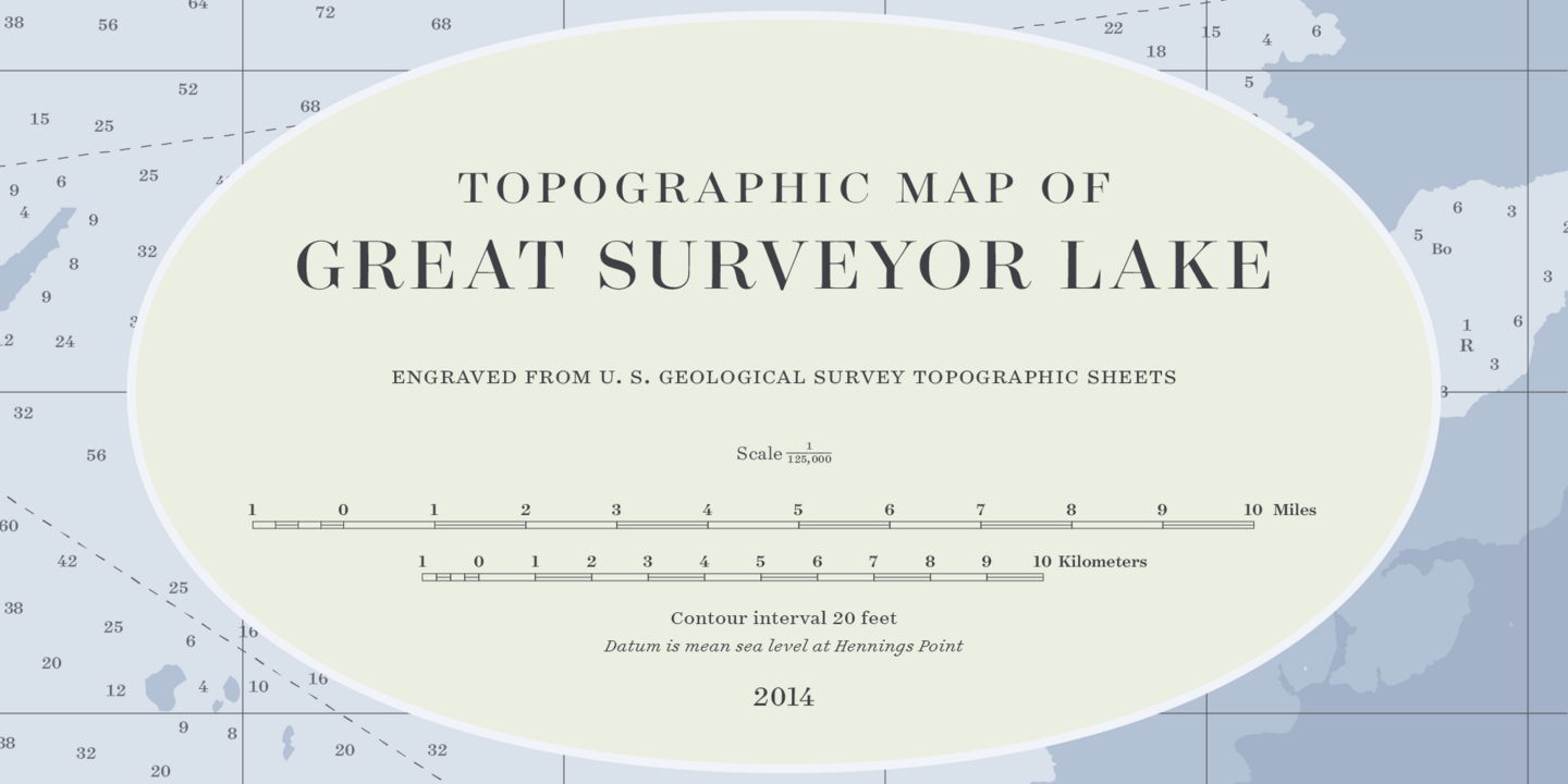
Surveyor’s style of lettering garnered inspiration from the early nineteenth century—the material properties of copperplate engraving and cartographic needs. A letter with compact proportions, delicate serifs, and a sinewy italic designed to follow rivers and coastlines, map lettering invited endless variation to help distinguish different kinds of data. A map that used italics for rivers and canals might use its roman for churches and villages, small capitals for bays and harbors, and a grand, sweeping arc of italic swash capitals for the names of the oceans. Inch for inch, few things have ever matched engraved maps for the density of their information, the range of their typographic vocabulary, or their pure visual delight.
Fonts in use.

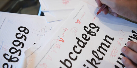
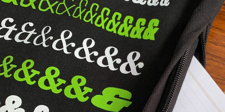
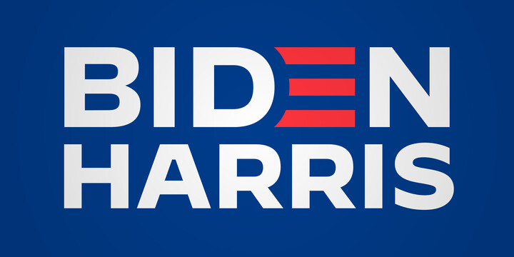
Hoefler&Co.

Hoefler&Co is the first type foundry ever to be honored by the National Design Awards at the White House. Their work is the subject of an Emmy-nominated episode of the Netflix documentary series Abstract: The Art of Design. As permanent collections of both the Smithsonian Institution and the Museum of Modern Art in New York, Hoefler&Co typefaces will live on forever.

Creative Type Director
Sara Soskolne
Sara Soskolne is a Creative Type Director and designer. As a reformed bookworm, her deepest inspiration as a typeface designer is the experience of reading, and her abiding interest is in creating typefaces which not only serve but enrich that experience. Originally a graphic designer, Sara’s increasing fascination with type eventually drew her to study typeface design at the University of Reading in the UK, and then to practice it at Hoefler&Co.

Advanced Font Engineer
Colin Ford
Colin is an advanced font engineer based in New York. He is a graduate of the Type and Media masters program at the Koninklijke Academie van Beeldende Kunsten (KABK) and the Maryland Institute College of Art (MICA) undergraduate program before that. Over the past decade as a type designer, he has lectured and taught workshops at the Atelier National de Recherche Typographique, the Cooper Union, MICA, and the Letterform Archive. He teaches a course in font production for the Type@Cooper Extended Program.

Type Designer
Jordan Bell
Jordan Bell is a letterer and type designer at Monotype. He is fascinated by handwriting and its effect on modern type design as well as early American typefounding. Originally from Texas, Jordan received a BFA from Abilene Christian University and then worked as a graphic designer in Santa Fe, NM before attending the MATD program at University of Reading in the UK to further his knowledge in design history, graphic communication, and typeface design.
