Fonts from Monotype

The Monotype Studio is a collaborative, passionate group of renowned designers from all over the world. From the timeless classics that bring a comforting familiarity to the futuristic fonts that form the words on our screens, much of the Monotype Studio’s work is the very type that decorates our day-to-day lives.
Popular Monotype fonts.
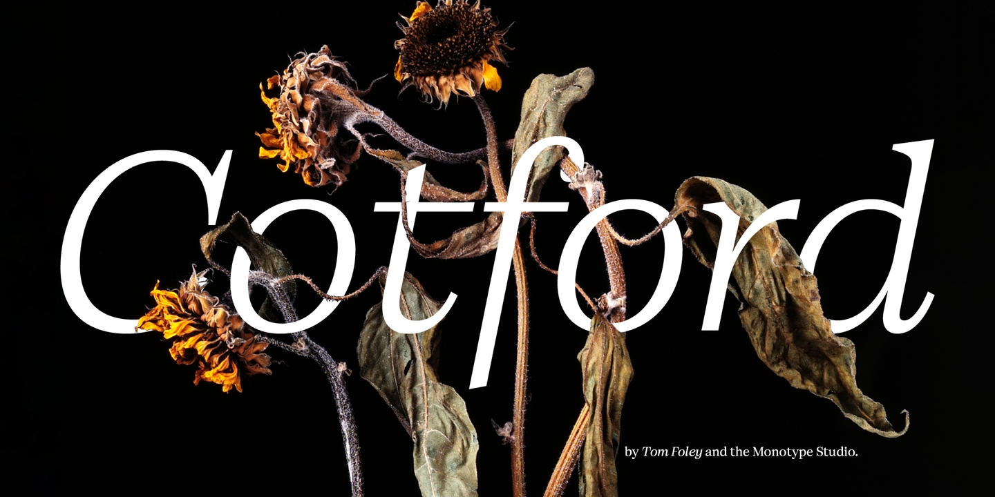
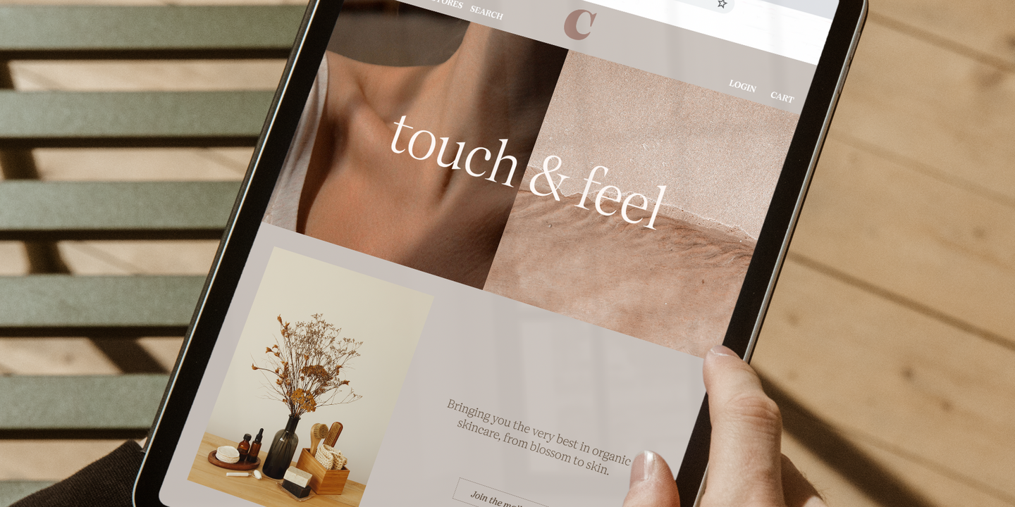
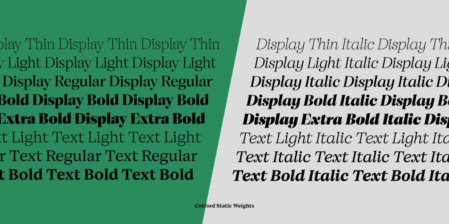
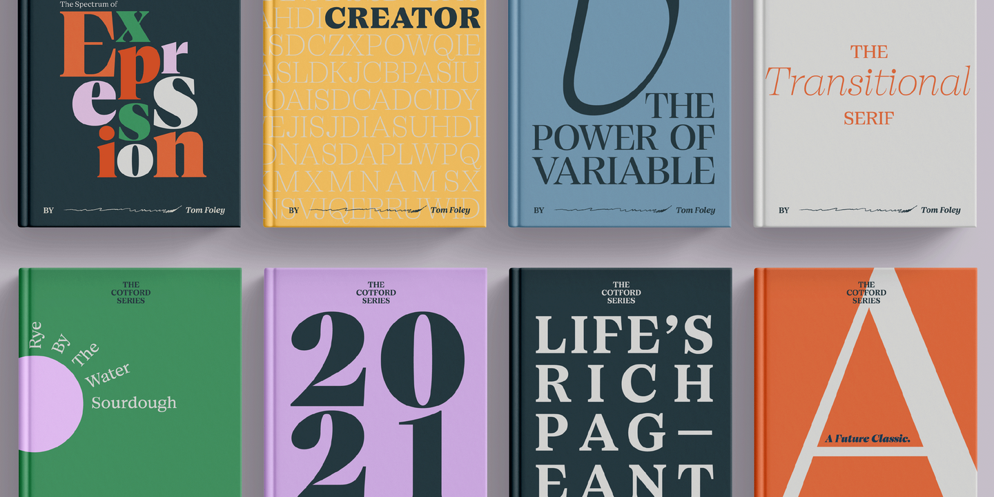
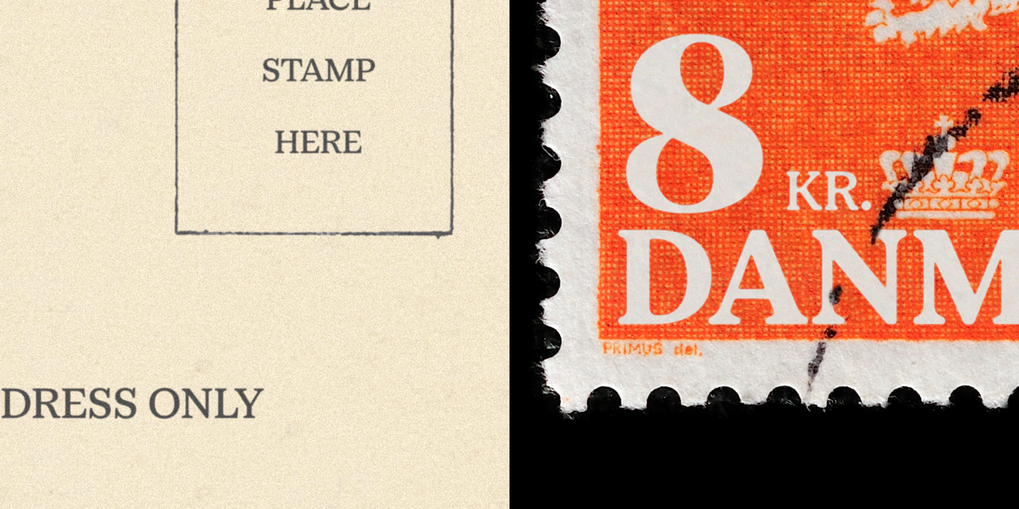
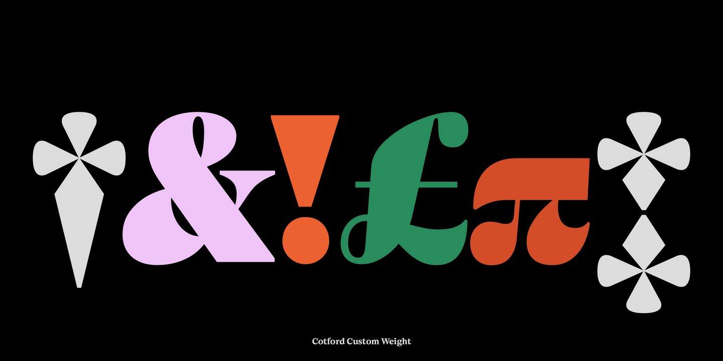
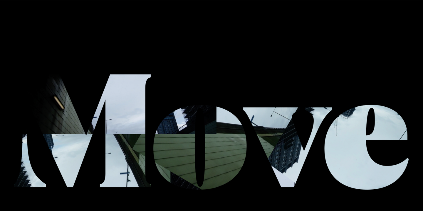
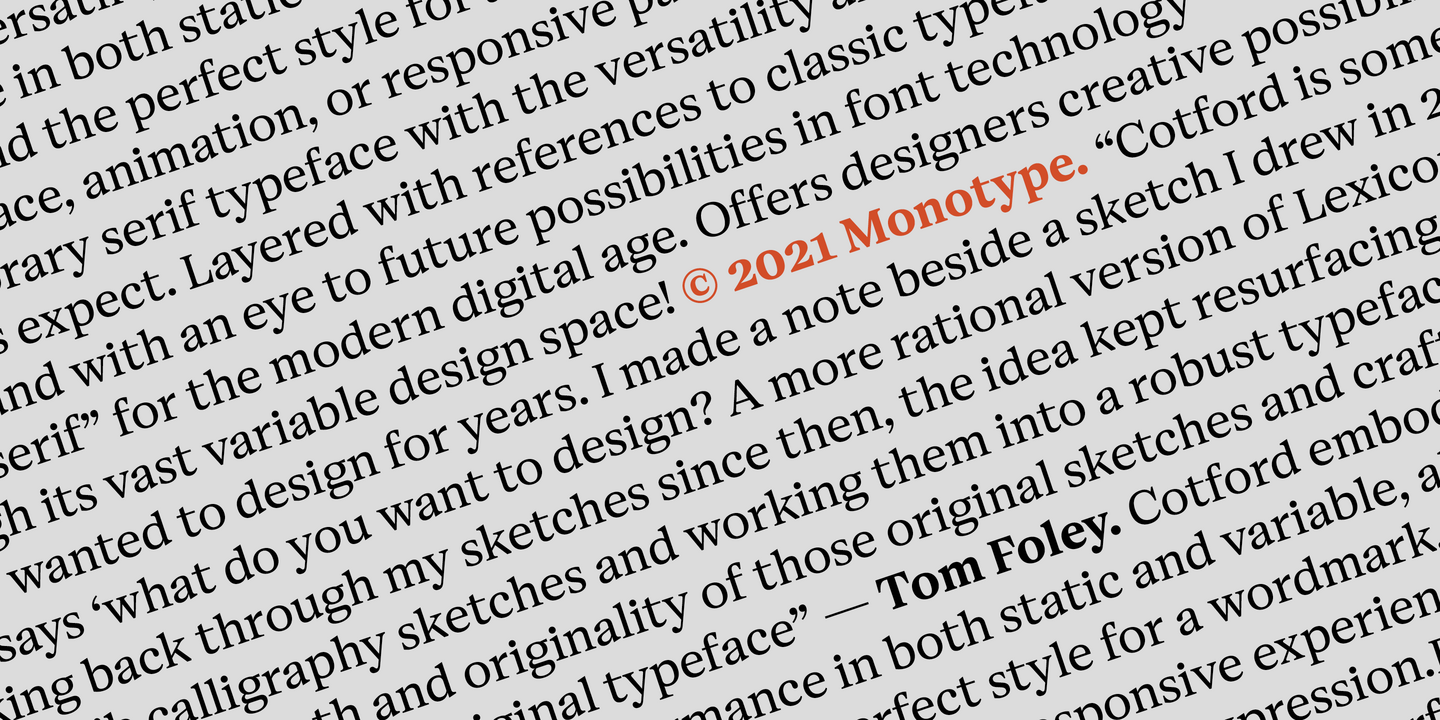
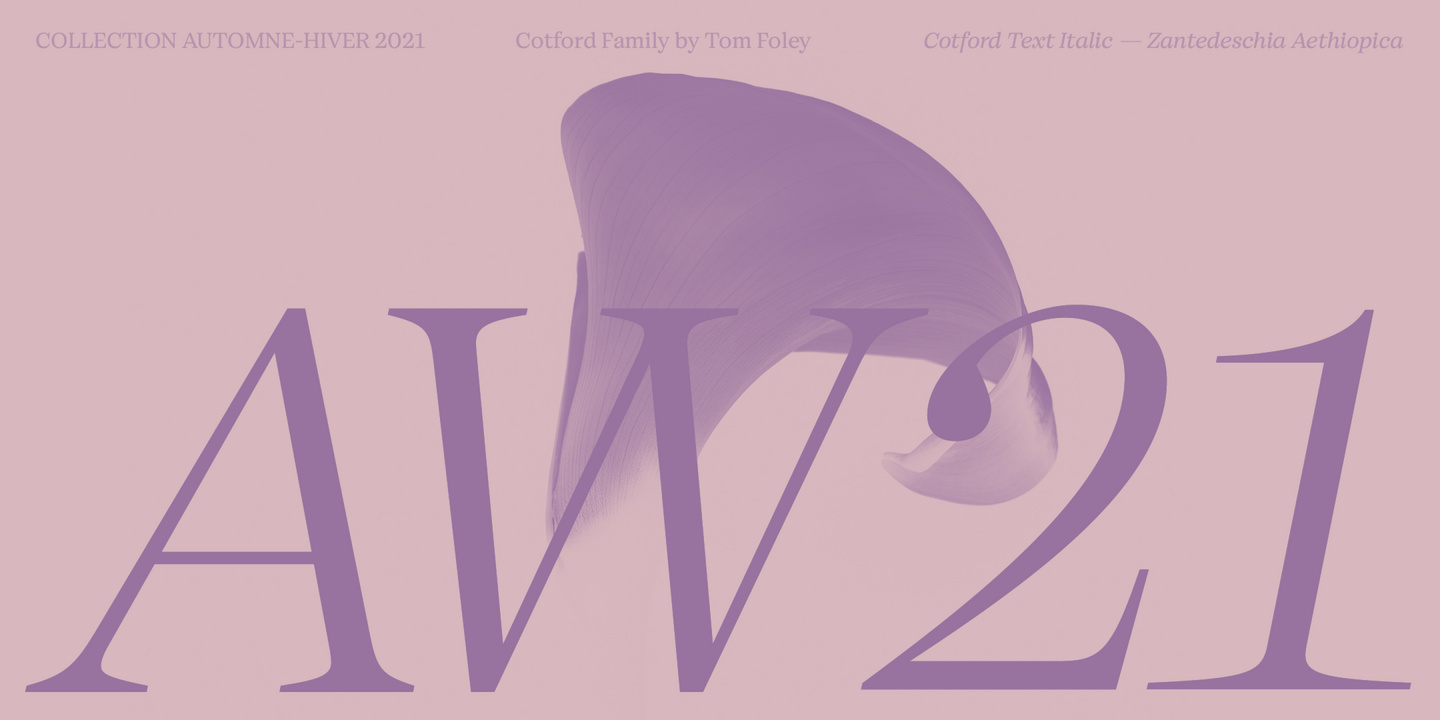
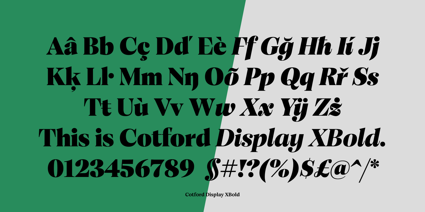
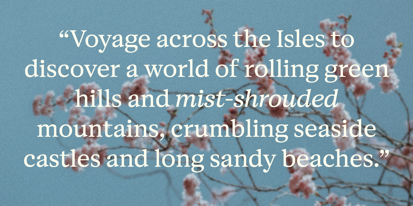
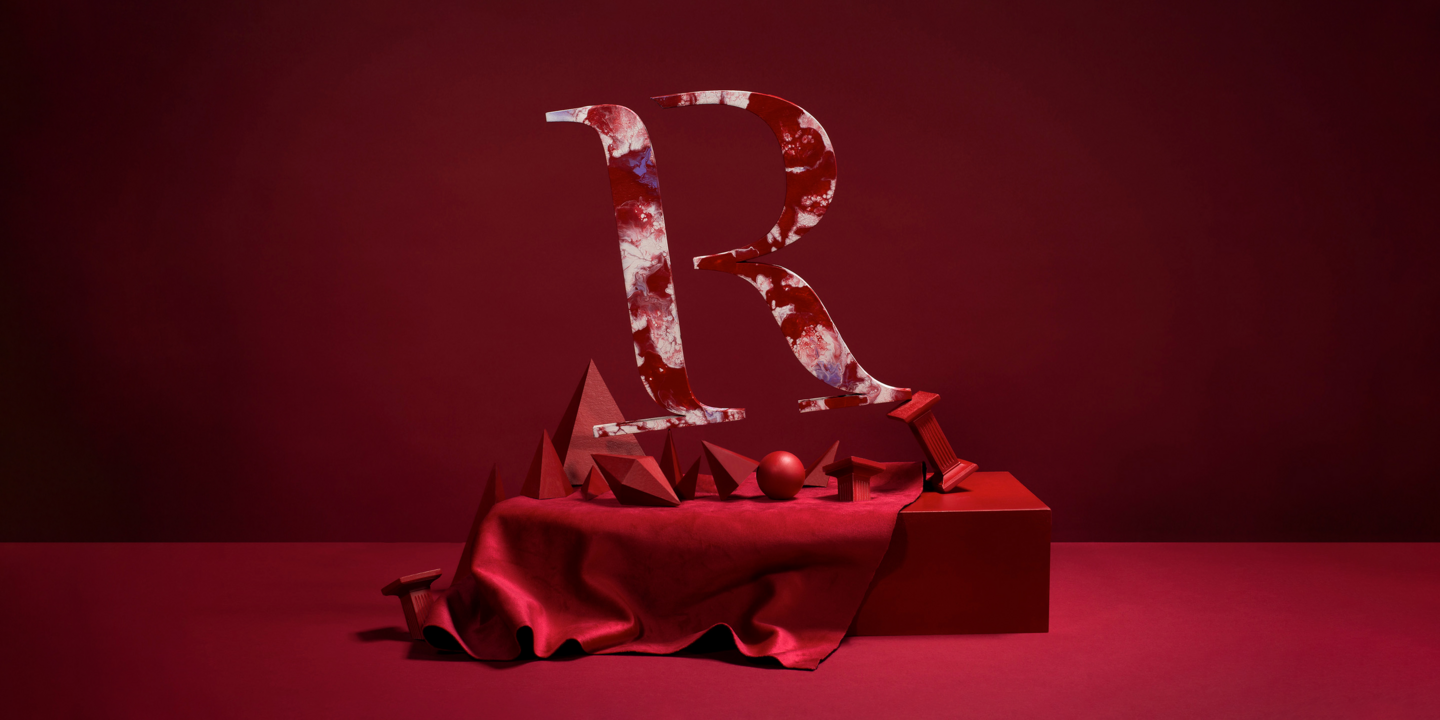
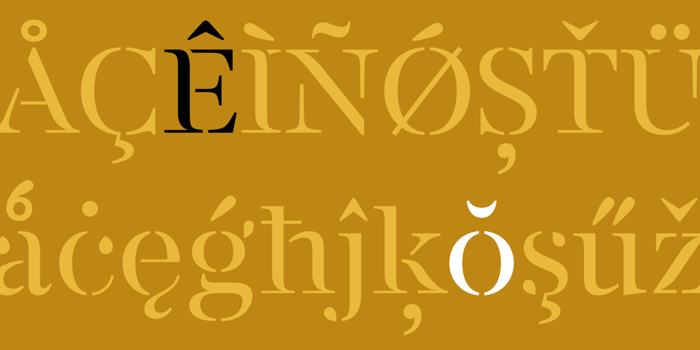
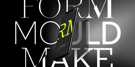
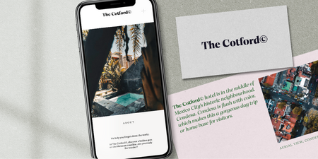
New from the Monotype Studio, Cotford is a contemporary serif from Creative Type Director, Tom Foley. Dynamic, adaptable, and surprising—Cotford is a languid serif that ranges from delicate thins, bending and reaching like flower stems, to bold heavy weights that command the page and screen with confidence and vintage charm. And as a Variable font, Cotford allows designers to explore and refine the design almost endlessly, unearthing its many visual tones and hidden secrets.
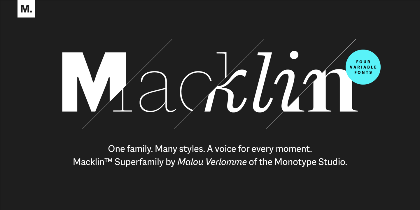
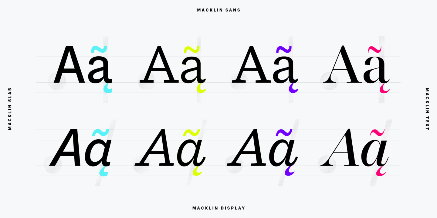
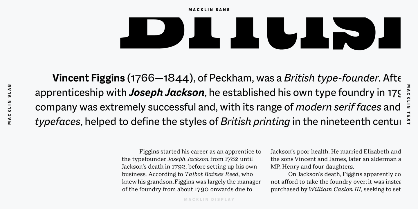
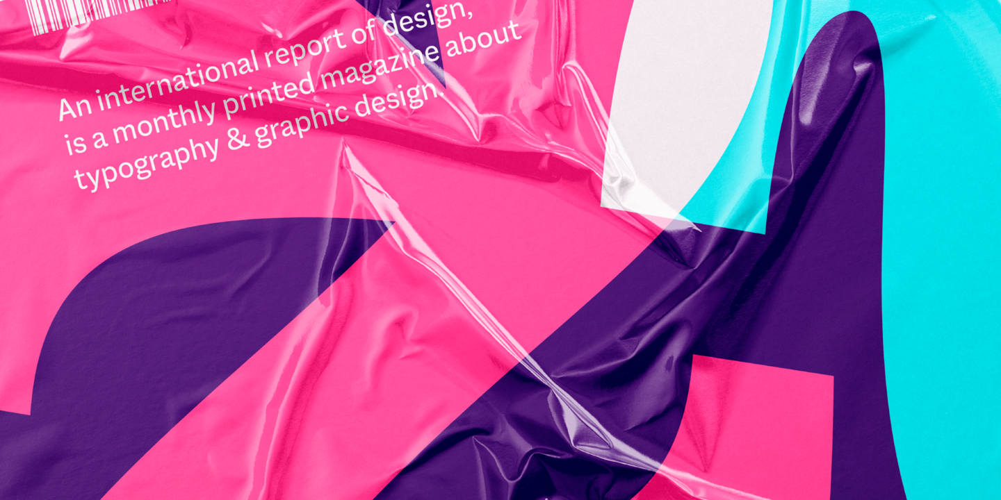
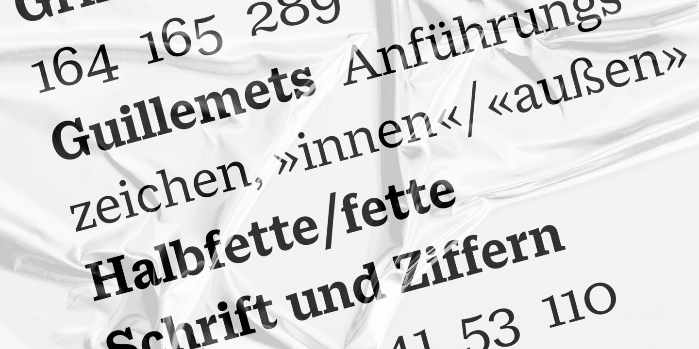
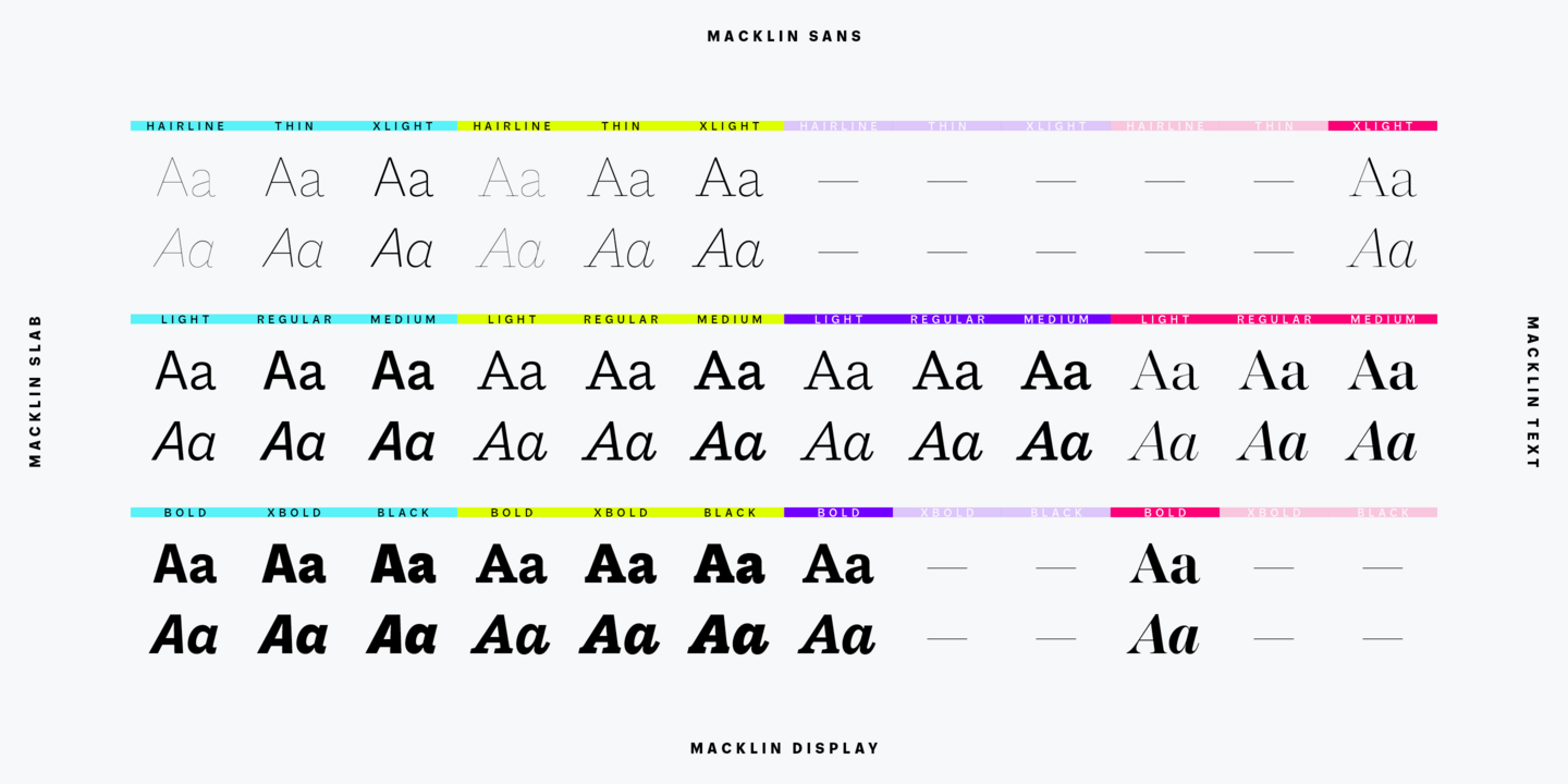
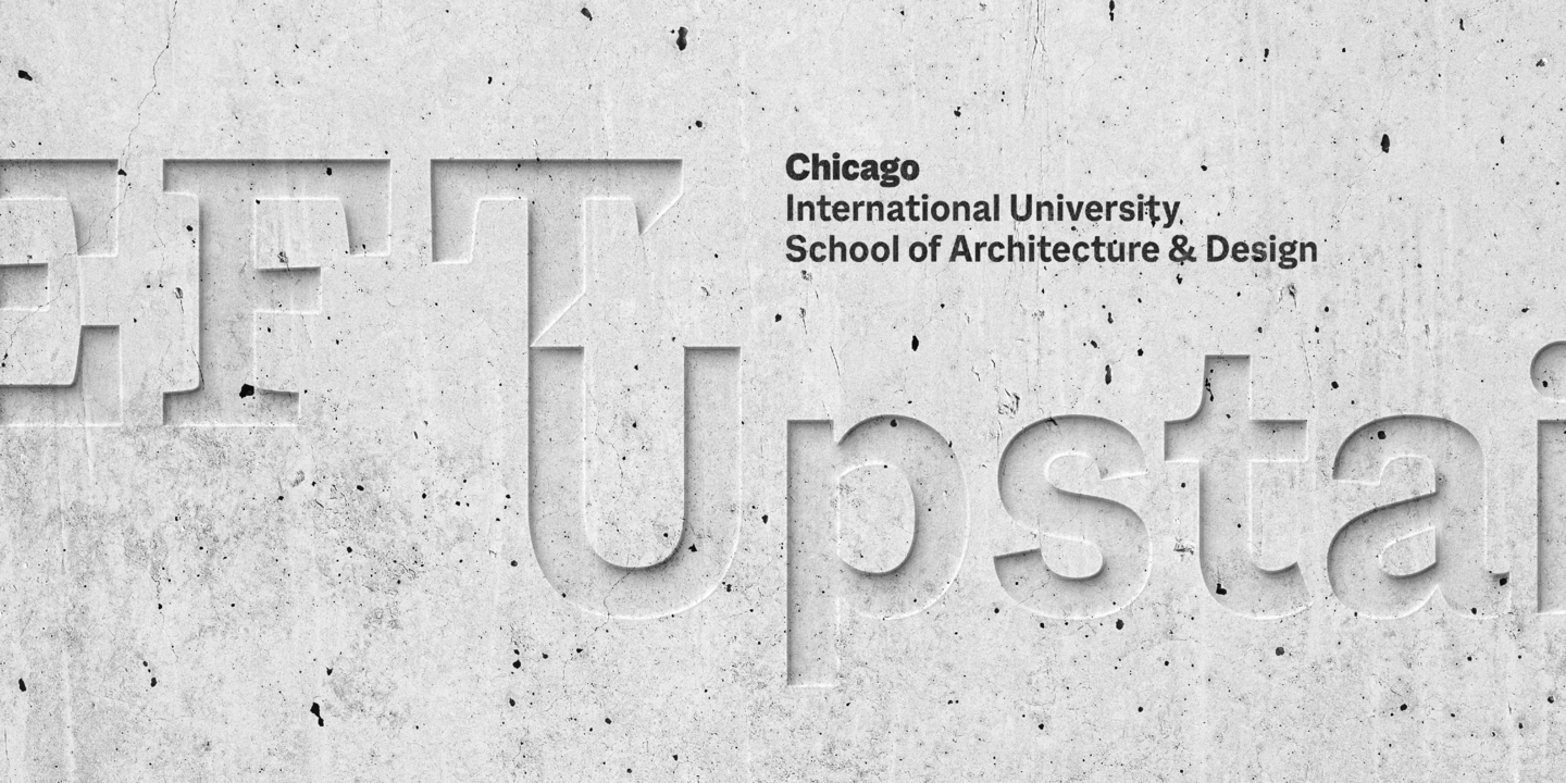
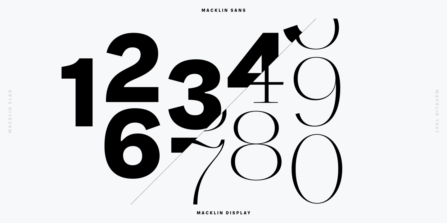
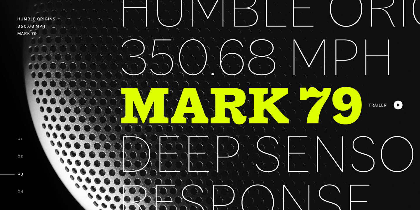
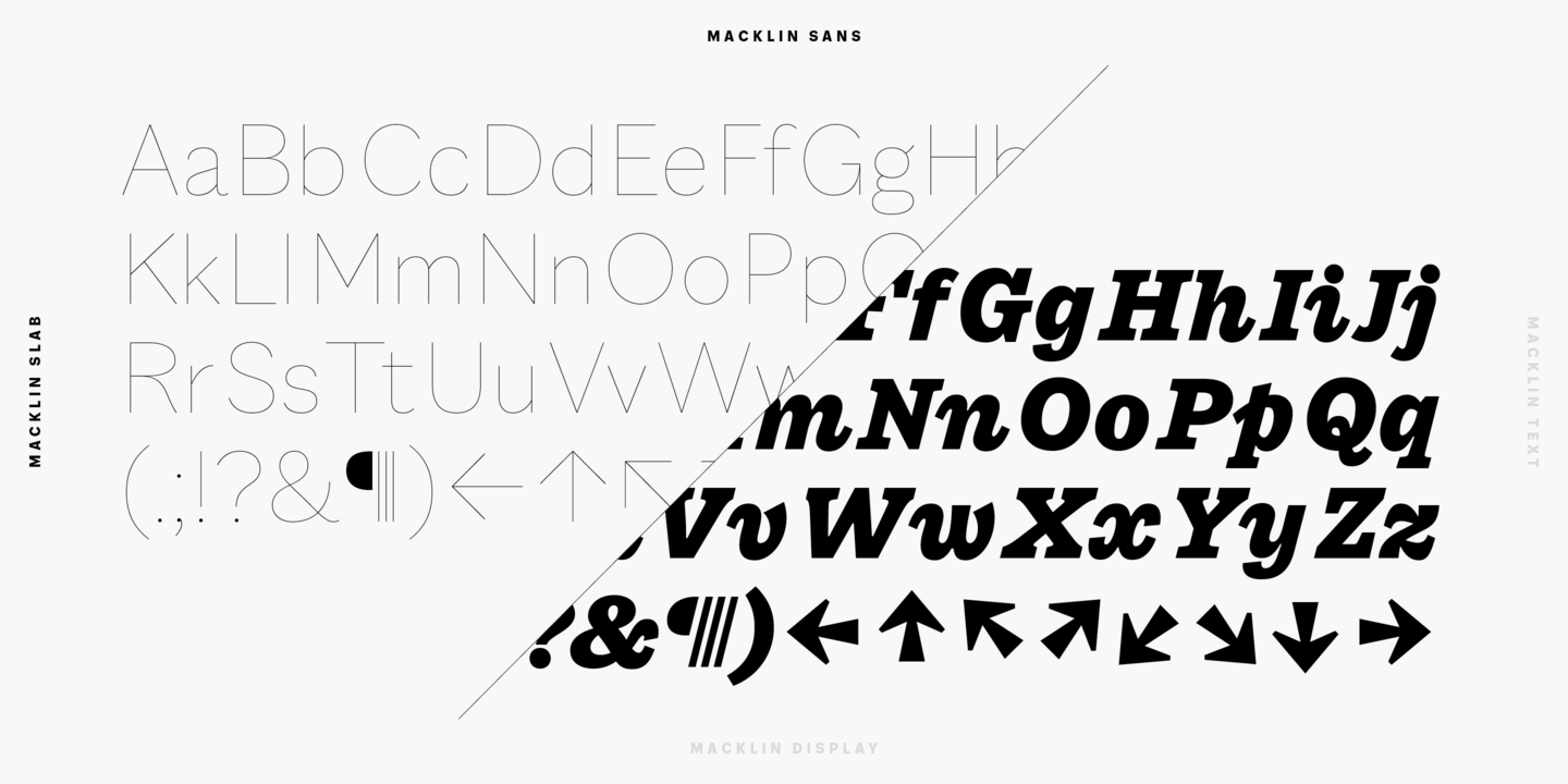
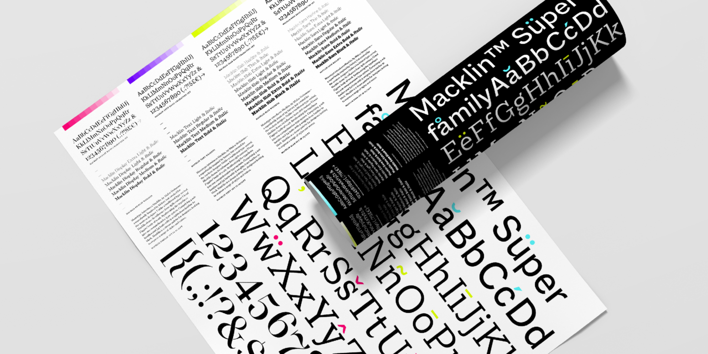
Designed by Malou Verlomme of the Monotype Studio, Macklin is a superfamily, which brings together several attention-grabbing styles. Macklin is an elegant, high contrast typeface that demands its own attention and has been designed purposely to enable brands to appeal more emotionally to modern consumers. Macklin comprises four sub-families —Sans, Slab, Text, and Display— as well as a variable. The full superfamily includes 54 fonts with 9 weights ranging from hairline to black.
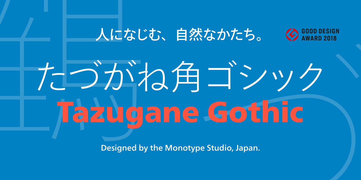
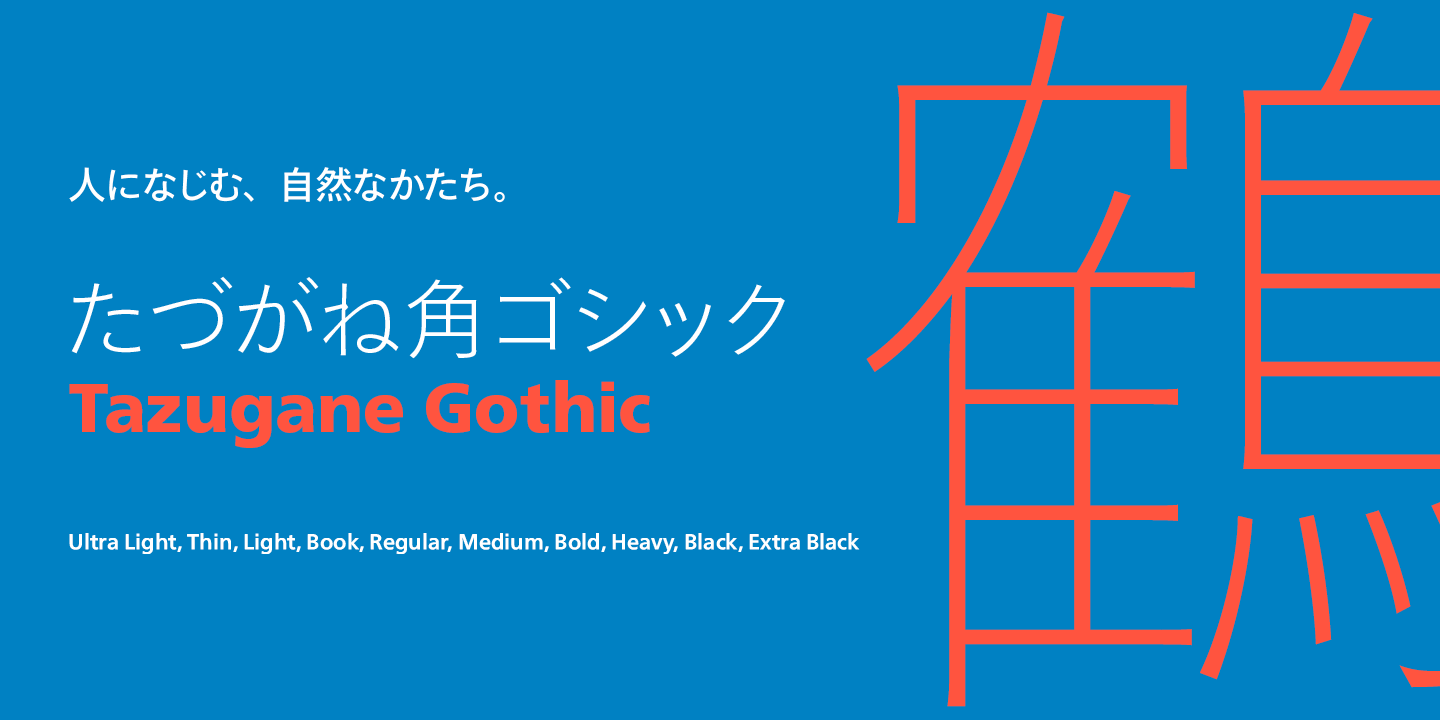
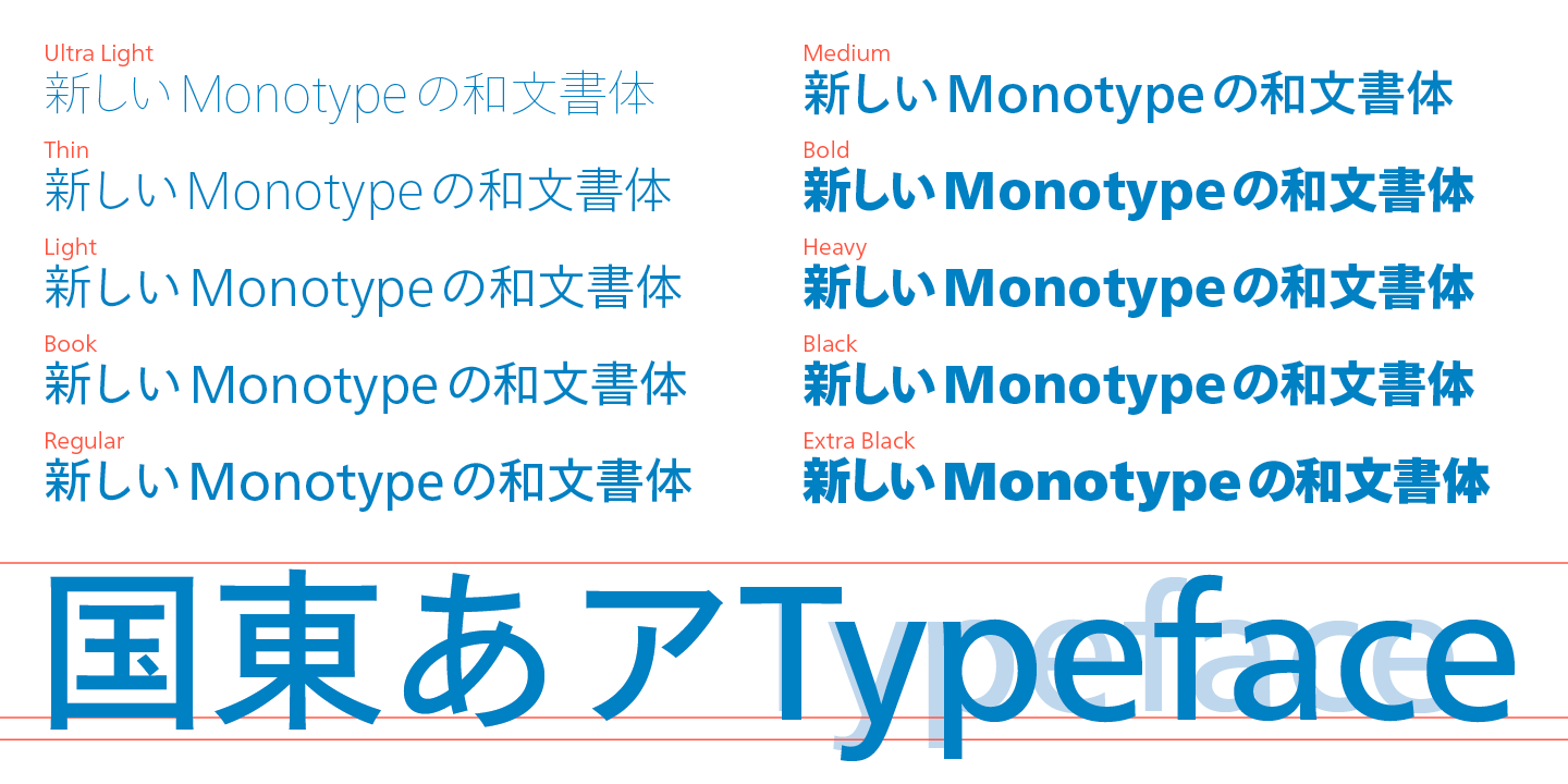
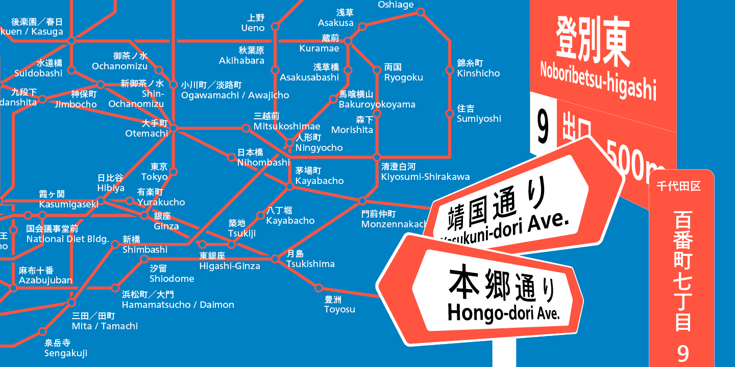
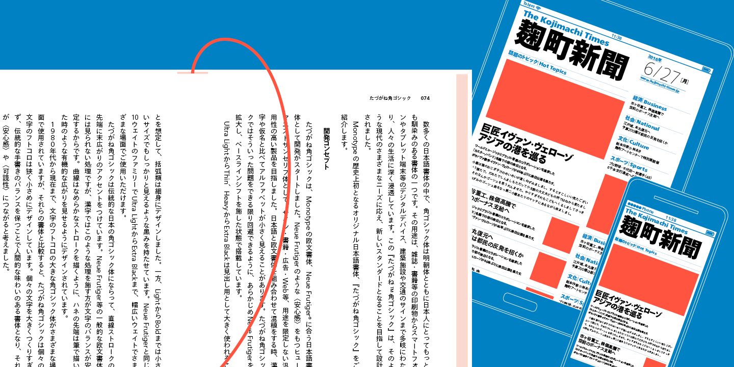
The Tazugane Gothic typeface family is Monotype’s first original Japanese typeface. Designed by Akira Kobayashi, Kazuhiro Yamada, and Ryota Doi of the Monotype Studio, the Tazugane Gothic typeface offers ten weights and was developed to complement the classic Latin typeface, Neue Frutiger. The design of the Tazugane Gothic typeface balances an original, humanistic style with elements of traditional Japanese handwriting. The two typefaces work together in a natural, seamless, and adaptable manner so that Japanese and Latin texts can be used side-by-side. This allows for a wide range of applications, including use in magazines, books, and other print media; on digital devices; in branding and corporate identity systems; and in signage for buildings, highways and mass transit.
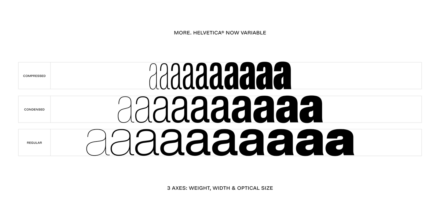
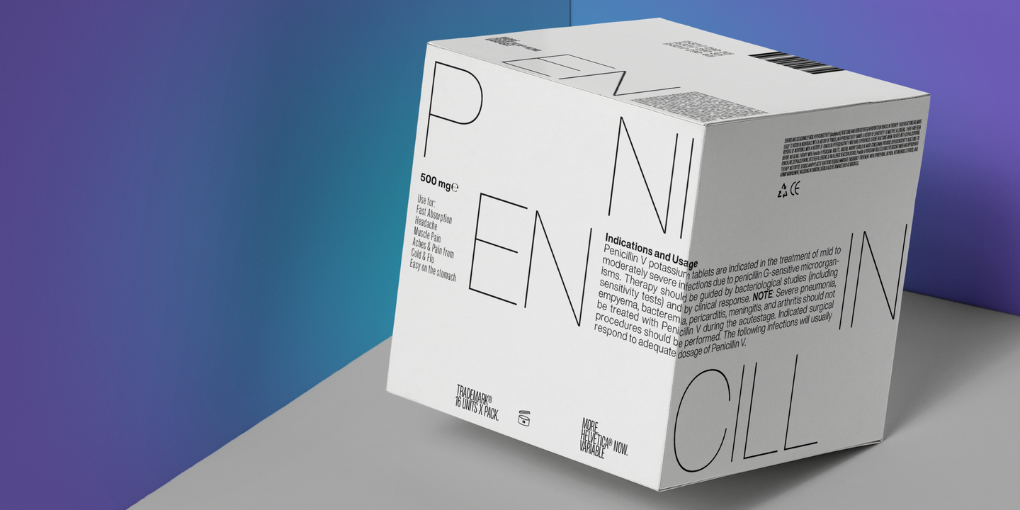
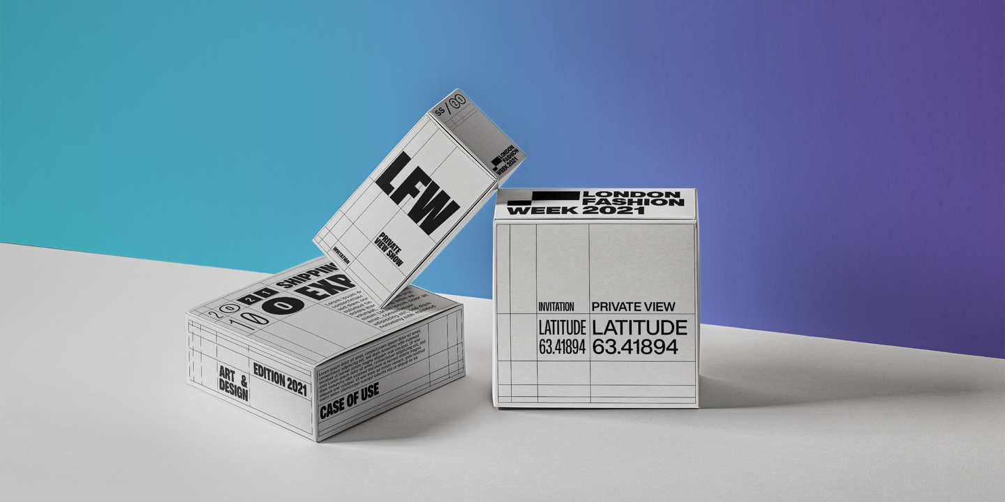
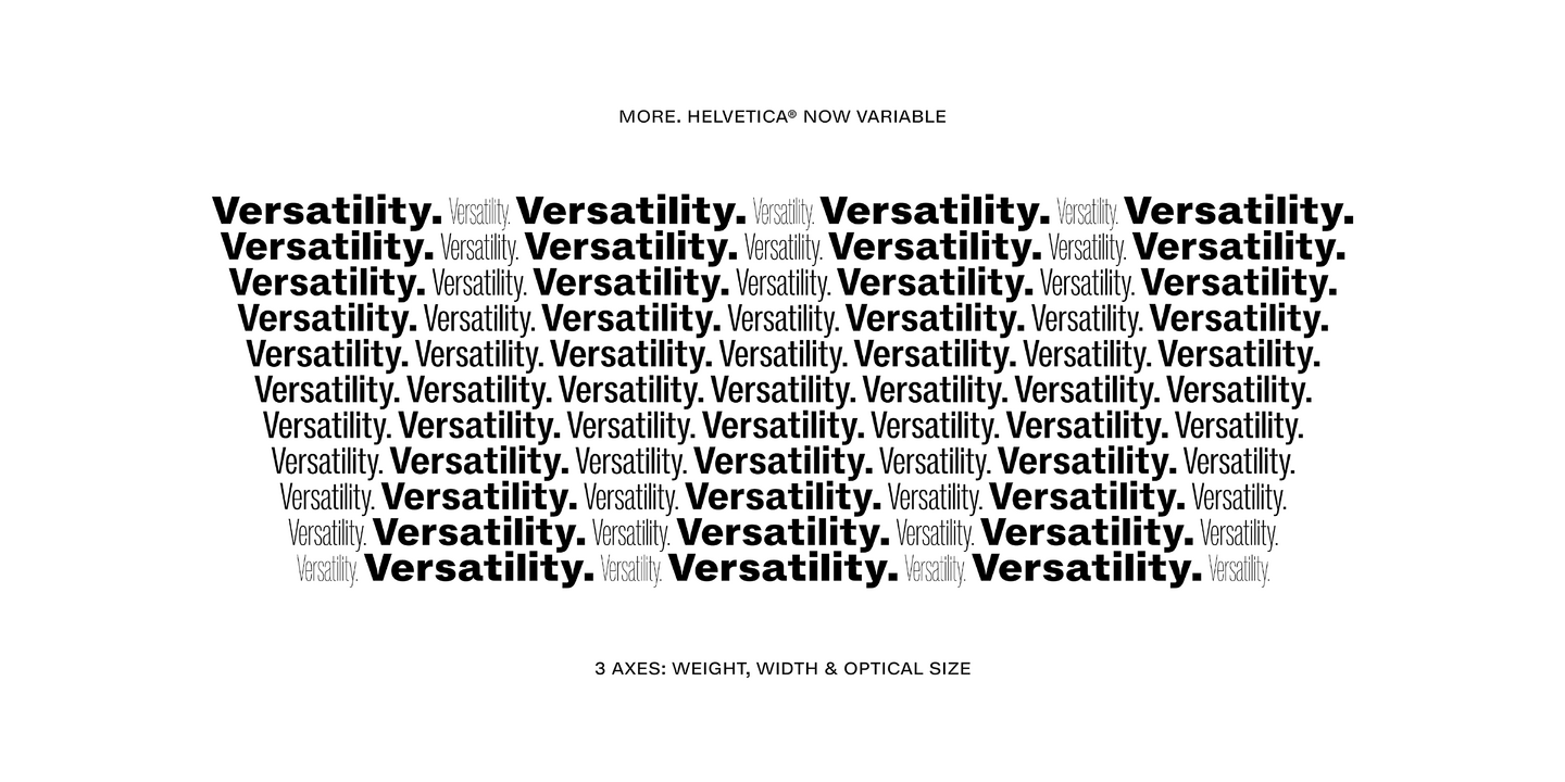
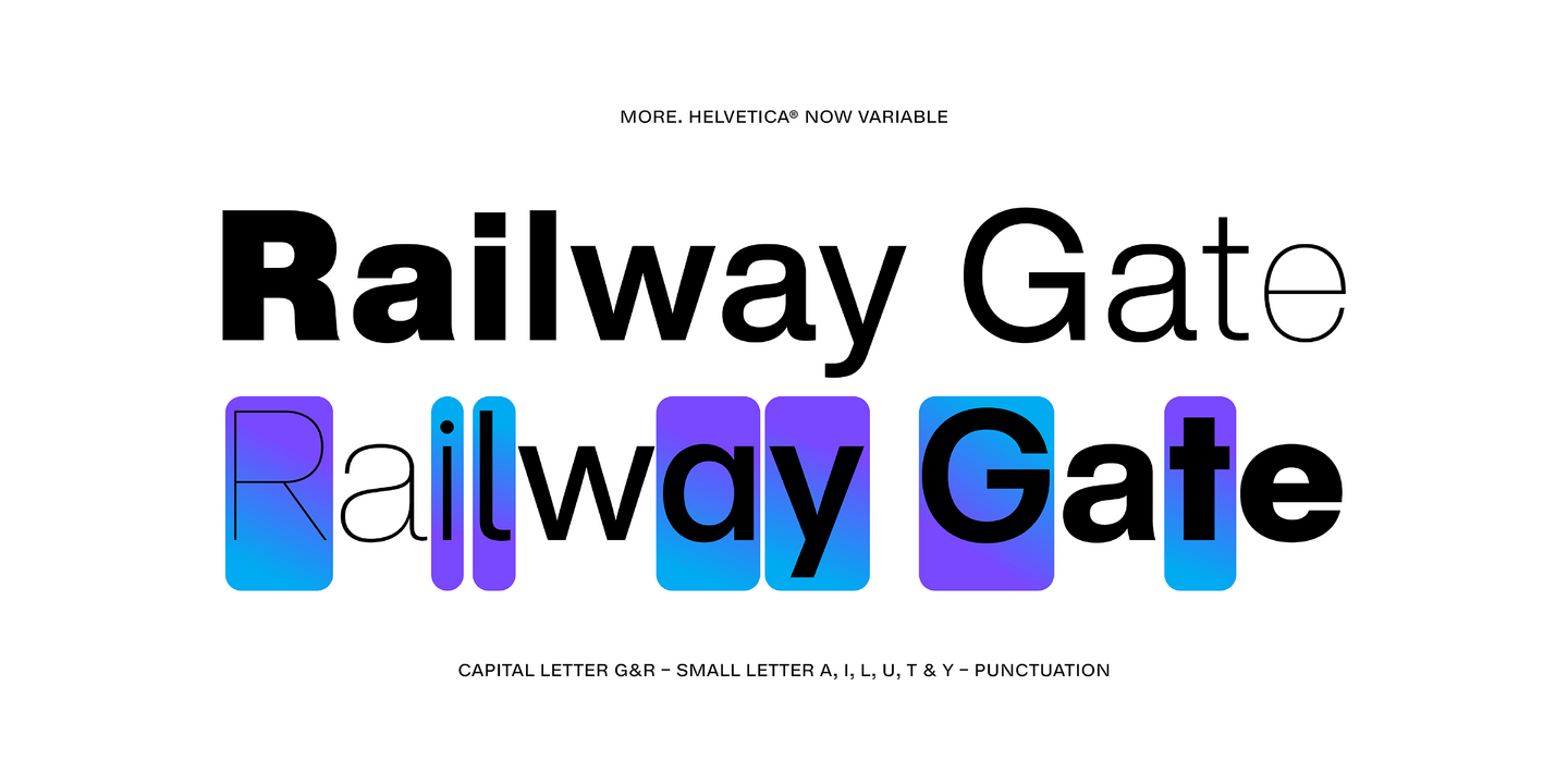
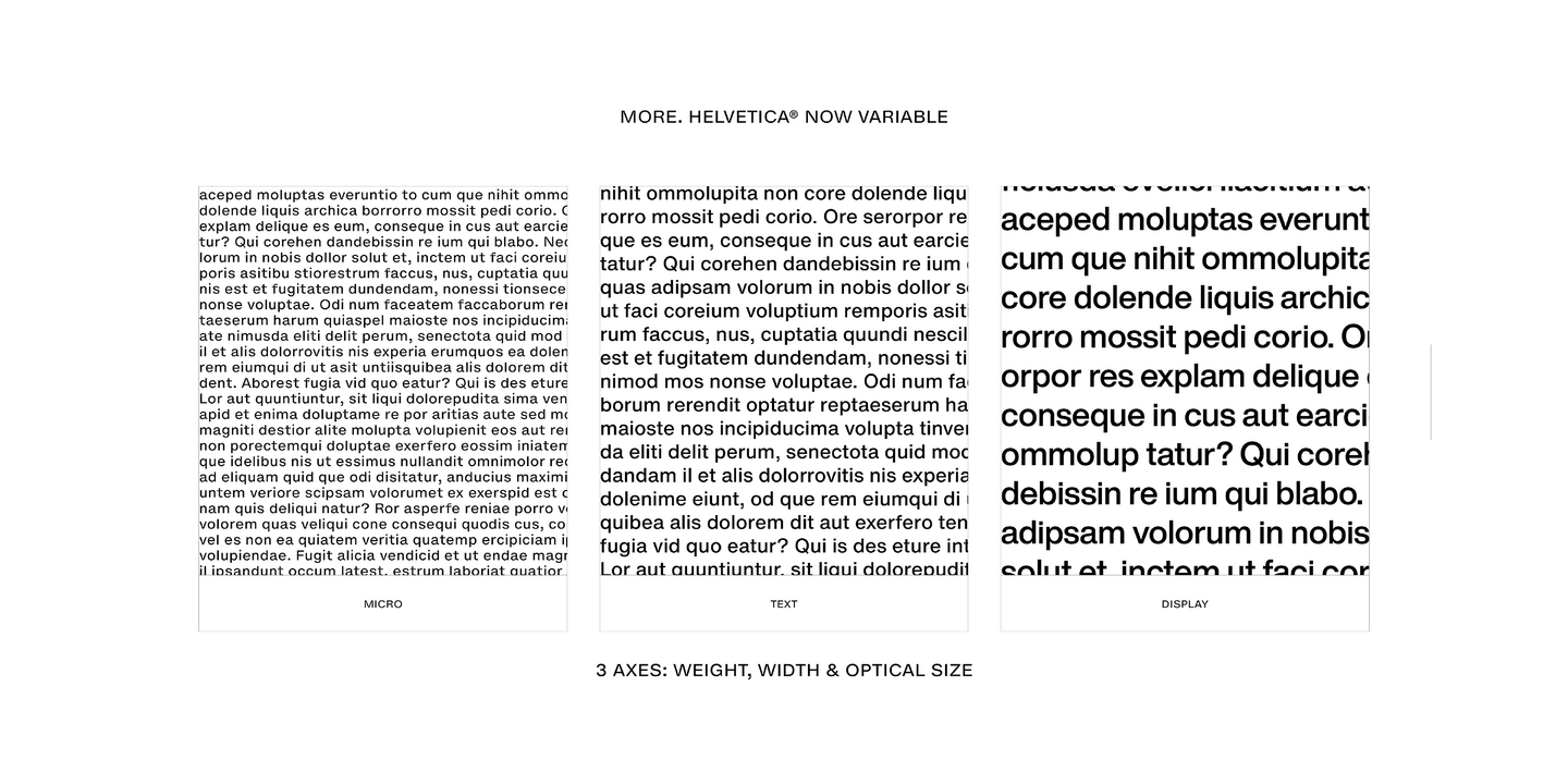
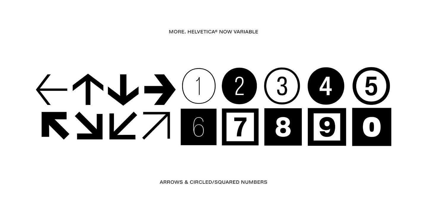
Helvetica Now 2.0 builds on the groundbreaking work of 2019’s Helvetica Now release—all of the clarity, simplicity, and neutrality of classic Helvetica with everything 21st-century designers need. In this 2021 release, we introduce Helvetica Now Variable and add condensed weights to the Helvetica Now static fonts. Helvetica Now 2.0 includes 96 fonts in three distinct optical sizes (Micro, Text, and Display), now with 48 new condensed weights. The Helvetica Now Variable fonts include even more: 144 instances—48 normal, 48 condensed, and 48 compressed.
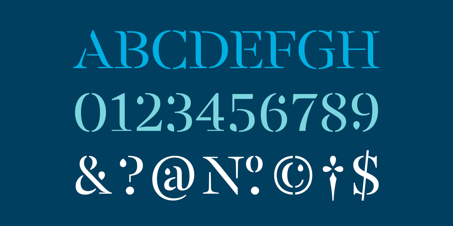
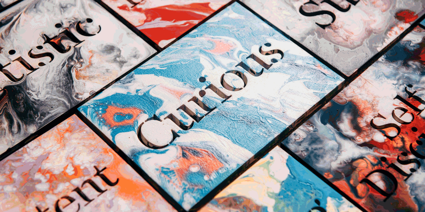
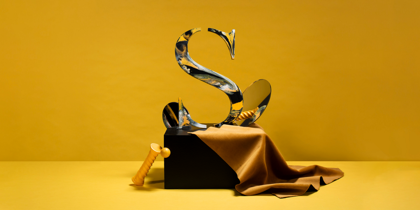
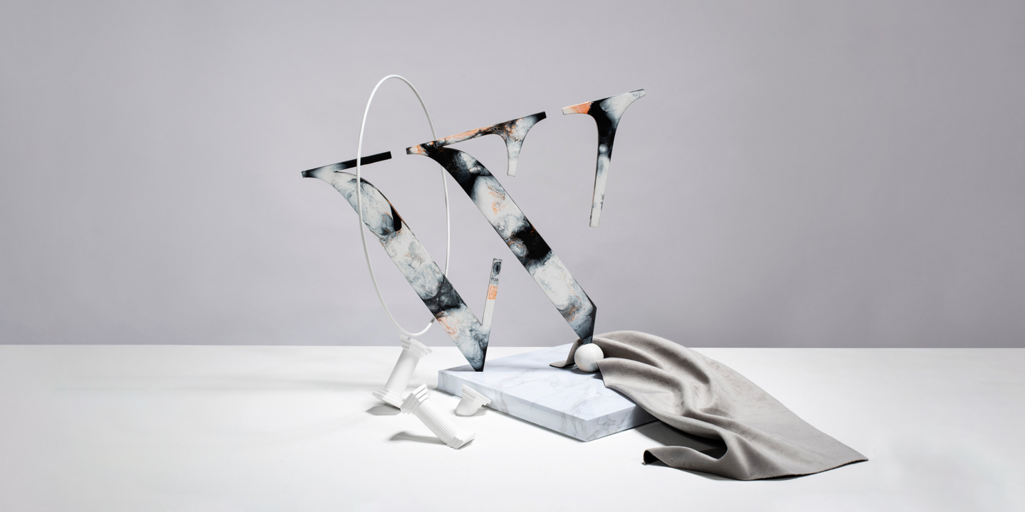
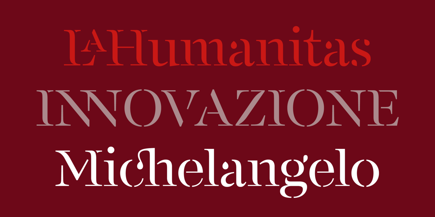
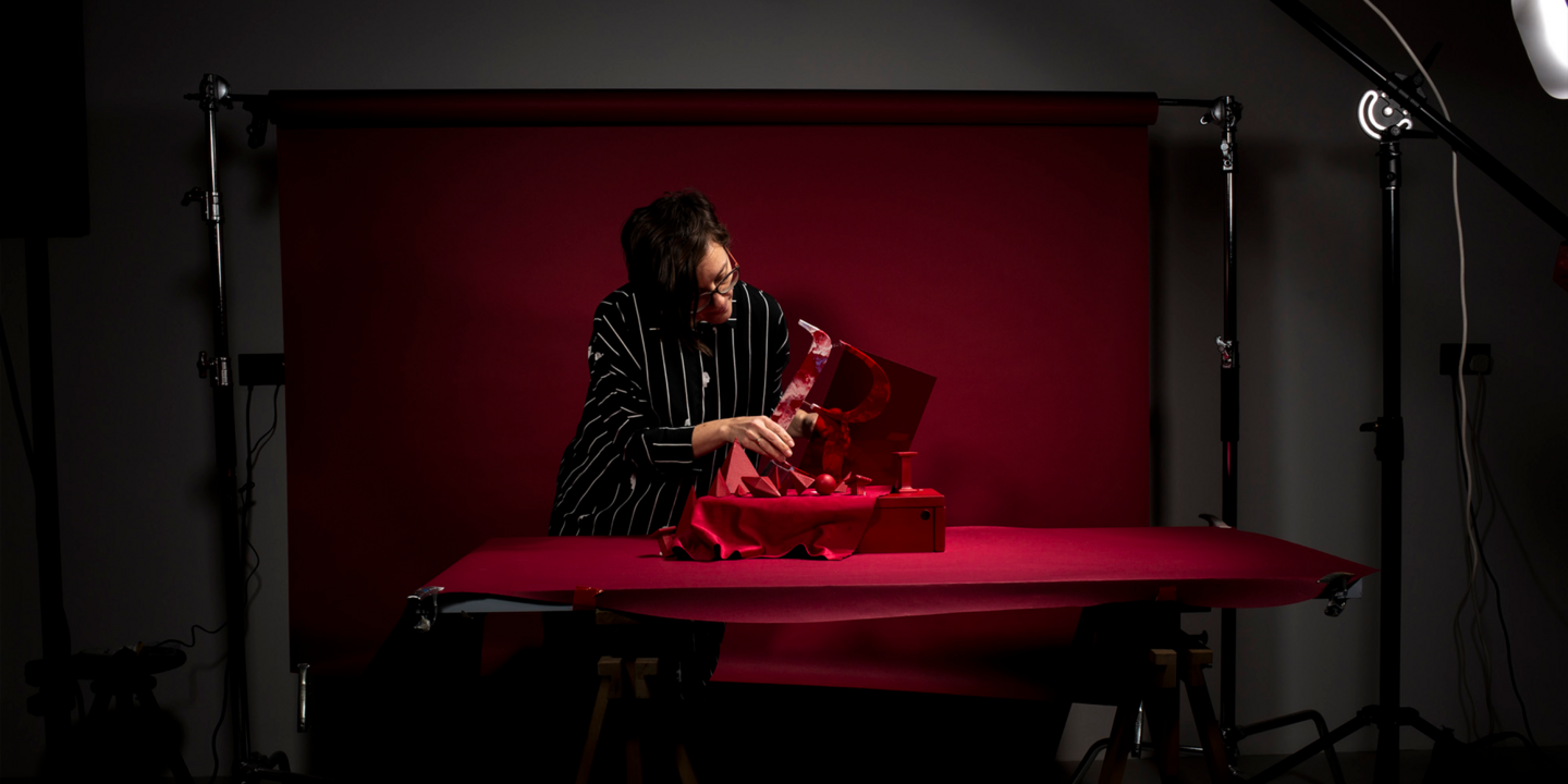
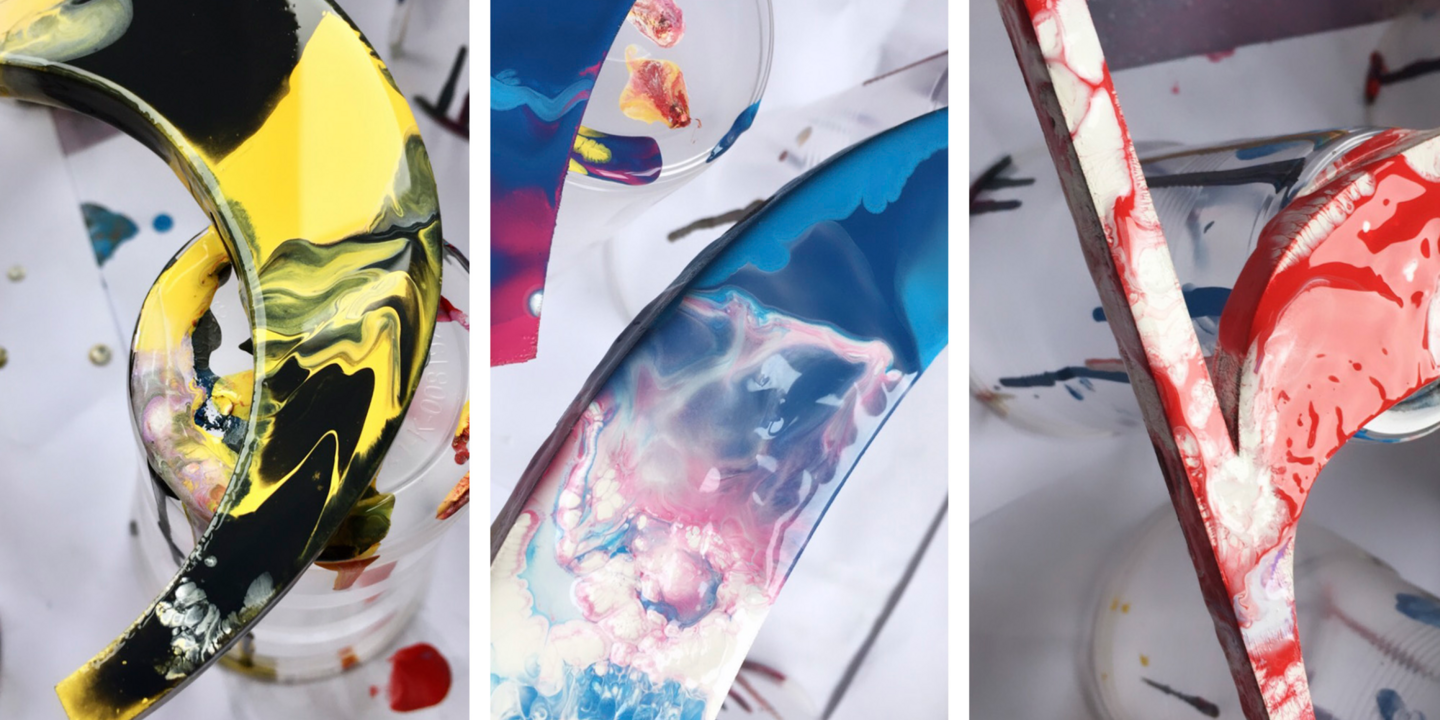
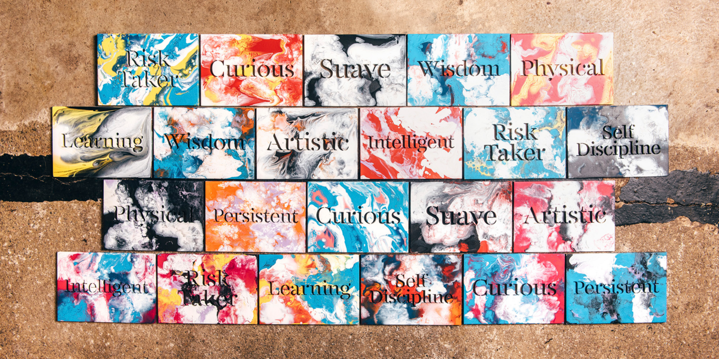
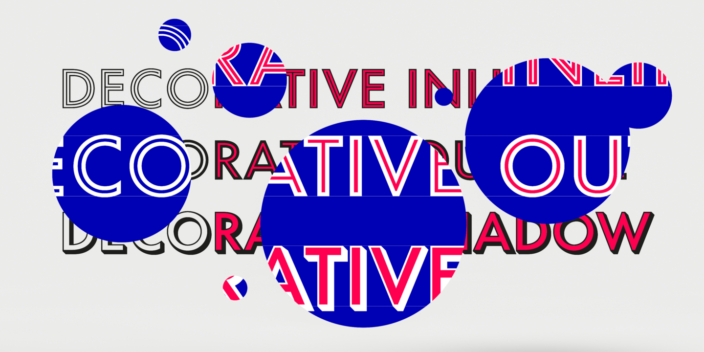
FS Renaissance is a display stencil typeface by the Monotype Studio. A collaboration between lettering artist and designer Craig Back and Creative Type Director Pedro Arilla, the single style font explores the intersection between art and design. With artist and designer working hand in hand, each letter was crafted as a standalone piece of art, while working harmoniously together as a functioning typeface.
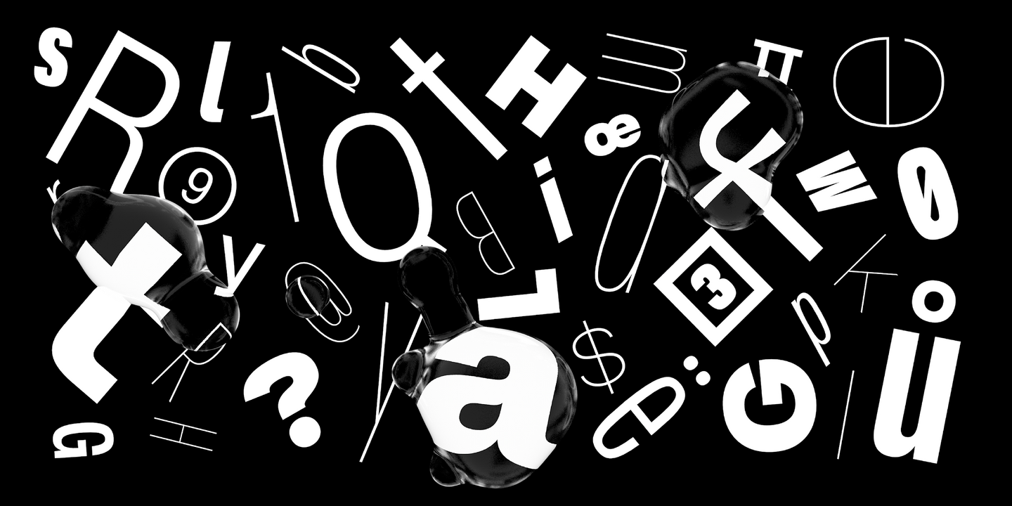
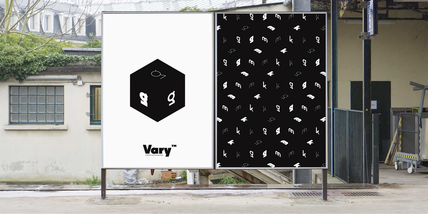
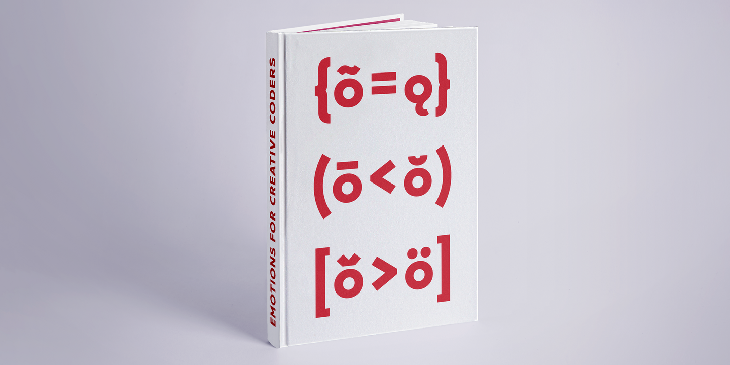
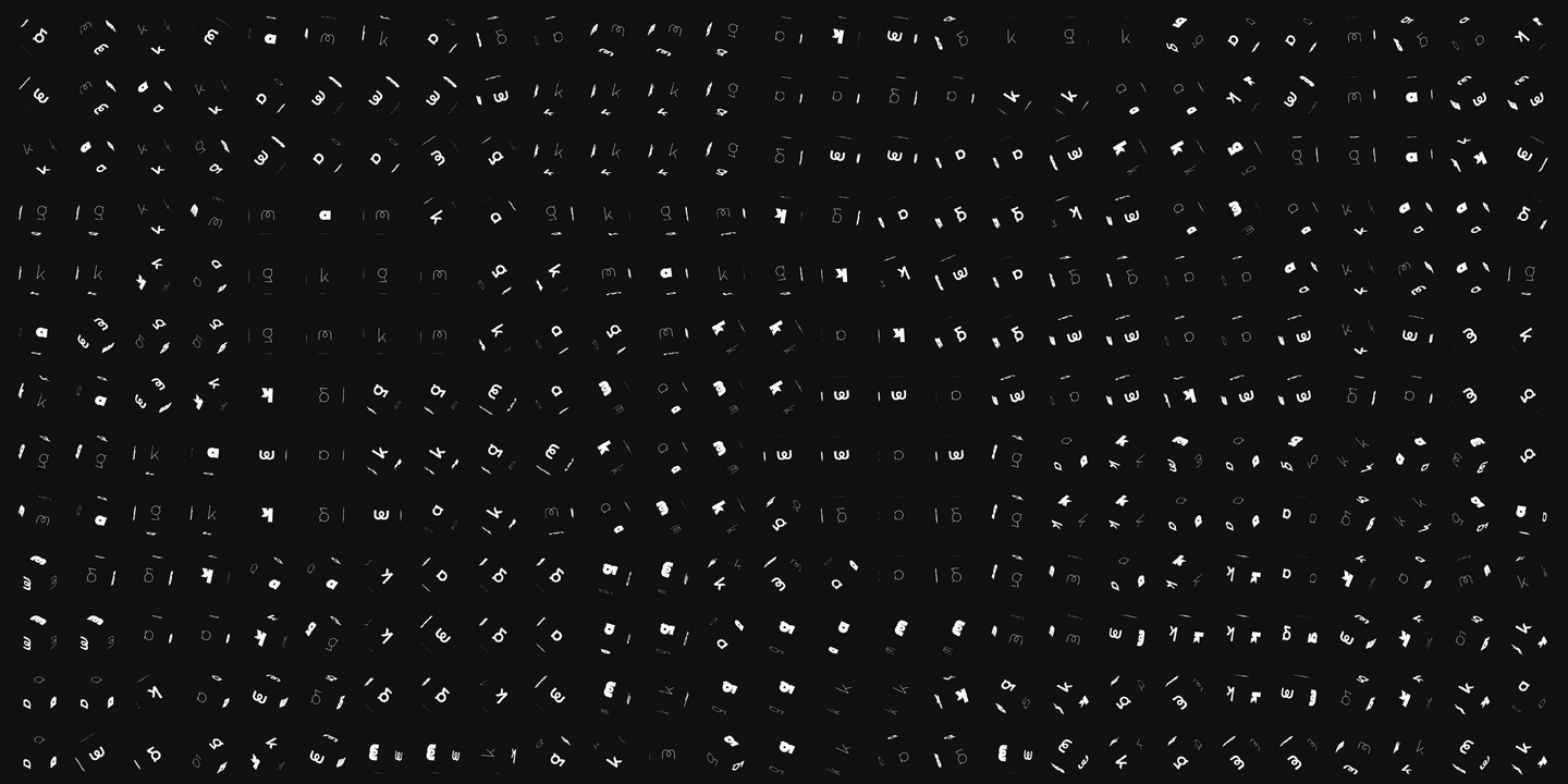
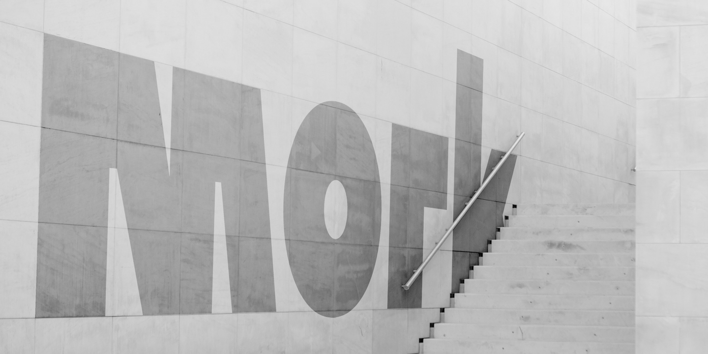
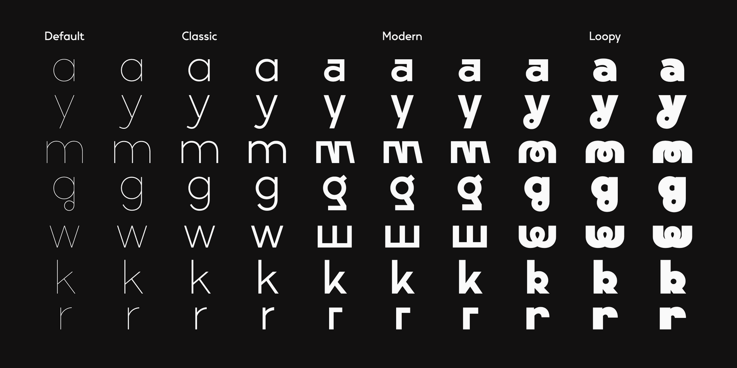
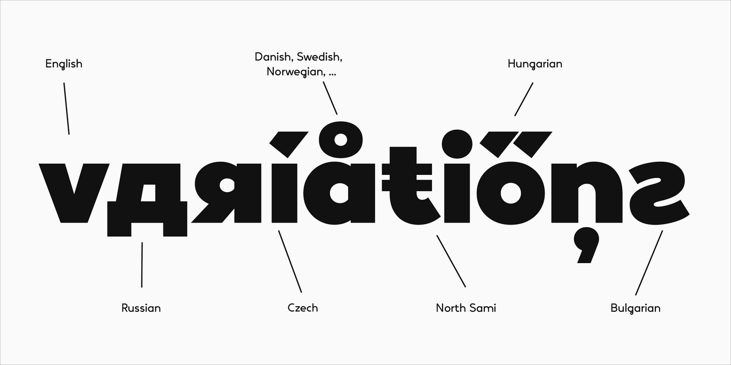
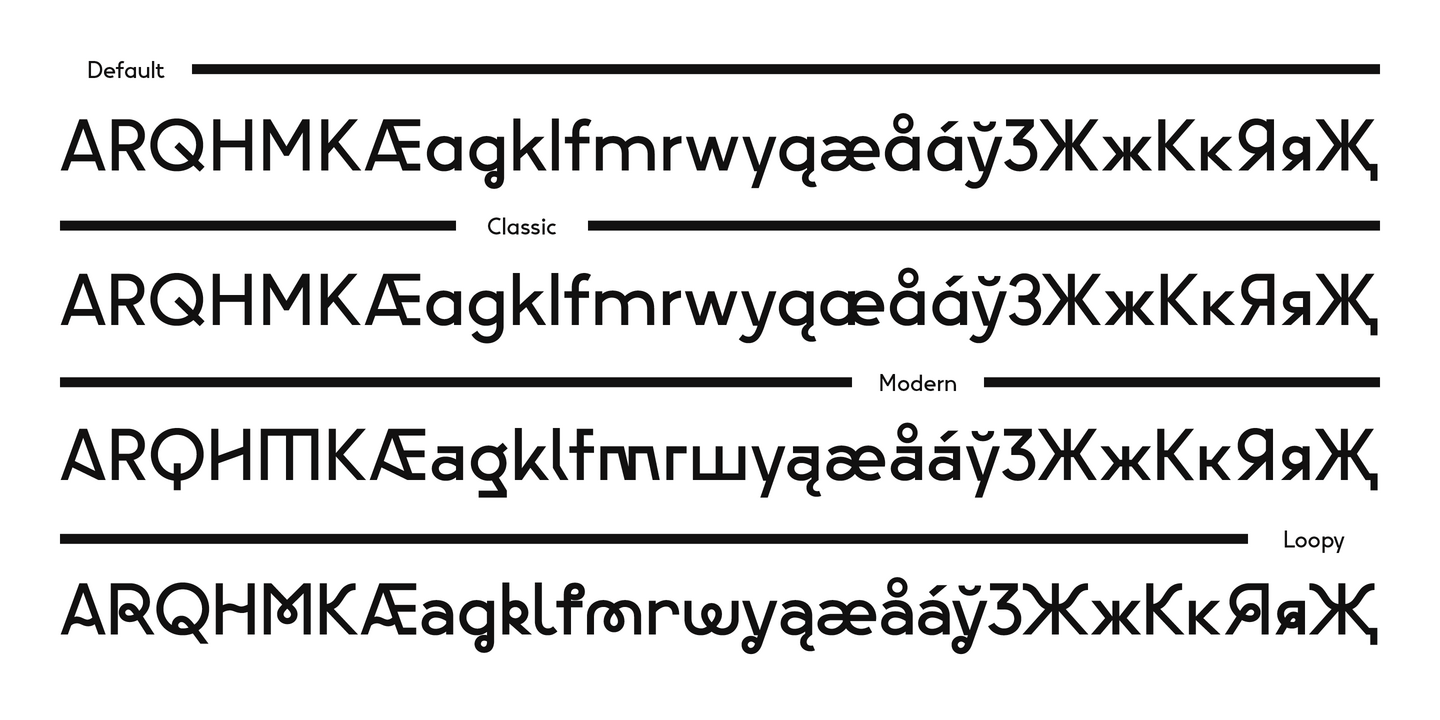
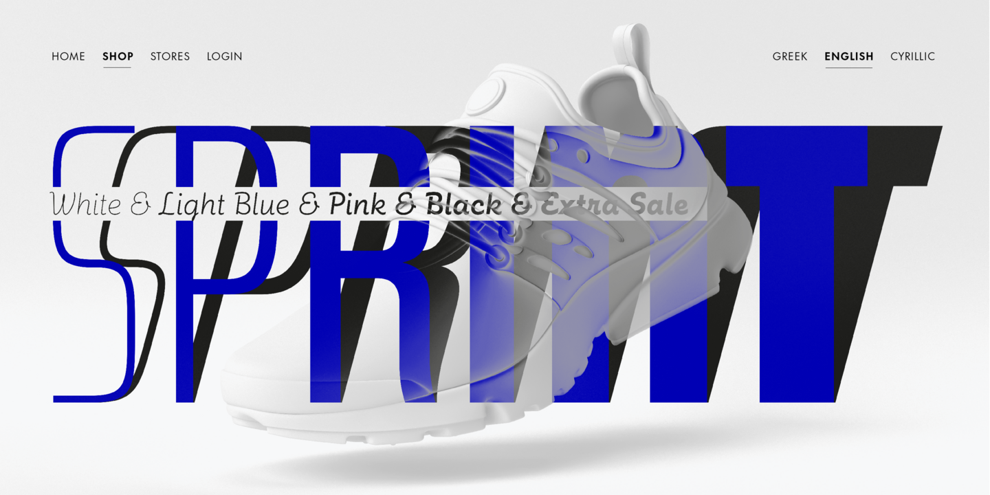
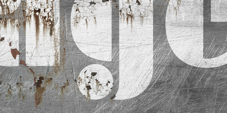
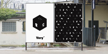
Vary by Olli Meier is a geometric sans serif typeface inspired by Bulgarian Cyrillic. Vary is fun and adaptable and was built with three feelings (variations): classic, modern, and loopy, offering an opportunity for designers to be playful in their creations. The inspiration in Bulgarian Cyrillic is seen mostly in the character “g,” which was inspired by a very uncommon handwritten “?” spotted by the designer in a shop window in Sofia, Bulgaria. When he flipped this design in 180°, the Latin character ‘g’ was born for Vary Another example is the “R” in the modern stylistic set, which was inspired by the handwritten Cyrillic character “?”.
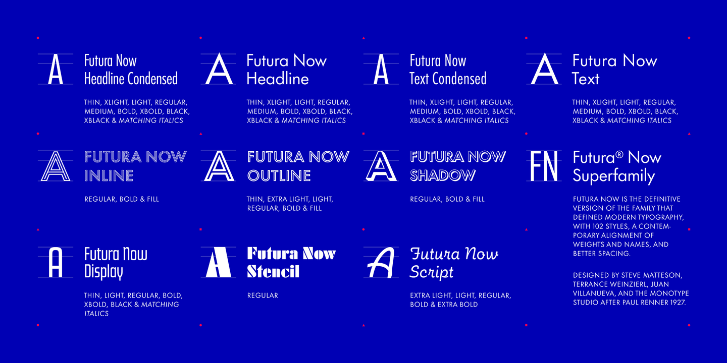
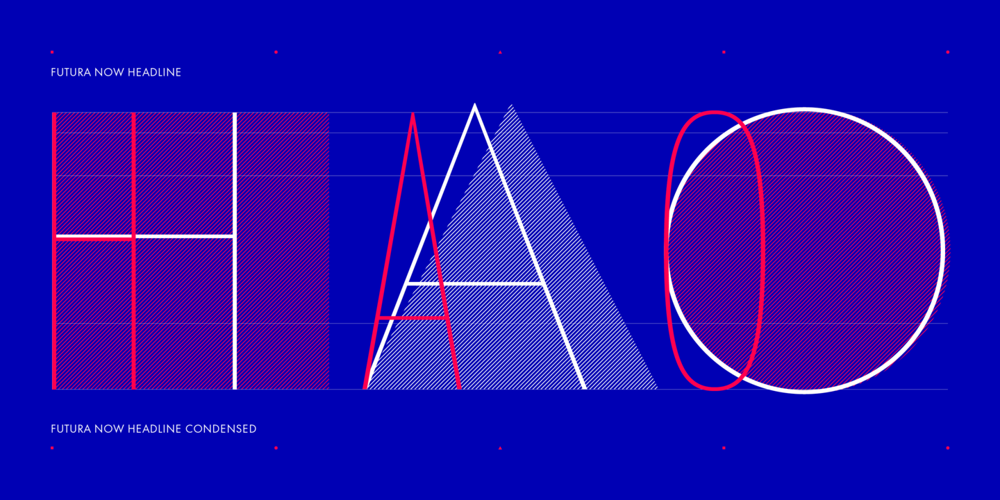
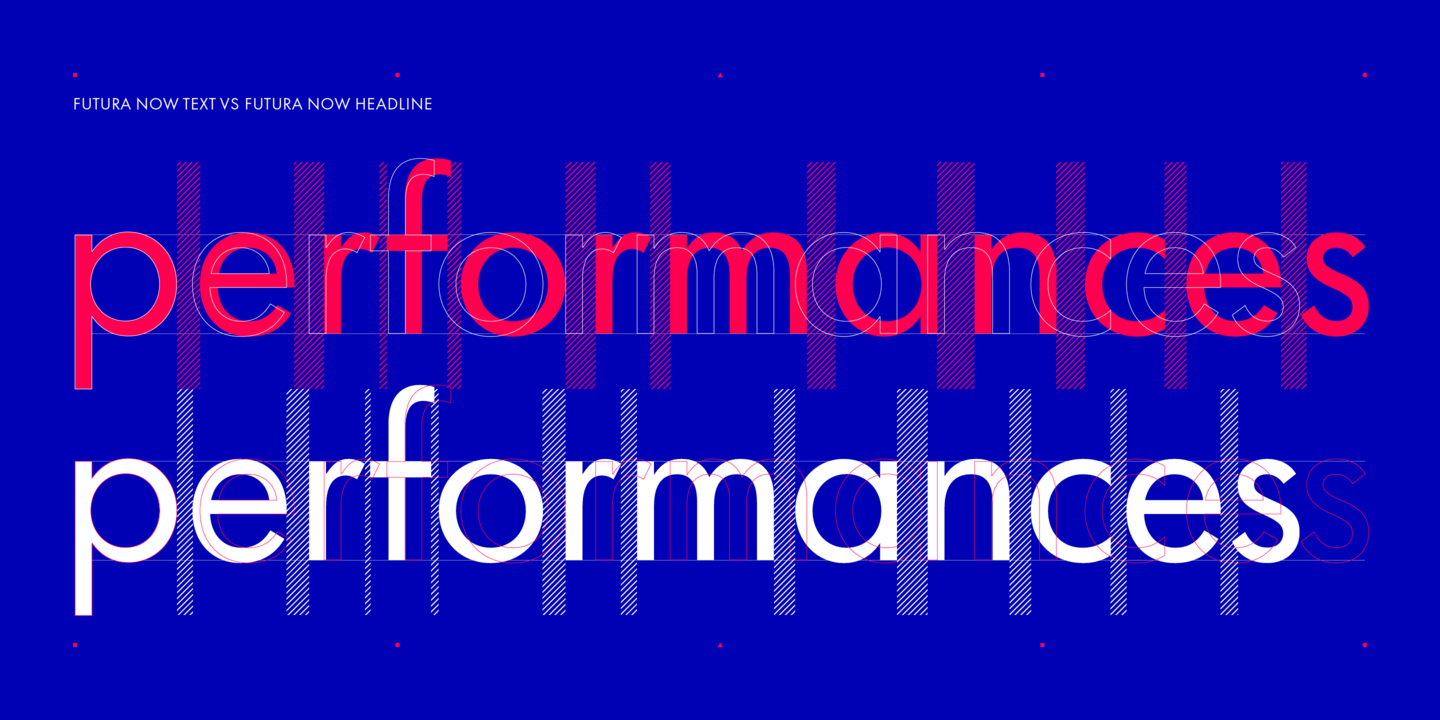
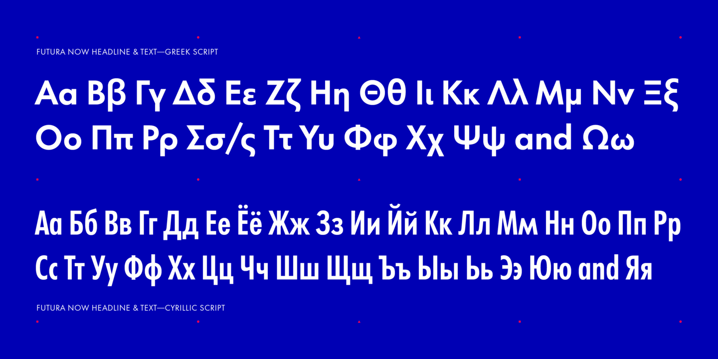
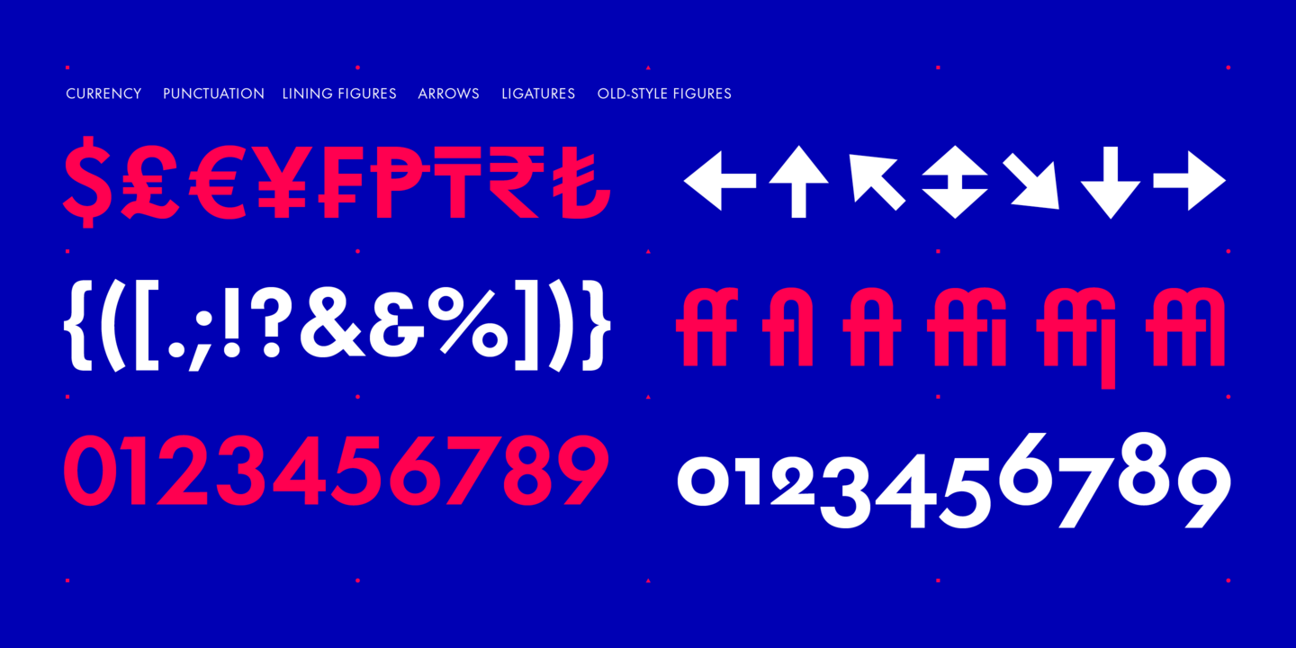
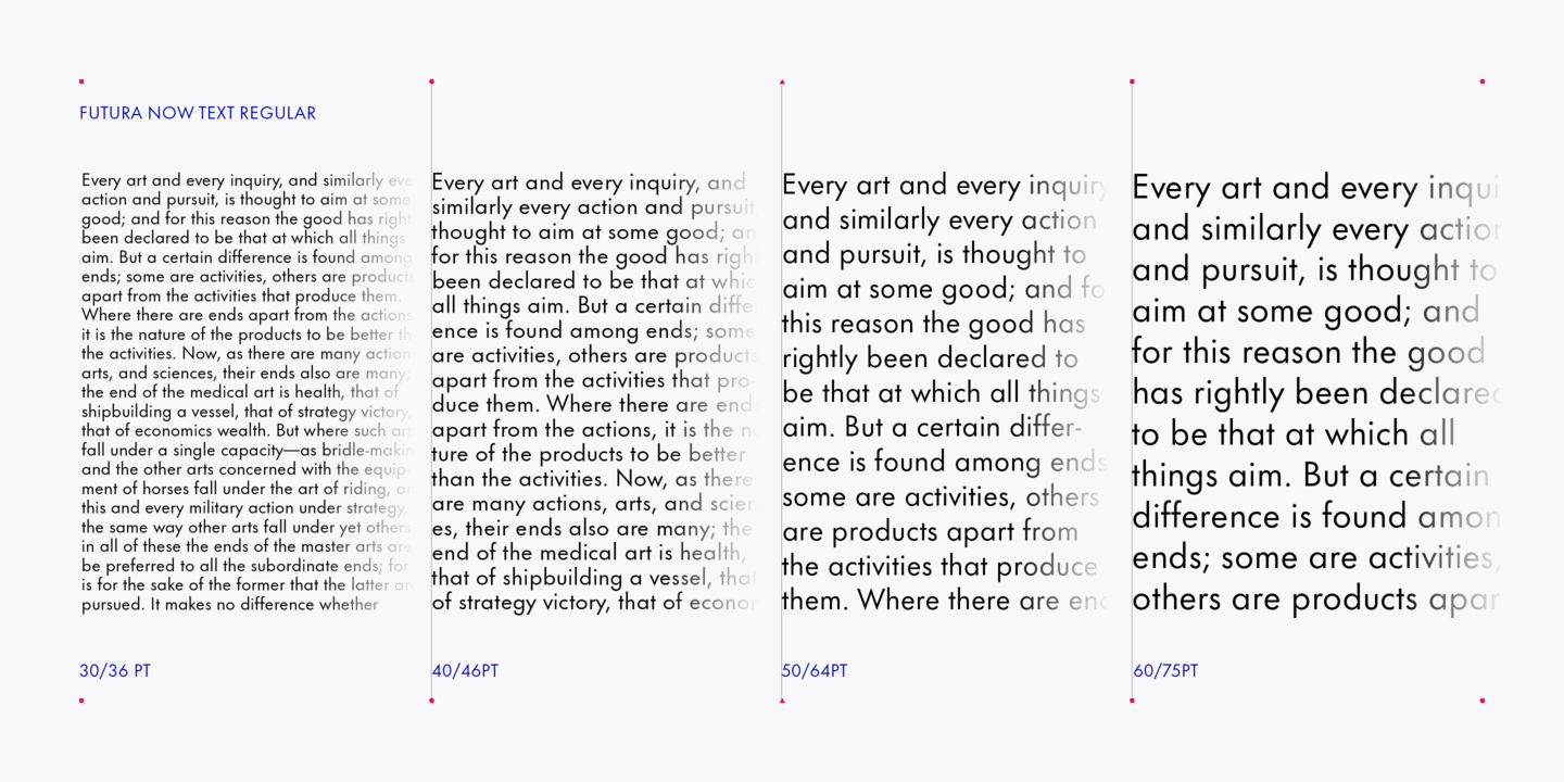
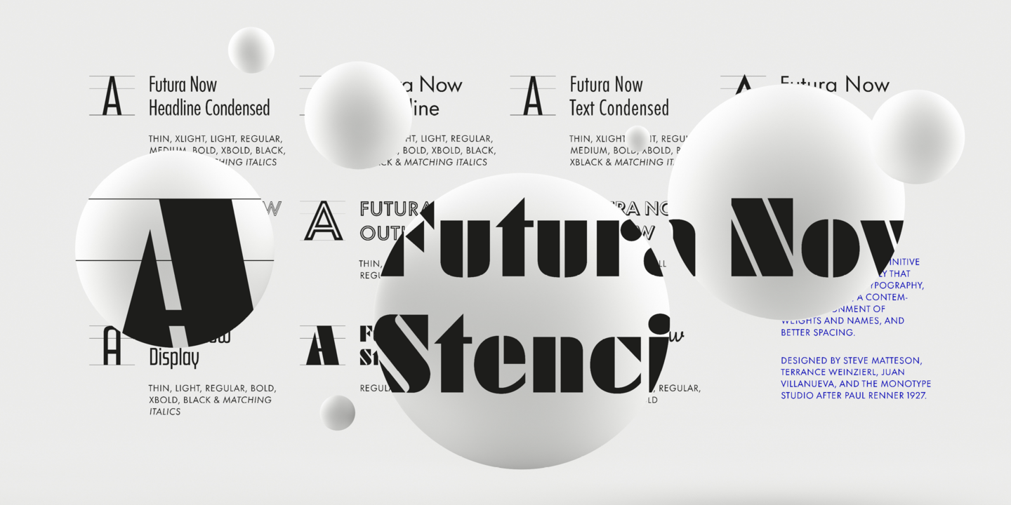
For nearly 90 years, Paul Renner’s Futura has been as popular as it is versatile—from children’s books to fashion magazines to the plaque on the Moon. Futura is a typographic icon. Futura Now offers designers a chance to see Futura with fresh eyes. It’s more truly Futura-like than any digital version you’ve ever worked with. “It brings some much-needed humanity back to the world of geometric sans serifs,” says Steve Matteson, Monotype’s Creative Type Director who led the design team.
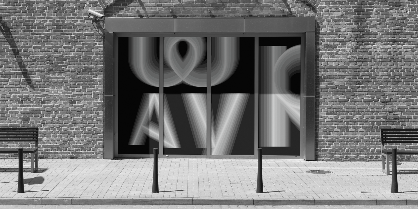
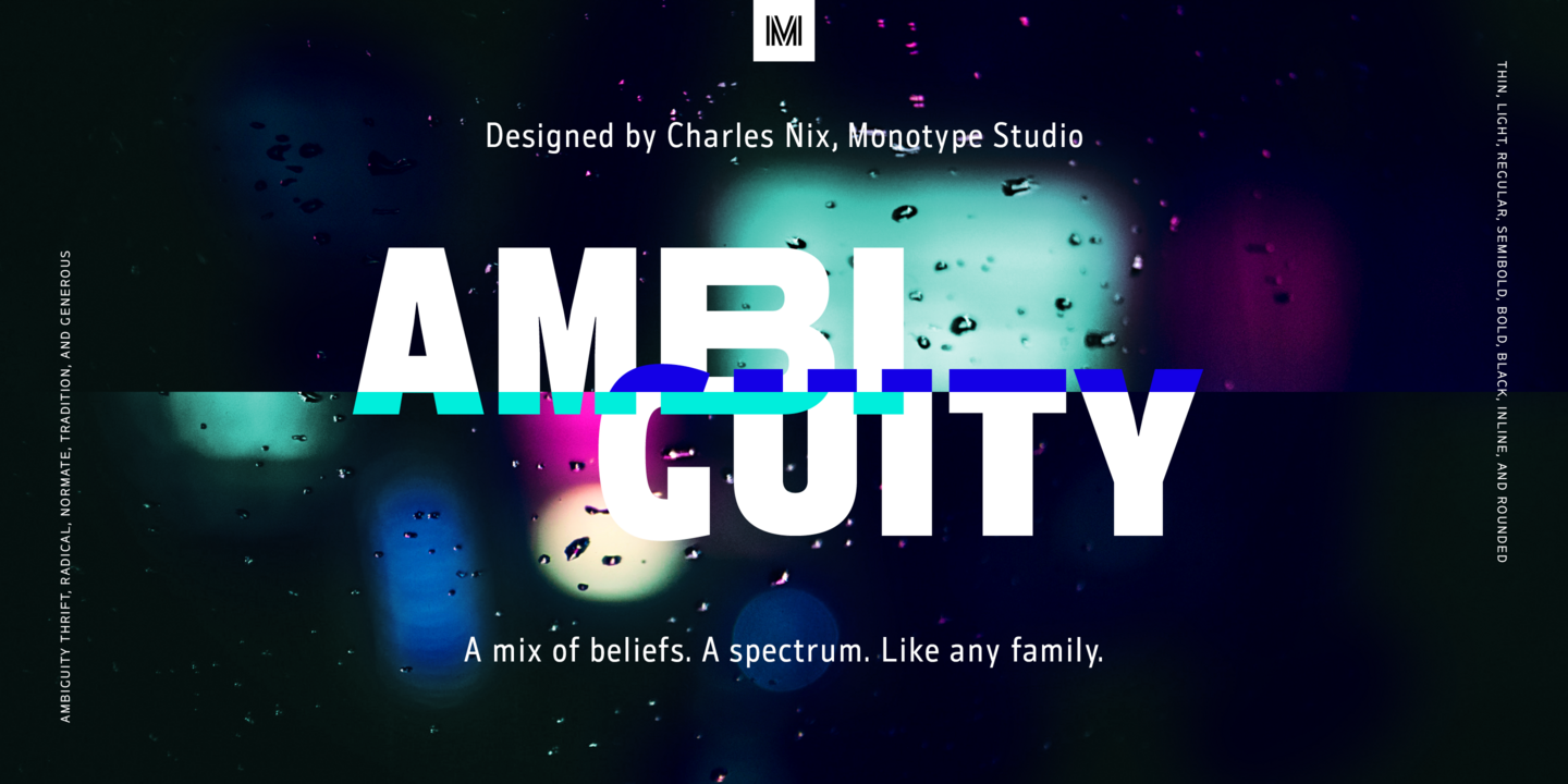
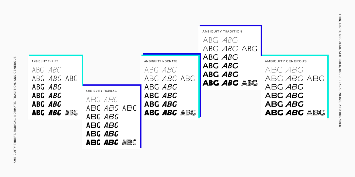
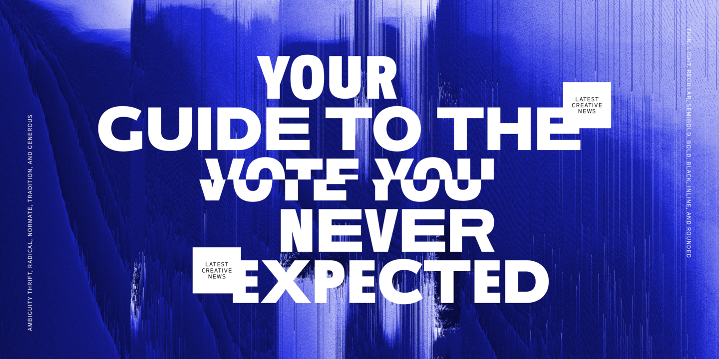
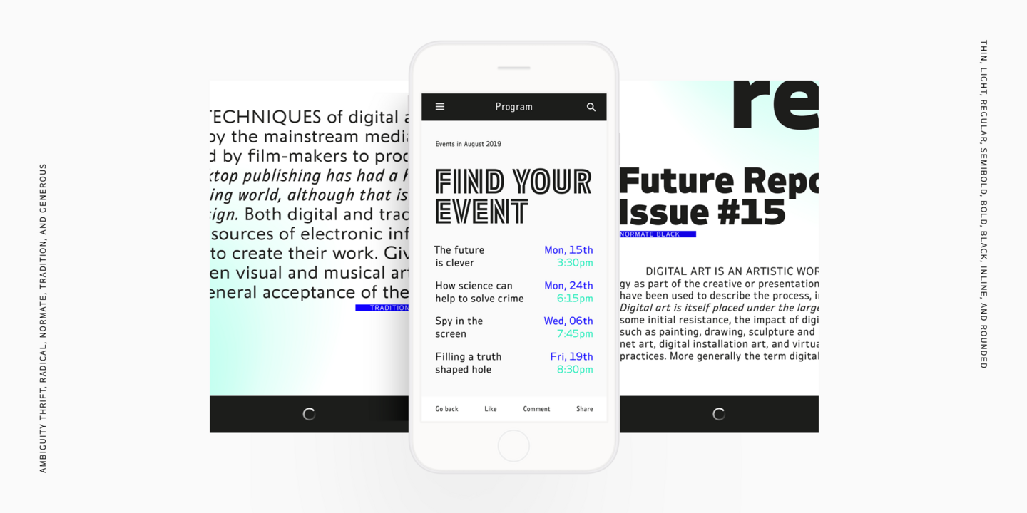
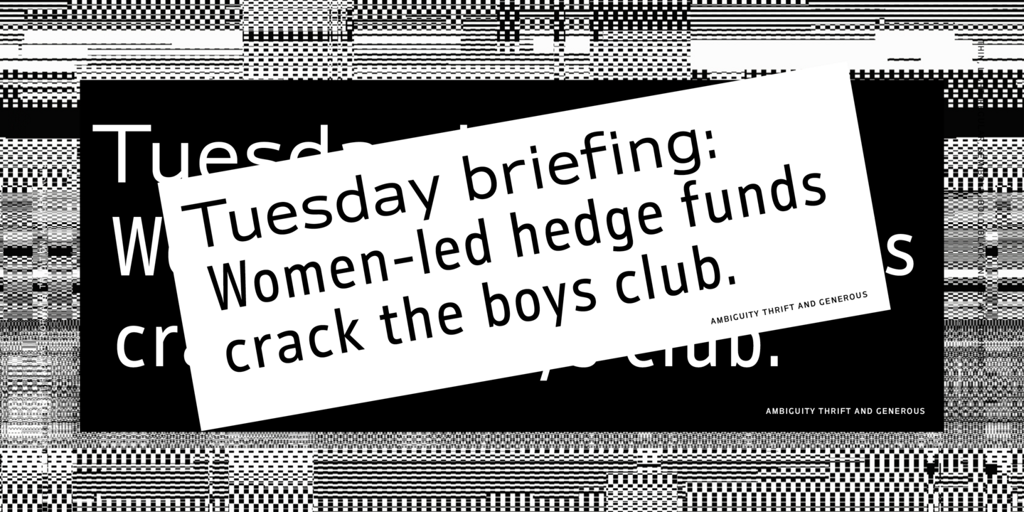
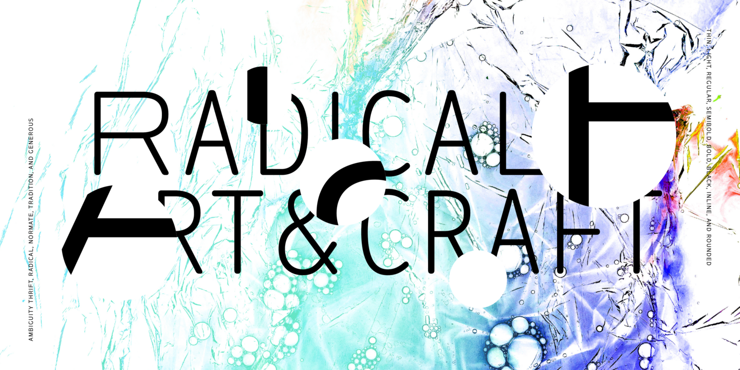
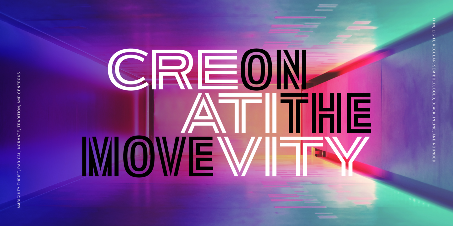
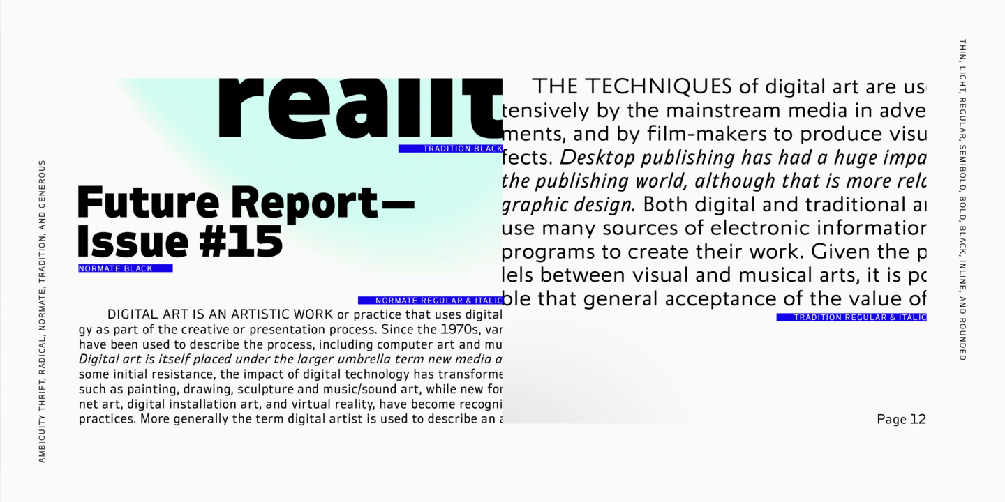
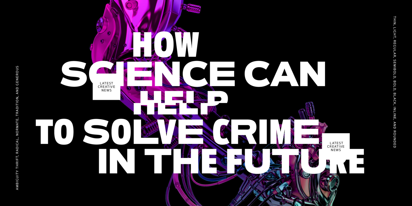
Ambiguity is a type family with five distinct personalities or ‘states’, created as a tool for coaxing designers and brands out of their comfort zone. It embraces both tradition and radicality, as well as generosity and thrift, encouraging us to question our beliefs about the intersection of style and meaning. The family is designed by Charles Nix, who describes Ambiguity as “as much thought experiment as typeface.” Its five states—Tradition, Radical, Thrift, Generous, and Normate—each express or subvert different aspects of typographic tradition.
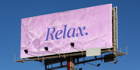
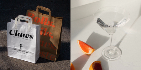
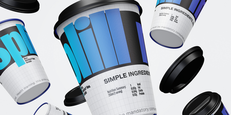
Fonts in use.




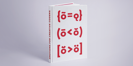

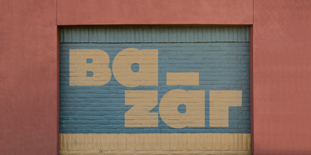

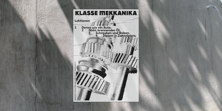

Fonts from Monotype.

The Monotype Studio brings together technology and expertise to create remarkable typefaces. Driven by their passion for type and a “nothing is off limits” attitude, the Monotype Studio is the heart of the largest library of fonts in the history of the world.

Creative Type Director
Tom Foley
Tom Foley is a Creative Type Director for Monotype, and in his role, is responsible for leading a team of type designers creating fonts for the Monotype Library and corporate brands. Words and letters are in Tom’s blood - his great-grandfather was from a family of stonemasons that specialized in letter carving, and his uncle was a sign painter.

Creative Type Director
Phil Garnham
Phil is a Creative Type Director and type designer with many years of experience in the design and engineering of fonts for global brands. Working in collaboration with design studios and global clients, Phil understands the creative and business needs of brands looking to build continuity with type.

Creative Type Director
Akira Kobayashi
Creative Type Director Akira Kobayashi has three decades of experience, with an extensive background in Japanese typeface design and a deep understanding of calligraphy. After studying at Musashino Art University in Tokyo for four years, Akira Kobayashi accepted his first job at phototypesetting manufacturer Sha-Ken Co., where he was involved in the lengthy and intricate process of designing Japanese fonts.

Creative Type Director
Charles Nix
Charles Nix is a Creative Type Director, designer, typographer and educator. He designed a number of popular typefaces in the Monotype Library, including Walbaum and Hope Sans, which received a Certificate of Typographic Excellence in the 22nd Annual Type Directors Club Typeface Design Competition. He’s also designed custom typefaces for Google Noto, Progressive Insurance and the Philadelphia Museum of Art.

Creative Type Director
Tom Rickner
Tom Rickner is a Creative Type Director with a career in type that spans more than three decades. During that time, he has mastered nearly every aspect of type design and font production, from his earliest days editing bitmaps, to designing some of the very first Multiple Master fonts for Adobe and TrueType GX Variations fonts for the Font Bureau and Apple.

Creative Type Director
Sara Soskolne
Sara Soskolne is a Creative Type Director and designer. As a reformed bookworm, her deepest inspiration as a typeface designer is the experience of reading, and her abiding interest is in creating typefaces which not only serve but enrich that experience. Originally a graphic designer, Sara’s increasing fascination with type eventually drew her to study typeface design at the University of Reading in the UK, and then to practice it at Hoefler&Co.

Creative Type Director
Terrance Weinzierl
As a Creative Type Director in the Monotype Studio, Terrance Weinzierl has been creating and modifying typefaces for the Monotype Library and a wide range of brands since 2008. In addition to working on custom projects for PBS, Microsoft, Google, Barnes & Noble, Domino’s and SAP, he’s designed type for video games, professional sports teams and auto manufacturers.

Type Designer
Friedrich Althausen
Friedrich Althausen is a type designer based in Monotype’s Berlin office. After his studies at the Bauhaus University in Weimar, Friedrich worked as a freelance designer with a special interest in book typography and letter drawing. He has designed typefaces for several textbooks on subjects such as mathematics and Cartography, and his typeface “Vollkorn” became widely known as one of the first free web fonts on the internet.

Type Designer
Jordan Bell
Jordan Bell is a letterer and type designer at Monotype. He is fascinated by handwriting and its effect on modern type design as well as early American typefounding. Originally from Texas, Jordan received a BFA from Abilene Christian University and then worked as a graphic designer in Santa Fe, NM before attending the MATD program at University of Reading in the UK to further his knowledge in design history, graphic communication, and typeface design.

Type Designer
Tao Di
Tao is a Type Designer at the Monotype Studio in Shanghai, China. He graduated from university where he studied engineering, and started his career as a graphic designer at an ad agency in China. During that period, he got attracted to the magic of fonts and started learning type design by himself.

Senior Type Designer
Ryota Doi
Ryota Doi is a Senior Type Designer for Monotype. Ryota first became interested in type as a design student while at university in Japan. After receiving his BA in design from Tokyo University of the Arts, he enrolled in the MA typeface design program at the prestigious University of Reading, where he studied the differences between Japanese and Latin type.

Chief Typographer and Production Manager
Robin Hui
Robin Hui joined Monotype Hong Kong as a type designer in 1988. He is currently the Chief Typographer and Production Manager of Monotype Hong Kong, responsible for a wide variety of type design and technology projects, including compression, hinting and rendering control of typefaces across different platforms. Before joining Monotype, he worked 10 years as a professional typesetter where Robin gained experience in how type is used effectively, while also developing a strong passion for Chinese typography.

Creative Type Director
Emilios Theofanous
Born in Cyprus, Monotype Creative Type Director Emilios Theofanous, has a soft spot for quality Greek and multilingual typography. Since joining Monotype, he has worked on multiple custom and Library projects. Prior joining Monotype, he collaborated with international foundries and contributed to large-scale projects such as Source Serif Greek Italic for Google Fonts and Adobe.

Senior Type Designer
Juan Villanueva
Juan Villanueva is a Senior Type Designer at the Monotype Studio in New York City. His contributions to the Monotype Library include designs such as Walbaum and Sagrantino. He’s worked on custom typefaces for clients including Tencent Sans, Ricky Zoom, and multiple Google Noto fonts.

Type Designer
Anna Damoli
Anna Damoli is an Italian type designer and calligrapher at Monotype London. After her Master’s in Visual Design, Anna worked as a visual designer at Interbrand Milan while exploring her love for letters through calligraphy and type design.

Creative Type Director
Damien Collot
Damien Collot’s interest and passion for type design comes from drawing. As a child, he could spend hours at his desk trying to get the perfect, most unique, Donald Duck. Damien easily found his place in a field where attention to details and focus are key assets to explore the nuances of letter shapes.

Executive Creative Director
Doug Wilson
Doug Wilson is an Executive Creative Director with 20 years experience in design, writing, and filmmaking. His love for typography began when he resurrected letterpress equipment at his university and became a full obsession with his 2012 documentary film, “Linotype: The Film.” He has presented at conferences and organizations as diverse as NASA, The New York Times, and Condé Nast.

Type designe
Laurène Girbal
Laurène Girbal is a Type designer at Monotype with a soft spot for scripts and logotypes. After her education in graphic design and her type design specialization at EsadType, she worked as a freelance designer before joining Colophon Foundry.

Creative Type Director
Sina Otto
Sina Otto is Creative Type Director at Monotype, based in Berlin. In this role, her extensive expertise is utilised by advising brands and agencies on branding and typography. Prior joining Monotype, she worked as an independent creative with renowned agencies and publishers in Berlin, Milan and Zurich, among others.

Senior Typeface Designer
Spike Spondike
Spike Spondike is an award-winning Senior Typeface Designer at Monotype. Her experience includes almost a decade working with Dalton Maag, and the past two years with Colophon Foundry.

Creative Type Director
Vaishnavi Murthy Yerkadithaya
Based in Bangalore, India, Vaishnavi is a Creative Type Director who delves deep into the world of written languages. Inspired by her grandfather’s knowledge of ancient scripts, she turned her childhood fascination into a career by pursuing an MA in Type Design at the University of Reading, supported by a Felix Scholarship.

Monotype Fonts
Fonts created by the Monotype Studio are included with Monotype Fonts.

