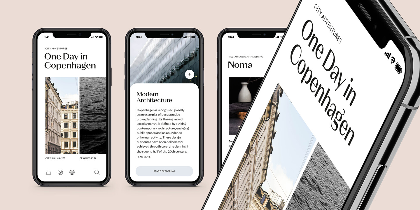
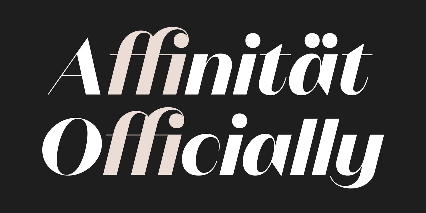
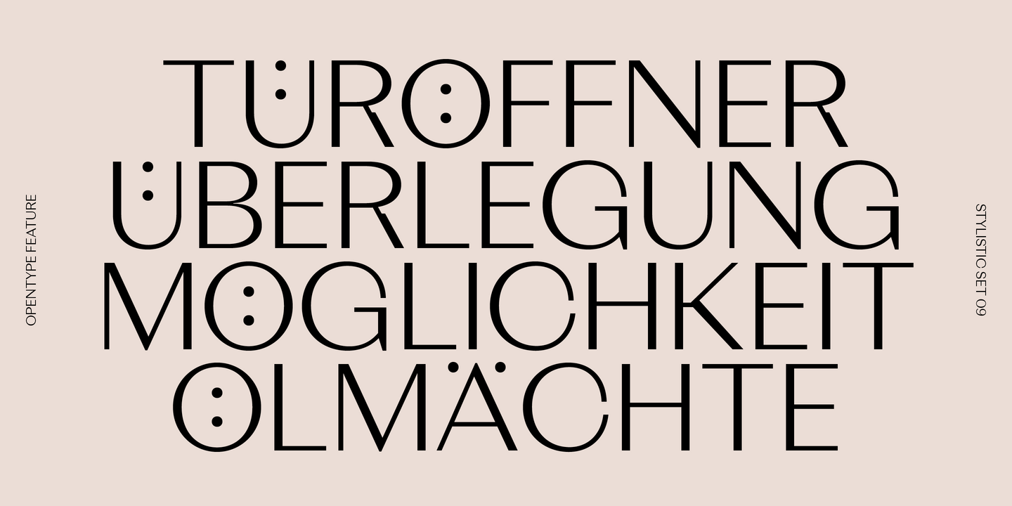
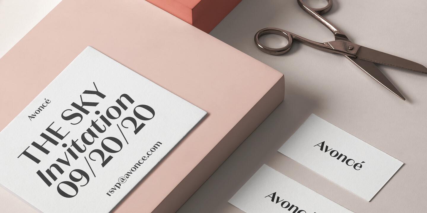
Fonts from Rene Bieder.

Studio René Bieder is a Berlin based Type and Graphic Design Practice. Since 2012 René Bieder develops highly successful retail font families like Campton or Galano and custom fonts for small and large clients.
Popular René Bieder fonts.
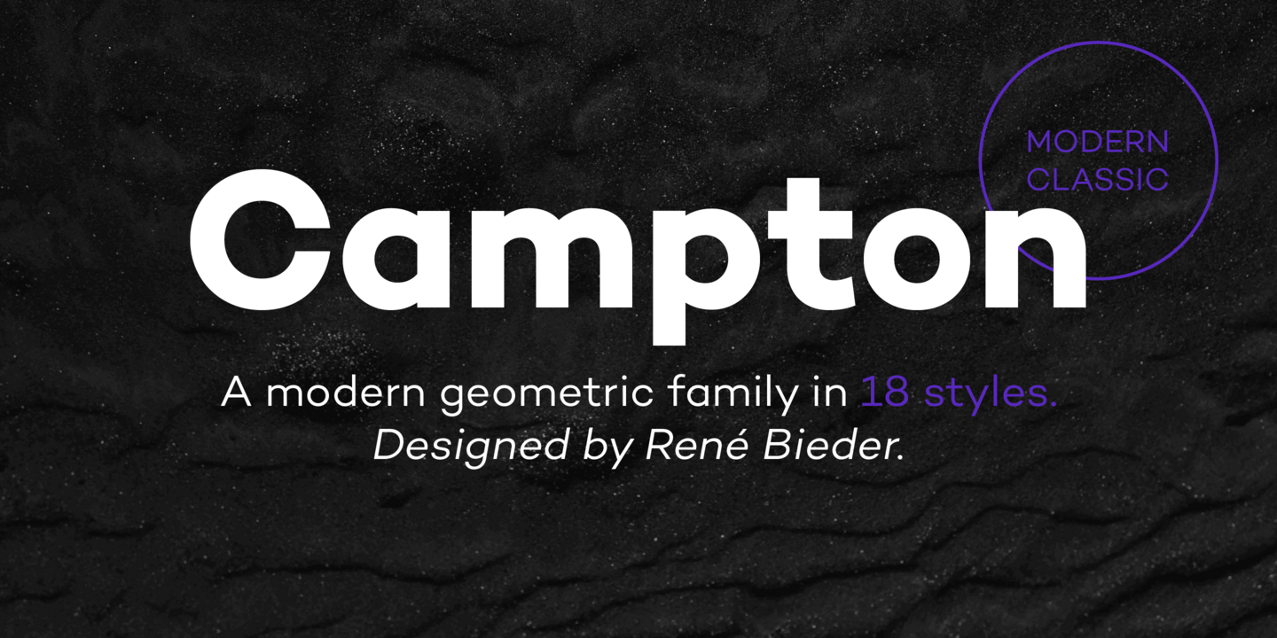
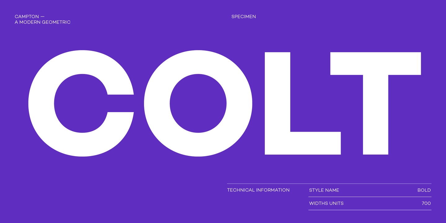
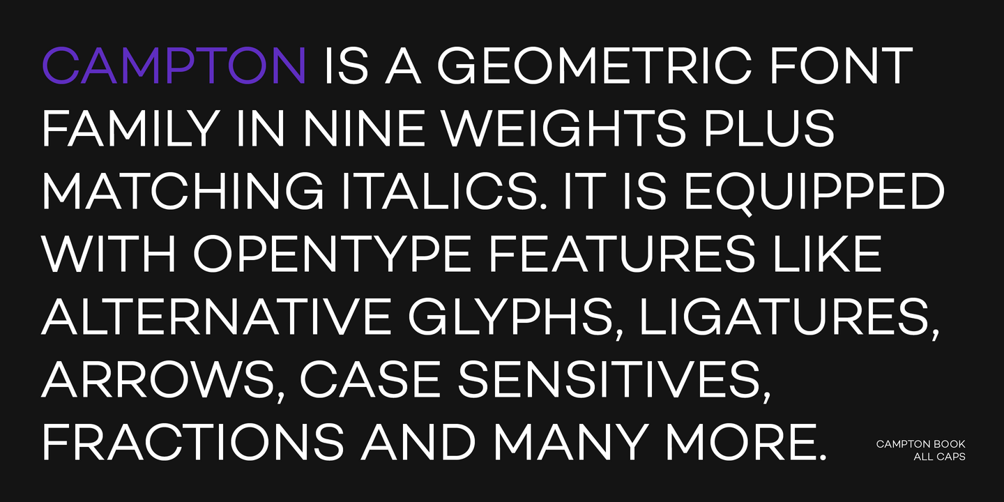
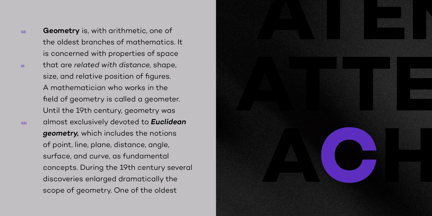
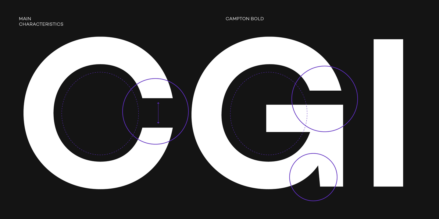
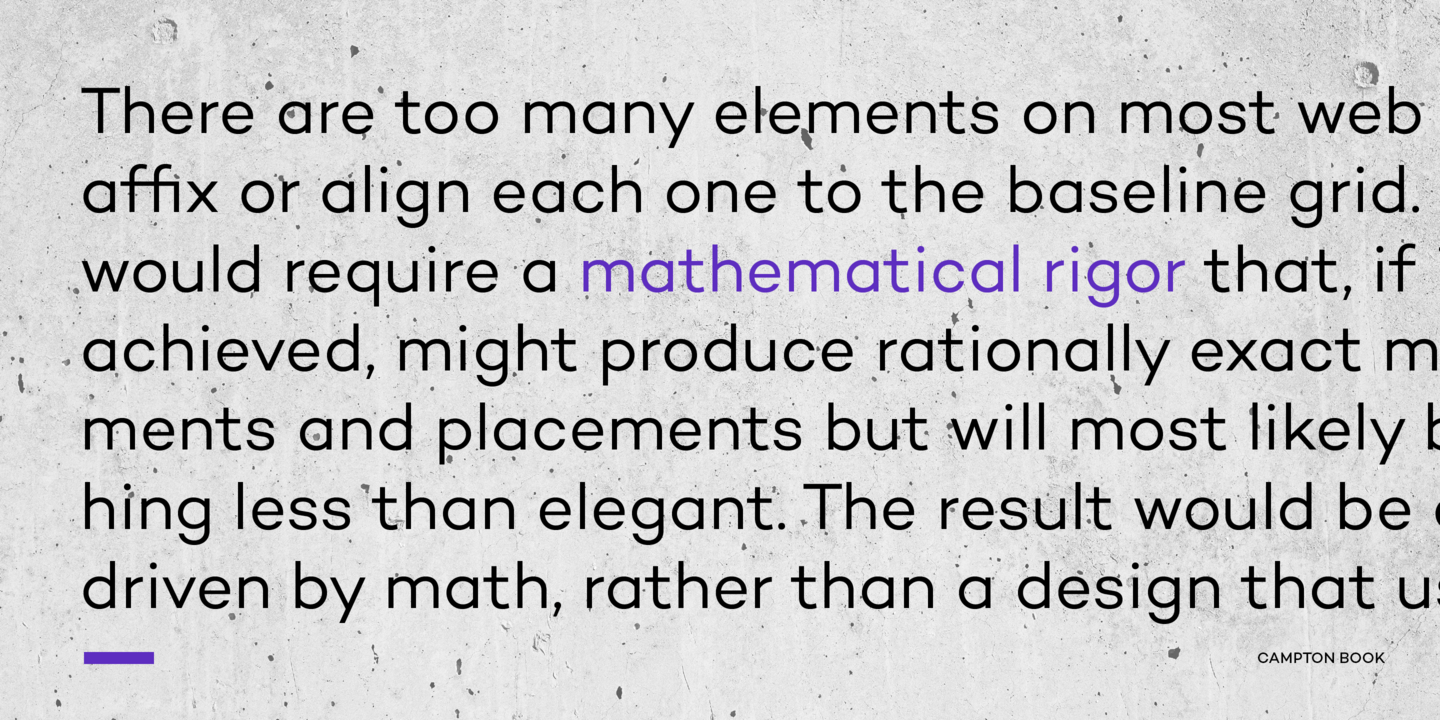
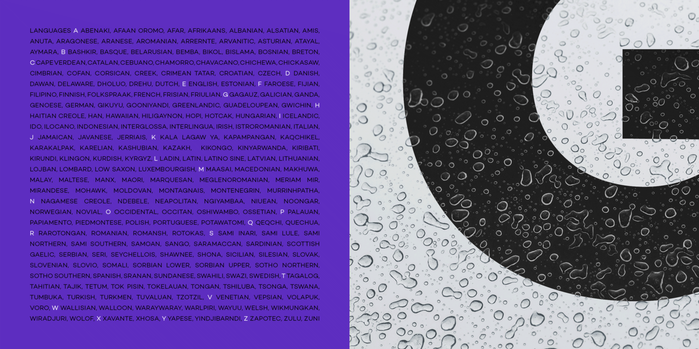
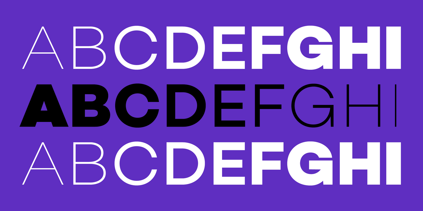
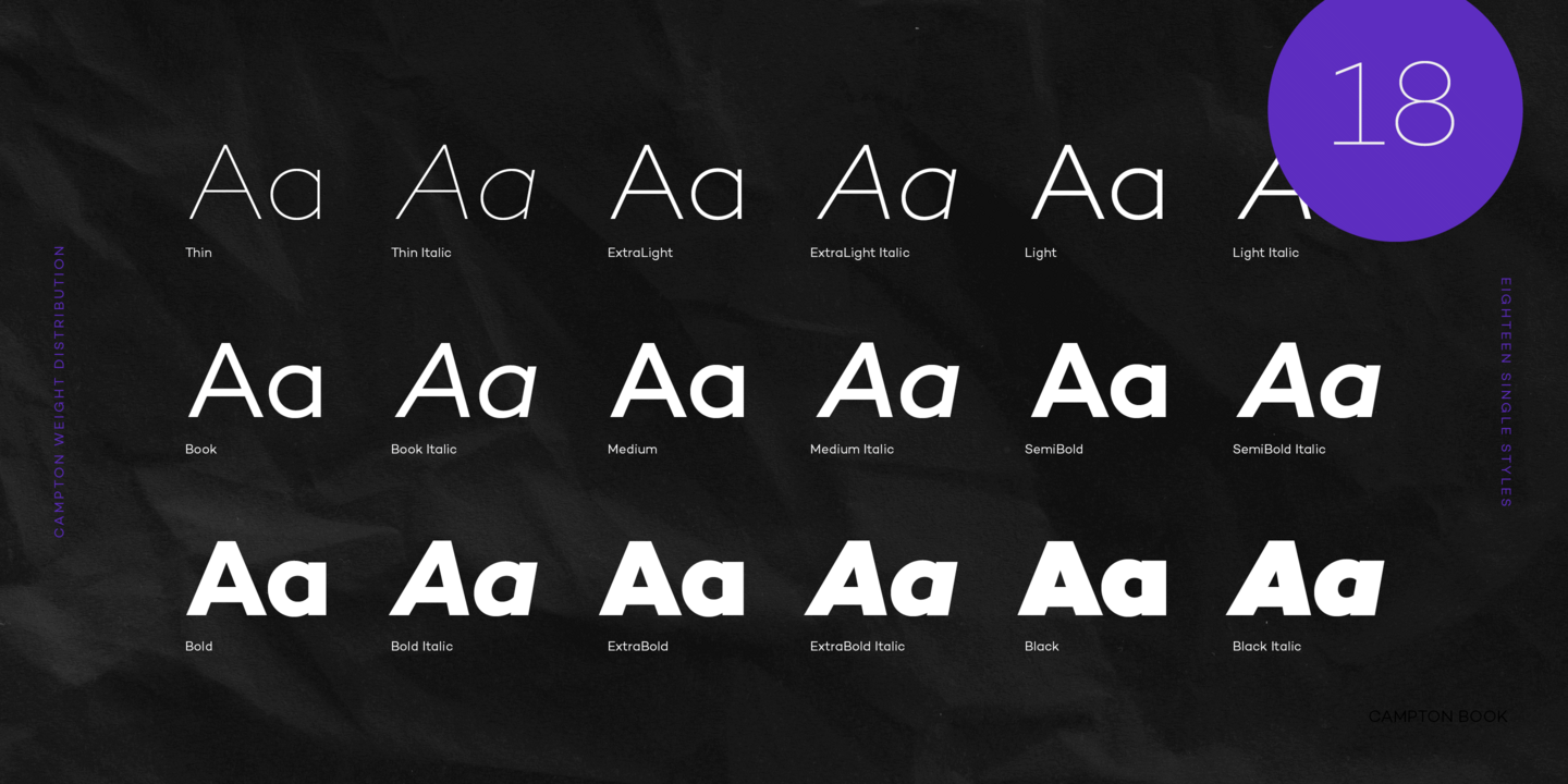
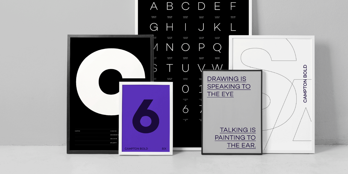
Campton is a geometric font family. It draws inspiration from different sources from the early 20th century such as Futura, Akzidenz or Gill Sans while combining them with contemporary elements such as proportional widths and a moderate x-height. The result is a modern and fresh take on the geometric genre that is perfectly suited for graphic design application ranging from editorial and corporate design to web and interaction design. The family comes in nine weights with matching italics and is equipped with a wide range of opentype features.
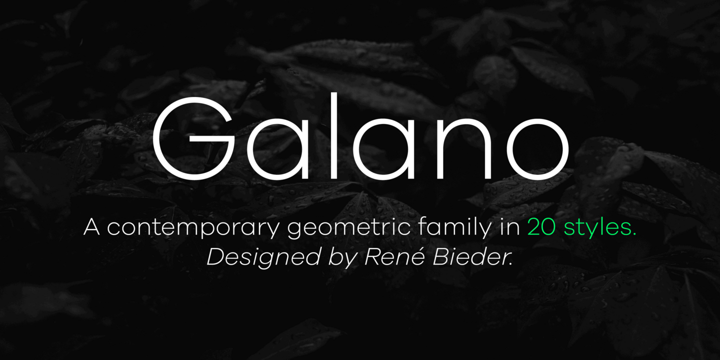
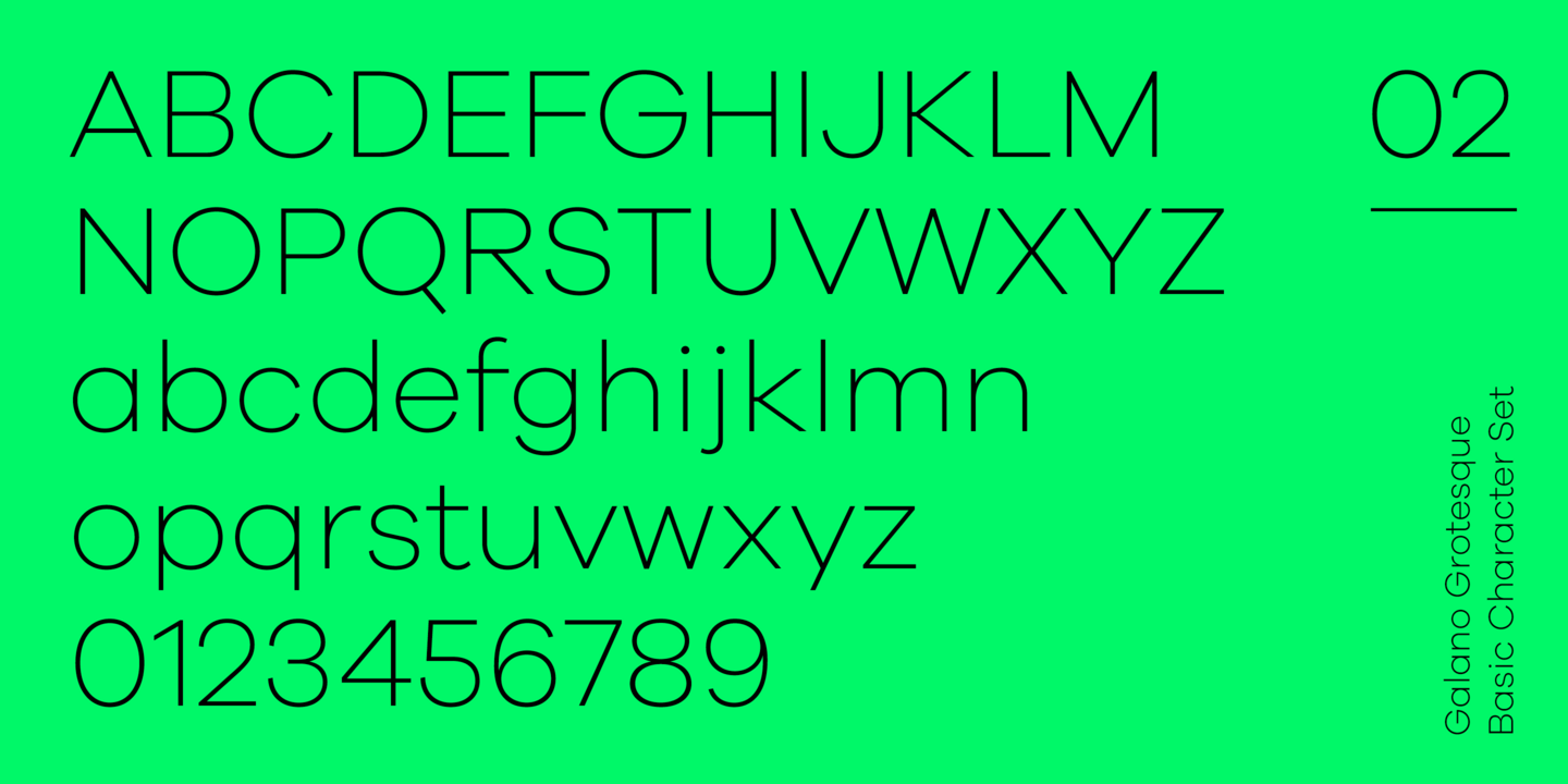
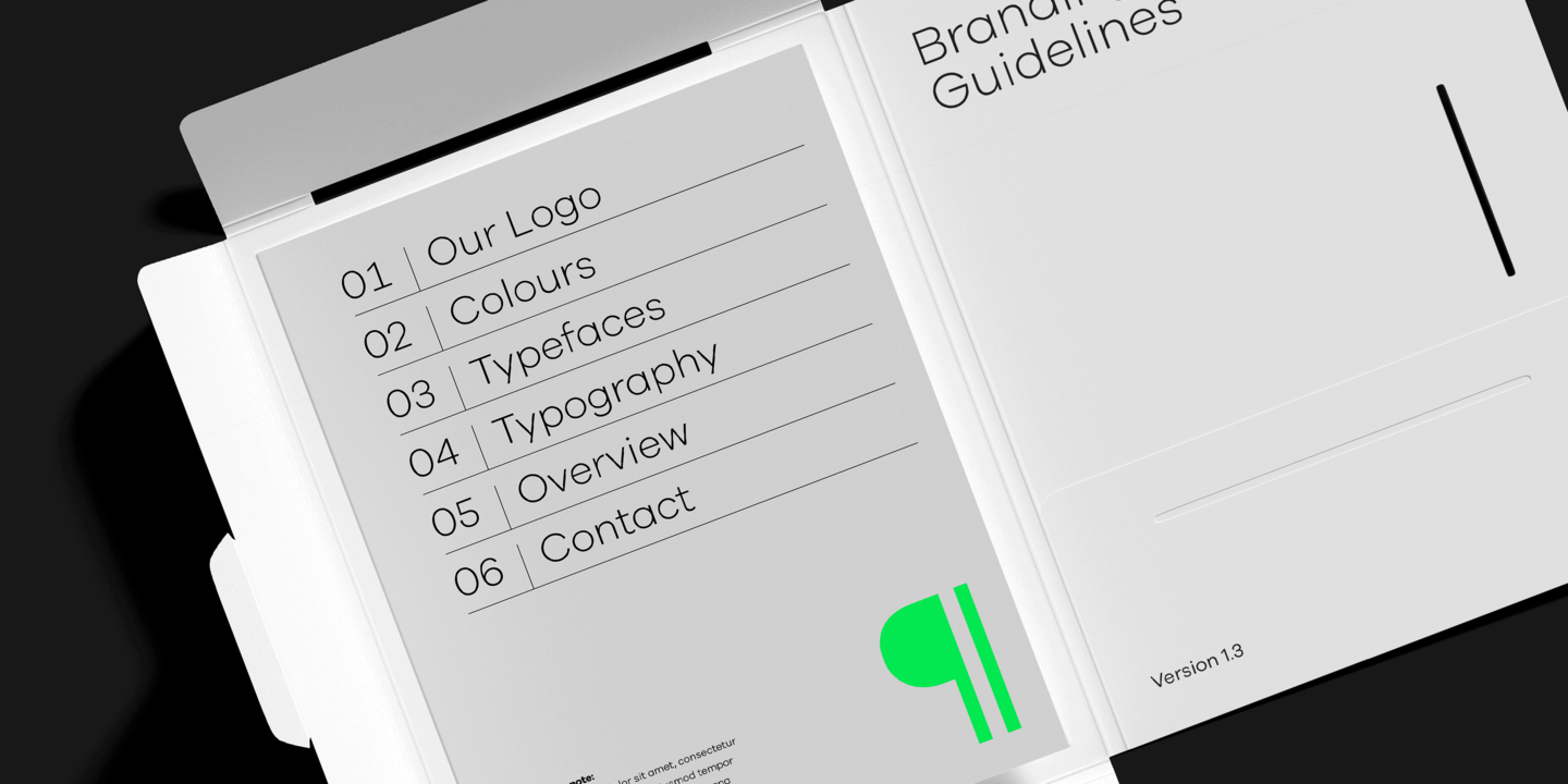
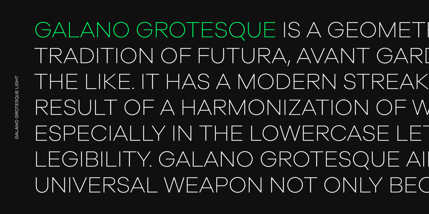
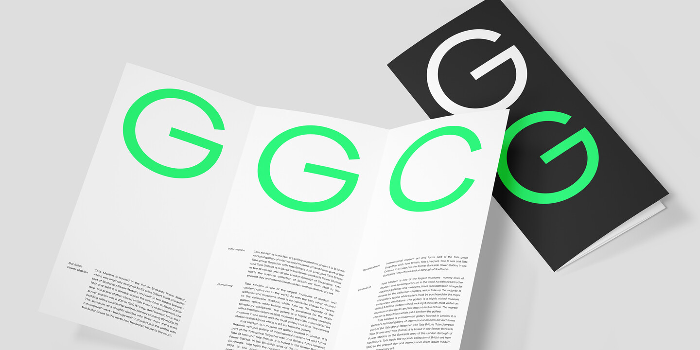
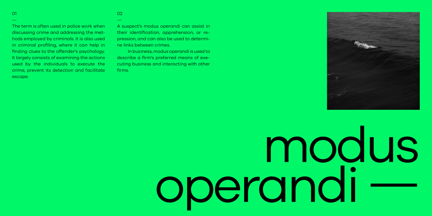
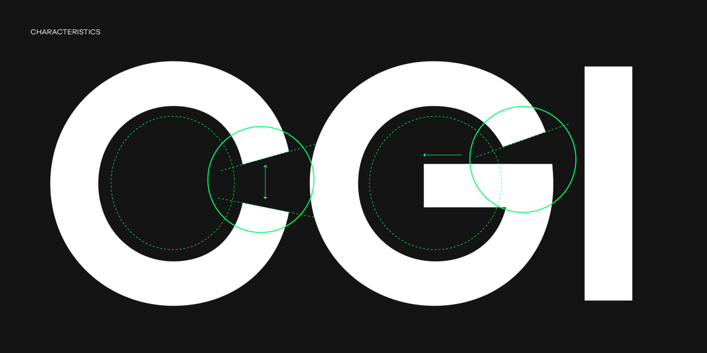
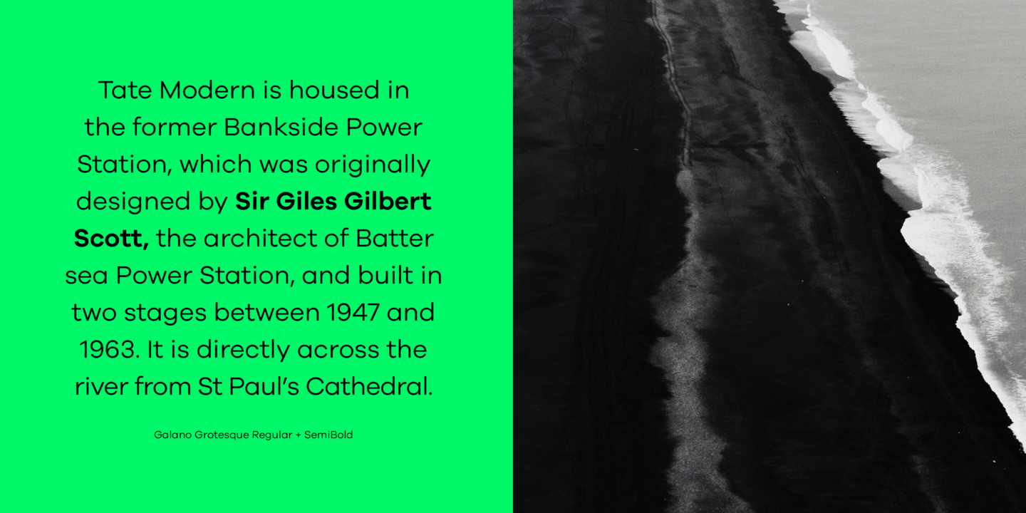
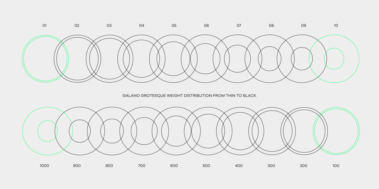
Galano Grotesque is a geometric sans in the tradition of Futura, Avant Garde, Avenir and the like. It has a modern streak which is the result of a harmonization of width and height especially in the lowercase letters to support legibility. Galano Grotesque aims to be a universal weapon not only because it works great in headlines, short and long copies but also because of its subtle neutrality. It comes in 10 different weights with matching italics and is equipped with a set of powerful opentype features including alternative glyphs, fraction, arrows, ligatures and many more. An extended character set, supporting Central, Western and Eastern European languages, rounds up the family.
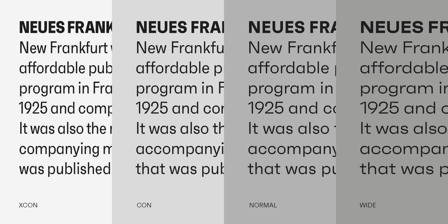
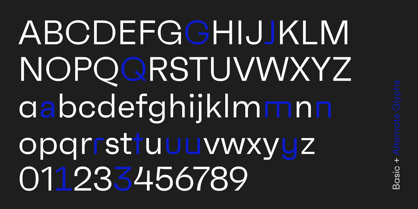
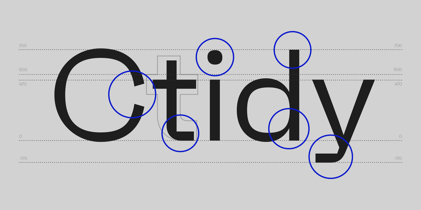
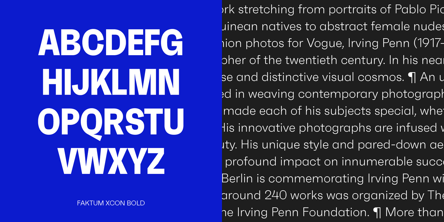
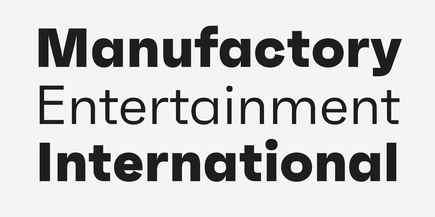
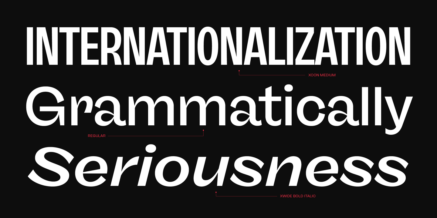
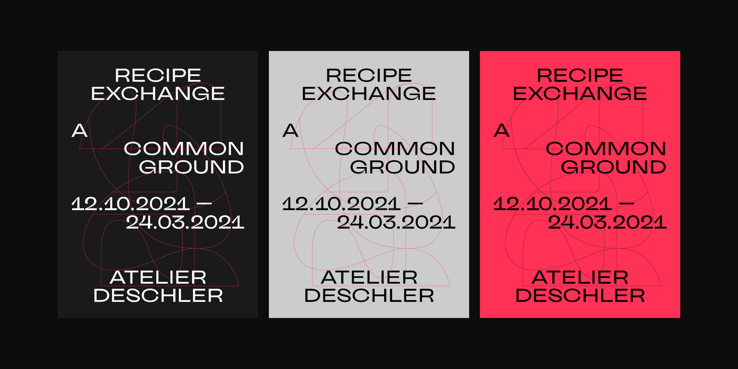
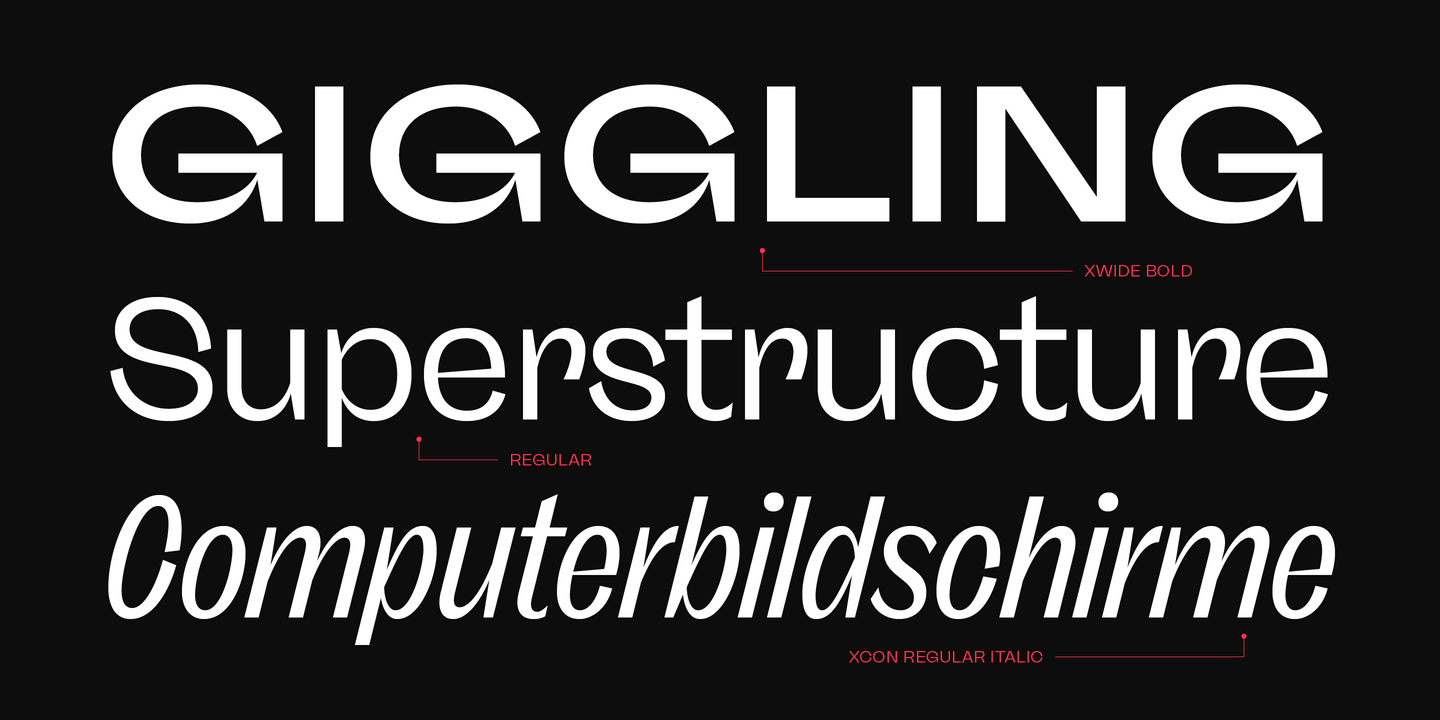
Faktum is an exploration into the geometric sans genre, inspired by Mid-century modern architecture and interior design. Especially the combination of clear lines, organic curves and geometric shapes, highly popular among designers and architects of the second third of the 20th century, gave the impetus for a design with modernist roots and a contemporary finish.
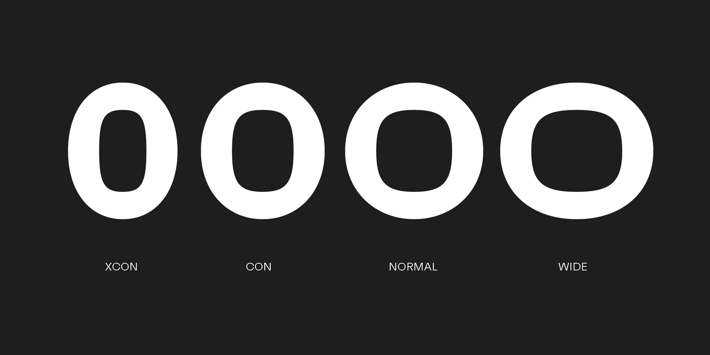
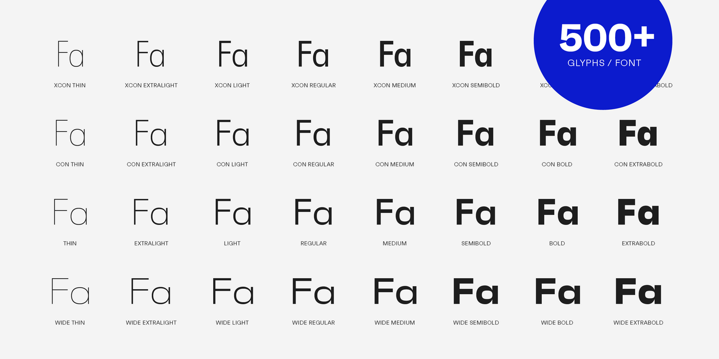
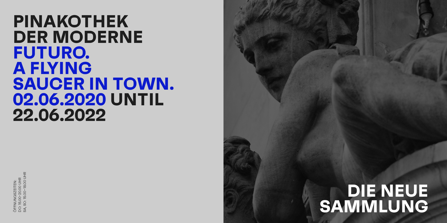
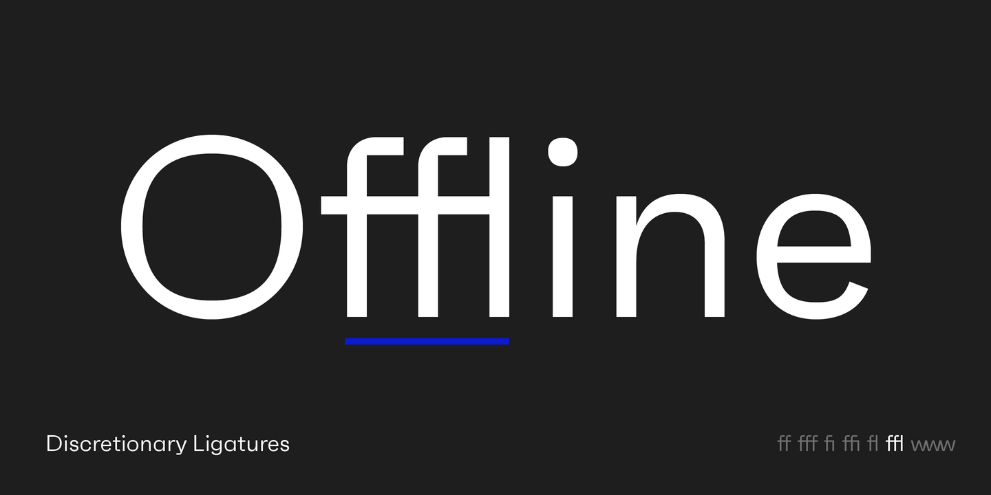
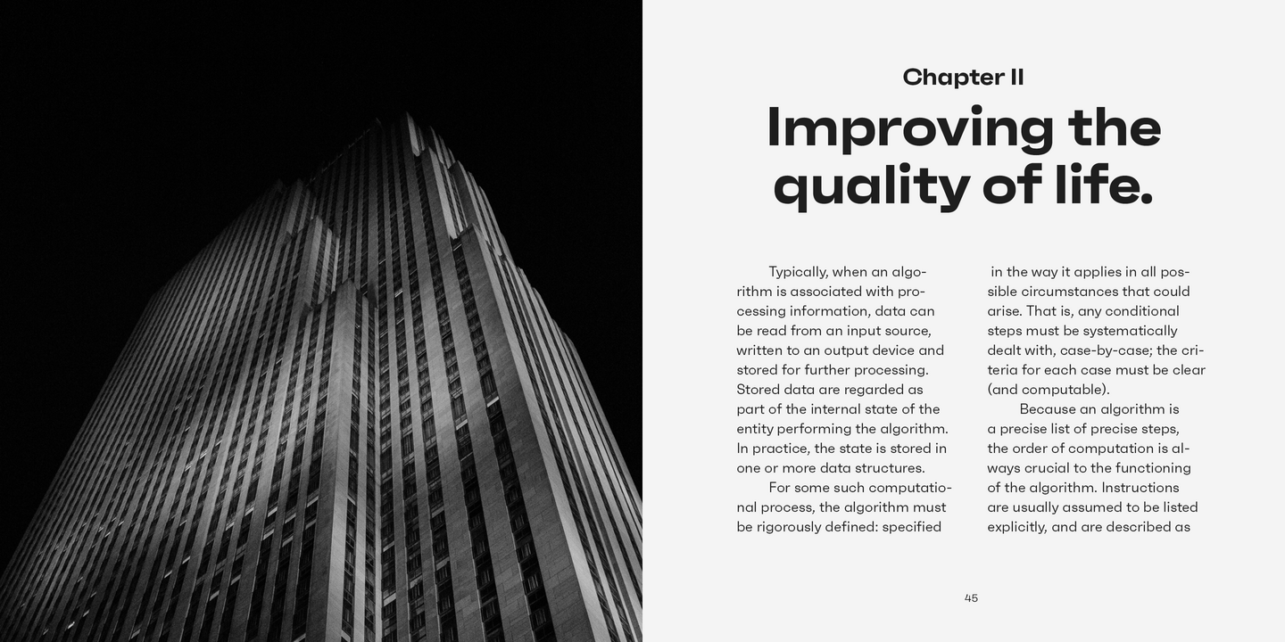
The family comes in 4 widths (XCon, Con, Normal and Wide) and 8 weights plus matching italics, featuring a wide range of alternate characters and opentype features like discretionary ligatures, case sensitive shapes, different number sets and many more. Due to its clean lines and slightly organic structure, Faktum functions great in many sizes and surroundings, working either as a restrained supporting font in long paragraphs, or as a main actor in powerful headlines.
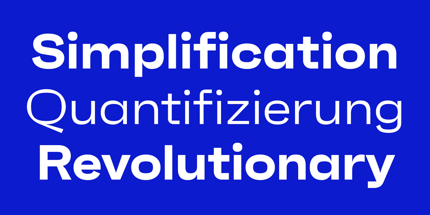
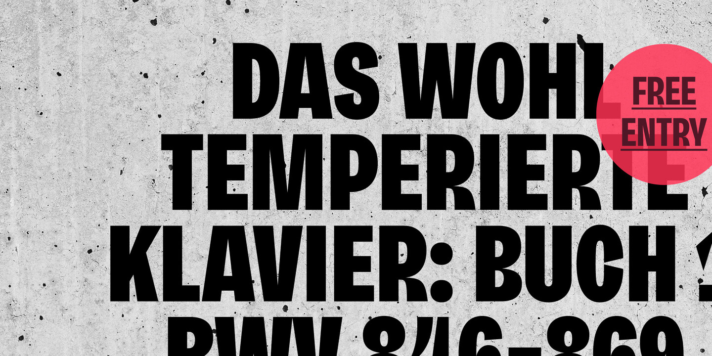
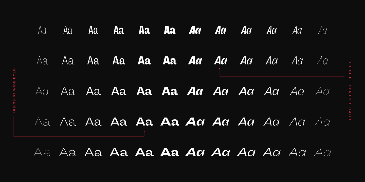
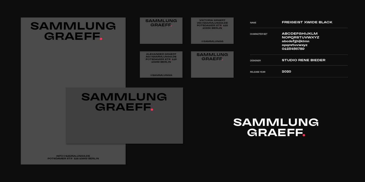
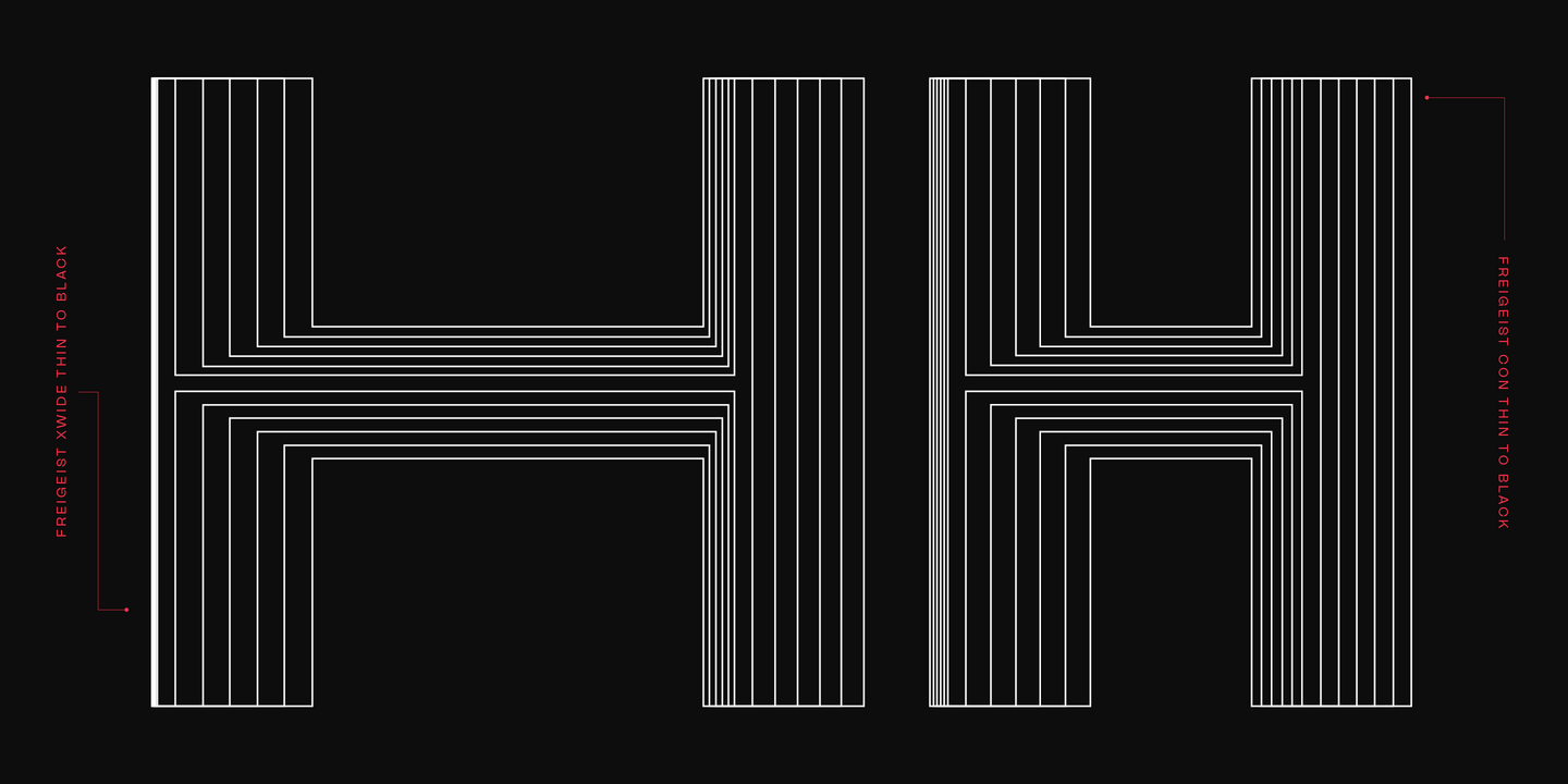
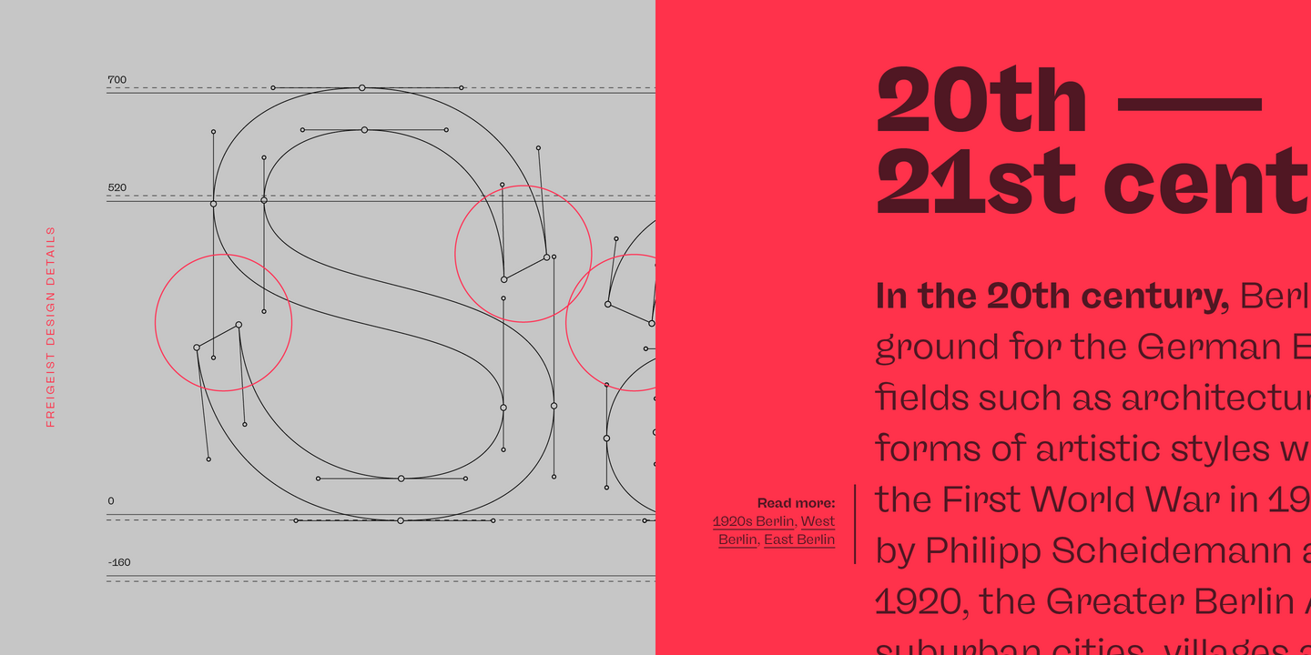
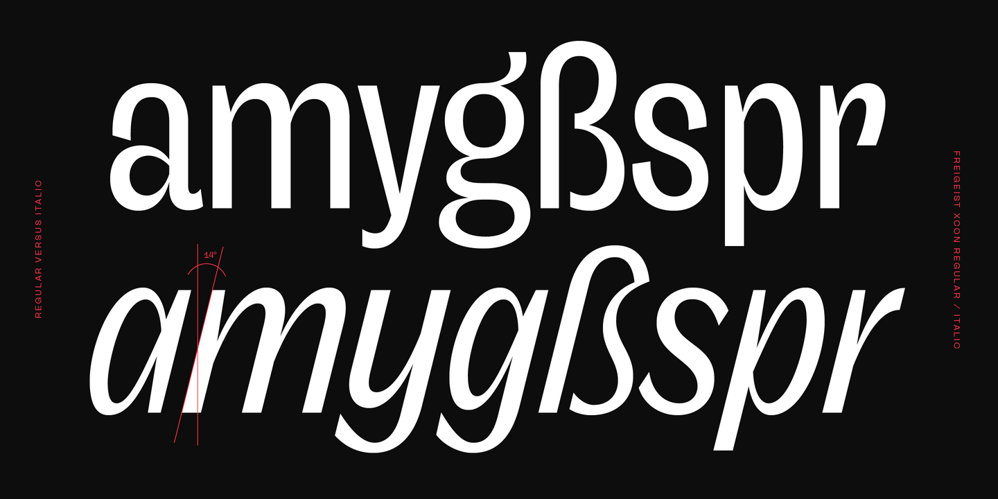
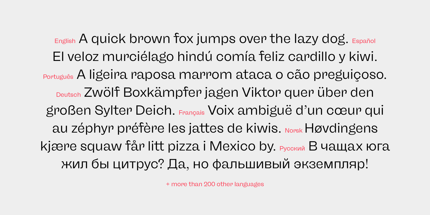
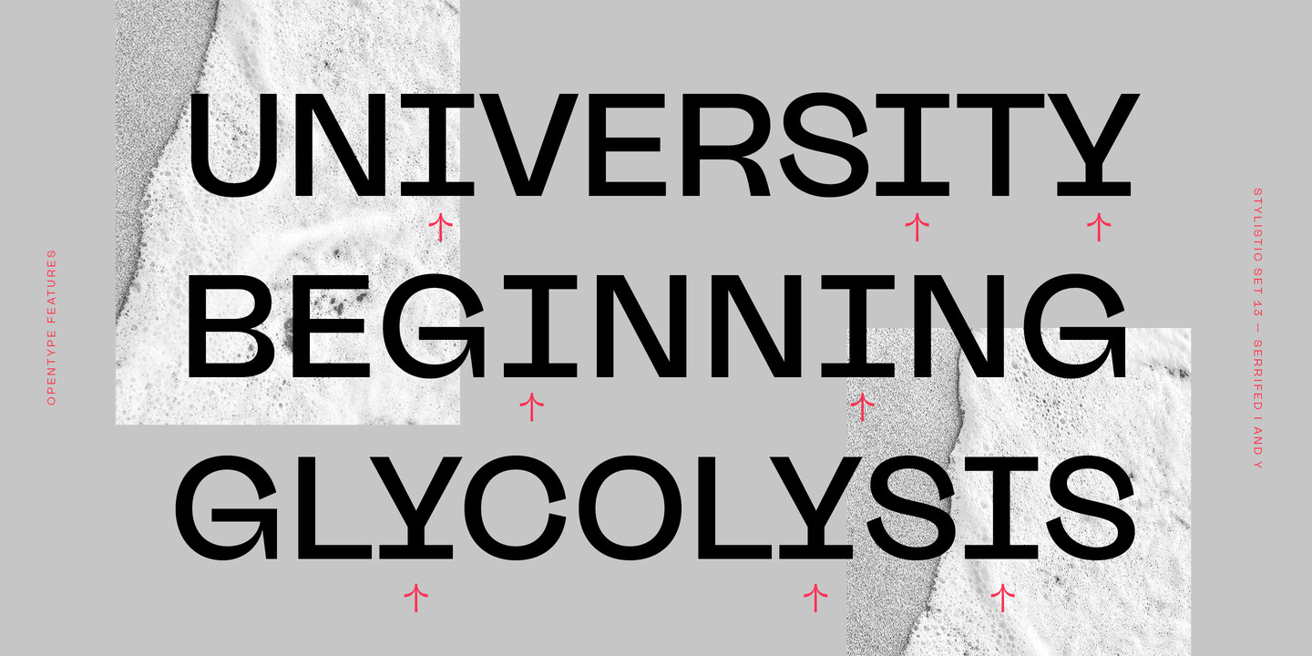
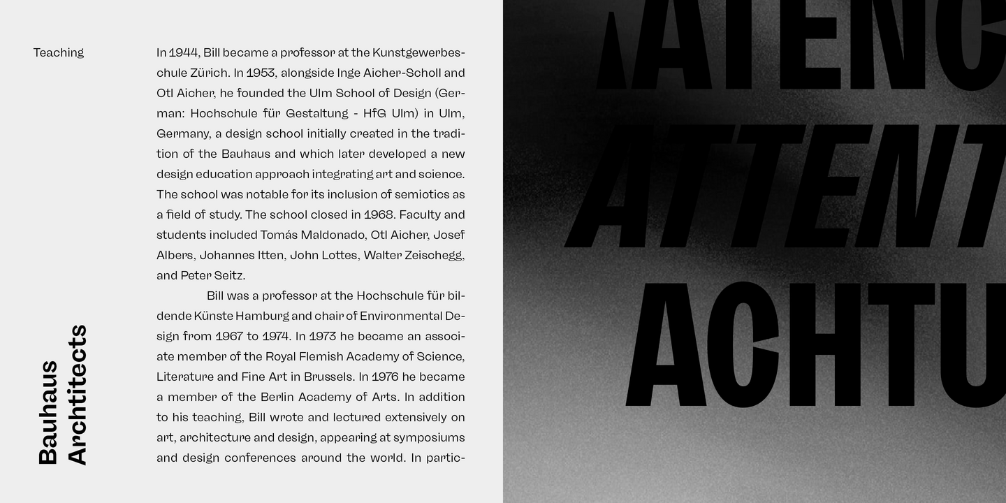
The story of Freigeist is a journey into the past, back to the early grotesk fonts and long before Helvetica and Co were standard fonts in operating systems. For what we take for granted today is the result of innovation and pioneering spirit of type foundries such as Caslon or Stephenson Blake in the 19th century, whose expressive designs are mostly forgotten today. The Freigeist family captures this untamed spirit — hence the name (German for “free spirit”) — and puts it into a contemporary context, resulting in a multi-faceted family with a wide range of applications, font styles and features for modern typesetting.
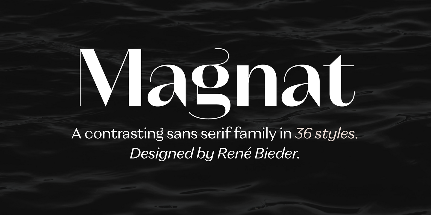
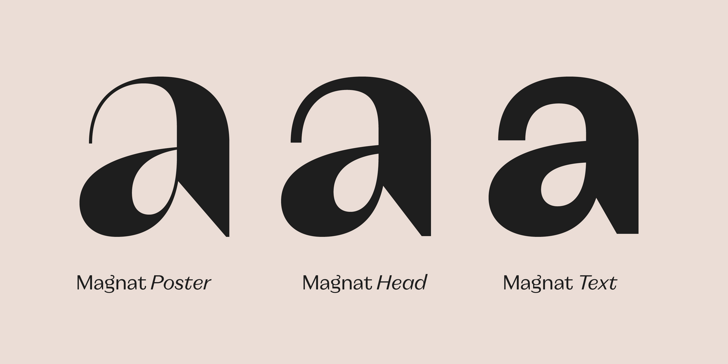
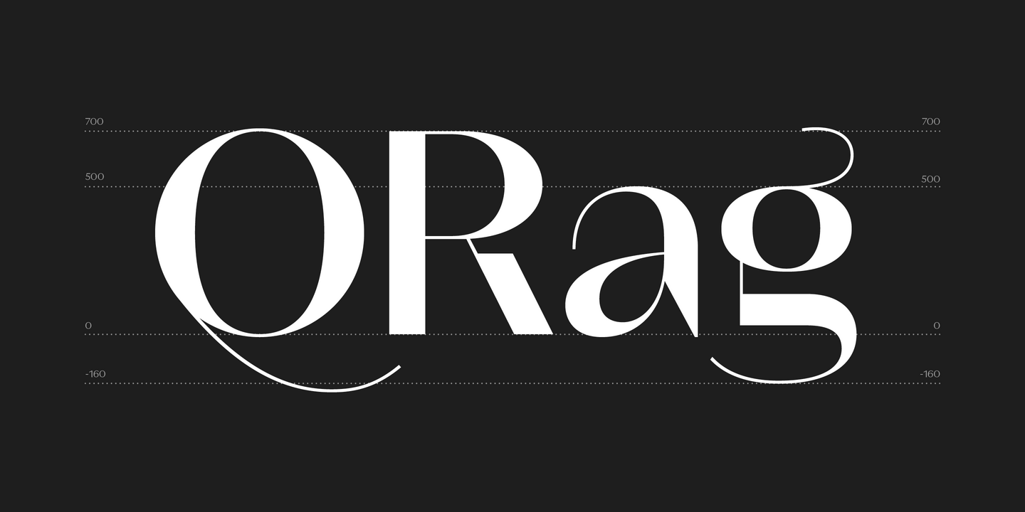
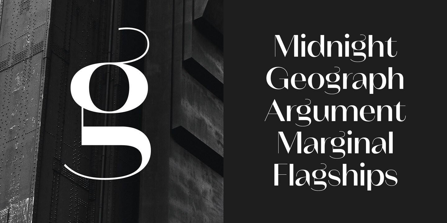
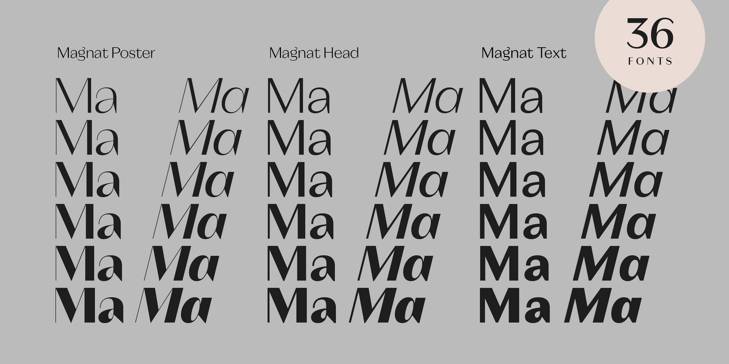
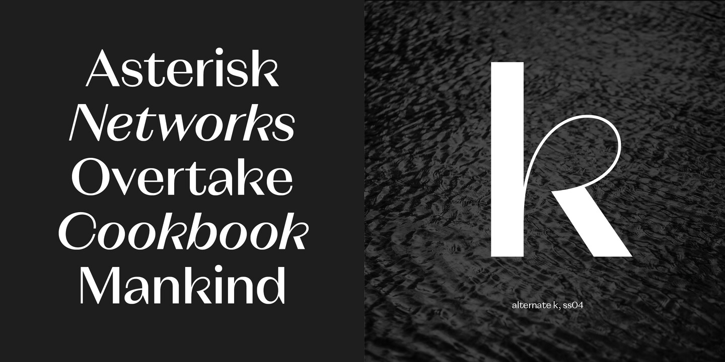
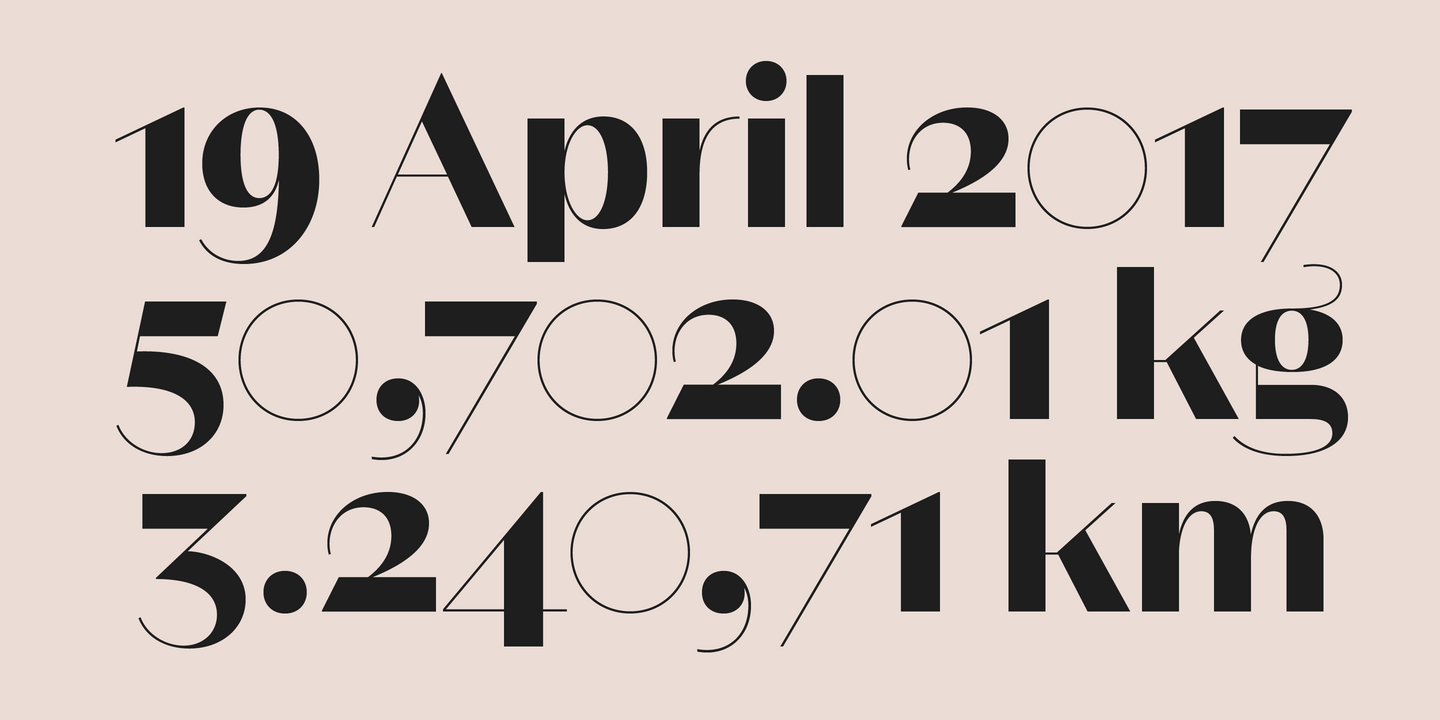
Magnat is a contrasting sans drawing inspiration from designs from the early twenties century and expands them into an elegant and distinctive contemporary design. Playful elements such as the curvy ear on the lowercase g or the long tail on the uppercase Q break the strictness and add character. The combination of closed apertures with the contrasting strokes create an elegant and distinctive overall appearance.
Fonts in use.
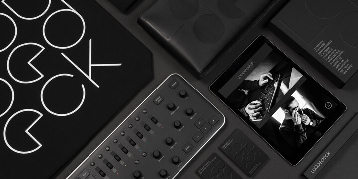
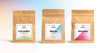
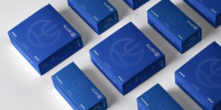
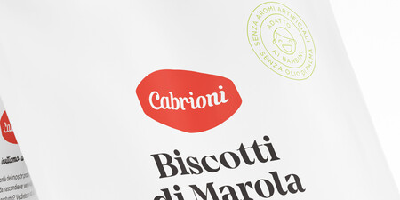
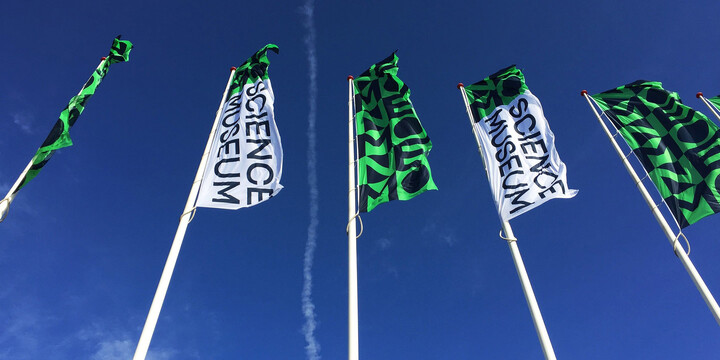
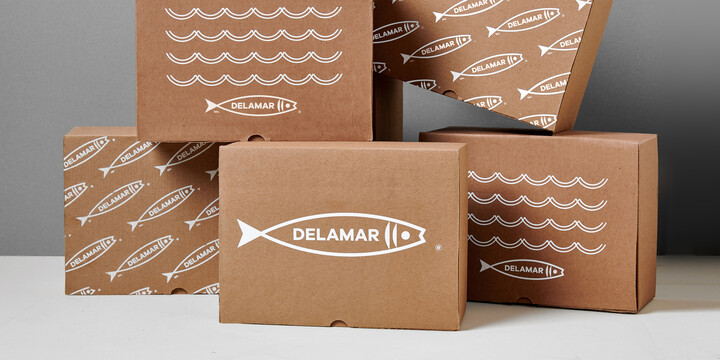
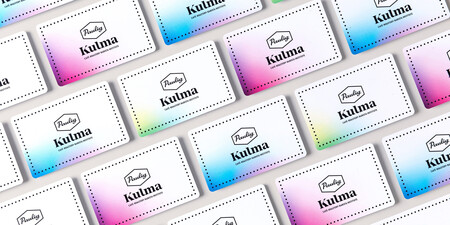
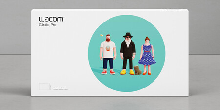
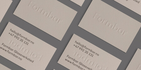

Studio René Bieder is an independent Type and Graphic Design Practice out of Berlin, specializing in the development of retail typefaces, custom font solutions and visual brand consultancy. All retail fonts are based around the idea of creating unique and powerful tools for brands and individuals, combining historical knowledge with a strong contemporary approach. Please visit www.renebieder.com for more information.

Type Designer
Rene Bieder
René was born and raised in Berlin. Before his first font release in 2012, he worked as an art director and designer for small and large advertising agencies in Berlin for over ten years. Fueled by the success of his first type release (MyFonts Most Popular Fonts of 2012), he started working on more designs and finally went freelance in 2014. Also in 2014, he released the Campton and Galano font families which are still featured today in the Top 50 Best Sellers list on Myfonts. His clients include brands such as Disney and Penguin Books, the New South Wales government, several private television stations, Wacom, Bahlsen, Bumble, and the Discovery Channel. René is currently working on new retail typefaces and custom fonts for companies large and small.
