Fonts from Zetafonts.

Proudly breeding quick brown foxes since 2001. Zetafonts finely designs high quality retail typefaces and provides custom font design services for commercial and institutional clients.
Popular Zetafonts Typefaces
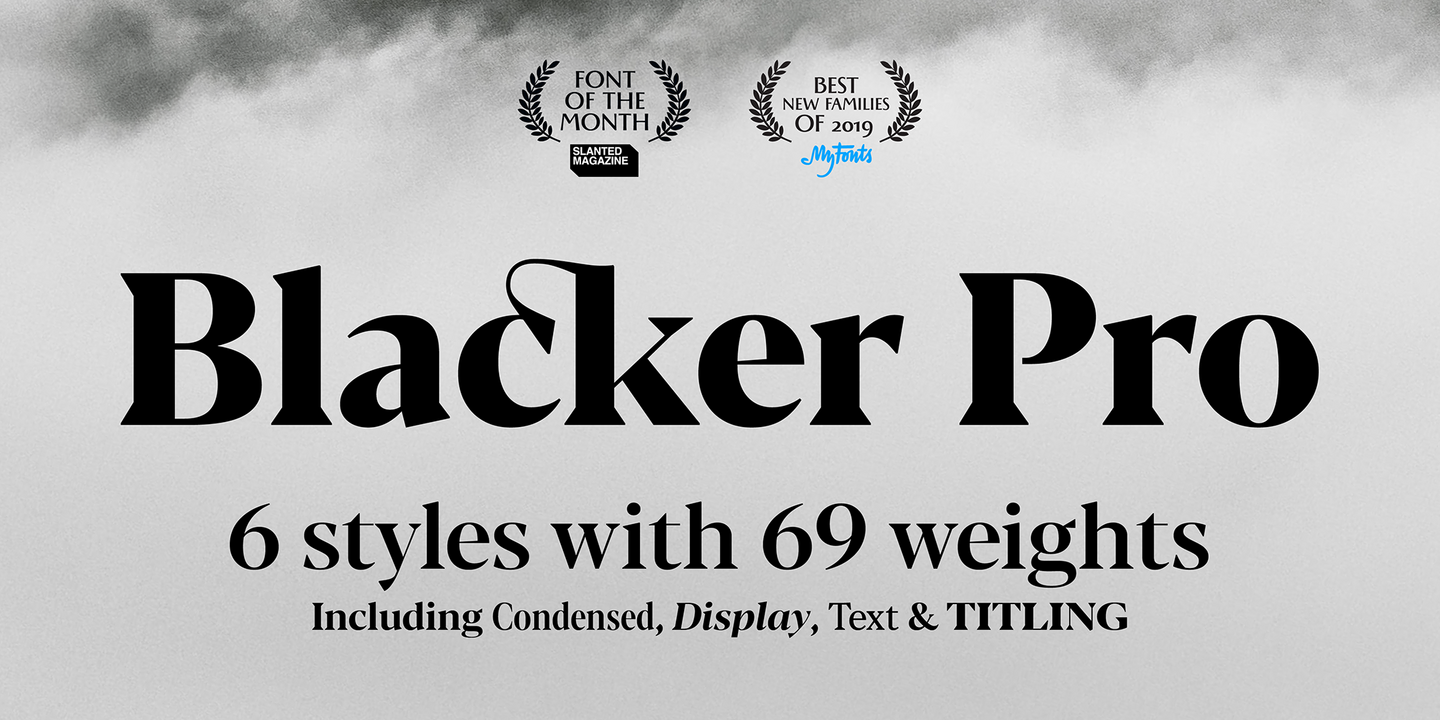
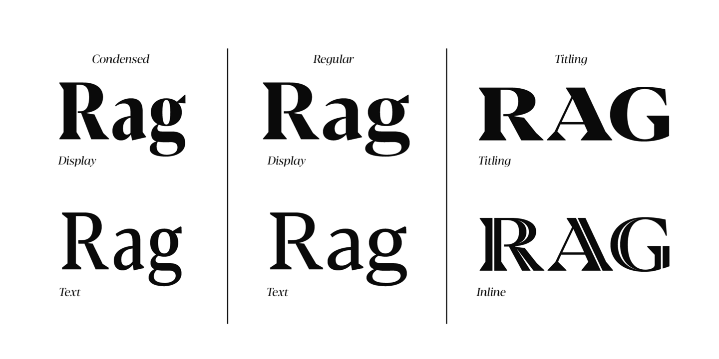
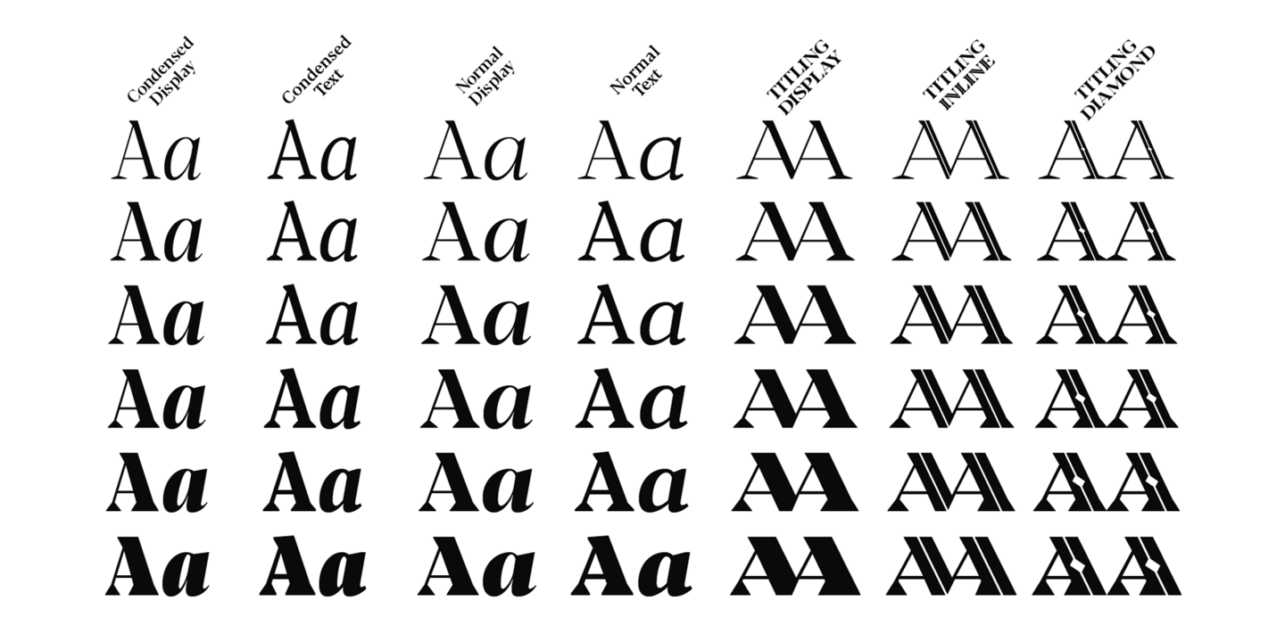
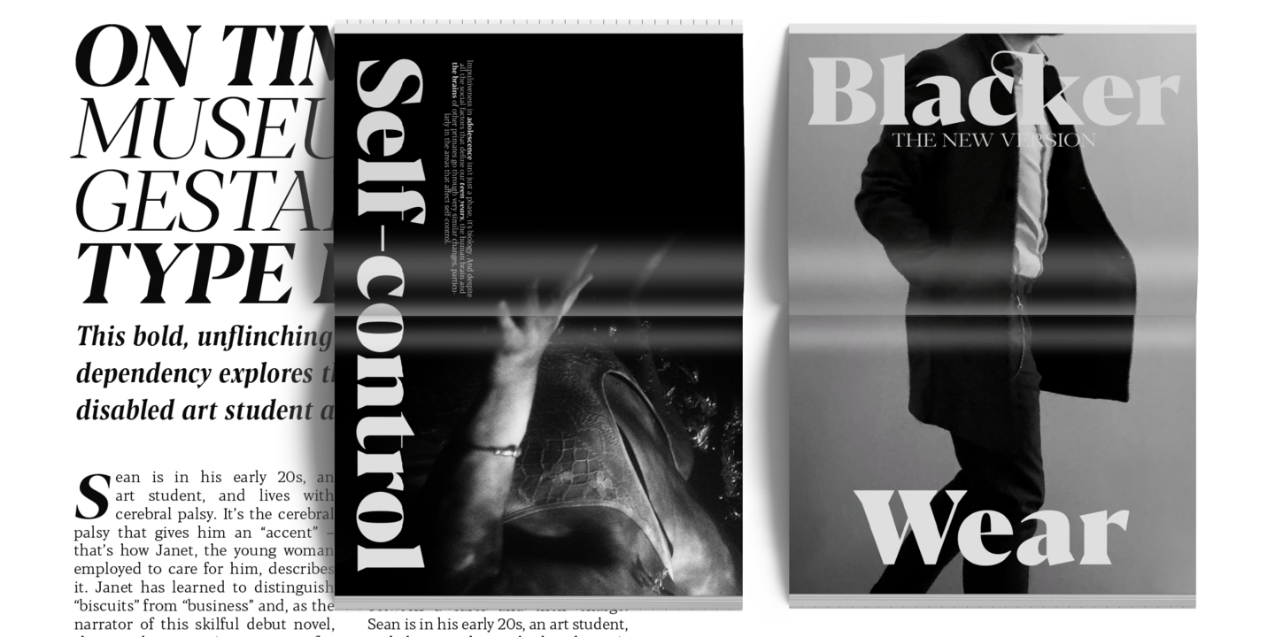
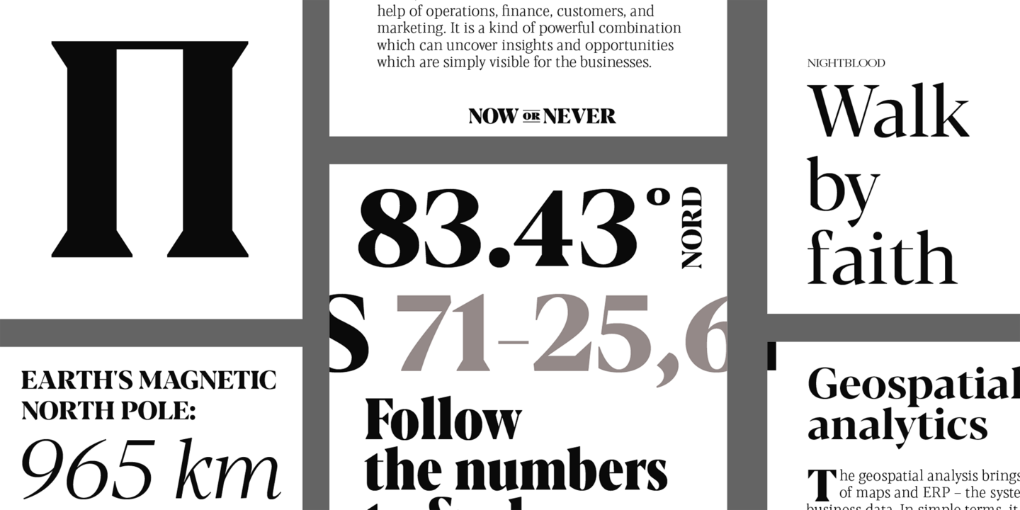
Blacker was developed as a take on the style defined as the “evil serif” genre: typefaces with high contrast, oldstyle or modern serif proportions and sharp, blade-like triangular serifs. Due to the high contrast in the design - slightly reminescent of didone typefaces - Blacker has been developed in two optical subfamilies (display and text), plus two additional condensed variant families, and three titling uppercase-only variants. Each of these variants has been developed in six weights for a total of 69 styles covering a wide range of editorial and advertising uses.
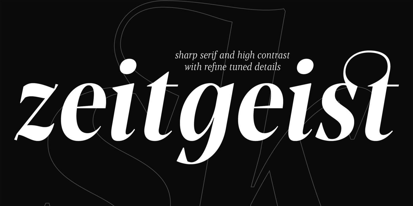
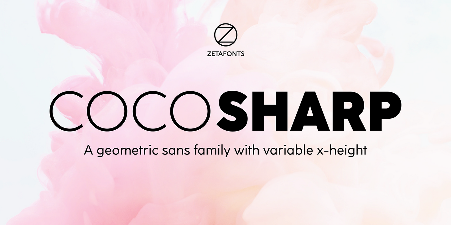
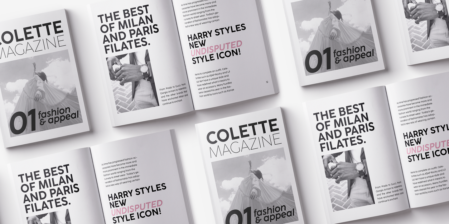
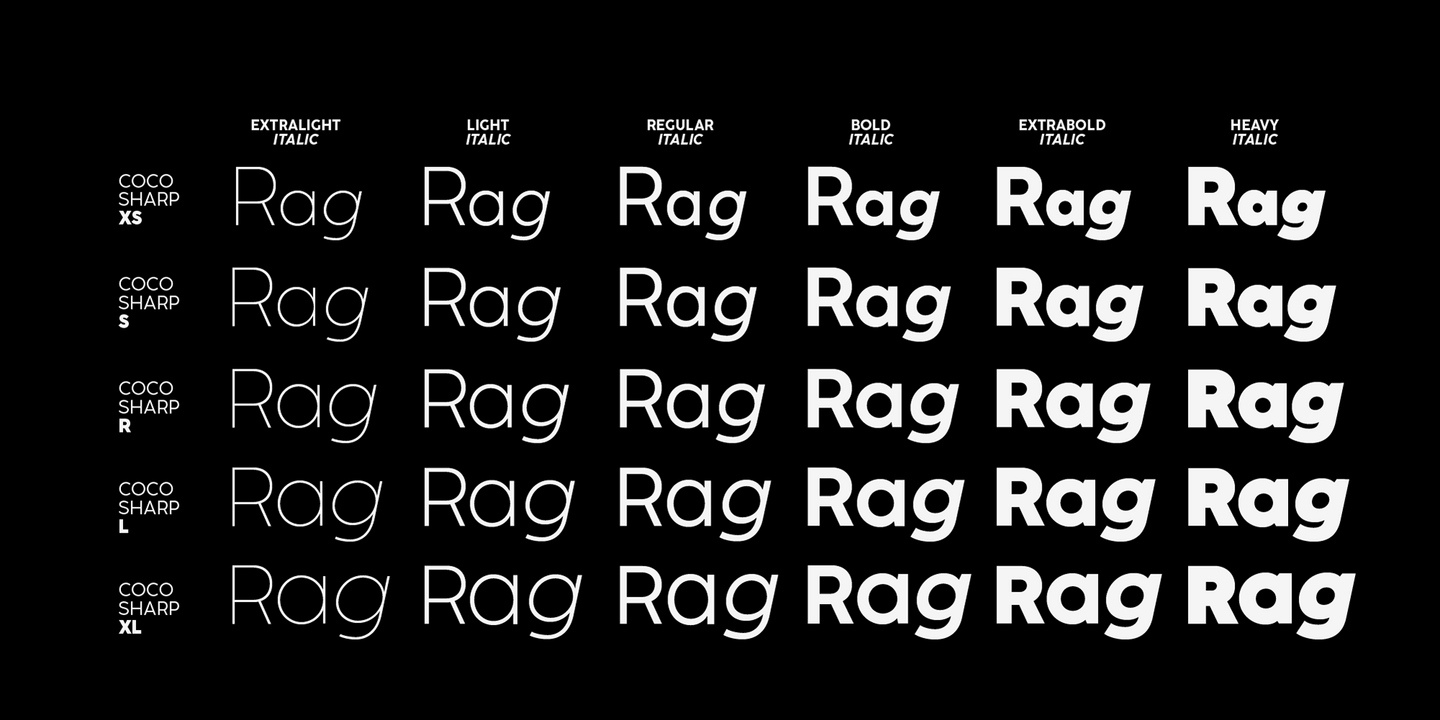
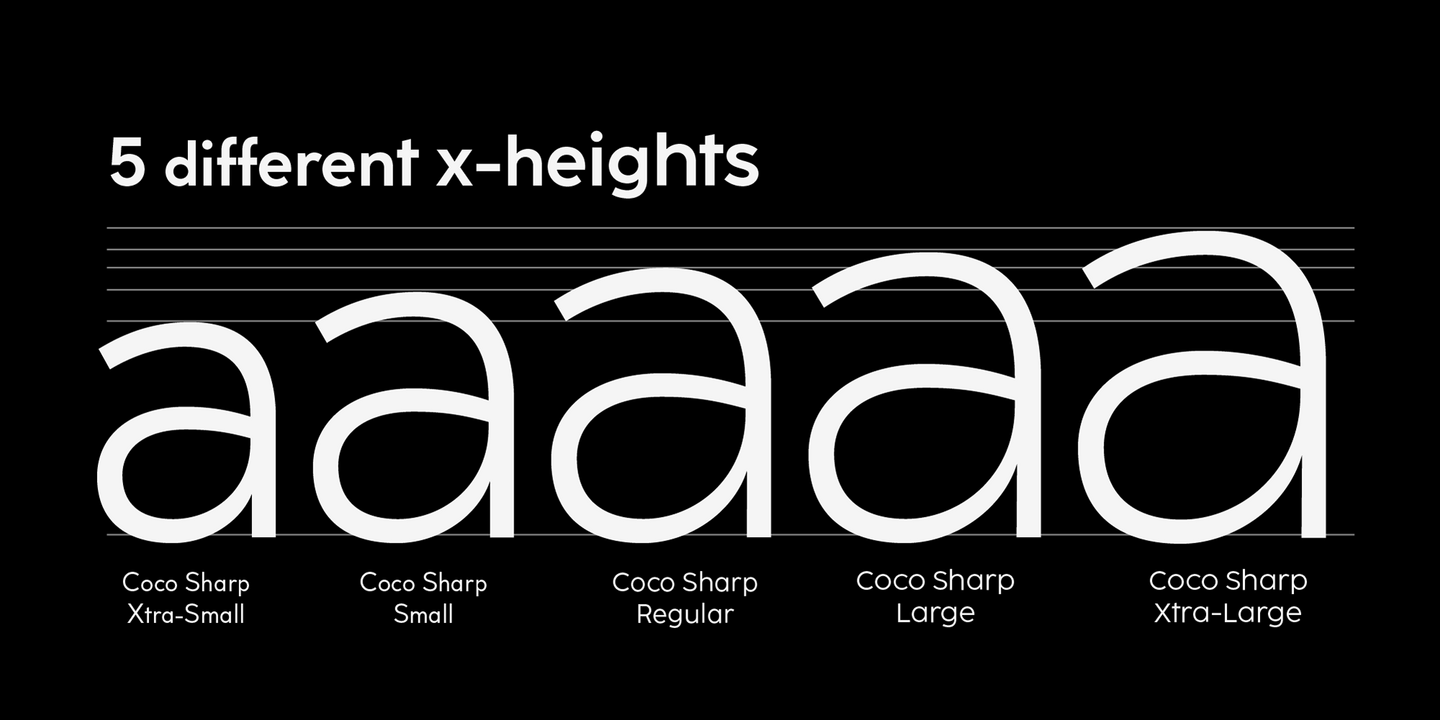
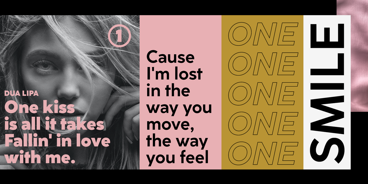
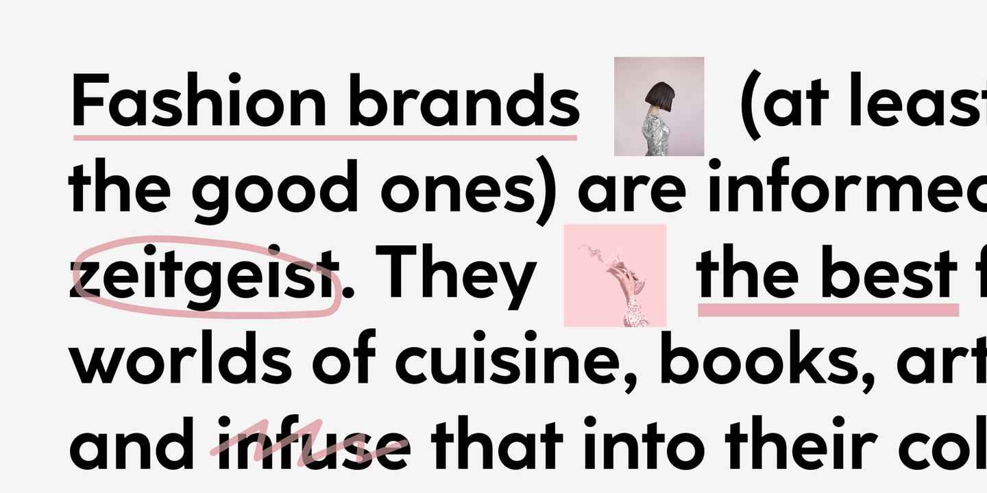
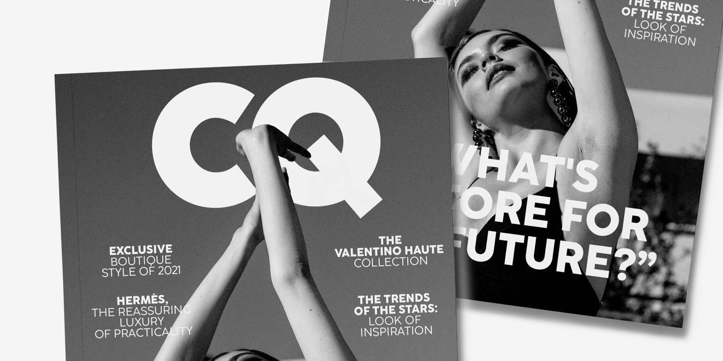
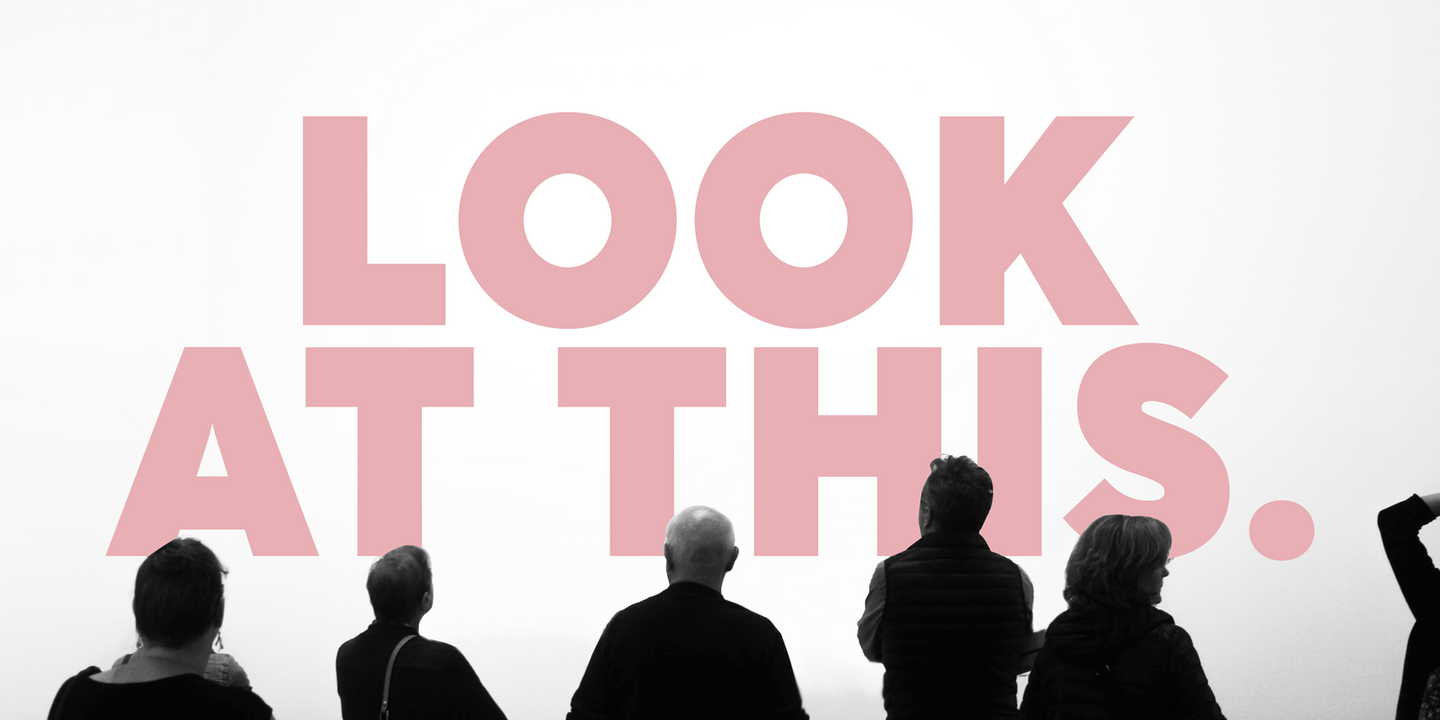
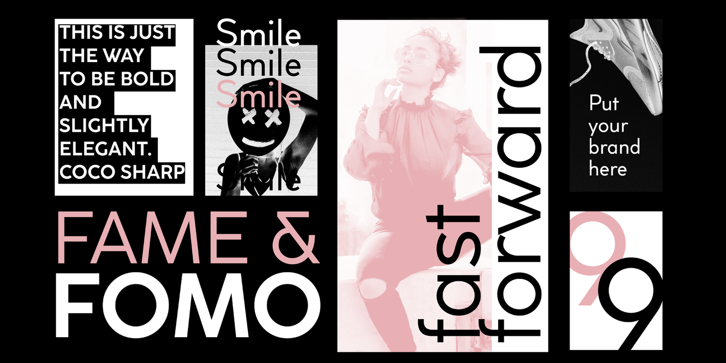
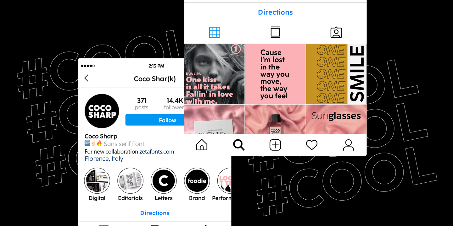
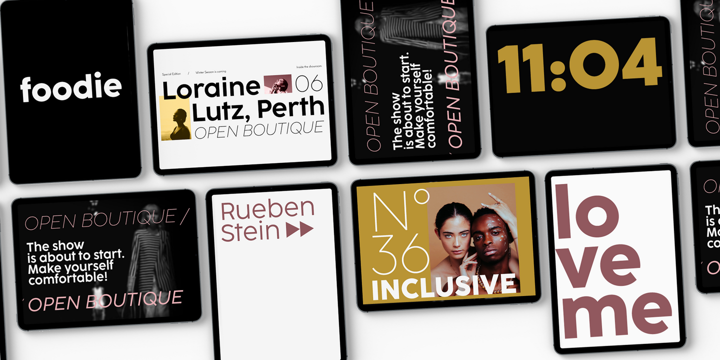
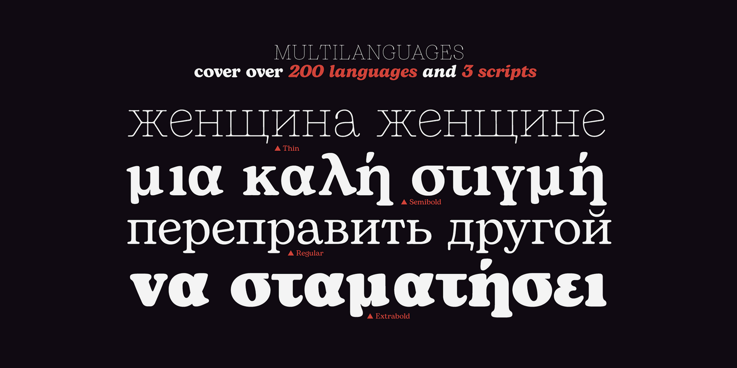
The peculiarity of Coco Sharp lies in the wide choice of xheights given to the user, both by providing a variable version and five graded sub-families, that allows designers to fine-control text readability and space usage. All the 60 weights of Coco Sharp come with a full set of open type features allowing faultless typesetting. Use Coco Sharp out of the box as a solid workhorse family or enjoy discovering the limitless possibilities of its 2000+ latin, Cyrillic and greek glyphs covering over 200 languages worldwide.
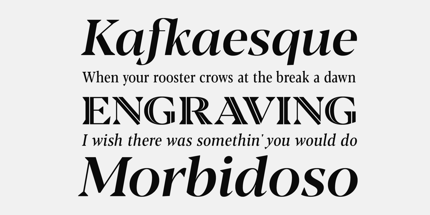
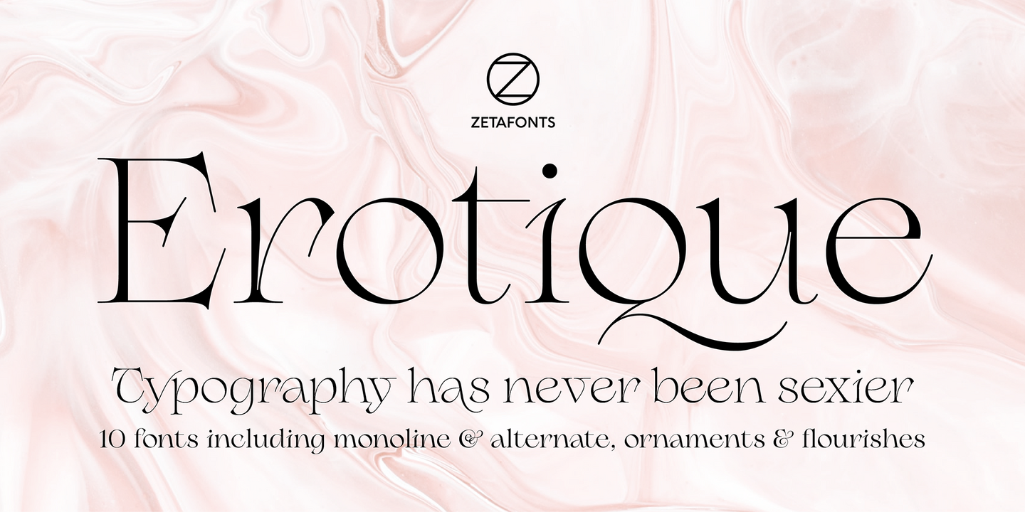
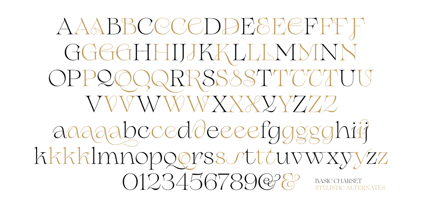
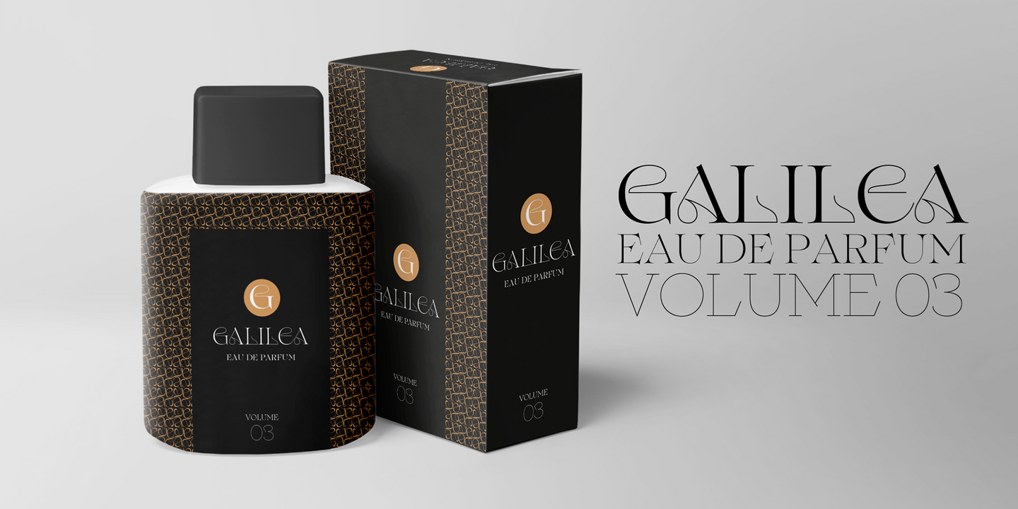
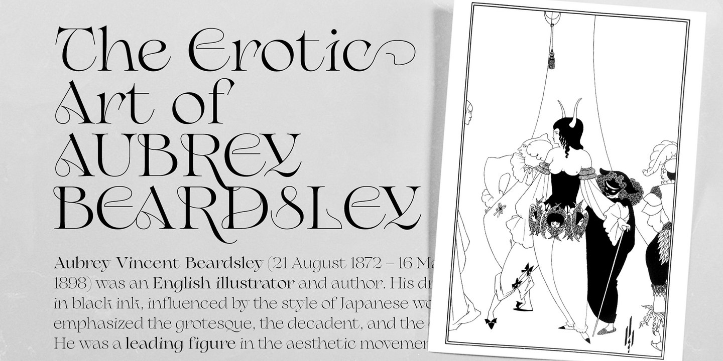
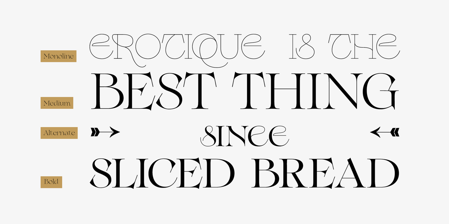
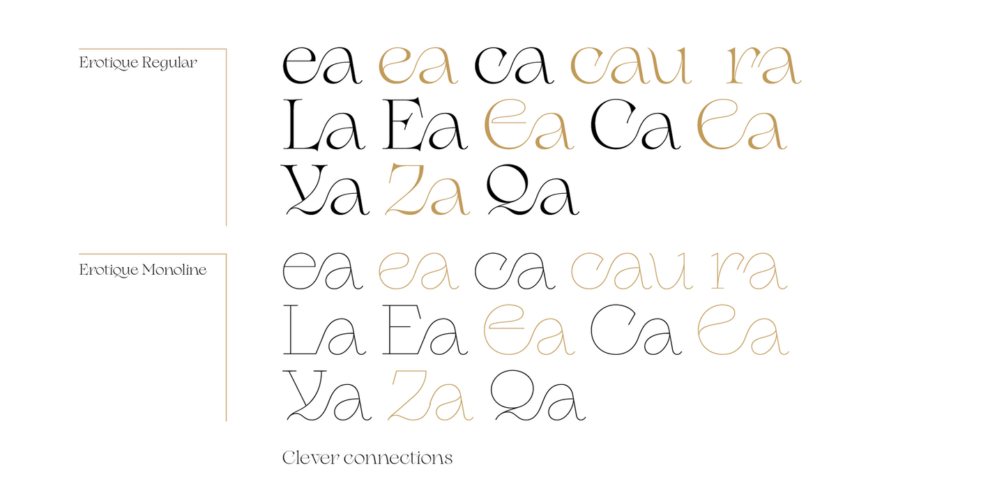
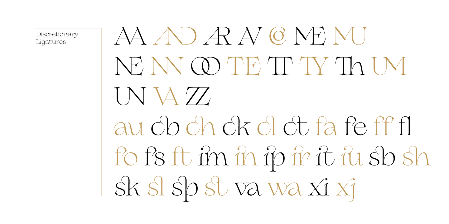
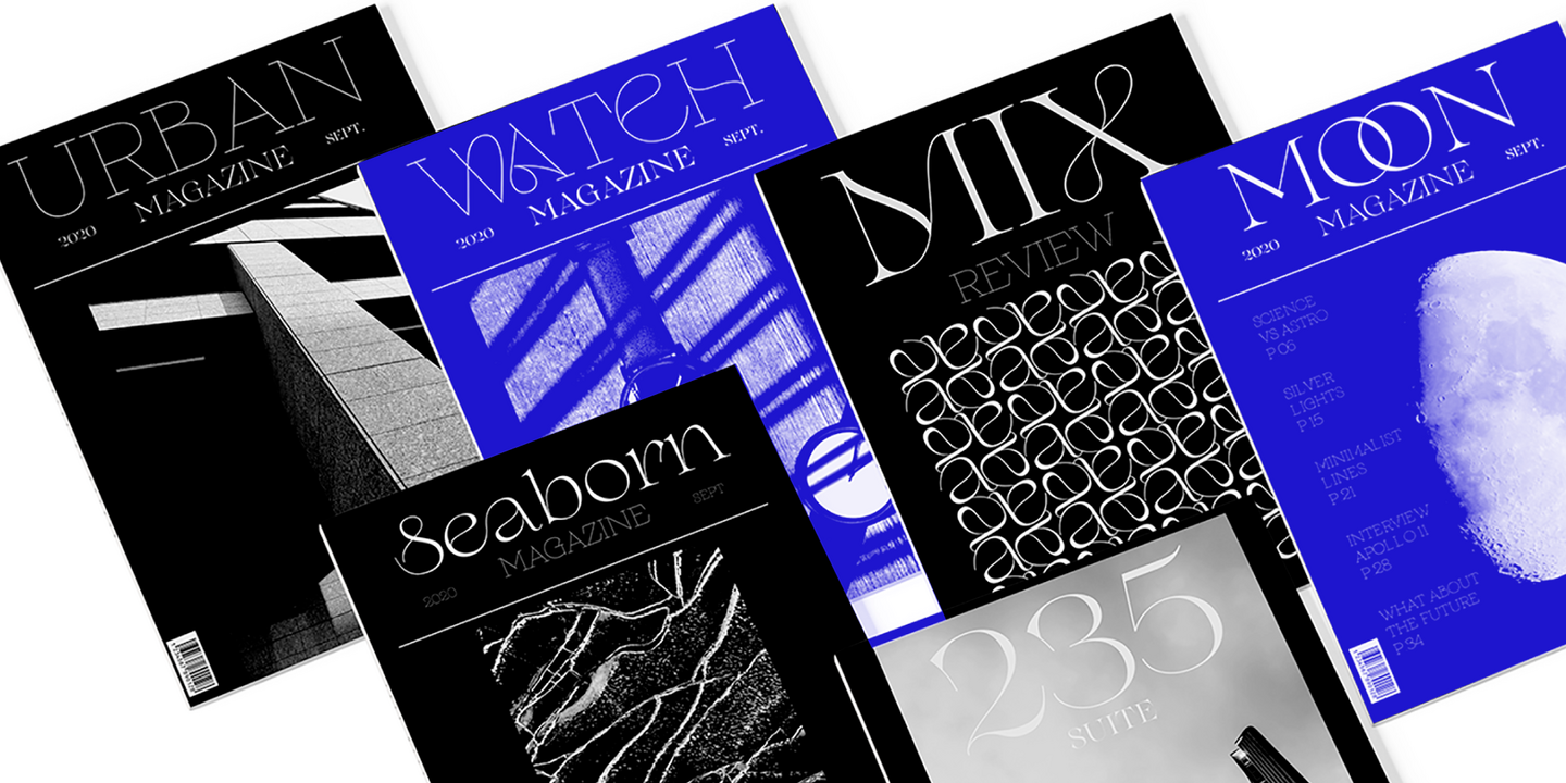
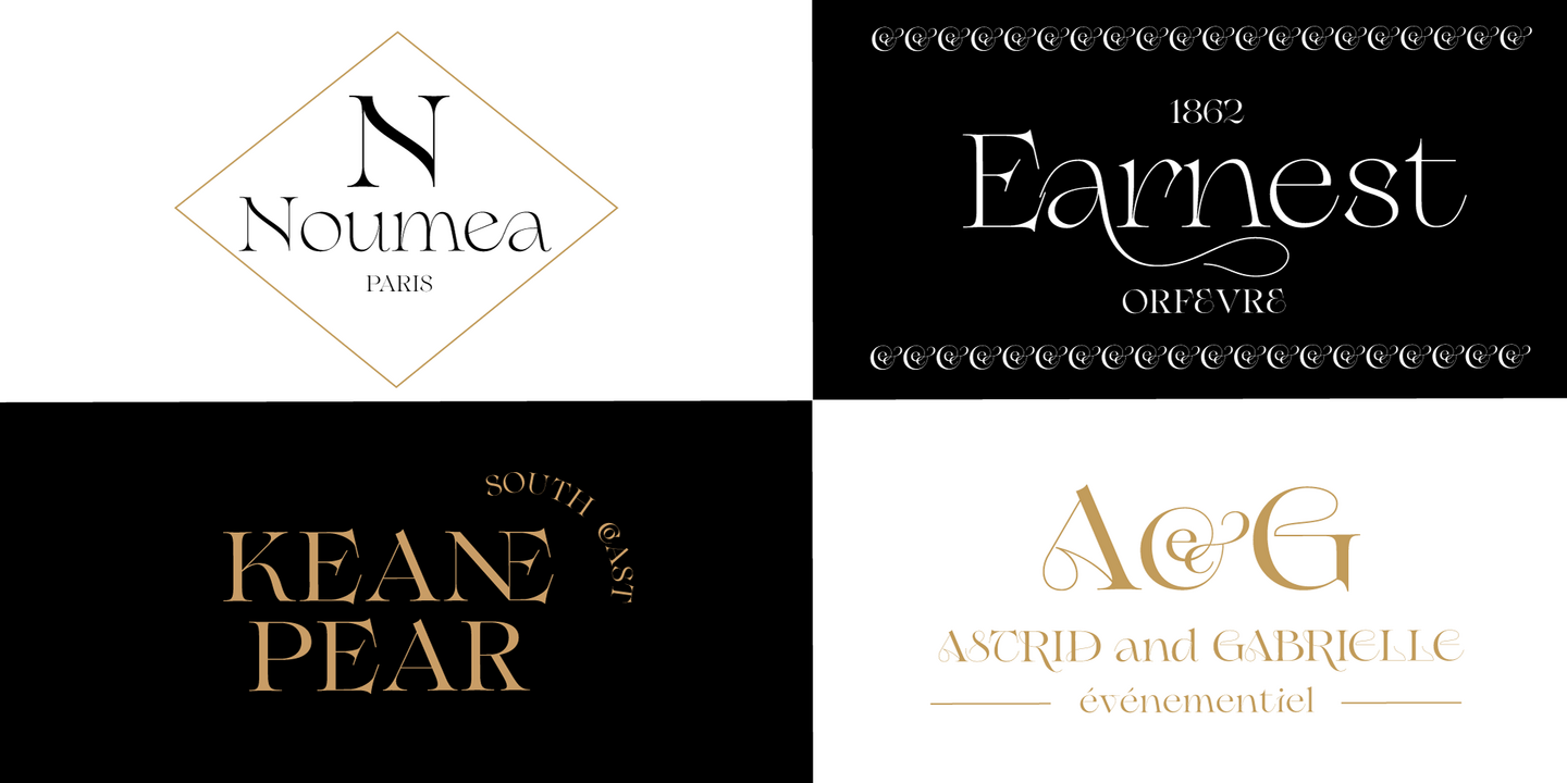
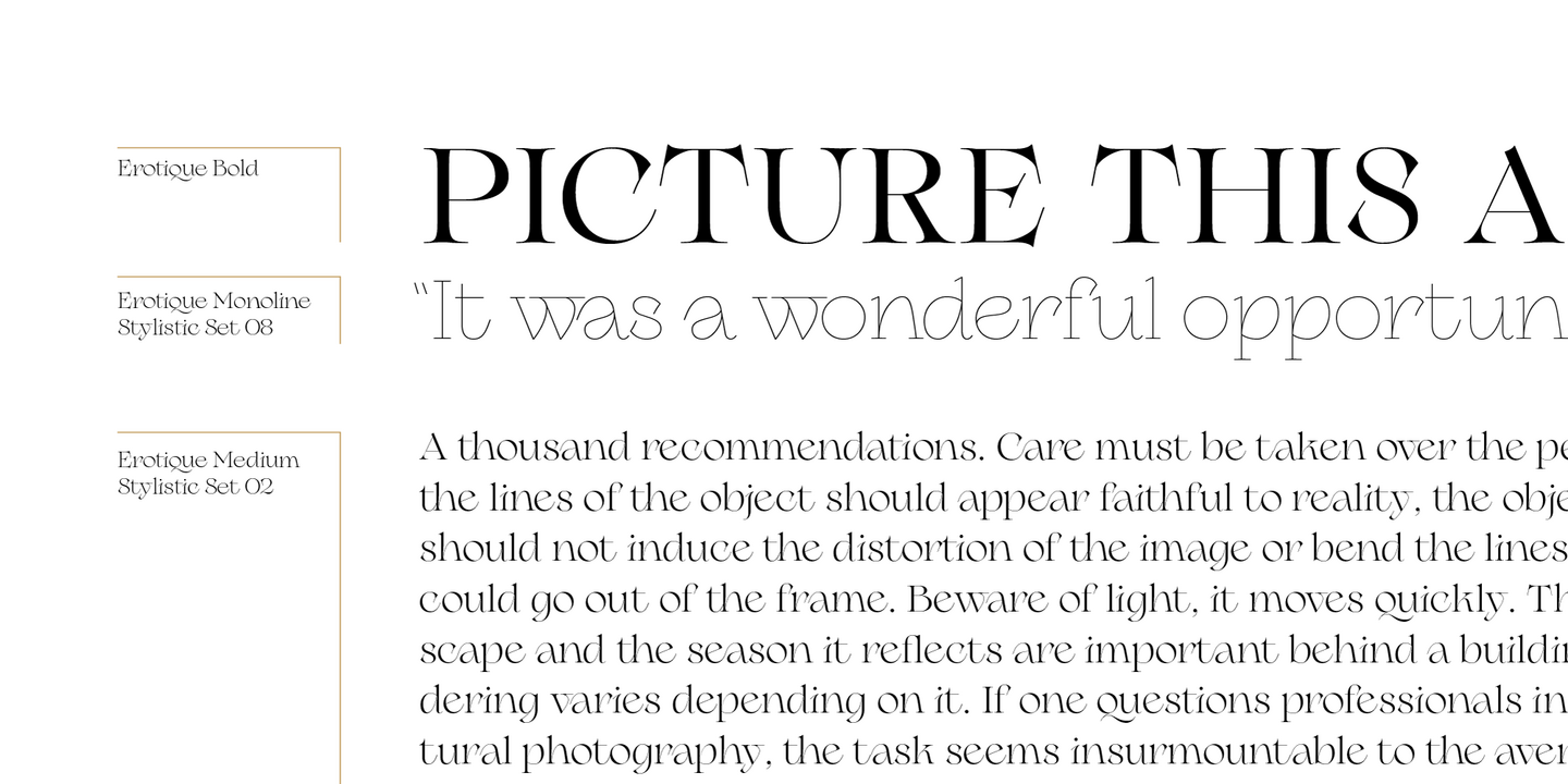
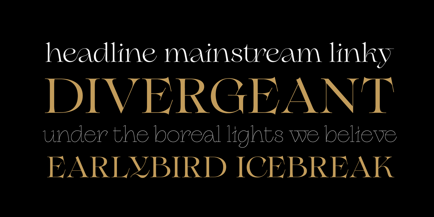
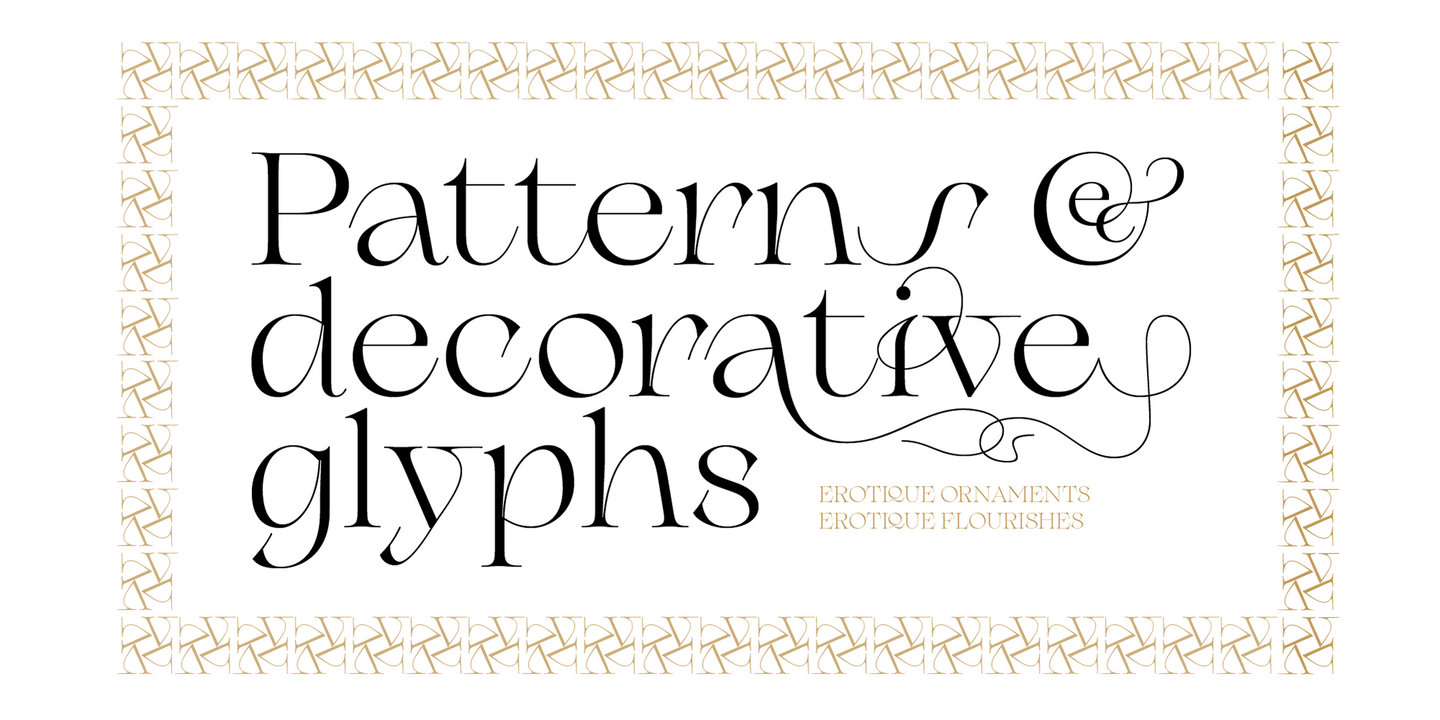
Sensuous but sharp, Erotique speaks the language of teasing, and unrequited love. Designed for display use, this high-contrast serif typeface is ready to take center stage in projects where a subtle elegance and an edgy, aggressive touch are required. For branding use it is paired by a Erotique Ornaments allowing for striking packaging, digital and ambient design. For editorial use it can add a sharp sensuality to logos and titles thanks to an impressive array of alternate glyphs, subtle ligatures and a set of whiplike fleurons. If you are a typeface lover, be warned: Erotique could be your fatal attraction!
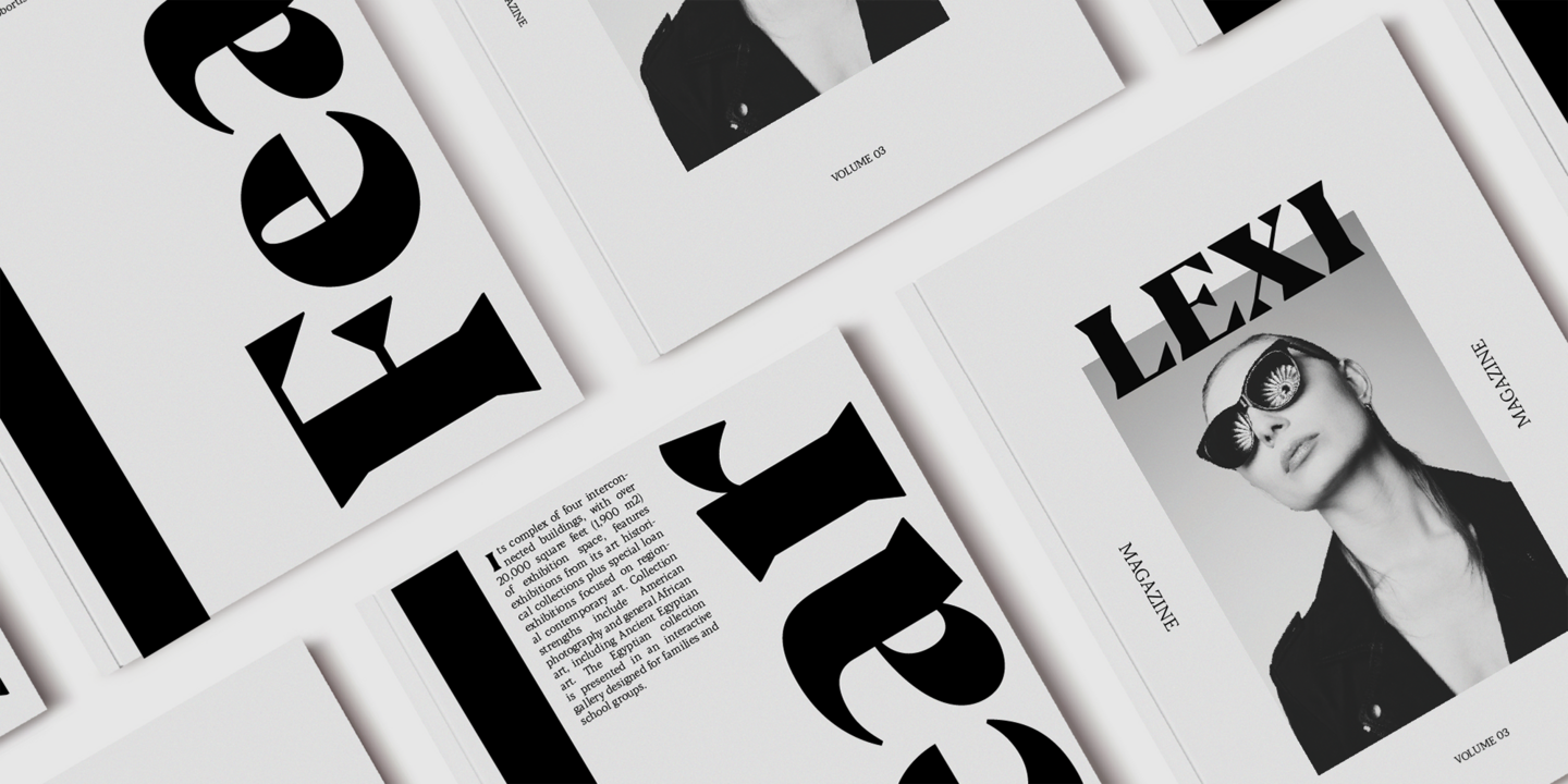
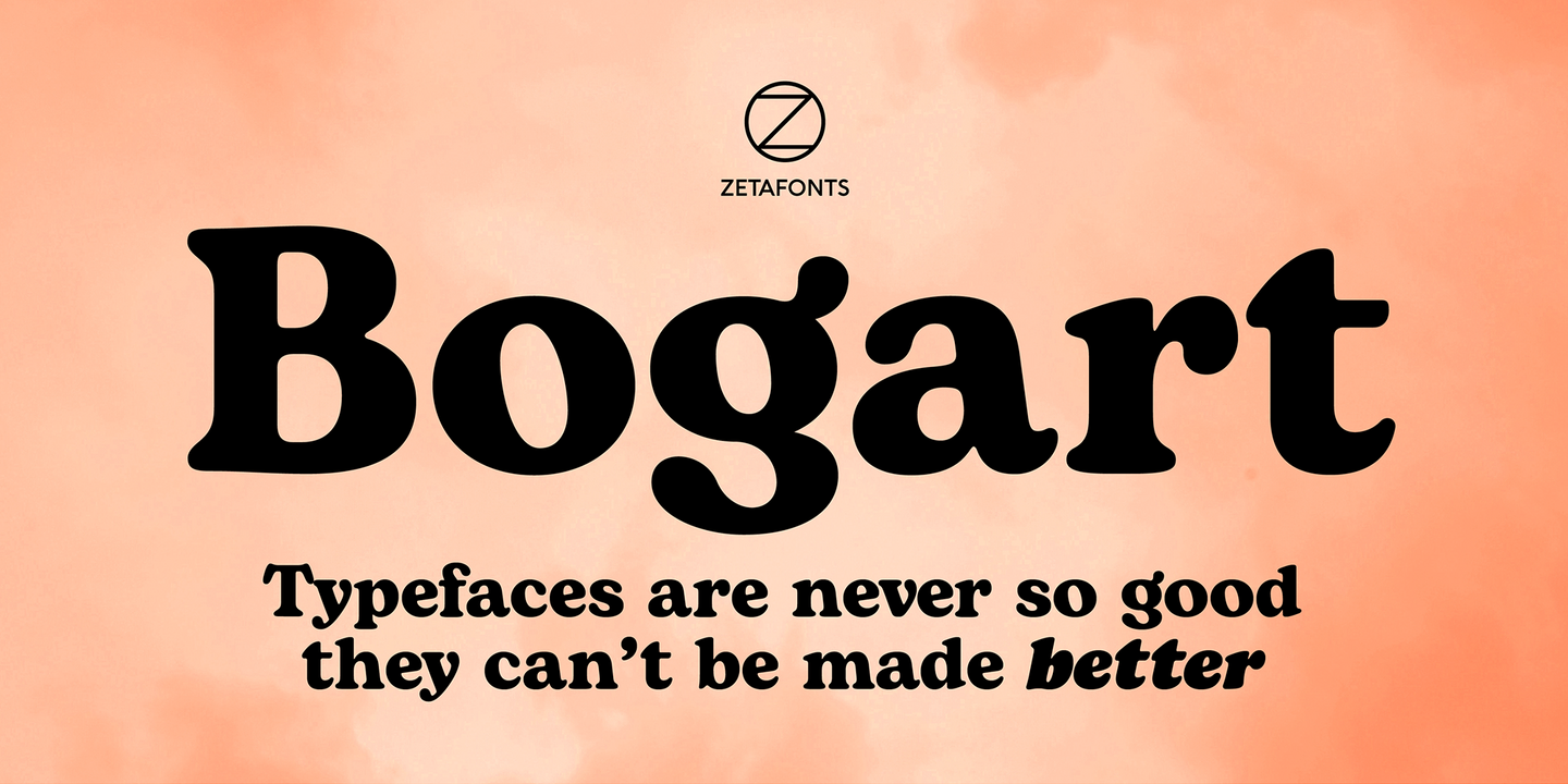
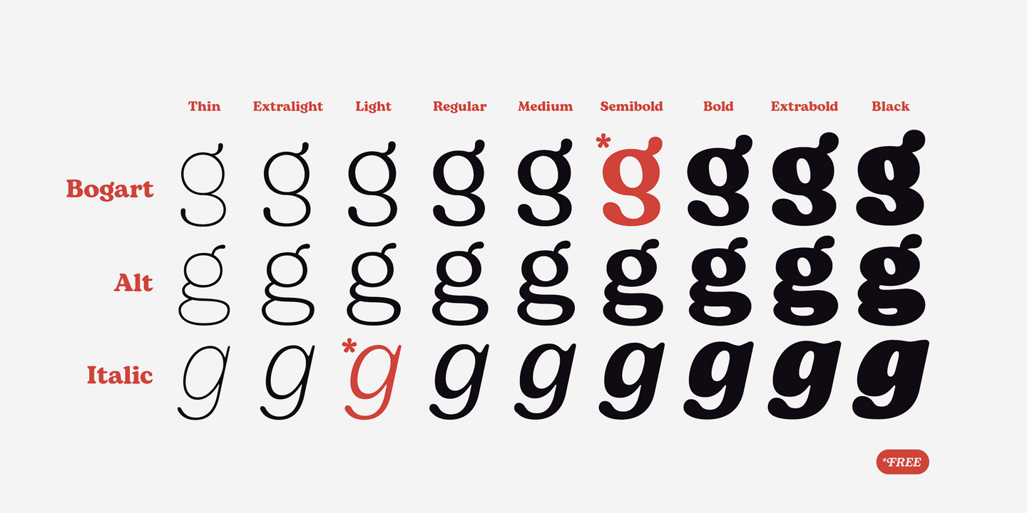
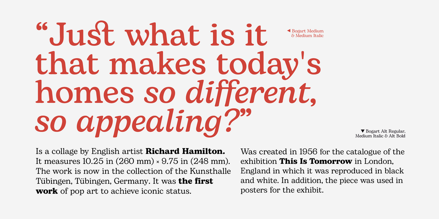
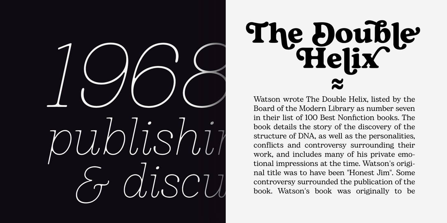
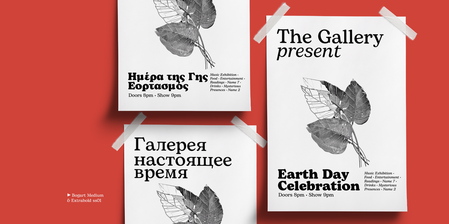
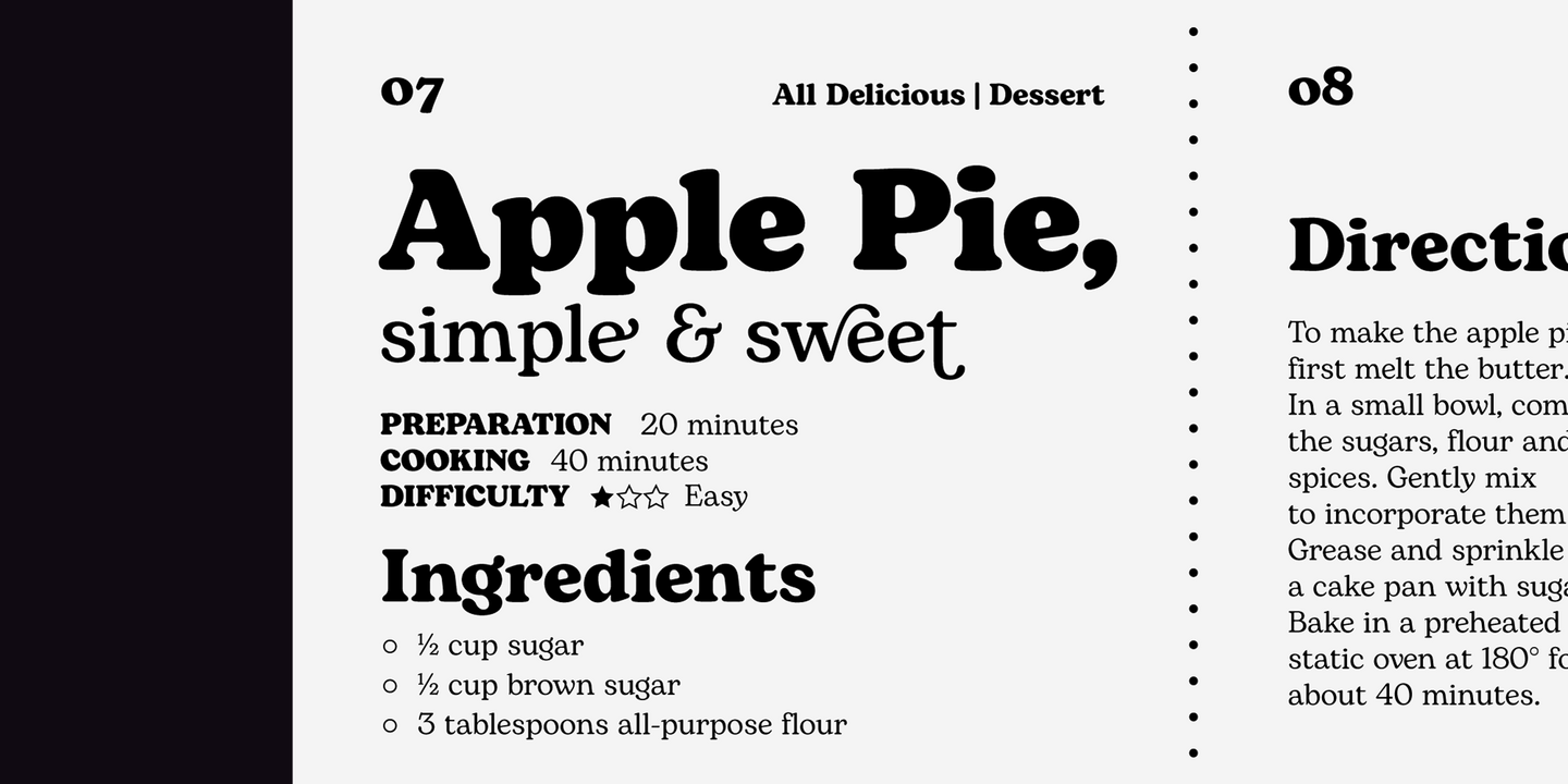
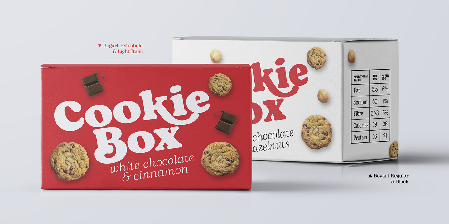
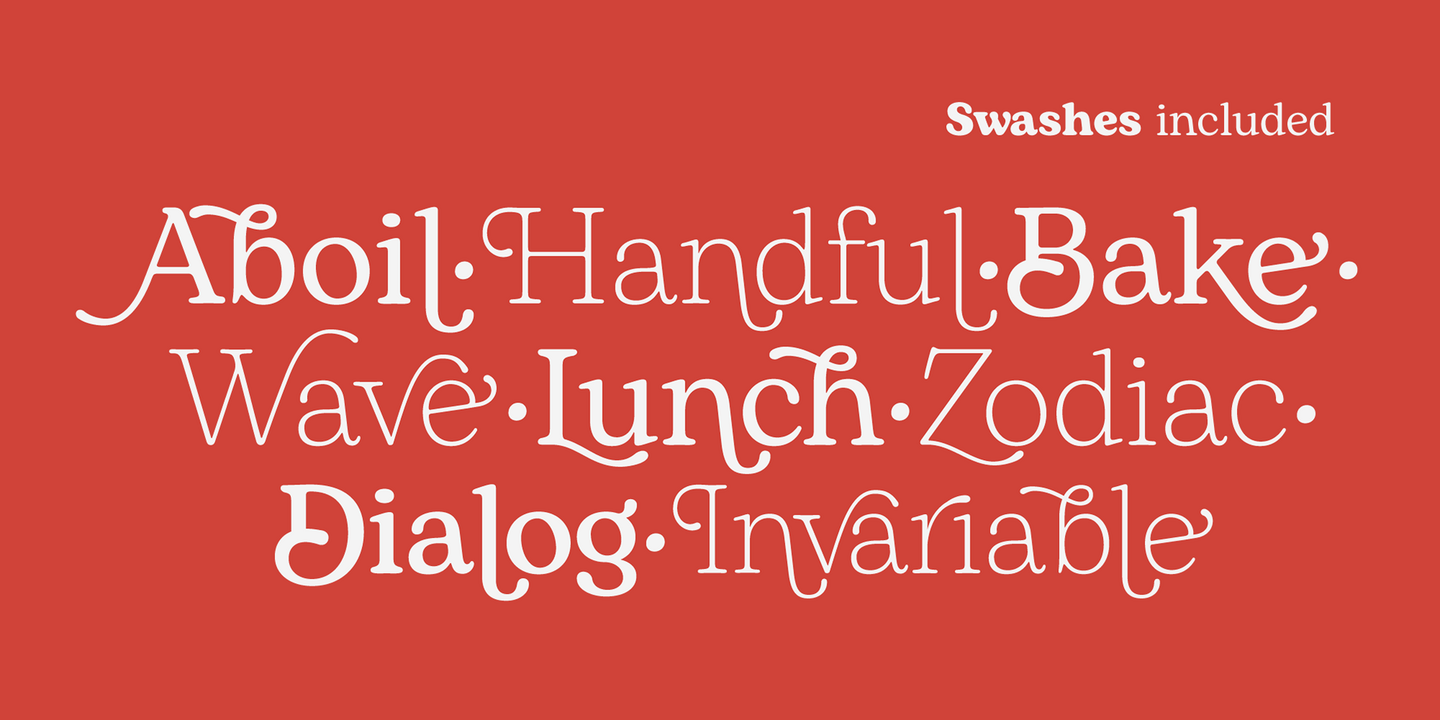
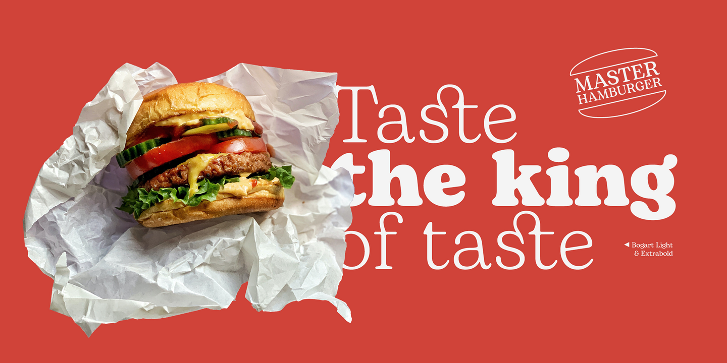
Bogart has been designed as an homage to the iconic look of low-contrast old style fat faces, like Cooper Black and Goudy Heavy Face. All the nine weights of Bogart, as well the matching true italics forms, feature an extended charset of over 1600 glyphs, covering 219 languages using latin, Cyrillic and greek alphabets, and sporting a complete set of Open type features. To add flexibility for editorial usage, a text-oriented Bogart Alternate set of nine weights was added to the family keeping the design more similar to its modern old style model and allowing for a heavy readable mid-weight range.
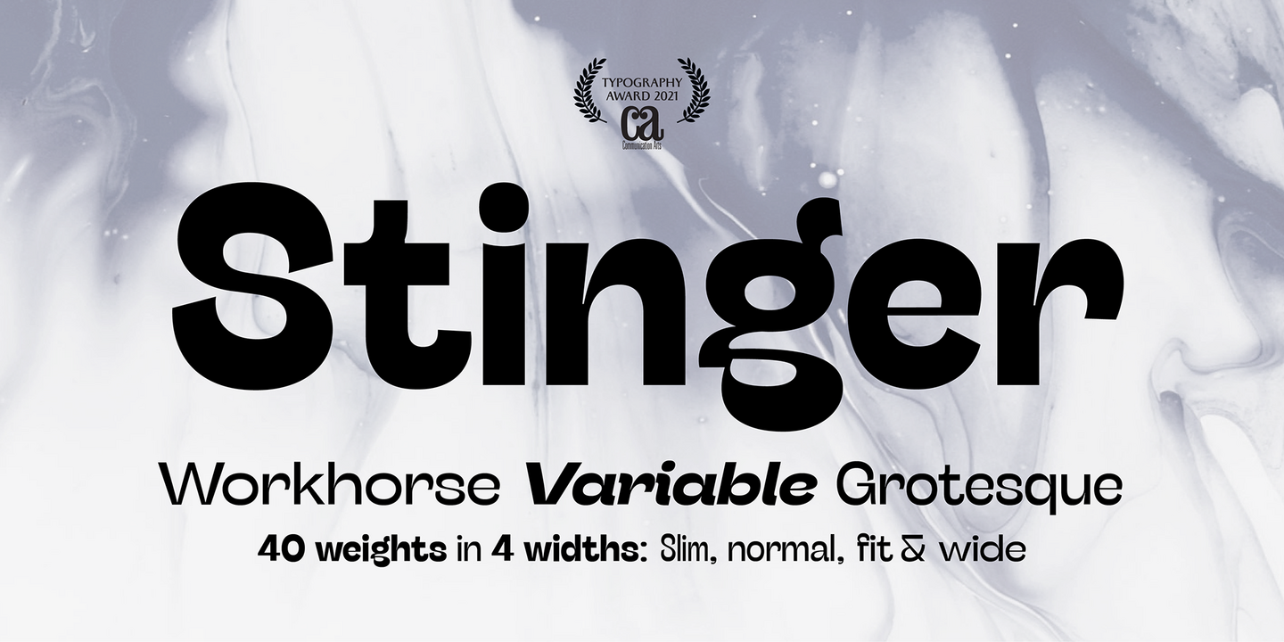
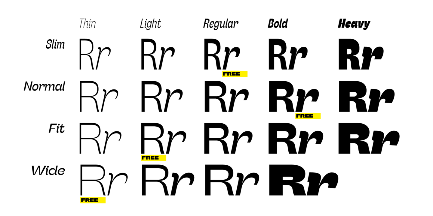
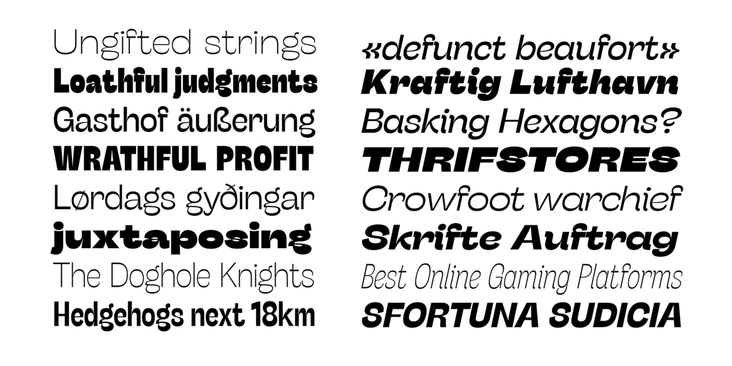
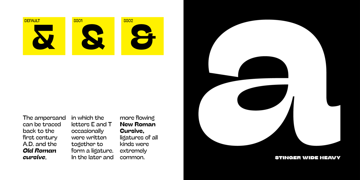
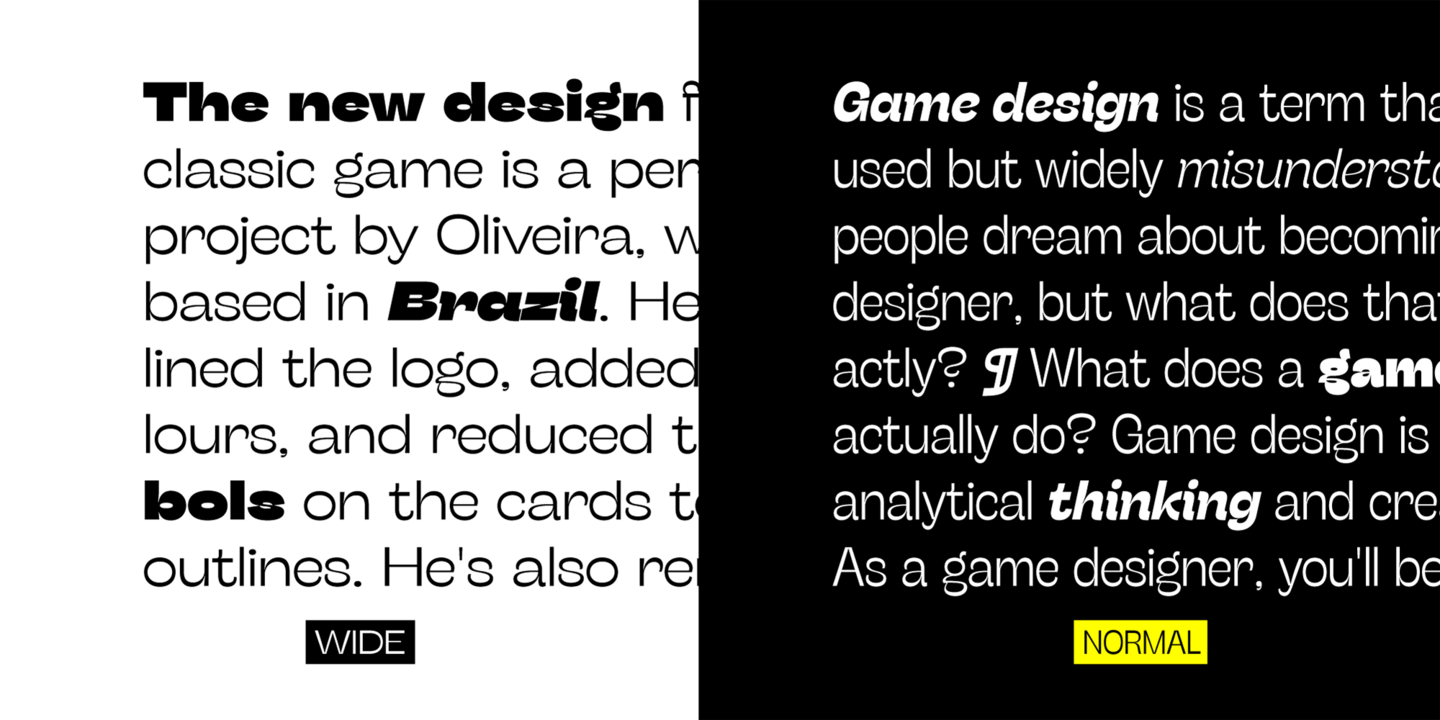
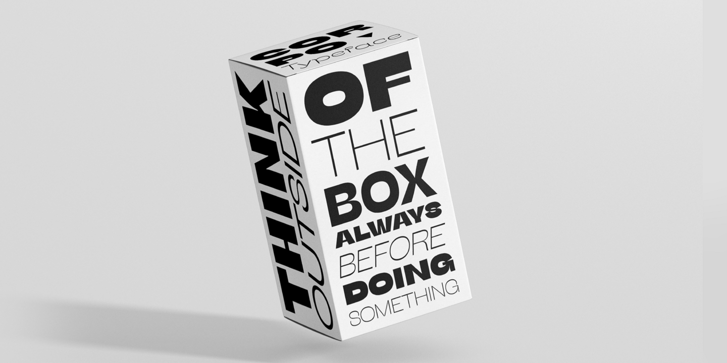
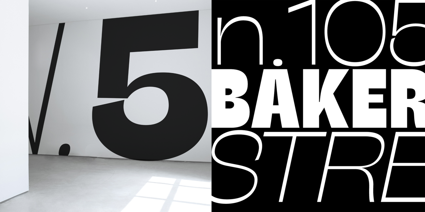
In the crowded panorama of contemporary grotesque typefaces, all aiming to stark geometric perfection, Stinger stands out with its bold choices and strong personality. A reverse contrast typeface with a workhorse approach, Stinger is a super-family with four widths, each in five different weights. From the calligraphy-inspired terminals in the thin weights to the logo-ready sculptural approach in the heavy weights, each variant manages to look striking without forgetting the readability and flexibility lessons of modern reverse-contrast classics.
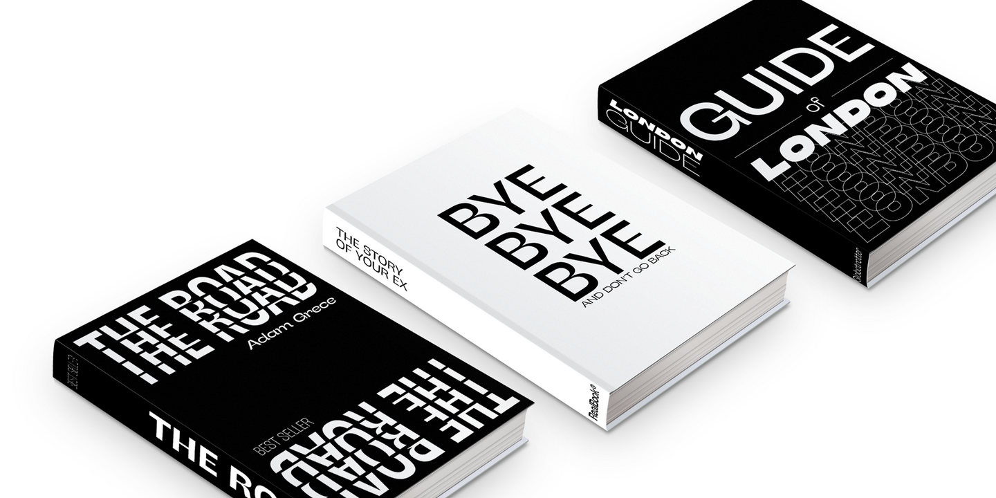
Fonts in use.
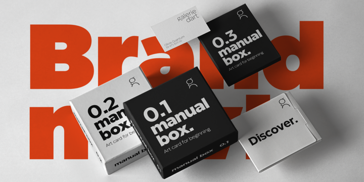
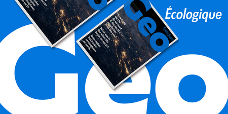
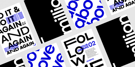
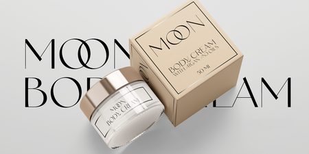
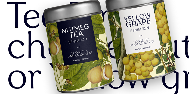


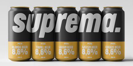
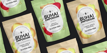

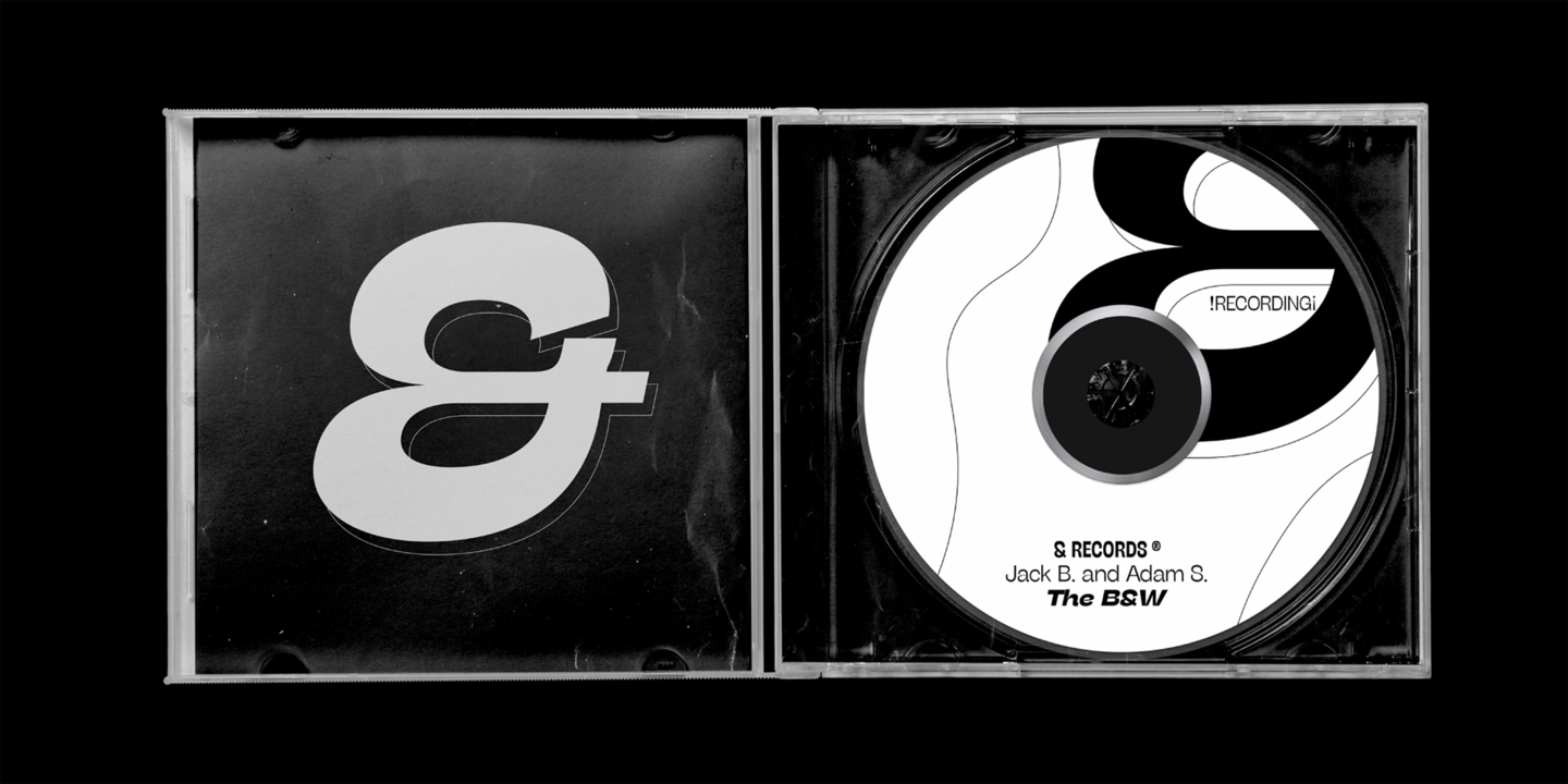
Zetafonts create meaningful typefaces with a clear “case of use situation” and a strong “problem solving attitude”. Its goal is to provide finely crafted and innovative yet solid design tools for graphic designers, art directors and brand managers worldwide. The Zetafonts activity is also towards the promotion of ypographical culture through the organization of educational initiatives, talks and courses.

Partner & Project Director
Cosimo Lorenzo Pancini
Cosimo bought his first typeface, an Arnold Boecklin letraset transfer, when he was nine years old. He has since then kept playing with letters both written and drawn, working as a type designer, visual arts teacher and art director for print, digital and video. He has designed over fifty typeface families for Zetafonts foundry that he co- founded with Debora Manetti and Francesco Canovaro. His typefaces include Cocogoose, Blacker (selected by Myfonts as one of the best new families of 2019), Monterchi (CA typography award 2020, Myfonts hidden gem 2019) and Stinger (CA typography award 2021). He lives in Florence with his wife, a cat named Bodoni and too many books.

Partner & Creative Director
Francesco Canovaro
Francesco has found in visual design and typography the natural evolution of his studies in painting and computer programming. With Debora Manetti and Cosimo Lorenzo Pancini he founded the transmedia branding agency Kmzero and the digital type foundry Zetafonts, a label under which he has designed over forty typeface families and countless custom fonts. His typefaces include Aquawax, Heading (Winter Type Games 2017 Bestseller on Myfonts.com), Blacker (selected by Myfonts.com among the Best new families of 2019), Kitsch (selected by Fontspring.com among the Best fonts of 2019). As much feared as loved by his students in creative direction and typography courses, he is often seen at type conferences listening to talks while creating new typefaces on his laptop. He lives in Florence with his wife Debora and two kids whose names end with consonants.

Partner & New Business Manager
Debora Manetti
Debora grew up in Tuscany and soon followed the artistic footsteps of his father, painter and polymath. Looking at him write all of Dante's Inferno by hand, she inherited his love for calligraphy and typography - a passion she later used to fuel her career as an art director, visual designer and branding strategist. She loves to design typefaces inspired by vernacular typography, which makes her smile for their often awkward but genuine spontaneity. She also has designed some custom handscript fonts for award-winning branding projects. Together with Francesco Canovaro and Cosimo Lorenzo Pancini, she is co-founder of the branding agency Kmzero and of Ligature, a company focused on the culture of type design (Zetafonts / Italiantype / Fontmood).

Type Designer
Andrea Tartarelli
Andrea studied at the Academy of Fine Arts of Carrara and worked as a marble sculptor until he discovered graphics and typography. Since then, he has dedicated himself to the creation of typefaces, hoping that it would be not as tough as marble carving. It turned out he was terribly wrong. Afterwards, he went deeper into his typography studies at the Plantin Institute at Antwerp, and teaches Type Design at IED Florence. He designed Tarif (selected by Fontspring.com among the Best fonts of 2019), Malik (shortlised for the Communication Arts Typography awards 2021) and has been co-designer on dozens of typefaces by Zetafonts including the award winning Blacker (selected by Myfonts as one of the best new families of 2019), Monterchi (CA typography award 2020, Myfonts hidden gem 2019) and Stinger (CA typography award 2021). He works and lives in Tuscany, Italy.

Font Developer
Mario De Libero
Mario was born in Livorno, on the coast of Tuscany. During his studies in visual communication at IED in Florence he fell in love with typography and soon joined Zetafonts as lead designer on the Italian Type label. Mario sees every letter as a music instrument that can do its best when playing well with the others in harmony: a typeface designer is like an orchestra director that must make sure all the voices are balanced. Always on the look for typography as a mean to rise empathy in others, he’s been focusing lately on historical re-designs and he’s responsible, among others, of the revival typefaces Cairoli and Etrusco (2020), both reviving the italian tradition of early twentieth century grotesque lead type.

Graphic & Type Designer
Sofia Bandini
Surrounded by art from birth, Sofia grew up as a curious girl and a careful observer. After her studies at IED in Florence she joined Zetafonts where she is working as a graphic and visual designer and as type designer, specializing in non-latin scripts. Her published work includes the font Eastman, Bogart, Garbata and Cocogoose. She believes that working with constancy and passion is the key to attract the attention of the typography user and create a connection with other designers.
Daily she receives different stimuli that allow her to have a 360 degree view of her work as a designer: following her instinct she succeeds in translating her intuitions into a delicate harmony between points.
