4 things every graphic designer needs to know about Cyrillic
4 things every graphic designer needs to know about Cyrillic
Krista Radoeva Global language
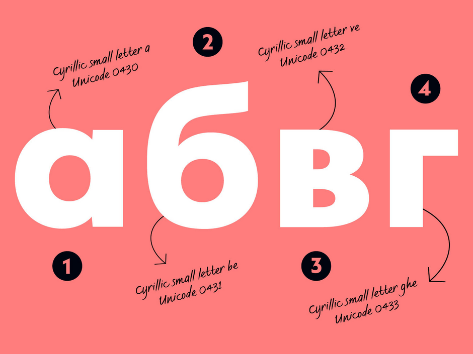
For anyone who is used to the Latin script, Cyrillic looks familiar and foreign at the same time – so many seemingly flipped Latin letters, a lowercase that looks more like small caps… It is difficult for a non-native designer to develop a sensitivity for these strange shapes, without always comparing them to Latin.
At Fontsmith we often witness clients’ confusion about Cyrillic. Are Cyrillic and Russian the same? Are Cyrillic and Pro the same? What languages does Cyrillic include? What is the Standard character set? It doesn’t help that there is very little information about Cyrillic in English. So to celebrate Cyrillic Alphabet Day (24th of May), we decided to give some tips, to help graphic designers understand the Cyrillic script better.
1. Cyrillic vs Russian
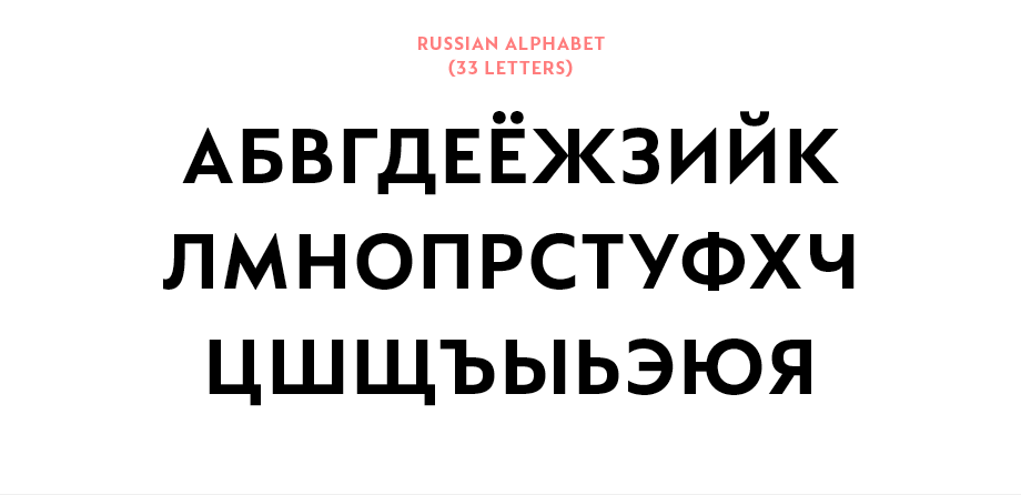
Cyrillic is a script, not a language. It is used to write over 50 languages, one of them being Russian. Since Russia has the largest population of all the Cyrillic script users, the confusion is understandable, but the two words are not interchangeable. The Russian alphabet consists of 33 letters, but there are more than 100 letters within the Cyrillic writing system.
So where does this weird name come from? Cyrillic is named after St Cyril (or more accurately St Constantine Cyril the Philosopher) who, together with his brother Methodius, was commissioned to invent a new alphabet for the Old Church Slavonic language. In fact, the two of them invented the Glagolitic alphabet, but it is thought that their students went on to develop the Cyrillic alphabet and name it after one of their teachers.
2. Cyrillic vs Pro
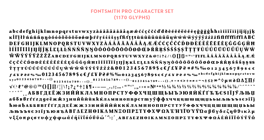
Many type foundries supply Cyrillic separately from their Standard fonts, which are usually Latin only. There are no strict rules of what a Pro font contains, but in most cases it’s not just Cyrillic, but also Greek, as well as other extras, such as small caps, different figure sets and many more features. Because Cyrillic and Greek often come together in Pro fonts it’s a common mistake to think that Greek is part of Cyrillic but this is not the case.
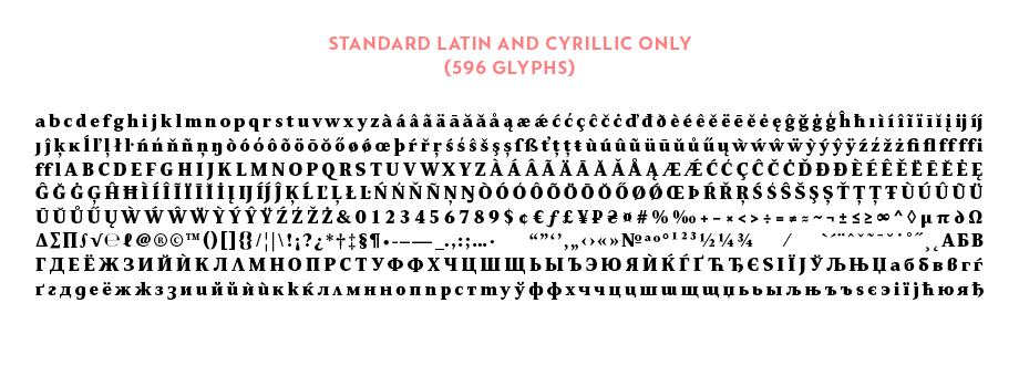
Another option is to supply Cyrillic separately, usually by adding the abbreviation CY after the font name. These fonts may or may not contain the standard Latin character set.
Other foundries, especially ones which are based in a native Cyrillic country, don’t make separate font files, and supply Cyrillic as a default.
So when you’re looking for a font with Cyrillic support, make sure you check with the specific foundry what the options are before purchasing. If you think this is already complicated, we haven’t even started talking about character set options.
3. Standard vs Extended Cyrillic
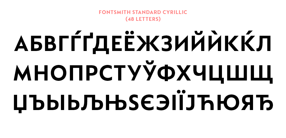
Most foundries use the Standard Cyrillic character set, 94 glyphs which covers the most common languages: Russian, Ukrainian, Belarusian, Bulgarian, Serbian, Macedonian and a few others.
Only a small number of fonts offer the full Extended Cyrillic. It includes more than 200 glyphs, covering not only the various Slavic languages, but also minority languages of the countries and communities around Russia and the former Soviet Union: Abaza, Abkhaz, Adyghe, Agul, Avar, Bashkir, Buryat, Chechen, Chuvash, Crimean Tatar, Dargin, Dungan, Erzya, , Ingush, Kabardian, Kalmyk, Karakalpak, Kazakh, Khinalugh, Kildin Sami, Komi, Kyrgyz, Lak, Lezgian, Mari, Moksha, Mongolian, Ossetic, Romani, Rutul, Sakha/Yakut, Tabasaran, Tajik, Tat, Tatar, Turkmen, Tuvan, Udmurt, Uzbek, Yuit, Yupik and many more languages you’ve probably never heard of.
It’s worth checking what language coverage is required, especially if commissioning a custom font, or a Cyrillic extension to an existing font. In most cases, Standard Cyrillic is sufficient. Extended Cyrillic requires more development time, but in the publishing, educational, news and media sectors, it might be a necessary addition.
4. Default vs Localised Cyrillic
Even if you technically have all the characters needed to cover Bulgarian and Serbian Cyrillic, that doesn’t necessarily mean that those characters look right to use in those particular countries. That’s because Cyrillic is drawn according to Russian standards by default. In Bulgaria and Serbia there are stylistic differences in the way some of the letters look. These localised forms aren’t offered with every Cyrillic font and are an underused feature for those that do.
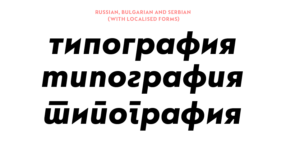
The differences from the default Russian forms are quite prominent. You can read about it in more detail here or in the new issue of TypeNotes magazine.
***
Do you still think Cyrillic is just a few flipped Latin letters? Besides the character set, there are many aspects and details to consider when selecting a Cyrillic typeface, many letterforms which are completely independent from their Latin counterpart. Expert knowledge is required to ensure good communication for the millions of users of the script.