FF Mark® Font Field Guide

FOUNDRY: FontFont
DESIGNER: Christoph Koeberlin, FontFont Type Department & Hannes von Döhren
CLASSIFICATION: Geometric Sans
Best Practices
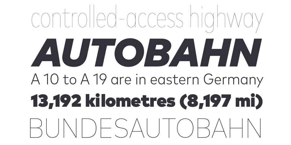
Ten weights with more than a thousand characters each, provide for a wide range of applications. Everything from advertising and packaging and long form text to branding, on screen and in print is within FF Mark’s range of capabilities.

Family
The FF Mark family contains eight weights of roman and italic designs in normal, narrow and condensed proportions. There is also an Ultra version for display settings. FF Mark W1G fonts features a pan-European character-set for international content. The character-set supports almost all the popular languages and writing systems in western, eastern, and central Europe based on the Latin alphabet, in addition to several based on the Cyrillic and Greek alphabets.
Font Facts
- The family has special umlaut characters for setting capital words or headlines with tight linespacing
- Erik Spiekermann provided creative input for the design.
- Each weight has over 1,000 characters
Roots
Released to MyFonts in 2013, FF Mark draws on historical examples from German geometric type designs of the early twentieth century.

Legibility
Capital letters are wide with open counters and generous apertures, to provide high levels of legibility in a sans serif design. Italic characters are harmonized to their Roman counterparts and retain simple geometric character shapes to ensure legibility at small sizes.
How to spot FF Mark

Alternate Choices
Perfect Pairing
Download a pdf version of the FF Mark font field guide and view the FF Mark font family.
More Font Field Guides

Greycliff CF Font Field Guide
Greycliff CF is versatile and designed to hold up to almost any use-case. It has been used in user interfaces, on-screen text, signage, and logotypes. Learn more

Avenir® Next Font Field Guide
The design of Avenir Next is clean, straightforward and performs with confidence in long blocks of text copy and headlines. It also pairs well with well with so many contemporary serif text typefaces. Learn more


