Ardena Font Field Guide

Best Practices
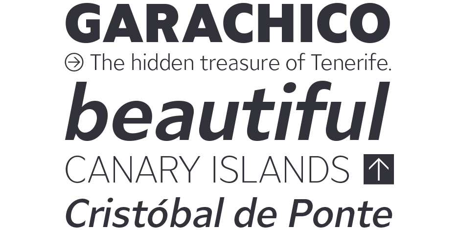
Ardena can be used in both a restrained and expressive way. The wide selection of styles makes it suitable for strong headlines and extensive body text. Completed with an extensive character collection, it becomes a real workhorse. A versatile allrounder that is up to all challenges – for corporate identity, editorial, branding, orientation and guidance systems and much more.

Family
Ardena is a modern sans-serif typeface family and has a total of 20 styles, from thin to heavy and matching italics. While neutral and clear at first glance, it can be characterized as both pleasant and confident due to its open, rounded forms and vertical terminals.
Font Facts
- The Ardena family has a total of 1064 glyphs per font, including a whole range of features like 200+ languages, small caps, numbers, arrows, symbols, alternates and many more.
- Ardena has an extensive range of circled and squared numbers. Thanks to Open Type Features and an easy system, the various designs can also be simply “written” without first having to select them in a glyph palette.
Roots
Julien Finckers primary motivation for Ardena was to design a low-contrast sans serif, neutral and versatile. One of which there are already thousands, but he simply wanted to draw his own interpretation. In terms of character, Ardena should appear pleasant and confident at the same time. Among others, Julien expected this from open, rounded forms and vertical endings. The design process of Ardena took about six months until it was released in February 2021.

Legibility
The thinner and thicker weights are particularly suitable for strong headlines, while the middle weights can be used for typographic challenges and body text. A large x-heigt, low contrast and open apertures provide a high level of typographic legibility.
How to spot Ardena

Alternate Choices
Perfect Pairing
Download a pdf version of the Ardena Font Field Guide and view the Ardena font family.
More Font Field Guides

PMN Caecilia® Sans Font Field Guide
While individual characters, weights and basic structure are based on PMN Caecilia, PMN Caecilia® Sans is optimized for on-screen imaging. Web pages, blog posts, newsletters, UX design, etc. are all within its purview. Learn more

ITC Legacy® Sans Font Field Guide
An excellent design for both hardcopy and interactive applications. The standard weights are full-bodied, while the condensed designs provide economy of space with little loss of legibility. Learn more


