ITC American Typewriter Font Field Guide

Foundry: ITC Designers: Joel Kaden & Tony Stan Classification: Serif, Slab Serif
Best Practices
The ITC American Typewriter typeface is a remarkably forgiving design in print, on screen uses and in under less than ideal reading environments. Its serifs, however, are quite long and can cause letters to link-up if copy is set too tight.
Family
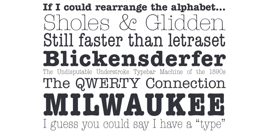
Three normal weights with corresponding condensed designs. A suite of italics complements the basic weights.
Font Facts
- The ITC American Typewriter family was released in 1974, marking the 100th anniversary of the invention of the oce typewriter.
- The typeface was key to Milton Glaser’s “I heart NY” logo.
Roots
The light and medium weights were drawn by Joel Kaden and the bold by Tony Stan. The challenge to Kaden and Stan was to create a typeface that would retain the immediacy, familiarity and personal nature of standard typewriter output while overcoming its inherent flaws of readability and legibility. The rigid character spacing of the original typewriter fonts is gone in the ITC American Typewriter design, while the distinctive typewriter flavor has been enhanced.
Typewriters were common communication tools when ITC American Typewriter was drawn. Now the family is a friendly reminder of a bygone era.

Legibility
The ITC American Typewriter design has all the characteristic legibility traits of slab serif typefaces, but is more aable and inviting. The lighter two weights are quite legible – even at small sizes.
How to spot ITC American Typewriter


