2023 Best New Font Interviews
In 2023, MyFonts welcomed a wave of new and exceptional font families. Our dedicated team has meticulously compiled data to present the Top 25 Best-Selling NEW Fonts of the year. This list honors the remarkable work of foundries and designers in 2023. With a plethora of unique fonts available, some have truly stood out. What sets these designs apart? Explore insights from the designers and teams behind these top-selling fonts, delving into their inspiration, design process, and challenges faced. These stories illuminate the creative journey of each font, demonstrating the boundless creativity derived from simple concepts.
Discover interviews with the designers and teams behind the best fonts of 2023 below.
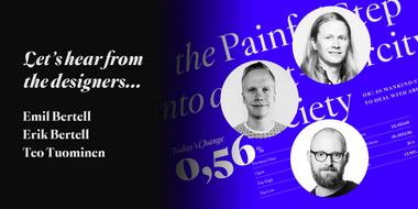
#01 Montaigne by Fenotype
Montaigne is envisioned as an intellectual and sophisticated typeface, embodying the essence of uncompromising and critical thinking. It stands as an antithesis to the contemporary chaos of information overload and fake news. Montaigne comes fully equipped with a range of modern features, including Oldstyle Numerals, Small Caps, Discretionary Ligatures, and Swash Initials.
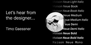
#02 Maison Neue® by Milieu Grotesque
Maison Neue is designed to play a vital and prominent role in any kind of environment/communication. Most importantly are they conceived to provide a distinct visual language that (hopefully) inspires it to use the fonts in a bold and innovative way. And finally, the meticulous and up-to-date execution, together with a large range of styles and weights allows a wide range of applications, from analog to digital, large to small, etc.
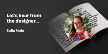
#03 Campeche by Latinotype
Campeche was created with the objective of being a very broad and versatile family (totaling 54 fonts + variable version) allowing various uses. It is made up of two subfamilies, one high contrast and one low, each with nine weights: from thin to heavy, as well as 3 width variations: condensed, normal, and expanded. Campeche has short ascenders and descenders, allowing for tight blocks of text. In addition, the possibility of combining high contrast weight with low contrast weight (title and subtitle) is a plus for any designer to use.
#04 Pais by Latinotype
«País» is a contemporary and modern grotesque sans serif, inspired by the grotesques of the early 20th century, but more geometric and with a wider x-height than its referents; making it ideal for the current times. The standard sans serif version is fresh, clean, and more ideally neutral. It’s a perfect choice for editorial design, branding, headlines, or any other piece of graphic design.

#05 Patron™ by Milieu Grotesque
Patron is designed to play a vital and prominent role in any kind of environment/communication. Most importantly are they conceived to provide a distinct visual language that (hopefully) inspires it to use the fonts in a bold and innovative way. And finally, the meticulous and up-to-date execution, together with a large range of styles and weights allows a wide range of applications, from analog to digital, large to small, etc.
#06 Mutable by Paulo Goode
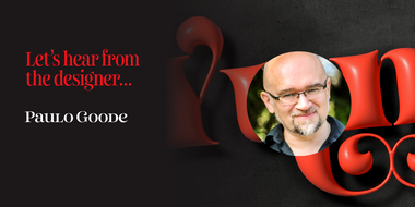
Mutable is a display typeface that excels in branding, titles, and headlines. One of the joys of using Mutable is unleashing the plethora of alternates that are available. Once you start playing with a word or phrase and swapping individual characters within it, you may find it difficult to know when to stop! The intention was to create a typeface that was fluid and mutable, one that would allow the user to create something that was distinctive and unique to them and the moment they created it.
#07 Aeroko by Monotype
Aeroko’s underlining design principle is to fill up space as much as possible :) The x-height is extremely exaggerated and the extenders are short, so that words and lines have the same boxy appearance as each letterform. Put that together with the full range of weights and widths, you have a powerful and vivid type system that can be used in many ways.

#08 Cordillera by Latinotype
Cordillera is a very functional font, it looks good both in large sizes as in body text, the mixture of neo-grotesque and geometric styles generates a lot of stability and security. Its alternatives are a great option to provide a unique look in corporate or advertising applications.
#09 PG Gothique by Paulo Goode
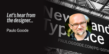
The design process for PG Gothique was meticulous, and it had to be. I wanted to deliver the most expansive gothic type family while also being available as a single variable font. Have you tried variable fonts yet? I believe this is one family that may convert you.
#10 TT Neoris by TypeType
The design of TT Neoris is highly modern and functional while staying true to the visual tradition of Neo-Grotesques. As a result, this font appears contemporary and relevant in any application, and by using stylistic sets, you can substitute many different typefaces in your project, infusing the font design with occasional surprises and impressive elements.

#11 PG Grotesque by Paulo Goode
After creating the initial character set that emulated Edel Grotesk, I began to create some promotional images for it and realised that this design would be robust enough to accommodate multiple widths and weights. I set about expanding the family so that it could handle numerous applications.

#12 Total Black by Resistenza
TotalBlack font employs its striking high contrast to skillfully emphasize key focal points. When strategically applied, it transforms headlines, calls to action, and focal elements into visually compelling compositions.
#13 TT Firs Text by TypeType
TT Firs Text is a geometric sans serif. The font’s Scandinavian-style graphics are rather minimalist. While crafting it, I reworked all expressive elements, giving them a calmer and more traditional look. Due to more standardized text typing, the font remains legible and readable even if a small point size is chosen for typing the text block.

#14 Royalis by Julien Fincker
Royalis is an expressive and extravagant serif typeface family. It is characterized by a high contrast and dynamic features in the details, such as long terminals or deep inktraps.
#15 Winner Sans by sportsfonts
Winner Sans is like a tool that no toolbox should be without. It’s a classic design without extravagance that can be used for more than just sports design thanks to its versatility – which has been further enhanced by the recent addition of a variable font.
#16 Flipante by Resistenza
Flipante brings a burst of fun to your layout while keeping things classy. Its smooth design ensures a polished look perfect for both print and digital projects, maintaining a consistent vibe across various platforms. This font is a chameleon, adapting seamlessly to branding and packaging designs, giving you room to play creatively.

#17 Liquida by Resistenza
Liquida is a decorative script font with slanted inclination. All characters were designed with brush and walnut ink on paper using real ink drops to generate a trickling effect. A display typeface perfect to set a refreshing liquified lettering in seconds!

#18 TT Cometus by TypeType
TT Cometus is a slab serif whose strong serifs are serifed at the junctions with the vertical stroke to give the typeface a dynamic and modern character. Thanks to this solution, some elements of the font evoke associations with calligraphic works, while display elements remain stable thanks to massive serifs.

#19 Interlaken by ROHH
Interlaken™ is a modern display & branding typeface allowing to design creative logotypes, posters, and headlines with ease. Interlaken has a powerful and very modern character, it comes in three width variants, making it a good fit in various design scenarios. Its cutout details make it look unique and create an impression of inner shadows when set on a dark background.

#20 Autovia by Santi Rey
Autovia is a typeface that was created mainly for big bold headlines. It works particularly well when applying tight tracking and leading. However, this is a highly versatile design, and the lighter weights are perfectly suited to be used in longer texts.
#21 Hello Monday by Fenotype
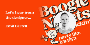
Hello Monday strikes with the feeling first. It has the familiarity of typefaces that were popular in the past, from the 60s to the 80s but with modern clean design. In addition, it’s well-equipped with modern OpenType features from Swash Alternates to Discretionary Ligatures and even a set of ornamental shapes.
#22 Gravita by TipoType
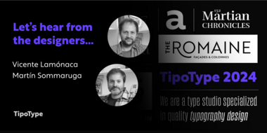
Gravita is a typeface family that conveys security and respect by combining the solidity of its classic proportions with the strict precision of its modern profile drawing. Ideal for modern corporate communication where you need customers to perceive confidence and transparency.
#23 Loretta Display by Nova Type Foundry
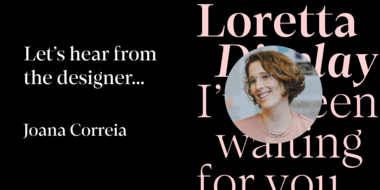
Loretta Display can help brands communicate in headlines that want to be innovative and still bring elegance and friendliness. It can be used in big sizes, and the italics can also set a different design tone. Experimenting with italics might get new ideas for your designs.

#24 Refrankt by Groteskly Yours
Refrankt is a multifunctional sans-serif type family with 18 styles, ranging from Thin to Black with matching italic styles. The key visual feature of Refrankt is its wider characters and expanded proportions, which accentuate the character of the type family and extend its application. Refrankt works well as a display font but can also be used comfortably in headings and larger bodies of text.
#25 Rovela by Larin Type Co
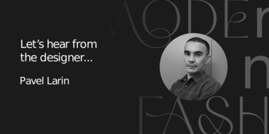
Rovela is an elegant, modern and contrast sans-serif font family, and a great fashionable solution for your project. It includes upright and oblique style, each of them has four weights from thin to bold. This is a modern stylish and bright logo font it includes many alternatives and ligatures with which you can play and choose the option that suits you.