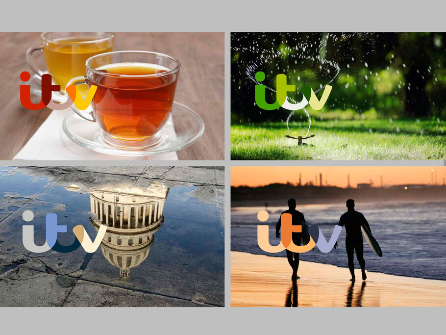
ITV Re-brand goes live
ITV Re-brand goes live
Fernando Mello Custom fonts
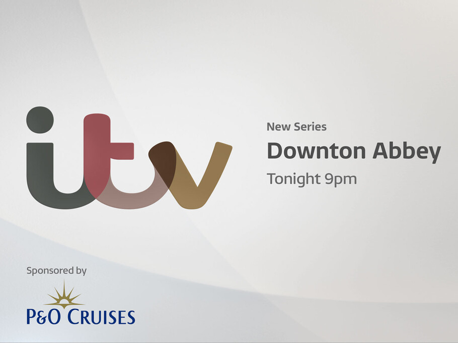
Leading type design studio, Fontsmith, has confirmed its role as part of the ITV re-brand team. Fontsmith designed ITV Reem, the new bespoke corporate typeface, which is to be used throughout the network. The new branding will bring much greater consistency to everything ITV does, all rooted in the positioning of a media brand at the heart of popular culture.
After being invited by ITV Creative and Rudd Studio, who were in the throws of conceptualising and invigorating the new ITV branding and logo, Fontsmith crafted, formulated and added the necessaries to bring Rudd’s logo to perfection.
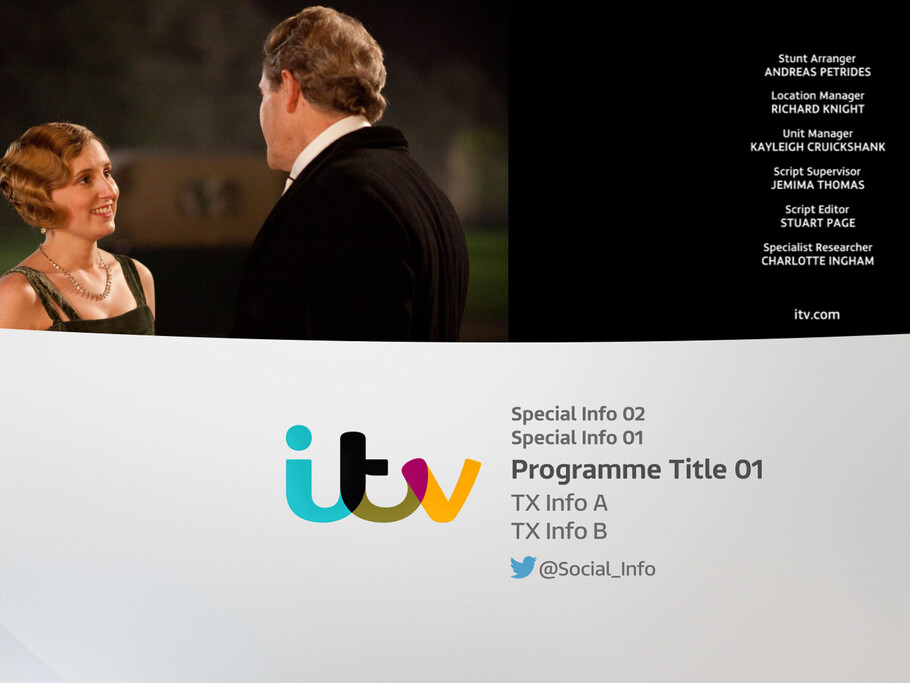
This quickly lead to a brand wide supporting typeface. The new typeface, ITV Reem, has been designed to evoke this brand essence, and to work across a broad range of channels and content, from serious news programming to light entertainment. This will include all five ITV channels as well as online and on-demand products including ITV Player.
On collaborating, Matthew Rudd of Rudd Studio says “we’ve worked with Jason and Fontsmith for over 10 years and it has always been great. Every time they make a real effort to get under the skin of a brief and produce something which supports the big idea. The ITV Reem typeface is of course beautifully executed and a pleasure for designers to work with.”
It’s well reem!
Fontsmith’s challenge with ITV Reem was to develop a font that can work on its own to develop a coherent identity across all content and stand out without the use of the ITV logo.
To achieve this, the design approach was very specific. Fontsmith Creative Director Jason Smith explains: “It’s quite a detailed, wide design, influenced heavily by what we explored with the new ITV logo, which has a modern script feel and is quite wide. The typeface is based on that sort of proportion, almost with a calligraphic feel in the sense that when you take a pen off the page after writing, you get a rounded end terminal.”
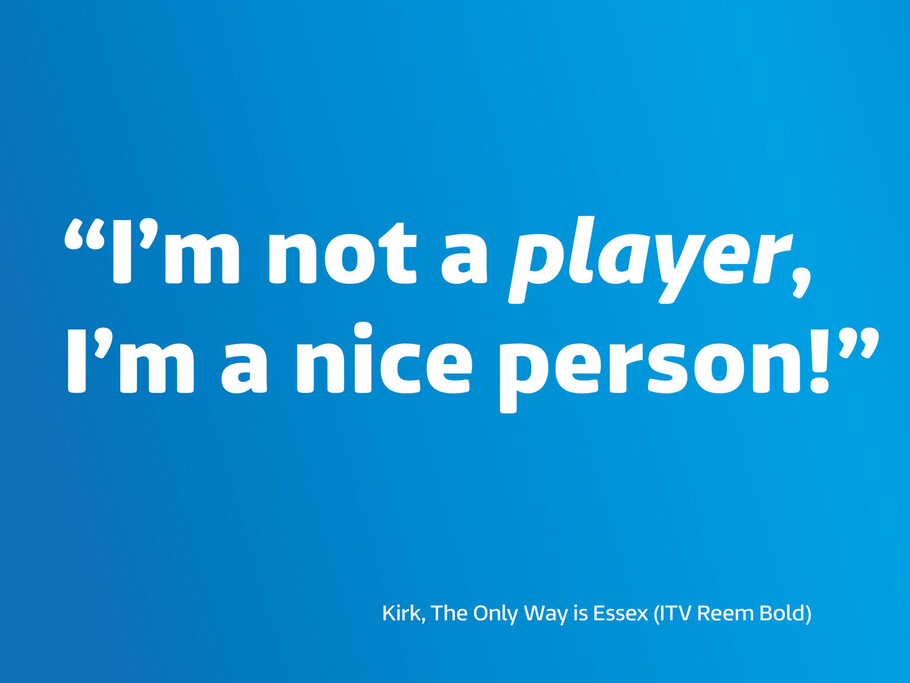
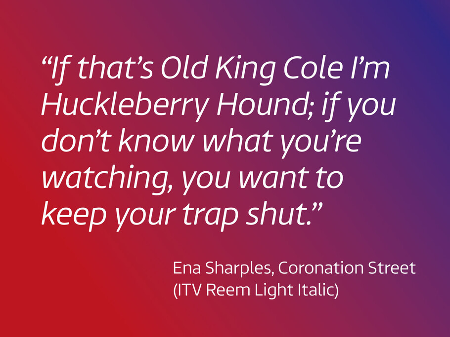
Named after the expression “it’s well reem!” made famous by ITV show ‘The Only Way is Essex’, ITV Reem has been created as a four weight sans serif. The four weights are Light/Light Italic, Regular/Italic, Medium/Italic and Bold/Bold Italic.
Station-to-station
Fontsmith has built a reputation of being the go-to type design agency for the TV and broadcast industry. With commissions from E4, Channel 4, More 4, Film 4, ITV, BBC1, Kanal 5, Living TV, Sky 1, GOLD, Virgin Media, Sky News, and many more…
What makes Fontsmith so successful in this sector is the ability to understand exactly how a typeface behaves on-air and off-air, providing personality to its parent brand. As well as awakening the attributes of the brand, the font needs to back up on-air and off-air identities.
Jason tells us “A well-designed font becomes part of who you are. It tells your customers about you. The more they see it, the more they trust you. The more they see it, the more they remember you. A font can – and should – be as much a part of a brand as a colour, a sound or a celebrity’s face. Here at Fontsmith we have many years experience in creating typefaces that work with the most visible, best-known TV brands in Britain.”
