Initial Letters Tips & Tricks Manual

Initial letters are double-edged typographic tools. They are a delight for the eye and handy road signs. They are not, however, something to be trifled with. There are a few guidelines for working with initial letters.
Alignment
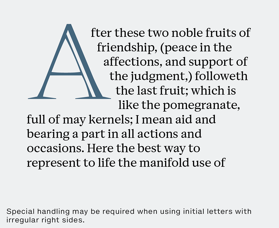
With most dropped initials, lines of surrounding text copy are aligned vertically with just enough indent to provide snug spacing between the initial letter and the lines of copy it adjoins. (This is usually less than the line spacing.) Sometimes, however, letters like A, L, R, or even an E, may require some special handling. When using initial letters with irregular right sides, the first line of the paragraph is usually brought in close to the letter and the lines that follow are aligned with the right side of its body. The key to the best alignment of initials is the same as for all other typographic arrangements: it has to look good. What works for one letter in one font may not work for the same letter in another font. Make design decisions on how things look.
Optics
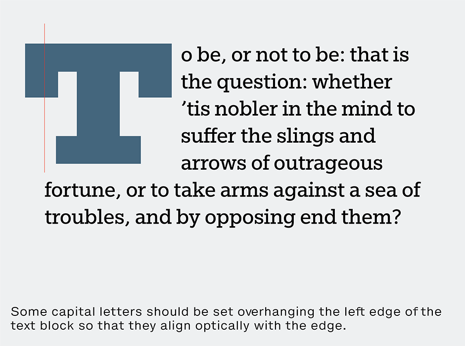
Whether you are using them as dropped or raised initials, some capital letters should be set overhanging the left edge of the text block so that they align optically with the edge. For example, when the initial is a cap T the left-hand serif on the top bar and part of the bar should project into the left margin. Round letters like C and O should extend slightly into the left margin to create an optically aligned left-hand edge.
Transitions
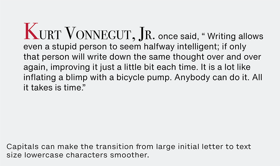
Frequently, words that begin with initial letters are completed with capitals. While this isn’t necessary, it makes the transition from large initial letter to text size lowercase characters smoother. When the first word has only one or two letters, it may facilitate the transition to use capitals for the second word as well.
When the initialed word is the proper name and you are using caps to create a text transition, the entire name should also be in capitals. The first letter of each word in the name should be set in capitals and the rest in small caps to distinguish it from the text.
Special Cases
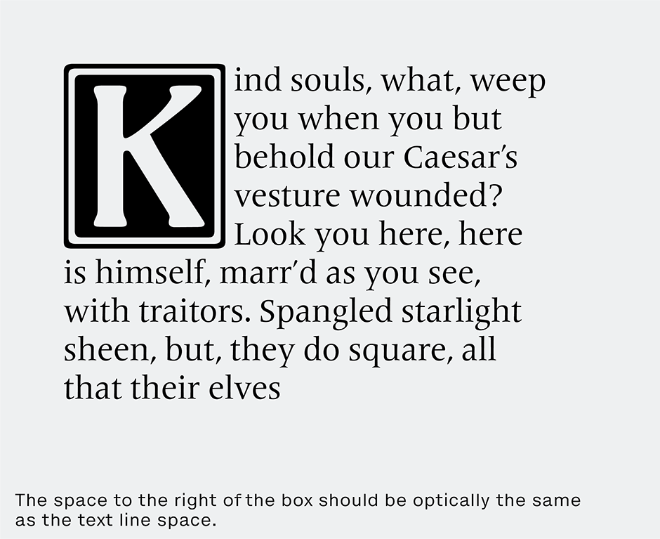
Sometimes initial letters are housed in decorative boxes. In this case, the space to the right of the box should be optically the same as the text line space.
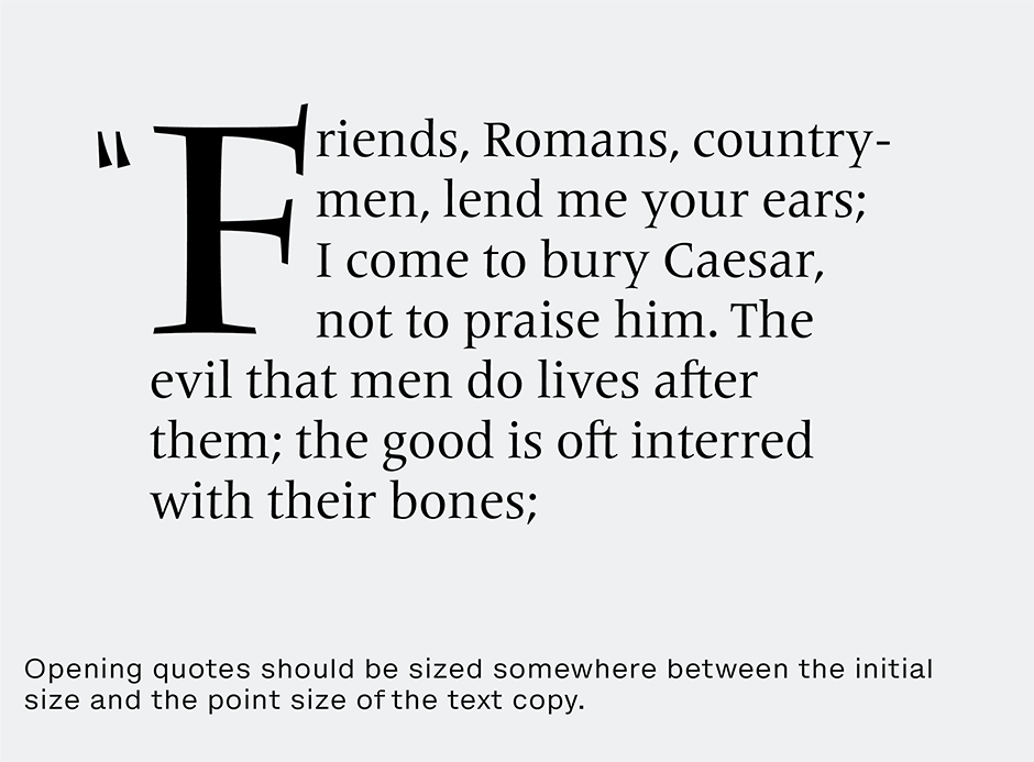
When using quotes, the opening quote should be sized somewhere between the initial size and the point size of the text copy – but its alignment should remain at the optical top of the letter.
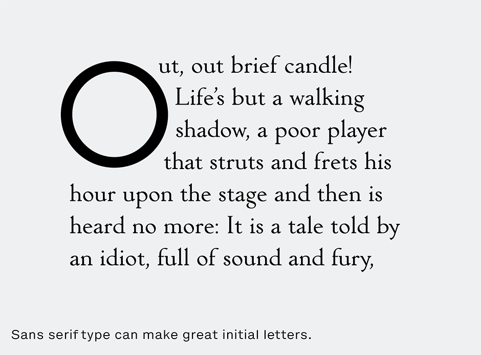
Historically, initial letters have not been used with copy set in a sans serif type styles – but this is a rule based on tradition – and we all know what rules are made for.
Download a pdf version of the Initial Letters Tips & Tricks Manual.


