Manual: Tips for Scripts

Five Tips for Scripts
Think Twice About Text
Blocks of script copy are not inviting to the reader. While scripts stand out, they also create a busy visual texture that is subtly off-putting to readers. In addition, scripts are harder to read than serif or sans serif typefaces. We are not as used to their character shapes as we are to those in more traditional typeface designs. This slows down the reading process, negatively effecting document comprehension and information retention.

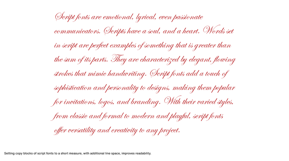
Lines of text in a script typeface can be made more engaging by setting copy in narrow columns. That way the eye does not have to travel far to catch everything on a line. Adding a little extra space between lines of copy will also make the copy more inviting and help the reading process by reducing the chance of “doubling” (reading the same line twice). Scripts should also be set large. Their x-heights are usually quite small, which means that most are difficult to read below 14 or 18 point. A good script rule-of thumb: when in doubt, go bigger.

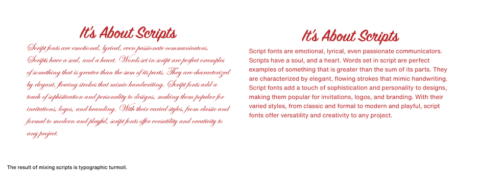
Don’t Mix Scripts.
Trying to mix two script typefaces in a single document is like herding cats. Because of their strong design personalities, each design wants to go its own way and make its own statement. The result of mixing scripts is almost always typographic turmoil.

Don’t Mess With Spacing
Individual characters should flow into each other, creating a continuous ribbon of typographic communication. Connecting scripts and even calligraphic or spontaneous non-connecting scripts should run smoothly across the page. Kerning and letterspacing script typefaces does nothing to enhance their beauty, readability, or communication power.

Never All Caps
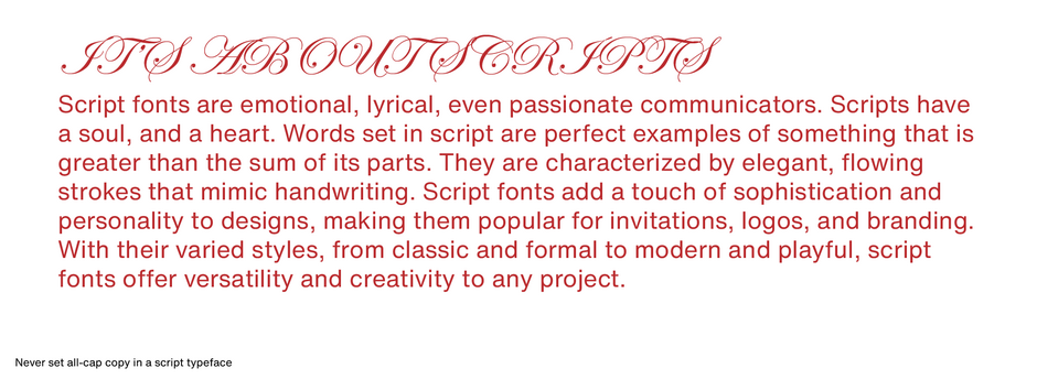
Never set all-cap copy in a script typeface. Script caps are designed to fit snugly next to lowercase characters. If set together, caps become entangled with the next character, creating a typographic mess. You could letterspace the capitals, but this would only give you a string of fancy, difficult-to-read letters. There is a place, however, where script caps can work on their own: They make wonderful initial letters to introduce a paragraph or block of copy.

Just A Pinch Will Do Ya
It’s easy to overuse scripts. They should be put into service only when appropriate to the situation and message. Parts lists, quarterly reports, lengthy brochures, and the like, are not the place to show off your collection of script fonts.
Be brief when using a script typeface to set headlines or other large copy. Script faces are not that much easier to read in large sizes than they are small. Headlines, subheads, pull quotes, and other blocks of large script type should normally be kept to about six words. Very long words are also not as easy to read in a script typeface as are short words.
Scripts have always been wonderful communication tools; they just need proper care and feeding to do their best work.


