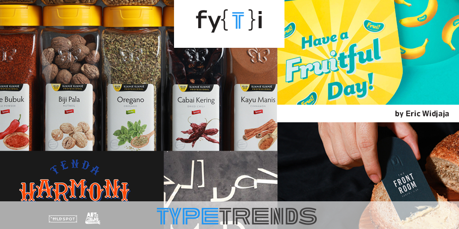
Type Trends: 2021 Q2 Trends by Eric Widjaja at Thinking*Room.
Eric Widjaja, Founder and Design Principal at Thinking*Room Inc.
If you’re reading this, you’re probably a font browser. When you’ve got a project that calls for something fresh and new, you browse the pages of MyFonts looking for that special typeface. You’ll sift through the hundreds of banners until you find exactly what you need. You probably, however, don’t take notice of the foundries that create the fonts – or where they’re located.
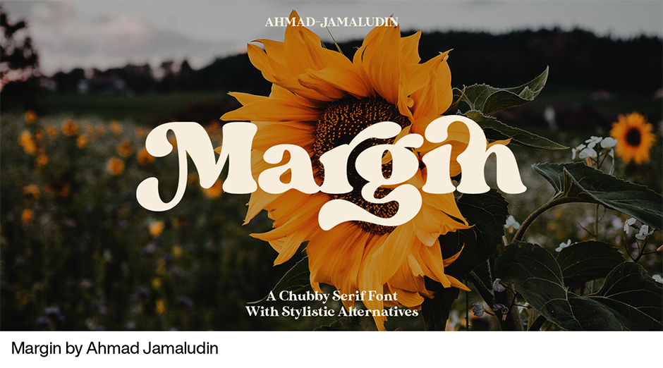
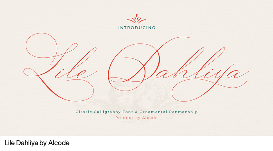
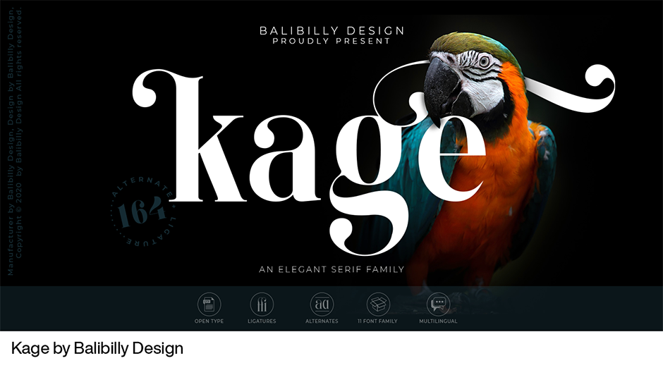
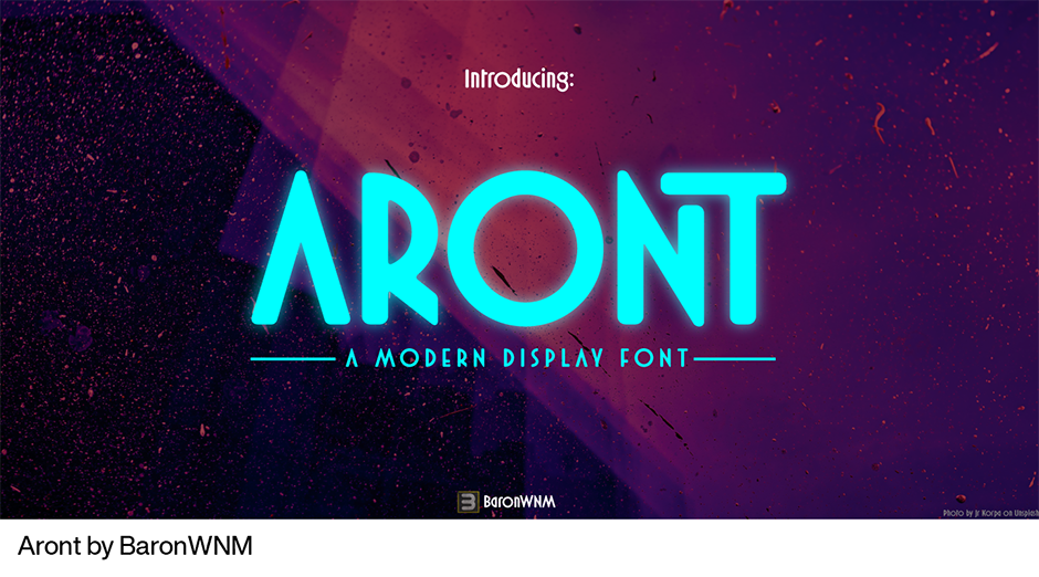
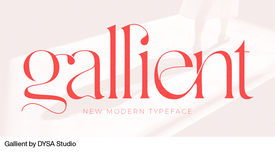
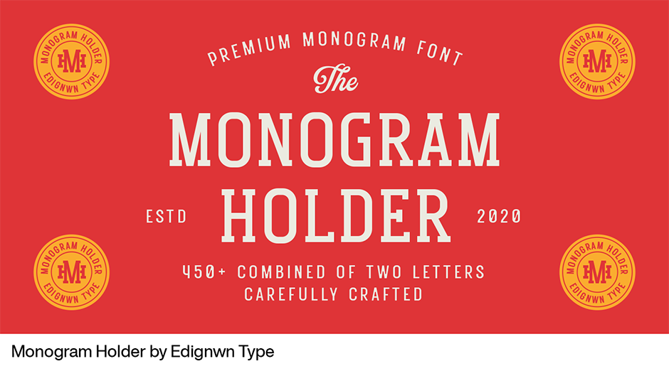
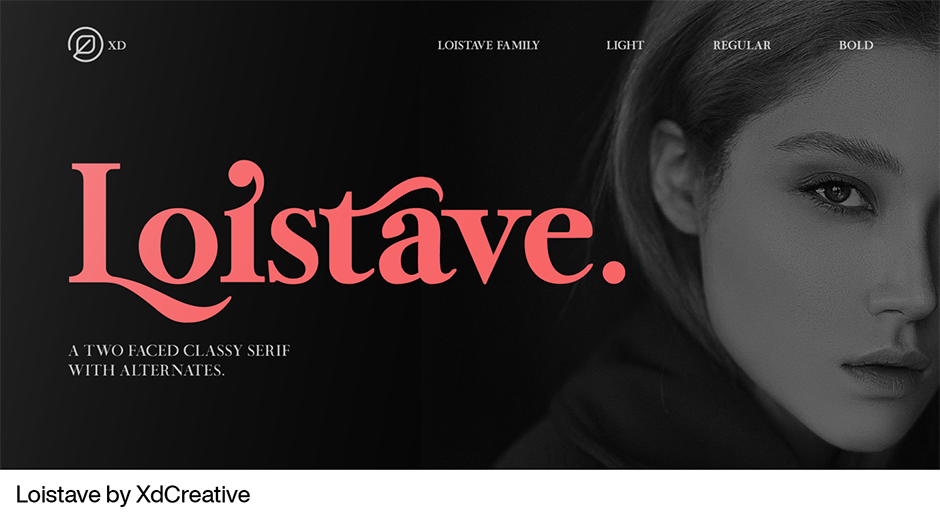
If you do, you might have discovered that Indonesia has become the source of some exceptional typeface designs. Recently, Indonesian type designers have released a tsunami of vibrant and original Latin typefaces. Ahmad Jamaludin, Alcode, Balibilly Design, BaronWNM, DYSA Studio, Edignwn Type, XdCreative, TOKOTYPE are just a few of the Indonesian type foundries with exciting new designs represented on MyFonts. A site search will reveal dozens more.
Eric Widjaja
About Eric Widjaja and Thinking*Room
With so many terrific fonts coming out of Indonesia, we thought it would be fun to reach out to an Indonesia design studio and ask if there are any trends in the use of fonts – Indonesia and otherwise.
This is where Thinking*Room Inc. comes in. It’s been setting design trends in Jakarta since 2005. Thinking*Room is inspired by the limitless potential of an idea. Known for pushing the limits, it has earned the trust of its clients to provide total design and concept solutions. The studio concentrates on branding, concept development, logo design, typography, environmental design, publishing, packaging, way-finding and website design.
Eric Widjaja is the founder and Design Principal at Thinking*Room. And, although he began his education seeking a degree in engineering, music and the arts soon lured him away. After graduating from Academy of Art University in San Francisco, Eric did a stint at Landor Associates where he worked with designers to create brand identity, print, packaging, and multimedia solutions for clients, the likes of, Levi’s, GE, and Xerox. After a number of design positions in San Francisco, he returned home to Jakarta in 2003, and founded Thinking*Room two years later.
What’s New and What’s Important
When we asked Eric about type and typographic trends, he told us about two noteworthy trends – and shared some sage typographic advice. He listed the growing importance of custom fonts and creating typographic surprises as important trends. Eric’s typographic consul was to embrace limitations, ensure that solutions – especially if they are following trends - are appropriate and that, while standing out is important, functionality is more so.
Bespoke Fonts
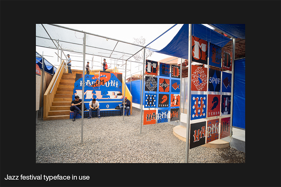
“I see more and more bespoke and customized typefaces crafted exclusively for clients,” says Eric. “Companies have realized that typefaces can be one of the most important parts of the brand. Having a bespoke design, they’re able to establish their brand persona simply and effectively. Voice is one of the most important roles in brand design — and the most common mediator of the brand’s voice is type.” An example of the branding power of bespoke typefaces is the design Thinking*Room created for a project brought by MLDSpot and Art&Sound Experience at Java Jazz Festival 2020, based on local food truck lettering.

Creating Surprises
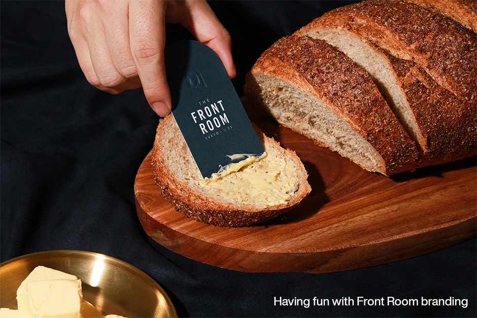
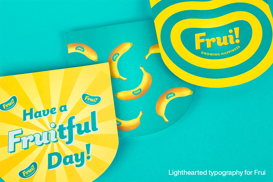
“Typography is a very powerful tool to express emotion,” explains Eric. “When design can speak for itself without explanation, it has stopping power. That’s where design succeeds most effectively. At Thinking*Room, we like to surprise the audience and have fun with type,” he continues. “The design we did for the Front Room and Frui projects is typical of our having a bit of fun with our work.”
Embrace Limitations
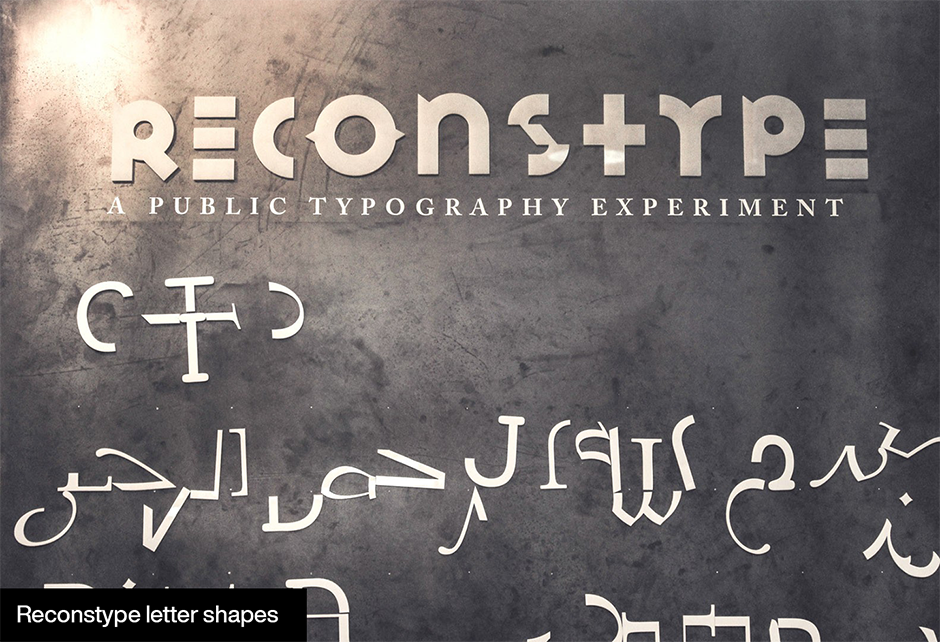
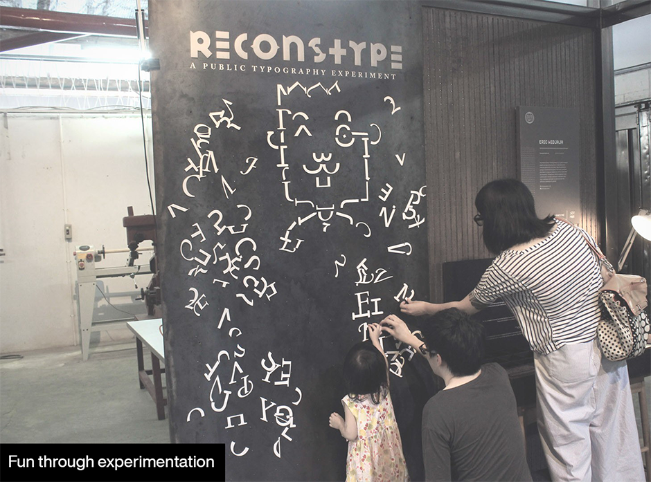
“Limitations can have a huge effect on successful design,” Eric continues. “When given limitations, creativity tends to be more ignited than when given total freedom. One of the more effective ways is working with a limited number of typefaces in a project. In doing so, you get these chances to explore and experiment with fonts – and the results can be exciting.” Typical of limiting its self, Thinking*Room was invited by Indoestri, an Indonesian Makerspace to showcase its work. Rather than do that, it created a typographic installation whereby the public could have fun creating new visual images.
Appropriate Solutions
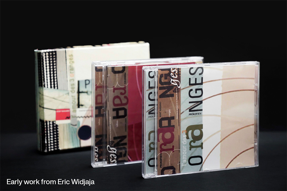
“I was heavily influenced by typography in design school,” says Eric. “The work of Emigre and David Carson had a huge effect on my work – sometimes too much. I was asked to design a wedding invitation for my cousin, when I was in college. It ended up looking like a spread from Ray Gun magazine. Unfortunately, my cousin wasn’t a fan of David Carson, and decided to find someone else to design the invitation.”
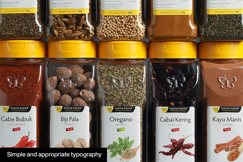
“I quickly learned that I needed to be objective in choosing the direction design takes. The work we do at Thinking*Room is solely based on the client’s and project’s objectives. We choose fonts and make typefaces carefully to match those objectives.”
Standing Out v Functionality
“At Thinking*Room,” says Eric, “ we try to add a bit of a refreshment to all our work. For example, a few projects lately were inspired by 1980s typography. I don’t think there’s anything wrong with that. It’s good to reflect on earlier design approaches and learn from great design of the past. But functionality – the ability to convey a message clearly and quickly – is always the most important thing.”
Standing Out v Functionality
While trends and “what’s hot” have always been intriguing to graphic communicators, “new” always needs to be tempered with solid design concepts. The result can surprise audiences, stand out from the crowd and communicate with clarity.
Download a pdf version of the Type Trends: 2021 Q2 article and add it to your bookmarks.


